NEOCLASSICISM, ROMANTICISM, AND REALISM IN FRANCE
Jean‑Auguste‑Dominique Ingres (1780‑1867) From the start of his career, Jean-Auguste-Dominique Ingres believed in the primacy of line, an idea promoted by Jacques Louis David since the 1780s. But Ingres then developed the idealism of line into something very personal.
Ingres entered David’s studio in 1796, at about sixteen or seventeen years of age, but soon broke away from the lessons of his master. By the first years of the new century, he had abandoned David’s imitation of Roman sculpture and adopted an art of curved lines instead of solidly modeled volumes. In the pursuit of an art based solely on line, Ingres imitated Greek vase painting and the work of Raphael (figures 3-21 and 3-22). In other words, he avoided copying, or making variations on, famous pieces of Roman sculpture, and he rejected a canonical system of proportions that did not allow him personal interpretation. Following his own ideas, he pursued a purity of line that in actuality led to distortions and weirdness in his drawing. He was inspired in this pursuit by Florentine Mannerism (Pontormo, Rosso) and the art of Flaxman as well.

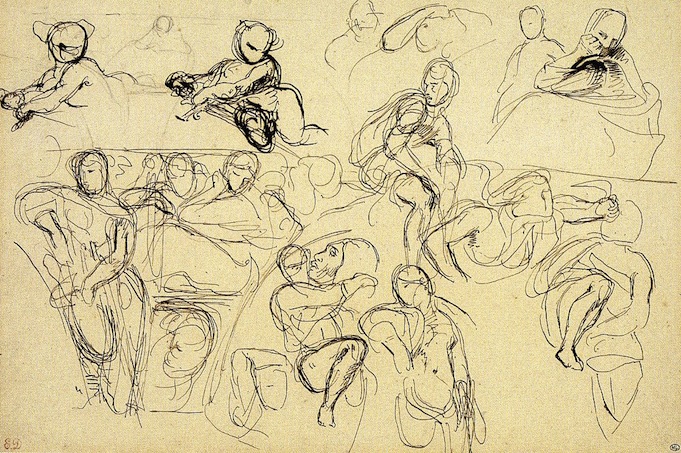
6-1 Jean-Auguste-Dominique Ingres, Studies for ‘The Grand Odalisque’ , 1814. Graphite on three attached sheets of paper, 25.4 x 26.5 cm. Paris, Musée du Louvre.
Ingres sometimes made pen sketches to nail down first ideas, but his preferred medium for studies as well as for finished drawings was graphite. He most often used the recently invented pencil in a medium hardness (3H). Like David, Ingres made numerous studies in preparation for each painting. Unlike David, Ingres frequently employed female models. In his many studies of the nude, such as Studies for ‘The Grand Odalisque’ (figure 6-1), Ingres searched for the appropriate contour with relatively short, exploratory scratches in order to form lines—as did David and Flaxman—until his eye was ready to draw a definitive smoother, darker, more emphatic curve across the scratches. Feint diagonal hatching scarcely models the forms into solids. Because graphite allowed it, he often erased pentimenti.
The three attached sheets of paper in figure 6-1 demonstrate that, rather than correct a single drawing, Ingres liked to do a part or the whole of an image over again to revise, improve, and perfect it. He often used tracing paper to start afresh his process of refining contour lines. In the lower, second sketch for the odalisque, he broadened her hip considerably; he solved the difficult problem of foreshortening her thigh as it recedes away from the viewer; he crossed the left leg over the right, instead of the opposite; he stretched her right arm so that she might touch her shin; and he lowered and lengthened and deepened the curve of her back. As has been noted for 200 years, her anatomy is humanly impossible. Nevertheless, the slowly curving lines instantly proclaim languid sensuality—even though the pose repeats that of Michelangelo’s burly Day on the Medici Tombs.
For a good part of the nineteenth century, Ingres extolled line and defended the supremacy of drawing—especially in the face of Romantic artists who championed light and color. In drawing, line would purify art from the seductions of chiaroscuro and its ability to convey the illusions of movement, texture, or drama. He once declared that “drawing (le dessin) is the probity of art,” as though it were somehow morally superior to any other form of creativity. Like Renaissance Italian artists, he understood that drawing encompassed design (disegno) as well as imitation. He explained that “Drawing does not simply mean reproducing contours; drawing does not consist only in strokes [of a pen or pencil]: drawing is also expression, interior form, plane, modeling. Look what’s left after that!” (R. Longa, Ingres inconnu, 1942, p. 10).

6-2 Jean-Auguste-Dominique Ingres, Study for ‘Antiochus and Stratonice’, 1840. Black chalk, stomped, 48 x 37.7 cm. Montauban, Musée Ingres.
Another sketch by Ingres, Study for ‘Antiochus and Stratonice’ (figure 6-2), drawn twenty-five years later, illustrates that he did not change his style or his methods very much in the interval. In this drawing, the lines are somewhat darker and firmer and the modeling slightly more pronounced, but the repetition of forms declares that he is still obsessed with achieving linear perfection. Instead of correcting one of the arms, he redrew the limbs again and again with slight alterations from one to the other. However admirable his pursuit of perfection may be, the exercise also suggests that he lacked imagination and was unsure of himself until he realized every possibility. Consciously or unconsciously, he held himself back.
Ingres’s drawings have always been appreciated more than his paintings, and connoisseurs have singled out his portrait drawings in preference to all others. One scholar counted 456 pencil portraits. Throughout his career, Ingres drew portraits of friends and patrons and gave them away as gifts. But for nearly ten years in Rome, he supported his family by drawing dozens of portraits of the British upper class who flocked to Italy after the fall of Napoleon in 1814. John Russell, Sixth Duke of Bedford (figure 6-3), sat for Ingres in Rome in 1815.
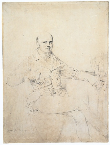
6-3 Jean-Auguste-Dominique Ingres, John Russell, Sixth Duke of Bedford, 1815. Graphite on white wove paper, 39.4 x 29.2 cm. St. Louis, City Art Museum of St. Louis.
In a great many of his portraits of individuals, Ingres included no background or accessories, although family portraits were usually set in a contemporary drawing room. (The views of Rome behind the sitter in some early portraits were probably drawn by another artist.) Most individual portraits are half-length, or three-quarter length at best, and posed full-face. But Ingres depicted the wealthy and accomplished Duke of Bedford nearly full-length in a casual pose: right arm cocked across the back of the chair, left arm resting on the table, and legs crossed. The books, inkwell, and quills allude to Bedford’s intellectual interests and skills. He turns his head slightly to one side as he looks out in the other direction. The soft shadows on the side of his lips and his left eye, rendered with minute strokes of parallel hatching, animate his face with the hint of a smile. In contrast to the Duke, most of Ingres’s sitters look frozen in time.
A primary effect of the drawing relies on a contrast of styles: the meticulous realism of the head—a realism he rejected in his studies of the nude—is surrounded by a bravura array of seemingly rapid lines for clothing. The contrast isolates the head, which is literally in sharp focus and is also the focal point of the lines of the limbs and torso radiating from it. In both manners, Ingres pulls off a virtuouso’s performance. Holbein (figure 3-56) and Goltzius (figure 2-29) had drawn portraits that contrasted finished and unfinished on the same sheet. Whatever the source, Ingres plainly used a style of drawing for his portraits different from his figure studies for paintings.
For portrait drawings, Ingres consistently used a light-weight wove paper with very little texture to it—a paper close to parchment, yet with a more regular surface. In general, he used a sharper pencil in his early portraits and a duller pencil in his later portraits, which are often more modeled, some even heightened with white. He always sharpened his pencil to a chisel-shaped point so that by turning the pencil, he could vary the width of the stroke. Ingres finished his portrait drawings in one day. Each sitter spent two hours in his studio in the morning and two hours in the afternoon, including a break for lunch. He often said that during lunch, he could better capture the character of the model, once he or she was freed from posing.
Before his death, Ingres bequeathed 4505 sheets of his drawings to his home town, Montauban, in southern France about thirty miles north of Toulouse. Seven to eight hundred more drawings exist in other collections. He never marketed his working drawings until, just before his death, he sold some to provide an income for his wife. A prolific and tireless draftsman, he taught many students in the nineteenth century about the importance of line as he urged them to draw, draw, and draw some more.
Théodore Chassériau (1819-1856) One pupil, Théodore Chassériau (1819-1856), spent his early teens in Ingres’s studio (1830-34), where he learned to draw graphite portraits in his master’s style. Chassériau’s Portrait of Madame Burg de Balsan (figure 6-4)—the wife of an ambassador—is as precisely executed, exquisitely refined, and psychologically insightful as the best portraits of his instructor.
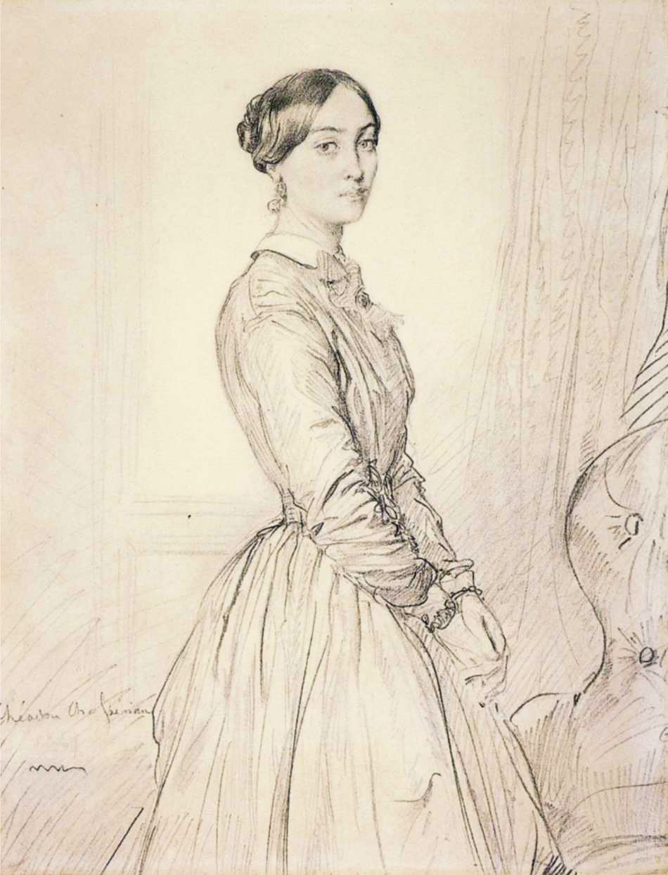
Théodore Chassériau, Portrait of Madame Burg de Balsan, 1847. Graphite. 33.3 x 26.1 cm. Philadelphia Museum of Art.
Madame Burg de Balsan turns slightly away from the source of light as did the Duke of Bedford (figure 6-3). Her hands clasped before her, she strikes, appropriately, a more reserved pose than the jaunty attitude the Duke assumed. Chassériau also gave her a more soulful look by means of larger eyes, stronger shadows, and parted lips. The folds of her dress are more detailed and finished in contrast to the sparse lines Ingres used for clothing. Except for Chassériau’s portrait drawings, which once belonged to the sitters and are now in major museums, the vast majority of the drawings by this precocious and prolific draftsman were donated to the Louvre by his heirs in 1934. The museum owns more than 2200 drawings and 35 albums by Chassériau.
Pierre-Paul Prud’hon (1758-1823) When David was in Rome designing his Oath of the Horatii, Pierre-Paul Prud’hon began three years of study in the city. He filled sketchbooks with drawings of ancient sculpture as David did as a student in Rome, but Prud’hon instinctively rejected the older artist’s heroic style. He was more attracted to the elegant and sentimental classicism of Anton Mengs, Angelica Kauffman, and Antonio Canova. In the Renaissance, his heroes were Correggio and especially Leonardo da Vinci.
![6-5 Pierre-Paul Prud’hon, Standing Female Nude, Seen from Behind, 1810-15. [?] Black and white chalk on blue paper, 61x 34.9 cm. Museum of Fine Arts, Boston.](/wp-content/uploads/2015/03/Prudhon6nude1.jpg)
6-5 Pierre-Paul Prud’hon, Standing Female Nude, Seen from Behind, 1810-15. [?] Black and white chalk on blue paper, 61x 34.9 cm. Museum of Fine Arts, Boston.
The model in Female Nude, Seen from Behind rest her left elbow on a plinth. Her body sways in a perfect S-curve because of the shift in weight. The pose, made canonical by the Greek sculptor Polycleitus, contrasts tensed, weight bearing limbs and muscles with relaxed limbs and muscles. The plinth allows the model to shift her torso to the left and project her hip to the right, farther than any free standing being could maintain by itself. The overlapping knees exaggerate the tapering of the lower body. The nude stands against a roughly-textured wall which, at her feet, is inexplicably on the same level with the plinth. The only space that matters to Prud’hon is the volume of the body.
Prud’hon aimed an artificial light on the model, not diagonally from above, but from the side, as he usually did in his académies. The nude casts a dark shadow on the plinth, but not on the wall. In fact, the wall arbitrarily changes from dark on the right to light on the left for the sake of the light-dark contrasts with the figure. A very precise contour marks the contrast between the highlights on her right side and the dark wall behind her. The contrast contributes to an uneasy polarity between the wire-sharp contour and soft modeling of the body. Prud’hon obsessively modeled the nude in black and white chalk, working with the middle tone of the blue paper, to create a dreamy and mysterious human form. He stumped his very fine parallel hatching, which follows the direction of forms, to produce even smoother transitions between light and dark. His modeling mimics the chiaroscuro across the smooth surface of marble sculpture like Canova’s. The darkest parts of the modeling occur in a line running from her neck down her back, buttock, and right leg, while much of her left side glows in a delicate veil of reflected light. Prud’hon’s hard-edged sfumato ultimately sprang from the style of Leonardo da Vinci. He may not have seen any of Leonardo’s drapery studies (figure 3-1), but he very likely saw David’s drapery studies for The Oath of the Horatii (figure 5-29) in his studio in Rome in 1785.
Eugène Delacroix (1798‑1863) Categorized as a colorist in opposition to Ingres the champion of line, Eugène Delacroix nevertheless made a great many drawings in a variety of techniques, especially pencil, pen, and wash. In fact, he was one of the most prolific draftsmen of the nineteenth century: he left behind several thousand single sheets as well as twenty-four albums of sketches. His drawings were not well known during his lifetime; indeed many critics thought he could not draw—at least not as accurately as Ingres. Delacroix preserved his drawings in the hope that their abundance and diversity would one day contradict his critics’ assumption that he painted spontaneously and without preparation.
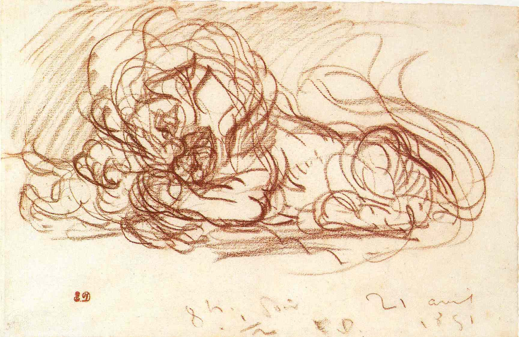
6-6 Eugène Delacroix, Crouching Lion, a Hare between his Paws, 1851. Red chalk, 19.8 x 30.6. Bremen, Kunsthalle.
Crouching Lion, a Hare between his Paws (figure 6-6), a rare red chalk drawing realized in the artist’s maturity, illustrates that Delacroix drew quite differently from Ingres. Whereas Ingres carefully refined a single, ideal contour line, Delacroix impetuously multiplied every contour three, four, or more times. He was well aware that a rigid contour line was an abstraction that does not adequately indicate shifting reliefs. His lines are much more than traditional pentimenti exploring and adjusting the forms in his drawing. They are instead the expression of the movement of forms and the quivering analog of the ferocity of the lion as it devours its prey. The skein of overlapping and intersecting lines also expresses the passionate spirit of the artist. In short, Delacroix redefined drawing as primarily gestures, which, as they build form, express feeling.
In his Journal, the diary that he kept for years, Delacroix wrote incessantly about color and light reflections, but seldom about drawing. However, a few entries comment on the importance of the sketch, or in Italian Renaissance terminology, il primo pensiero:
The first idea, the sketch, which is in some way the seed or the embryo of an idea, is ordinarily far from being complete. . . . It contains everything, if you will, but the artist has to extricate all this, which is nothing but the union of each part. . . .
What about . . . this penetrating and rapid impression, this primitive sketch of that ideal impression that the artist is supposed to have glimpsed or fixed on in the first movement of inspiration? For great artists, this sketch is not a dream, a confused cloud; it is something other than a union of scarcely perceptible lines. Only great artists go forth from a fixed point, and it is very difficult for them to return to this pure expression in the long or rapid execution of a work. (23 April 1854).
Leonardo and other artists of the High Renaissance recognized that a primo pensiero played a significant role in the invention of a composition, but no one gave it the importance that Delacroix did. In general, Renaissance and Baroque artists considered the first sketch merely a stage that must be developed and improved upon with much further study. In Delacroix’s mind, the sketch of the first idea was the moment of inspiration on which everything else depends: “It contains everything.” Delacroix’s words imply that the sketch is the essential and primordial act in art. Even great artists have trouble capturing it; mediocre artists lose their way. A drawing like Crouching Lion, which is not exactly the design for an entire composition, nevertheless embodies an idea that Delacroix wanted to express. (Crouching Lion served as the preliminary study for a painting of 1856 in the Louvre.) Even he sometimes failed to recapture the passion of his drawing in his finished painting.
Delacroix studied lions at the Paris zoo in the Jardin des Plantes, but he derived Crouching Lion from his own Lion in the Atlas Mountains, a lithograph of 1829. He can thank his friend Gericault for showing him that wild animals incarnate naked passions and for showing him a drawing style with repeated contours. (Young Delacroix posed for one of the bodies strewn about Gericault’s The Raft of the Medusa.) Delacroix’s drawing also owes a debt to the hunting scenes of Rubens, which Delacroix knew from prints. He had a collection of 2000 prints and made it a habit to copy some of them each day, just as a pianist might daily practice scales. He copied an engraving of Raphael’s Four Fighting Men (figure 3-20), for example, and many of the Caprichos of Goya, but Rubens was his favorite source. He scorned the Le Brun-like stereotypes the Academy gave students to copy and felt that even daguerrotypes were better aids in developing a good eye (oeil juste).
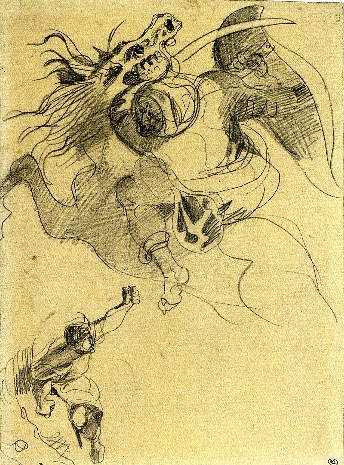
6-7 Eugène Delacroix, Oriental Horseman Holding a Shield and a Saber, late 1820s. Graphite, 27.5 x 19.9 cm. Paris, Musée du Louvre.
Delacroix did not hesitate to interpret his models even as he repeated them. He copied Oriental Horseman Holding a Shield and a Saber (figure 6-7) from an etching after Rubens’s painting, Lion and Tiger Hunt (Louvre). While copying the stationary etching, Delacroix did not multiple the contours in this drawing; instead, he bent them into taut curves that are ready to spring into action. His goal was to express the violence and passion of animal and hunter, not to be faithful to externals. He established areas of light and dark contrasts with vigorous hatching. Rather than hatch with a diagonal stroke at a consistent angle as most artist had, Delacroix usually made hatching strokes at different angles, as did Gericault. Delacroix’s hatching created over the surface a network of Cubist-like facets, which fragment an area of darkness into planes.

6-8 Eugène Delacroix, At Meknes: Landscape, Doors, with Figures of Arabs and Jews, 1832. Pen and brown ink, watercolor, sketchbook with 97 sheets, each sheet 19.3 x 12.7 cm. Paris, Musée du Louvre.
For six months in the late winter and spring of 1832, Delacroix visited Morocco and Algeria in the entourage of the French ambassador to the Sultan of Morocco. On the journey he kept at least seven small albums or sketchbooks of what he saw (figure 6-8). Four of them remain intact. He also sketched on about a thousand single sheets. Delacroix walked freely around the cities of Tangier and, in this case, Meknes, dazzled at the architecture, people, costumes, color, and light of an Orient he had only read about and dreamed about. Insatiably curious, he crammed his sketchbooks with drawings and written descriptions placed side by side so that images and words form an inseparable design and the two-page spread becomes a unified experience. Darting between images and words, the viewer recreates something of the excitement he felt.
Among the written remarks on these two pages, he included notes about the extraordinary contrasts and colors of the country and its people: at the top of the left page he noted “man seated on left orange caftan” In the middle of the page he observed “parts of walls painted in yellow, the bottoms in general in white /very suitable for making the figures stand out” and, underneath the pen sketch, “small mosque painted yellow.” At the top of the next page, Delacroix writes “very bright pink colors on the figure standing out / against the white wall.” Only in the evening, back in his room, did he have time to color some of the cursory ink drawings. Surprisingly, on these two pages, he did not follow any of his annotations about color. He left blank the parts of the drawing whose color he described.
Albrecht Dürer, David Teniers, and many artists in the past tinted their drawings with color, usually to increase a drawing’s saleability. At a much lower cost than an oil painting, a drawing colored with watercolor or bodycolor could be framed and hung on a wall. However, Delacroix, who did not sell his drawings, used his exploratory graphic work to study color in addition to line and chiaroscuro. For the most part, he “colored in” preexisting pen or pencil drawings rather than develop a design mainly through the resources of watercolor. Nevertheless, he knew how to take advantage of the transparency of watercolor, and he had learned a pure watercolor technique—that is, flooding a sheet with pools of color—from English artist friends in the early 1820s. (He went to England in 1825).

6-9 Eugène Delacroix, Study of a Nude Woman, Falling Backwards, for ‘The Death of Sardanapalus’, 1827. Pastel, red and white chalk, 40 x 27 cm. Paris, Musée du Louvre.
For The Death of Sardanapalus in 1827, he made a handful of figure studies in pastel—for example Study of a Nude Woman Falling Backwards (figure 6-9). He was attempting to capture the luminous color of pastel for the painting. In the drawing he tried out warm and cool color contrasts, as well as oppositions of light and dark. He seems to have introduced some cool blue into the modeling of the woman—a technique he could have observed in Rubens’s paintings. In the 1820s, Delacroix and a small number of French artists (especially Jules-Robert Auguste, 1789-1850) broke free from the eighteenth-century tradition of using pastels only for portraits. Delacroix made pastel studies intermittently throughout his career.
The year after he returned from North Africa, the French government commissioned him to paint murals above the windows and doors and on the ceiling of the Salon du Roi in the Palais Bourbon. For the next twenty-five years he worked on decorations in government buildings and churches in Paris, producing hundreds of preparatory drawings, mostly in pen, often in pen and wash. A typical example, Studies for the Salon du Roi in the Palais Bourbon (figure 6-10), finds him experimenting with figures for a pendentive and part of a frieze symbolizing Justice.
6-10 Eugène Delacroix, Studies for the Salon du Roi in the Palais Bourbon, 1833-38. Pen and brown ink, over graphite lines, 27 x 40.9 cm. Paris, Musée du Louvre.
In his struggle to find solutions, he repeated at least three of the figures on this one sheet. Their contours swirl around essentially oval forms. Delacroix employed what he called “a system of eggs” to establish the structure or framework of an object in a drawing. He felt that a series of ovals quickly established the principle masses, the major areas of light and dark, and the relief or projection of forms in space. Before describing any details, the ovals constructed the major movements and the essential planes on which he could draw with confidence.
For his mural projects, Delacroix followed the same traditional process of design that Raphael did three hundred years earlier: first ideas, compositional studies, and also figure studies. However, he made finished drawings of the posed model only for nude parts, faces, and hands. He then presented them to an assistant along with a modello or, in French, an esquisse, rendered in watercolor, gouache, or oil. An assistant traced the esquisse and squared it for transfer to a canvas. But the essential work was done in these rapid sketches while the temperature of his inspiration was still hot.
Camille Corot (1796-1875) In the summer of 1826, on the first of three trips to Italy, Camille Corot hiked about forty miles up the Tiber River valley from Rome to Civita Castellana where he drew Forest Interior with Rocks at Civita Castellana (figure 6-11). In these early years of his career, he usually drew with a graphite pencil so hard and sharp that, like a metalpoint stylus, it could leave a small trench in the paper. With this exacting instrument, he meticulously defined each tree branch and rock. His first drawing instructor, Achille-Etna Michallon (d. 1822), had encouraged him to work directly from nature and to draw it with precision. Corot agreed and wrote, “I also see how exacting we must be in drawing from life and above all not to be satisfied with a hastily executed sketch” (ca. 1825, Louvre RF 6742b). Only a few years after becoming an artist, he already possessed a sharp eye and the dexterity and patience to capture his vision of nature.
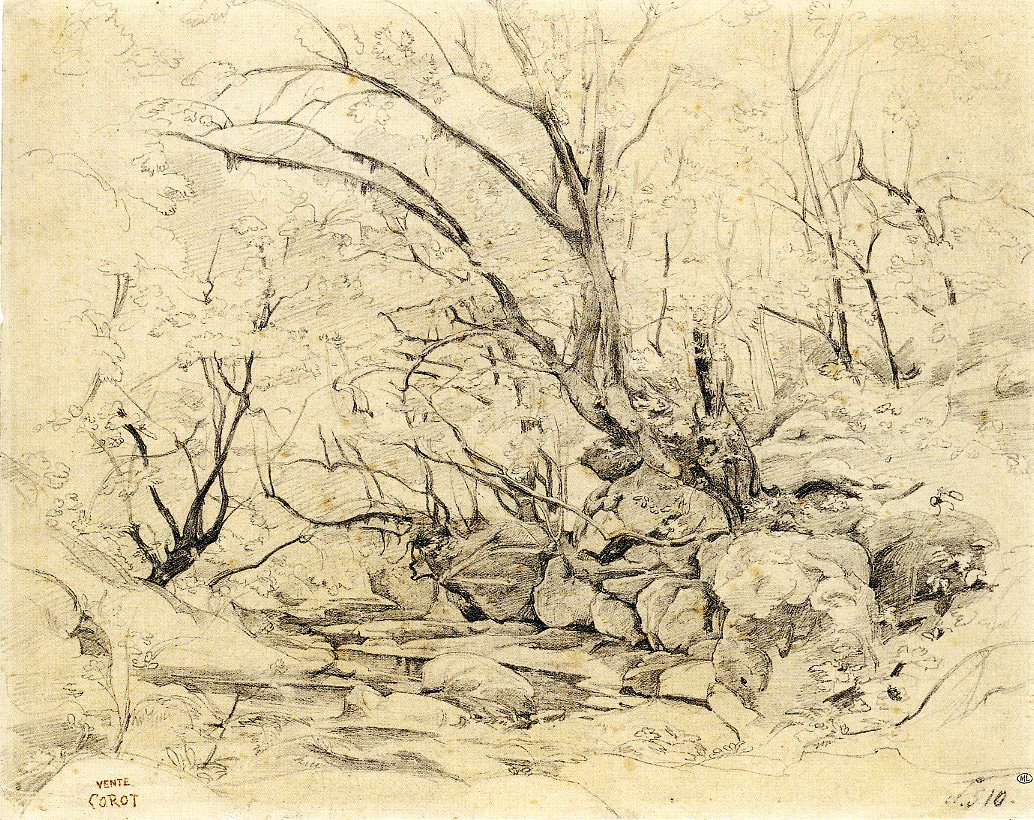
6-11 Camille Corot, Forest Interior with Rocks at Civita Castellana, 1826. Graphite, 31.2 x 39 cm. Paris: Musée du Louvre.
In Forest Interior, the thin branches of trees which grow out of the rocks arc across a small stream that meanders around the boulders. The view up the stream does not penetrate far into the tangled woods: the inter-laced trees and rock form a barrier. Also, Corot treated his drawing as a vignette—the details of the forest fade all around the edges of the sheet. Consequently, at the bottom no lines or planes lead us into the picture space and no planes on the left or right frame the scene and push it back, as a landscape by Poussin might do. Instead, the vignette design allowed Corot to focus on the complex network of lines and forms.
The composition abandons the classical formulas he usually followed in his major paintings. These drawings did not usually become paintings. They became, instead, a repertoire of ideas, based solidly on nature, that he kept in portfolios in his studio.
Since there are no cast shadows, it is difficult to pinpoint the direction of the light. For the most part, the light seems to come from behind the trees, turning the tree branches into silhouettes and making the foliage a translucent blur. The rocks are modeled both top and bottom, turning them onto flat planes that face the viewer and providing little indication of spatial recession. It was not the sharpness of his pencil or the accumulation of details, but Corot’s sharp eye for design that made this drawing a much reproduced classic.
Corot made several other carefully rendered studies of the rocky gorges at Civita Castellana. As was his habit, he often strengthened and reworked these graphite drawings with a fine pen and ink. His landscapes usually included a figure whose small scale enhances the towering trees and rocks. Figure 6-11, however, lacks a human presence—its wildness is too impenetrable.
In addition to landscape drawings, Corot made studies from a model and portraits of family and friends. No one knows the identity of the person in Young Woman Seated, with her Arms Crossed (figure 6-12), an outstanding example of his ability to give mood and character to the individuals he drew.
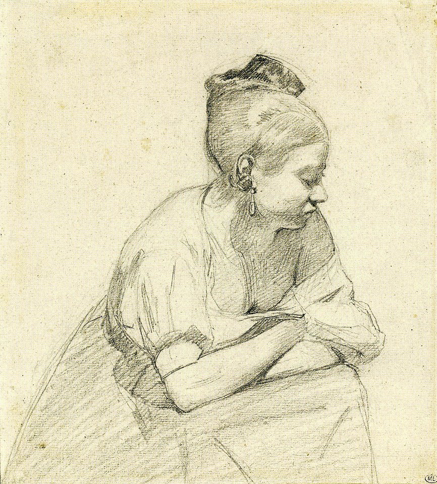
6-12 Camille Corot, Young Woman Seated, with her Arms Crossed, 1830s? Graphite on gray paper, 21.2 x 19.1 cm. Paris: Musée du Louvre.
In many of his earliest portraits, Corot drew with such a fine precise line that recent critics have noted a similarity with sixteenth-century German art. Perhaps in Rome, Corot was familiar with the Nazarenes who consciously imitated an early German style. However, Young Woman Seated is not a study of refined contour lines but an essay in values and the emotional effects of value contrasts. The drawing presaged the women who read or dream in paintings from late in his career.
The woman bends over out of fatigue or boredom and, seemingly deep in thought, turns away from the light, thus putting her facial features in darkness. She leans on her folded arms—body language that closes herself in and closes us out. In her isolated reverie, she lets the sleeve of her blouse fall off her shoulder. The hatching that creates the shadows cloaking her eye, mouth, and shoulder is applied broadly, probably with the side of his pencil, and appears even broader across her skirt. This drawing also is in focus, as it were, only in its center.
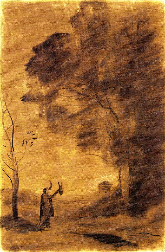
6-13 Camille Corot, Orpheus, or Hymn to the Sun, 1865. Charcoal with white heightening on buff paper, 47 x 30.6 cm. Paris: Musée du Louvre.
About 1850, Corot changed his style of drawing. Instead of graphite, he preferred to draw with charcoal. The switch resulted in mysterious and visionary drawings such as Orpheus, or Hymn to the Sun (figure 6-13). The drawing is a sketch for one of the panels commissioned for the dining room of a patron.
For charcoal drawings, Corot usually chose beige, brown, or gray colored paper. He also drew scenes like this from his imagination, or rather, from the memory of all the places he had sketched for several decades. He lay down the charcoal in broad strokes, then stumped most of it to produce the velvety grays and blacks that set the mood.
Throughout his career, Corot traveled incessantly, crisscrossing France and sojourning to Switzerland, the Netherlands, and Italy. He always carried with him pocket-sized sketchbooks in which he recorded itineraries, travel expenses, and thoughts on art and constantly sketched what he saw. At his death, the artist had accumulated nearly eighty sketchbooks—almost half of them are now in the Louvre.

6-14 Camille Corot, Landscape with Draped Figure (bound sketchbook), ca. 1860? Graphite, each sheet 15.8 x 10.7 cm. Paris: Musée du Louvre.
He filled most of the pages with a quick flurry of lines, as in Draped Figure in a Landscape (figure 6-14), a drawing that is more concise and abbreviated than most. In this and other drawings, to record the values he observed without resorting to extensive hatching, Corot developed a shorthand: a system of circles and squares. According to his friend, the collector Etienne Moreau-Nélaton, “A circle means light and a square dark. The dimension of those signs is proportional to the progression of the values” (Corot: le génie du trait, 99). The drawing was an aide-memoire of a place he saw in passing or the first thoughts for an imagined composition. Clearly, the few lines are just as much a visual shorthand as the two circles and two squares. By the time of his second and third trips to Italy (1834 and 1843), as the canvases that he painted directly before nature became more precise, his drawings before nature became sketchier.
Countless artists imitated (and forged) Corot’s landscape paintings, and some were impressed by his drawing too. Although they rejected his style, the Impressionists continued to work in the open air, trying to capture the light of nature, as he had done for five decades. Camille Pissarro was once a follower of Corot and even imitated the style of his early drawings. He and Claude Monet also employed sketchbooks as did Corot: as a storehouse of motifs for painting. His charcoals anticipated the fad for that medium from1860 to1890, and his emphasis on value contrasts and dreamy figures encouraged young Odilon Redon, who met Corot in 1864. Corot’s celebration of values set the stage for the investigation of light and dark in the art of Jean-François Millet and Georges Seurat.
Honoré Daumier (1808‑1879) In his review of the Salon of 1845, the French poet and astute art critic Charles Baudelaire wrote, “We know of only two men in Paris who draw as well as Delacroix. . . . The first is Daumier, the caricaturist; the second, Ingres. . . . Daumier draws perhaps better than Delacroix, if you prefer his healthy and robust qualities to [Delacroix’s] strange and disconcerting talent.” (Baudelaire was Daumier’s neighbor and close friend.)
In the early part of his career, Honoré Daumier worked full time as a printmaker and drew mainly on a lithographer’s stone. Very few of his independent drawings survive from before the Revolution of 1848. In that year he began to paint and to draw more actively, although not many of his drawings can be connected with his paintings. Most of his over 800 drawings date from the late 1840s, the early 1850s, and from the early 1860s, when he lost his job with Le Charivari, the journal that published his lithographs.
Daumier possessed a natural ability to draw. An early employer told him, “Vous avez le geste, vous” (“You have the moves, you do”). As part of his training, Daumier had studied drawing from the posed model and had copied works in the Louvre, where he came in contact with Michelangelo’s Captives. But it was the twenty years of drawing with a lithographer’s crayon directly on a stone that accounted for his rapid and spontaneous execution and for his acute perception of the world around him. The practice of lithography enabled him to draw everyday life from memory with facility and with an agile, lively touch. He remarked that the soft, greasy litho crayon “followed [his] thoughts,” whereas “the lead pencil was stubborn and did not obey” him (P. Courthion, Daumier raconté par lui-même, 148). He worked the stones with stumps of used crayons because they gave his lines strength and muscularity.

6-15 Honoré Daumier, La Soupe, ca. 1853-57. Charcoal, black chalk, watercolor, pen and ink, wash, conté crayon, 30.3 x 49.4 cm. Paris, Musée du Louvre.
It is clear from his paintings after the 1848 revolution that he modeled his style on that of Rubens. Also in drawings, such as La Soupe (figure 6-15), in which a husband and wife devour their simple, steaming meal, the figures are typically weighty and monumental in the manner of Rubens. Possessing also the power of Michelangelo’s prophets and sibyls, they transform this family meal into something primal and sacred. They fill up the space of the sheet—he had to add more room for them on the left with another strip of paper.
Daumier built the images in this drawing by rapidly combining a half dozen drawing tools: he first roughed out the figures in charcoal and black chalk; then he applied wash and watercolor for relief; finally, in pen and ink and conté crayon he defined forms with strong contours. Just as he reworked his paintings over time, he may have reworked this drawings in additional media after a gap of time.
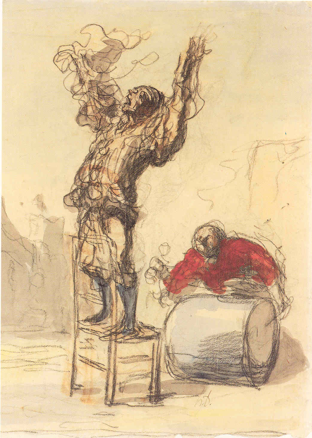
6-16 Honoré Daumier, Street Show, mid 1860s. Black chalk and watercolor, 36.5 x 25.5 cm. New York, The Metropolitan Museum of Art.
At some point—it is impossible to date most of his drawings—Daumier developed a second drawing style. He often drew with a flurry of irregular, wrinkled, and agitated lines that never definitively demarcate a form. The style is evident in Street Show (figure 6-16), a black chalk and watercolor drawing of a thin clown and a fat drummer attempting to attract attention in an empty city square. In contrast to the regular lines of the chair, the swirling lines of the clown portray nothing solid but rather the movement of the clown as he waves his arms in the air. The maze of lines also expresses the emotion of the figure as well as records the energy of Daumier’s creative process. Baudelaire noticed the similarity to Delacroix’s gestural drawing style (figure 6-6), but Daumier’s gestures in chalk are even more unlike traditional pentimenti that search for forms than Delacroix’s. Daumier’s lines are not simply filler or mere decorative flourishes. Each stroke is vital and urgent.

6-17 Honoré Daumier, A Man Reading in a Garden, ca. 1865-70. Pen and ink over black chalk, and watercolor, 31.5 x 24.5 cm. New York, The Metropolitan Museum of Art.
In the 1860s, Daumier produced a number of more restrained, relatively finished, and more elaborated drawings, which he sold or gave to collectors. For over a half century after his death, they were his best know drawings. He often had difficulty translating his vigorous drawing style into paintings, but the extensive use of wash and watercolor in these drawings allowed a part of his drawing manner to show through a colored surface.
In A Man Reading in a Garden (figure 6-17), the transparent washes of color fill the grove of trees with subdued light. The curved form of the man absorbed in his reading fits perfectly into the lattice of lines made by the animated trees. As Cezanne did some years later, Daumier integrates foreground and background with lines and blobs of color set down next to one another across the surface.
Jean-François Millet (1814-1875) In the 1840s, Daumier and Jean-François Millet lived near each other in Paris and became close friends. They shared an interest in depicting the people of Paris: specifically, the middle class (Daumier) and the working poor (Millet). Unlike the self-taught Daumier, Millet had absorbed the practice and principles of academic drawing during two years of study under Paul Delaroche. Millet first tried to make his way with portrait drawings and paintings, then with drawings and paintings of female nudes. Finally, in 1849, he found his path when he settled in Barbizon, a farming village thirty miles south of Paris. There he fused his conspicuous drawing skill with his empathy for poor farm laborers. He himself had toiled on his family’s farm in Normandy.
6-18 Jean-François Millet, Studies for “Harvesters Resting,” ca. 1852-53. Black conté crayon, 19.24 x 29.9 cm. New York, Brooklyn Museum.
For his important paintings, he made dozens of figure and compositional sketches, including nude studies of each major figure. (Millet scholars count more than 1500 such drawings.) Studies for “Harvesters Resting” (figure 6-18) is one of over fifty sheets he filled in preparation for the painting by that name shown at the Salon of 1853. The Academy taught him to always give the human figure a distinct outline. But instead of finding his way to a perfect contour with small scratch marks, as Ingres and his imitators did, Millet drew contours with repeated, forceful, straight strokes. The repeated lines are not revisions so much as reinforcements of the contour. For nearly all his single-color drawings, he used black conté crayon, compressed sticks of pulverized chalk bound with oil. The oil made his lines darker and more emphatic than natural chalk.

6-19 Jean-François Millet, Woodcutter Making a Faggot, ca. 1853-54. Black conté crayon, 38.1 x 29.8 cm. New York, The Metropolitan Museum of Art.
Mindful of sales to collectors, he also made a large number of finished drawings, such as Woodcutter Making a Faggot (figure 6-19). (He signed a drawing only when he sold it.) The design is a variant of a painting in the Louvre of the same subject.
The man in the drawing raises a curved cutting tool to lop off a branch to make a straight stick that can more easily tied into a bundle. A hat shrouds the man’s face, and because the light comes from behind him, darkness veils his features. Light and dark areas alternate across the surface. As he worked up his drawing, Millet manipulated his crayon to mimic the texture of the materials he depicted. Broad, rugged strokes catch the coarse knotted bark of the branches. The blended modeling of his pants’ leg reflects the stiff material of its cloth. Faint smudges define the embankment behind him. And over the thick darkness across the top of the sheet, he drew repeated vertical lines to define a dense forest. Millet’s control of form and light gave the poor man’s endless labor a feeling of time standing still.
A later finished drawing, Winter Evening (figure 6-20), was commissioned by Emile Gavet, an avid patron of Millet’s drawings. In a dark interior, lit only by the flame of an oil lamp, the husband weaves a basket as the wife sews a shirt. Their child sleeps in the cradle between them. The iconography, composition, and tenebrism evoke the art of Rembrandt and convert this farm family into a modern Holy Family. Millet’s draftsmanship reinforced the spiritual aura. Lines that radiate from the blaze of light over the child’s head continue beyond the couple into every corner of the room. Combining black conté crayon with pastels, he limited himself to only the primary colors, red, blue, and yellow. The subdued tonality and the symmetrical simplicity of the drawing convert earthy realism into the ageless.

6-20 Jean-François Millet, Winter Evening, ca. 1867. Black conté crayon and pastel on pale gray wove paper, 44.2 x 54 cm. Boston, Museum of Fine Arts.
Millet’s drawing impressed Pissarro, Degas, Cézanne, Seurat, and Van Gogh. In 1875, the year Millet died, the drawings in his studio and Emile Gavet’s collection of pastels were exhibited and sold. A retrospective exhibition of Millet’s paintings and drawings at the Ecole des Beaux-Arts in 1887 again brought his drawings to the attention of artists. Despite the high prices paid for his paintings in the nineteenth century, many artists, including Pissarro, prefer his drawings.