VENICE AND SPAIN
VENICE
In the eighteenth century, Venetian art entered a second golden age; its artists played major roles on the international stage. Since Venice established an academy rather late in the century (1756), drawing instruction was given in the studio of individual artists. Most eighteenth-century Venetian painters were fluent and prolific artists, the epitome of Baroque verve and virtuosity. So too were their drawings fluid and vivacious.
Sebastiano Ricci (1659-1734) When Sebastiano Ricci returned to Venice in 1696, after fifteen years spent working in Bologna, Parma, Rome, and Milan, he revived Venetian art by emulating the art of Paolo Veronese and other Venetian masters of the sixteenth century. Few drawings from his formative years still exist to illustrate the different currents of late Baroque art that he experienced in those cities. But drawings from his three decades of triumph in Venice demonstrate that he had formed a distinct personal style by the time the new century began. An album of 211 drawings in the Royal Collection at Windsor and an album of 133 drawings in the Accademia at Venice contain the finest examples of his work. The albums were assembled in the early eighteenth century by two prominent collectors who were friends of the artist.

5-32 Sebastiano Ricci, Mary Magdalen Anoints the Feet of Christ, 1725. Pen and brown ink, gray wash, 24.5 x 35.3 cm. Windsor Castle, Royal Library.
For the composition study The Magdalen Anointing Christ’s Feet (figure 5-32), from the Windsor album, Ricci borrowed from Veronese the Palladian architectural setting, the figure types, and their costumes. Ricci made this modello in preparation for a very large painting of the subject, also in the British Royal collection. The drawing was not the final word, however, because only the four principle figures remained the same in the painting. Everything else was changed. Instead, the drawing represents a stage in his efforts when he put together earlier figure studies and compositional schemes into a finished design in order to make a judgment of the whole.
The drawing must also have been a showpiece of his bravura style, calculated to attract his patrons. Clearly Ricci had an amazing ability to set forth and control a grand composition with nothing but abrupt, jerky, and rapid lines. A relatively few wavy and flickering strokes of the pen bring people and objects to life, put their masses in motion, and shatter volumes into splinters of sparkling light. Different tones of gray wash contrast with the reddish-brown ink of his lines and add color to the drawing’s attractions. The drawings of Veronese (figure 3-37) may have inspired Ricci to free his pen. But instead of searching for the appropriate contour with loose circular strokes, as Veronese did in his sketch, Ricci disregarded contours and practiced an impressionism of lines, as though a lightning flash allowed him only a moment to record reality with a stroke here and a curlicue there.
Giovanni Battista Piazzetta (1683-1754) In 1705, Giovanni Battista Piazzetta returned to Venice after working for several years in Bologna. In that city he made it his business to imitate the Carracci and Guercino and to study their legacy. He brought home with him a taste for academic discipline and careful preparation, for diligent study of the nude model, and for chiaroscuro. His experience in Bologna and his sober personality made him a very different draftsman from Ricci.

5-33 Giovanni Battista Piazzetta, Young Man (Self-Portrait?), ca. 1725. Black chalk heightened with white, 38.3 x 26.7 cm. H M Queen Elizabeth II.
During his lifetime and beyond, collectors especially sought after his black chalk drawings of expressive heads (tétes de caractère) of which figure 5-33 is an excellent example. Some critics understood these drawings of busts and half-lengths as a male counterpart to the very popular pastels of Rosalba Carriera (figure 5-6).
It has been suggested that Piazzetta’s drawing is an idealized self-portrait of the artist, who would have been in his early forties when the drawing was made. Whoever he is, the fellow wears an exotic costume with a tasseled fur collar that rises high on one shoulder and hides part of his neck and chin because the viewer looks up from below. The young man’s strong features are framed by his thick and animated hair. Although Piazzetta probably set down some contour lines in the making of the drawing, he eventually established forms almost entirely with contrasting areas of light and dark. He stumped the hatching of the face to soften the modeling and elsewhere let stand a more vigorous application of chalk. The strokes of chalk carefully modulate the light in order to generate the illusion of textures, such as fur, hair, and flesh.
Piazzetta was a slow and methodical painter who found that he could supplement his unsteady income with a regular production of drawings. Many of his drawings, most often in red chalk, provided the basis for book illustrations, including those for a volume of nude studies, Studi di Pittura, published posthumously in 1760. The book illustrated each nude twice, once in outline form and once fully modeled. It confirmed his reputation as a great teacher. Indeed, he may have run a life class in his own studio; and when a state-sponsored academy was finally founded in Venice, he became Professore del Nudo and devoted his time almost exclusively to teaching.
Giovanni Battista (Giambattista) Tiepolo (1696‑1770) Unlike Ricci and Piazzetta, Giovanni Battista (Giambattista) Tiepolo stayed in Venice to refine his skills. As a young artist, he gravitated toward the tenebrism of Piazzetta. But by1730, when he was in his early thirties, he had developed a mature style of drawing built on the light and exuberance of Ricci.

5-34 Giovanni Battista Tiepolo, Seated River God, Nymph with an Oar, Putto, ca. 1740. Pen and ink, brush and ink over black chalk, 23.7 x 31.3. New York, Metropolitan Museum of Art.
Seated River God, Nymph with an Oar, and Putto (figure 5-34) exhibits the manner of drawing that Tiepolo wielded at the height of his prolific and brilliant career. Typically, he began a drawing like this with swirling faint lines in graphite or black chalk that map out possibilities for a rough arrangement of the figures. No lasting decisions were made at this stage. The underdrawing mostly served to warm up his wrist and his imagination. Then with a quill sharpened to a fine point, he drew exact and fluid contour lines for the intertwined and steeply foreshortened figures. Confident of his skill, he drew without hesitation or corrections—a daring high-wire act that allowed no missteps. (In truth, a certain completeness about the drawing suggests that it was not his first attempt at the motif.) Finally, he applied two layers of wash: first, dabs of saturated ink for the darkest shadows, then a very diluted transparent layer that kept these darks translucent and full of light. (He had long since given up diagonal hatching in pen.) Unlike Ricci’s figures, which disintegrate into random squiggles, Tiepolo’s luminous god and nymph maintain their volume.
He made pen and ink drawings such as Seated River God to study the arrangement of various groups of figures and especially the effects of light on them. His corpus of drawings includes roughly hewn primi pensieri as well as finished and elaborated drawings attractive to collectors. It also includes some landscapes, caprices or fantasies, and also caricatures. However, Tiepolo usually made the modello for each canvas or for an entire fresco composition in oil. And he did not follow the academic practice of studying individual figures in great detail. Anatomical details concerned him little—they were second nature to him in any case. His loose manner with the pen freed his imagination for dramatic inventions and brilliant effects of light. (An album that contains 67 spontaneous studies on the theme of the Holy Family bears witness to his creative fecundity).

5-35 Giovanni Battista Tiepolo, Allegorical Group for a Ceiling (Palazzo Vecchia (Romanelli), Vicenza?), ca. 1755. Pen and wash, 20 x 28.8 cm. Civici Musei di Storia e Arte di Trieste. Inv. 2001.
For the most part, Tiepolo drew for himself and kept his inventions in his studio for future use. The group of river god and nymph (figure 5-34) first appeared in the frescoes at the Palazzo Clerici in Milan in1740 and twelve years later in the ceiling of the Kaisersaal in the Würzburg Residenz.
After Tiepolo’s return to Venice in 1753, his touch grew even lighter. In a flurry of curving whiplash lines, to which he added several areas of very pale wash, he quickly improvised another group of cloud-borne figures for a ceiling (figure 5-35). His dazzling penmanship is breathtaking—his quill glided over the paper like an Olympic figure skater over ice. Just a few abbreviated lines and several swipes of the brush seized the solid figures that flashed in his imagination.
Tiepolo made an enormous number of drawings—over 2000 still exist. During the last years of his life, he and his son Domenico mounted their drawings in a series of albums, catalogued by type and subject, as other Venetian artists had done. Because the drawings were kept together in this way, especially during the years of low esteem that followed his death, a remarkable number of the albums survived intact into the twentieth century. Nevertheless, problems with them persist.
Two kinds of paper divide the Tiepolo drawings into two broad categories: drawings on white paper, which were normally executed in pen and wash over an underdrawing in black or red chalk; and drawings on blue paper, which were normally executed in black or red chalk heightened with white. The pen and wash drawings are mostly the preparatory studies, like figures 5-34 and 5-35, that Tiepolo made for every important project throughout his career. Although albums contain many pen and ink drawings by his son Domenico, the son’s are easily recognized by their style and often by his signature. However, a great controversy surrounds the rather more detailed chalk drawings on blue paper, which the majority of experts consider the work of the son. The few that the father drew probably served as models for his pupils to copy. Many were recordi (records) of his frescoes, drawn most likely by his sons to preserve groups and motifs from the murals for future use. If the sons drew the majority of chalk drawings, then there are very few existing drawings in chalk or ink that directly relate to Giambattista’s great frescoes in Würzburg and almost none to his last decade in Madrid.
Domenico Tiepolo (1727-1804) Domenico Tiepolo elaborated his father’s caprices and caricatures into original, lighthearted scenes of social comment. In the last decades of his life, Domenico stopped painting and devoted himself entirely to drawing in pen and wash. In those years he produced several large series of biblical subjects, scenes of contemporary life, and his final, finest, and most famous drawing series, Divertimento per li Regazzi (Entertainment for Children). This last series recounts in 104 drawings the life of Punchinello, the sly and witty trickster from the Commedia dell’Arte. His adventures take place in a Venice populated with other Punchinello-like characters. In short, Punchinello becomes Everyman.

5-36 Domenico Tiepolo, Punchinello Arrested, 179–. Pen and ink, wash, over black chalk, 35.2 x 46.6 cm. (sheet). The Cleveland Museum of Art.
Like the other drawings in the series, Punchinello Arrested (figure 5-36) is a finished composition framed by a standard border. Most of the drawings have an even more elaborated architectural or landscape setting than this example. Unlike his father’s suggestive use of wash, Domenico developed consistent cast shadows, modeling, and tonality over the entire composition. More than any other aspect of his pen drawings, Domenico’s lines distinguish his style of pen drawing from that of his father. The son always drew arbitrarily wavy contours, more like those of Tintoretto or Sebastiano Ricci than the suave yet accurate contours of his father. The sleeves of the characters in the center of the drawing best display Domenico’s characteristic line.
Punchinello Arrested, number 33 in the series, is signed in the lower right corner. On the left, a turbaned oriental is one of many motifs in the series that Domenico borrowed from his father’s paintings and drawings. Modern critics have soberly interpreted Divertimento per li Regazzi as an allegory of the end of the Venetian Republic and a critique of the moral seriousness of the Enlightenment—in the guise of a delightful illustrated children’s book.
Canaletto (Giovanni Antonio Canale) (1697-1768) Canaletto, the famous view painter of Venice, made two types of drawings: sketches that documented the buildings of the city and finished drawing that he sold to collectors.
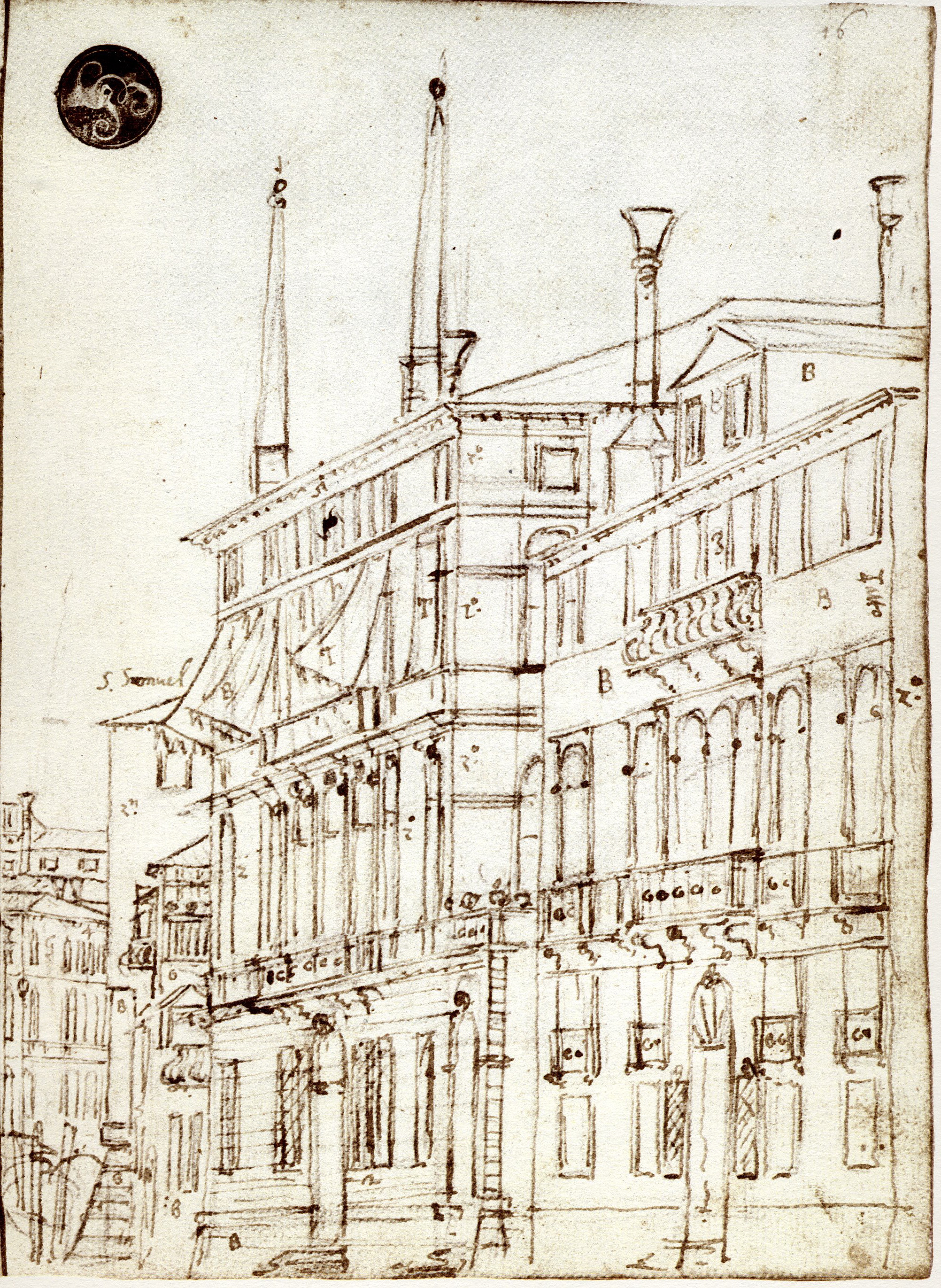
5-37 Canaletto, The Grand Canal (Quaderno Cagnola, 16 recto), ca. 1730. Pencil, pen and ink, 23 x 17 cm. Accademia, Venice.
Figure 5-37 is a sketch that records the appearance of two houses along the Grand Canal. It is one of 138 similar drawings still bound in one of his notebooks (Quaderno Cagnola, Accademia, Venice). It seem certain that Canaletto sketched these building on the site in pencil, traces of which are visible in the drawing, and then redrew the sketch in ink back in the studio. He annotated the drawings with observations about colors (B = blanco, white) and the function of the building. The sketchbook drawings, which never show water, almost all go to the edge of the page, suggesting the spread of the city that lies beyond the limits of the drawing. In fact, figure 5-37 in one of six drawings that documents the Grand Canal on successive pages of the sketchbook. The drawings in sketchbooks like the Quaderno Cagnola were the raw material for Canaletto’s paintings and etchings.
He may have used a mechanical device, a camera obscura, to make the initial pencil sketch—just as he may have sometimes used a ruler to make straight lines or a compass to draw semicircular arches, as most draftsmen do. They were tools, not crutches. The camera did not constrain his vision; in fact his point of view shifts slightly from one drawing to the next in the sketchbook, perhaps in order to get a better grasp of each building. Back in the studio, his pen often straightened and adjusted the pencil lines as he saw fit. While sketching, Canaletto ignored chiaroscuro and omitted wash or hatching.
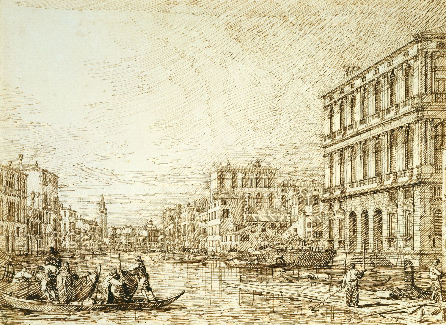
5-38 Canaletto, The Grand Canal Looking toward the Carità, ca. 1735. Pencil, pen and ink, 27 x 37.4 cm. Royal Library, Windsor.
Canaletto sold almost all his paintings and finished drawings to British gentlemen, who sometimes requested a series of views. The Grand Canal Looking Toward the Carità (figure 5-38) was one of 143 drawings in the collection of his best patron, Joseph Smith, the British consul in Venice. Indeed, Smith owned almost a third of Canaletto’s extant drawings. (The drawings and paintings in his collection were sold to George III in 1763.) The scene in this finished drawing was developed from four sketches in the sketchbook, and the view was repeated in a painting now at Woburn Abbey. Nevertheless, his finished drawings were usually not preparatory models for paintings, but independent works alongside them. He clearly enjoyed expressing himself in drawings.
What distinguishes this drawing from a sketchbook drawing is the attention to chiaroscuro achieved by means of carefully modulated hatching and by atmospheric perspective. He shaded the sides of buildings facing away from the light with very regularly spaced diagonal hatching. The size of the gaps between the diagonal lines controls the degree of darkness or light. Notice how he has widely spaced the hatching beneath the entablatures of the main building to indicate the soft shadows underneath them. (He may have used a metal pen to form such consistent lines.) The hatching in the sky and the different sort of hatching in the water suggest different light and therefore different texture. In addition, objects in the foreground are heavily inked while structures in the distance have faint thin lines to account for the atmosphere. The reproduction of natural light makes it seem that his drawings were sketched on the spot because, as a contemporary put it, “one sees the sun shining in them” (Marchesini 172).
In some finished drawings, Canaletto developed the chiaroscuro in the drawing with gray wash instead of hatching. The wash creates a more pictorial appearance, more like a painting, and consequently they probably sold well. The perceptive Smith, however, owned few of them. Although the wash is translucent, it tends to lie flat on the page. It does not reproduce the scintillation of natural daylight as well as Canaletto’s pen lines. Later in his career, for human figures and foliage, he developed a different and perhaps more fashionable style of pen line, replete with curlicues and flourishes.
Francesco Guardi (1712-1793) Shortly after Canaletto returned to Venice in 1755, having spent nearly ten years in England, he hired Franceso Guardi as a studio assistant. By then in his mid forties, Francesco had collaborated for decades with his older brother Antonio, painting mostly small religious images and altarpieces. (About forty of Francesco’s religious drawings survive.) By the time of brother Antonio’s death in 1760, Francesco had become a viewpainter in the manner of Canaletto.
Francesco Guardi’s paintings and drawings from around 1760 have often been confounded with those of Canaletto since they are so close in iconography and style. But by the early 1770s, when he drew A Regatta on the Grand Canal, Venice (figure 5-39), Guardi had developed a very different personal manner.
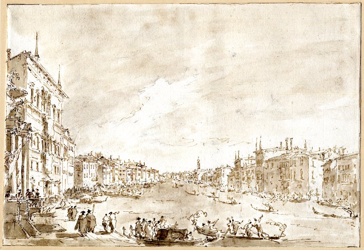
5-39 Francesco Guardi, A Regatta on the Grand Canal, Venice, ca. 1770-75. Pen and ink, wash over black chalk, 23.9 x 35 cm. British Museum, London.
The most obvious difference is the change in scale: the buildings and people are smaller and the sky is larger and more significant. In fact, most of the drawing is the washed-in sky, which broods over everything. For optical reasons, it grows lighter toward the horizon to create a contrasting background for the dark buildings. Unlike Canaletto, Guardi constantly applied brown wash and seldom used hatching for shading. The perspective is very deep and the right bank of the canal tends to spread out. Instead of the long, fine, straight lines of Canaletto, Guardi formed buildings with freely drawn short dashes that merely suggest the architecture.
Scholars have suspected that Guardi somehow knew Sebastiano Ricci’s style of impressionistic strokes of the pen. While this drawing records a specific or at least a recurrent event, eventually Guardi will disregard topographical accuracy in his views of Venice. Most human figures–reduced to minute squiggles–have their backs toward us he. They are merely vibrating reflections of the light that fragment the whole scene. Instead of Canaletto’s rational analysis of nature, Guardi turned the city into a fantasy, conjured up by his flashing slight of hand. An early nineteenth-century Venetian critic was the first to call his art “magic.”
The bulk of Guardi’s six hundred or so drawings still in existence came from the last dozen years of his life. Most of them were what was left in his studio at the time of his death, and most of those drawings were capricci—dreamed up combinations of real or imagined buildings, ruins, or landscape. Venetians seemed to appreciate the inventiveness, artifice, and wit of capricci in contrast to every-day views of their city. Canaletto painted and drew some imaginary architecture in the years that Guardi was an associate of his. Guardi, however, painted and drew capricci with abandon.
His studio was also filled with macchiette (literally, little stains), as Italian writers call them—cursory sketches of the people and boats of Venice. Like Watteau, Guardi must have carried a sketchbook around Venice, taking visual notes of what he saw. Both artists incorporated the sketches in later paintings.
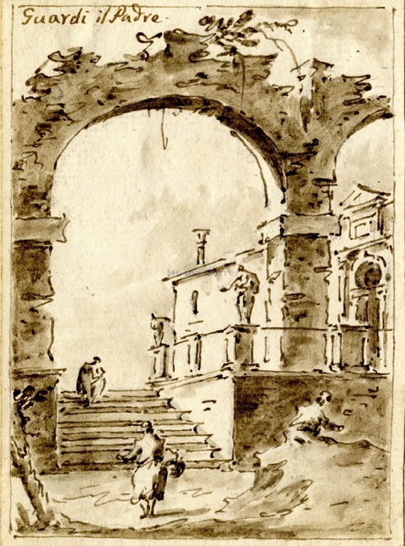
Francesco Guardi, Capriccio with Ruined Arch and Villa, after 1770. Pen and ink and wash, 14.7 x 10.7 cm. Museo Correr, Venice.
Capriccio with Ruined Arch and Villa (figure 5-40) illustrates quite well the freedom of his late manner. He often framed a vista with an archway that acts as a proscenium opening unto a scene behind it. Two or three figures move about. Typical of his macchiette, they are formed with just a few strokes of the pen. Guardi literally dashed on the sheet a minimum of lines, then liberally applied wash with a stunning sensitivity to light, especially the contrast between the dark of the arch and the bright light of the villa.
The relatively large and finished drawing A Regatta on the Grand Canal is similar to a painting in Lisbon, and the small and rough Ruined Arch and Villa is similar to other paintings. Exactly how the drawings functioned as studies for the paintings is unknown. Guardi must have also sold some of his finished views of Venice to foreign collectors, but at much cheaper prices than those commanded by Canaletto.
SPAIN
Relatively few drawings by the major artists of Spain have survived. A single drawing has a shaky attribution to Francisco Zurbarán. A mere half dozen drawings have been attributed to Diego Velázquez. Five drawings have been generally accepted as belonging to El Greco–although in 2007 Nicolas Turner attributed twenty-two more to him. Jusepe de Ribera, Alonso Cano, and Bartolomé Esteban Murillo have a significant body of graphic work to their name—about one hundred each. The big exception to the scarcity of Spanish drawing is Francesco Goya. He left behind many hundreds.
Spanish drawing of the fifteenth century is almost non-existent. The few examples that remain are mostly architectural designs by artists born in the Netherlands. However, there does exist a series of roughly sketched heads in charcoal and chalk on the backs of seven wood panels of an altarpiece of 1437 by Bernardo Martorell, now in the Diocesan Museum, Gerona. The drawings confirm that, when paper was still scarce, workshops throughout Europe made sketches from life on panels, which they normally scraped clean for reuse, except in this case.
In the sixteen century century, small groups of drawings have been attached to a handful of artists, all of whom spent considerable time in Italy before they made their reputation in Spain. In addition to El Greco, the artists are Fernando Yáñez de la Almedina (d. ca. 1530), Pedro Machuca (d. 1550), Alonso Berrugete (d. 1561), and Gaspar Becerra (d. 1570). Presumably, they brought an Italian tradition of drawing with them when they returned to Spain.
In 1994 nine silverpoint drawings in the Louvre, attributed to Bernardo Luini, were reassigned to Yañez de la Almedina. (Boubli, École Espagnole, cat. 23-31) Most of them—single or double figure studies squared for transfer—are related to paintings he did in Cuenca in the early 1530s. Yañez is generally believed to be the “Ferrando Spagnuolo” who Vasari said assisted Leonardo da Vinci on his Battle of Anghiari in Florence. The most remarkable thing about the drawings is not that they resemble the work of a follower of Leonardo like Luini but that an artist in Europe still made studies in silverpoint by 1530. Yañez seems to have considered them as exempla to be inserted now and again into his works, similar to illustrations in a model book.
Pedro Machuca has been identified as the “Pietro spagnolo” who assisted members of Raphael’s workshop on several projects in Rome. He may also have encountered the expressive Mannerism of Rosso in Florence before he returned to Spain in 1520. His several drawings are all many-figured, finished compositional designs in pen and wash, heightened with white, for subjects like the Decent from the Cross or the Entombment. In short, they are modelli.
Alonso Berrugete (1488-1561) Vasari wrote that in 1508 “Alfonso Berrugete spagnuolo” copied the cartoons of Michelangleo’s Battle of Cascina in Florence. It was the start of a career-long attachment to the art of Michelangelo. Berruguete also probably collaborated with Rosso and Pontormo in Florence in the actual formation of Mannerism.
5-41 Alonso Berruguete, A Seated Man, ca. 1540? Pen and black ink on beige paper, 26.5 x 15 cm. Musée du Louvre, Paris.
In 1996, the Louvre Museum acquired a pen and ink drawing of A Seated Man (figure 5-41) and added it to the nucleus of about four extent drawings that are certain attributions to Berruguete. Like Michelangelo’s ignudi or slaves, the entire brooding figure twists one way then another: the left foot moves behind the right, the right arm points to the left, and the head sinks to the right. Berrugete also modeled the figure, and considerably darkened it, with a heavy amount of cross hatching that resembles the chiseled hatching lines of Michelangelo’s early years. (See figure 3-12.) Seated Man has the tapering elegance distinctive of Berrugete: each arm ends in a pointing index finger. Also typical of Berruguete, the man conveys more outward emotion than the introverted creatures of Michelangelo.
Gaspar Becerra (1520-1570) When Gaspar Becerra returned to Spain in 1557, he left behind in Italy a respectable body of work. He had assisted Vasari and Daniele da Volterra on frescoes in Rome. Ceán Bermúdez in his Diccionario (1800) wrote that Beccerra built his compositions around multiple stages of drawing. However, what remains today are basically a dozen or so fragments of the cartoons he used, especially for the mythological scenes on the ceiling of the Pardo palace. The cartoon pieces hint that he drew grand, weighty figures similar to those of Michelanglo in his later years—but without the anxiety. (Becerra copied the Sistine Chapel Last Judgment before its nudes were clothed.) Like Michelangelo in those years, he used black chalk almost exclusively for his figure studies and cartoons.
The library at El Escorial has very few drawings by Pellegrino Tibaldi, Luca Cambiaso, Federico Zuccaro or any of the other late sixteenth-century Italian artists who worked at the palace-monastery. The only exception is two portfolios, by various artists, of about 100 ink and sepia wash drawings that supplied patterns for embroidery work. The Italian artists at El Escorial did bring to Spain a predilection for elaborated compositional drawings in pen and ink and wash. And they trained the leading artists of Madrid in the early seventeenth century, namely Vincente Carducho (1576-1638) and Eugenio Cajés (1575-1634). Dozens of drawings by these two artists still exist.
In sum, major Spanish artists of the sixteen century drew figure studies, modelli, and cartoons. They came back to Spain steeped in the artistic practice of Rome and Florence and, in El Greco’s case, Venice. However, from what remains of their drawings it is unknowable whether any one of them brought to Spain Raphael’s practice of inventing a composition in a primo pensiero and developing it with many studies of individual figures and groups. The small number of isolated drawings by some of the major sixteenth-century artists of Spain do not allow us to make conclusions about how drawing functioned in their creative process and about how they developed a personal style.
The small amount of Spanish drawing has led some writers to claim that Spanish artists did not draw all that much—at least not as much as their Italian contemporaries. Written evidence about drawing does not clarify the picture obscured by the present scarcity. An inventory of El Greco’s studio at his death in 1614 listed a mere 150 drawings. Francisco Pacheco (d. 1654), who ran an academy that Velázquez attended in Seville, boasted in 1638 that he had made as many as 170 drawings. Neither number approaches the hundreds of drawings that the majority of Italian artists of the period passed down. It seems that little effort was made in Spain to preserve an artist’s drawings or to form collections until the seventeenth and eighteenth century. Unfortunately, most of those collections were destroyed or dispersed by fire and war.
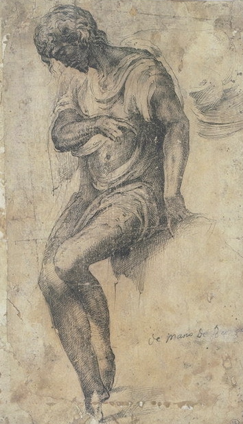
Jusepe de Ribera (1591-1652) Jusepe de Ribera left Spain at age fifteen, never to return. While living in Rome, between 1606 and 1616, he absorbed a version of Caravaggio’s realism as well as an un-Caravaggesque love of drawing. He later confessed that in Rome he had studied the work of Raphael in drawing. After Rome, he spent the rest of his career in Spanish-controlled Naples.
Over 160 drawings now make up Ribera’s surviving corpus. About thirty of them are finished red chalk drawings. Almost all the others are in pen and ink, half of those with wash. The bulk his drawings date from the 1620s and 1630s.
Saint Sebastian in the Indiana University Art Museum is an excellent example of the skill that he possessed with red chalk in the 1620s. A young man tied to a tree was a favorite subject–there are nine other drawings like it. The latest catalogue calls the Indiana drawing “probably the most beautiful.” None of the ten nor any of his other chalk drawings were models for an existing painting.
Posed in a svelte curve, Sebastian hangs from ropes tied around his wrists. His arms and torso are stretched beyond the possible. Nevertheless he sits on the ground his thighs expertly foreshortened forward. His head is thrown back in dramatic foreshortening too. The contours of his torso are refined and exact and not at all sketchy. The lines are stronger and darker in the shadows and thinner and more luminous in the light. Closely spaced hatching models the nude, and only a few precise whiffs of chalk describe the anatomy of the torso.
Most of Ribera’s ink drawings from the same period, the 1620s, look quite different. Consider, for example, Saint Appolonia in the Fine Arts Museums of San Francisco. The drawing may have been his sketchy first thought about the subject. The tall saint strikes a statuesque pose in classical contrapposto–right foot pointed to the left, head turned sharply to the right. Otherwise the drawing is an energetic drapery study. The clothing clasps the thin figure in large angular folds and in smaller zigzag folds as on her sleeve. The parallel lines of Ribera’s hatching vigorously loop back and forth in one continuous line. The saint’s elongated fingers also betray Ribera’s hand.
In the 1630s Ribera radically changed his style. The Virgin and Child in the Metropolitan Museum is probably from the early 1640s. In ink drawings of this period, thick pen lines become remarkably thin. Trembling, disjointed contour lines skip across the edges of forms. Sometimes a stroke of pale wash substitutes for the evanescent line. Notice the back of the Virgin. The staccato lines and light touch create an effect of bright, gossamer delicacy. The style is unique.
Alonso Cano (1601-1667) In the eyes of early writers about Spanish art, the outstanding draftsman of the seventeenth century was Alonso Cano. Antonio Palomino wrote that Cano had produced “innumerable” drawings and that he now had many of them (El Museo Pictórico, 1715-24). The most recent exhibition of his draftsmanship (in 2001) displayed 104 survivors. In addition to painting, Cano also practiced sculpture and architecture—consequently, a number of his drawings are carefully wrought designs for the architecture of retables. Almost all the rest of his graphic work falls into two categories: modelli in pen, ink, and wash and rapidly drawn rough sketches in pen.

5-42 Alonso Cano, Annunciation, 1645. Pen and wash, 26 x 17.6 cm. Museo del Prado, Madrid.
In 1645, Cano presented his drawing of The Annunciation (figure 5-42) to the parish church of Getafe for their approval. The finished painting still resides in the small town church outside Madrid.
As in most of the other modelli, which Cano was no doubt contractually obliged to produce, he set down his ink lines over a preliminary drawing in graphite or black chalk. His lines are refined and consistent. They are of course sketched freehand, yet they betray a hand that was accustomed to precisely measured architectural drawings. He next applied areas of carefully gradated wash—not to model individual forms but to establish blocks of light and dark in the Baroque manner. He learned to make finished drawings in pen and wash during his apprenticeship in Seville (1614 to 1619?) with Francisco Pacheco. They both were indebted to the Italian tradition of pen drawing at El Escorial. Cano’s style of drawing does not change very much for the next twenty-two years, and he continued to create harmonious and serene compositions, little affected by the naturalism of his friend Velázquez and other artists of the period.

5-43 Alonso Cano, Seated Nude Youth, 1645-1649. Pen, 21.9 x 13.7 cm. Uffizi, Florence.
Seated Nude Youth(figure 5-43), which Cano penned in a much more vigorous and spontaneous style, is a good example of his other category of drawing. (Only a few chalk drawings exist.) The pen lines in Nude Youth are course and sometimes broad, sometimes thin—indications that he employed a reed pen. His rapid sketches such as this seldom used wash and instead employed a telltale form of hatching. (Perhaps inspired by the emphatic hatching in ink of his older Sevillian contemporary, Francisco Herrera the Elder.) Rather than lift the pen from the sheet for each diagonal hatching line, Cano shades forms with an energetic continuous zigzag.
Despite the aura of spontaneity and immediacy in the drawing, there is little evidence of pentimenti—in short, there is no evidence that he was working out the pose and proportions as he was drawing.
Missing from what we have of Cano’s output are the many figure studies and other preparatory drawings that Italian artists of the period commonly produced. It was well known in Cano’s day that he, like so many of his Spanish contemporaries, derived his compositions mostly from prints by other artists. (He owned, it seems, a large collection of prints.) He usually reworked the design to make it his own, but he did not need a series of drawings for its invention. In all probability, Nude Youth was not drawn from a living model but was rapidly copied from a print or painting to which he had brief access.
Cano was one of the few Spanish artist to make drawings of the nude, even the female nude. They are all copies of works of art in the royal collection in Madrid, where he was court artist from 1638 to 1652. Furthermore, Palomino tells the story that Cano used to make spontaneous sketches that he then gave to street beggars to sell for a few coins, but no such drawings of everyday life exist. Of course he may have sketched, in Palomino’s words, “some figure or head or . . . architectural decoration” for the beggar, not from his surroundings, but from his imagination.
Bartolomé Esteban Murillo (1618-1682) The remaining ninety or so drawings by Bartolomé Esteban Murillo display a variety of types. Enough remains to demonstrate that he set down his inventions for compositions in a few rapidly sketched chalk lines. He then made figure studies and drapery studies of individuals or groups to secure the design. However, unlike Cano, Murillo normally presented his patrons oil sketches as modelli. It is easy to conclude that, like Italian Renaissance masters, he created his paintings through his drawings. Although he never studied in Italy, Murillo is one of the few Spanish artists about whom we can say with assurance that drawing was central to his art.

5-44 Bartolomé Esteban Murillo, Virgin and Child, ca. 1670-72. Pen and wash over black chalk with touches of red chalk, 21.4 x 15.4 cm. Cleveland museum of Art.
Murillo sometimes employed chalk, but he drew mostly in pen, or pen and wash. A superb example of his pen and wash style, Virgin and Child (figure 5-44), was drawn in preparation for his well-know Santiago Madonna (Metropolitan Museum, New York). In the drapery over the Virgin’s lap, the zigzag hatching lines, connected by loops on the right, reveal that he knew very well the energetic pen style of Cano (figure 5-43). In earlier drawings by Murillo, the contours resemble even more closely the broken, jagged lines that Cano drew. In Virgin and Child, a late drawing, one can scarcely speak of contours—the right arm of the Madonna, for example, is formed by a series of short curves. The shaggy, broken lines throughout the drawing seem to dissolve the image—an effect analogous to the vaporousness of his late paintings. And yet the scale of the limbs and the light and dark contrasts give her the grandeur and weight of Greek sculpture. A variety of wash tones not only contributes to the impression of bulk, but it also adds to the atmosphere of mystical drama.

5-45 Bartolomé Esteban Murillo, Saint Francis of Paula, 1665-70. Red and black chalk, 33.3 x 23.3 cm. British Museum London.
Murillo almost always started a pen drawing with a rough outline in chalk—as he did in Virgin and Child. Occasionally he recorded his first thoughts in chalk. More often he used chalk to make chiaroscuro studies—as he did in Saint Francis of Paula (figure 5-45), a study for the light and dark contrasts of the central figure in a painting now in an English private collection. Instead of the loose and energetic lines of his pen drawings, Murillo carefully applied chalk in numerous fine short lines that softly modulate the light across drapery folds and in the atmosphere. Lines as such barely exist anywhere in this and other similar tonal drawings. Some contours nearly disappear against the light—the left side of the stick, for example. In his chalk studies, he often used red chalk for the face and hands or other visible body parts. Perhaps he had seen multicolored chalk drawings that Rubens might have left in Spain in 1628-29.
In 1660, Murillo, Francisco de Herrera the Younger, Juan de Valdés Leal, and other painters founded a drawing academy in Seville. (It folded in 1674.) The bylaws of the academy decreed that nightly meetings would be held for “the exercise of drawing.” A monthly fee would pay for heat, lighting, and a model. (An académie in red chalk appears in Murillo’s painted Self-portrait, National Gallery, London, yet no académie by him on paper actually survives.) Although Murillo was co-president and co-instructor of the life drawing class at the academy for only its first year, the imprint of his drawing was felt in Seville to the end of the century and beyond. In the words of Jonathan Brown, in Seville “a ‘communal’ drawing style” of vibrant pen work—from Herrera the Elder, through Cano, to Murillo—ran through the seventeenth century (Murillo & His Drawings, 22).
In the eighteenth century, artists from France and Italy, working at the court in Madrid, brought with them a different tradition of drawing, one based on the practices of Annibale Carracci and his Bolognese and Roman followers. The French painter Michel-Ange Houasse arrived in 1715; Jean Ranc in 1722; and Louis Michel Van Loo in 1737. They had been trained at the French Royal Academy in Paris where they absorbed the lessons of Le Brun about drawing. (Only the graphic work of Houasse in Spain has survived in any quantity.) In 1752, Van Loo helped found the Spanish royal academy (Real Academia de Bellas Artes de San Fernando). Like the French academy, the Spanish academy was concerned with the teaching of art through drawing. Young men from all over Spain learned in Madrid to prefer chalk on colored paper in contrast to the pen and wash on creamy white papers employed by most Spanish artists until then. Academy students also learned to prepare paintings with an extensive campaign of drawings. Although Giambattista Tiepolo spent the last years of his life in Spain (1762-1770), his drawing had no impact on Spanish art. However, the early Neoclassical painter Anton Mengs made a strong impression in Spain—nothing less than a transformation of taste. (He was in Spain 1762-69 and 1774-76.)
Francisco Goya (1746‑1828) When Francisco Goya toured Italy in 1771, he purchased a sketchbook, as had many other young artists visiting Italy. Goya used the opening pages of his sketchbook (Cuaderno italiano (Italian Notebook) Prado Museum) for a dozen black chalk drawings of a draped model, followed by a series of six red chalk, relatively finished compositions of scenes from Genesis. Elsewhere in the book, he made line drawings of the Farnese Hercules and the Belvedere Torso, each in several different views. In contrast to the hundreds of classical antiquities that David reproduced less than a decade later, Goya noted only a few classical remains in his sketchbook. Other pages contain a few rough preliminary ideas for a painting about Hannibal, a list of the cities he visited, other written notes, and not much else. When he returned to Spain, a great many of the 172 pages in his Italian Notebook were blank. It appears that, in his early years, Goya was not a compulsive draftsman.
Indeed, there exist only two dozen conventional-looking red or black chalk figure studies related to his tapestry cartoons and to a few religious works from the first half of his long career, the period from about 1770 to 1795. Goya seems to have had little interest in making an array of drawings in preparation for his paintings. He no doubt felt that the academic manner of drawing hindered his creative imagination. More and more, he painted directly on canvas with his brush. Even when he painted frescoes in the church of San Antonio de la Florida, Madrid, in 1798, he brushed the paint on the wall with extraordinary freedom after preparing the design with only a few oil sketches.

5-46 Francisco Goya, The Duchess of Alba “tears her hair” (Valentín Carderera, 1867), Sanlúcar Album (A), 1796. India ink, 17.1 x 10.1. Biblioteca Nacional, Madrid.
Two years earlier, he began to draw on paper in a new and revolutionary way. In 1796, at the age fifty, while spending part of the summer at the estate of the Duchess of Alba at Sanlúcar de Barrameda in southern Spain, he filled a small sketchbook (Sanlúcar Album or Album A) with at least sixteen spontaneous brush drawings in India ink. They are candid views and fleeting glimpses of the vivacious duchess (figure 5-46), her servants, and other women, lightly clad or nude, seen in the relaxed atmosphere of the country.
As in several other drawings in the sketchbook, the Duchess of Alba stands on a simple flat ground line, implying a low point of view. The lack of background and context intensifies the figure. Goya started drawing the duchess with a thin contour line—pentimenti are visible next to her left arm pulling at her long black hair—then dabbed on a variety of tones for the flowers and bows of her dress in the same manner that Velázquez had painted similar ornaments in Las Meninas. (Goya had made prints from Velázquez’s paintings in 1778.) It might be said that Goya’s à la prima painting method engendered his new method of drawing. In other words, Goya painted in ink.
Vittore Carpaccio (figure 3-30) and Albrecht Dürer (figure 3-59) had made relatively refined and disciplined drawings with a brush. Rembrandt (figure 4-51) and Giambattista Tiepolo (figure 5-34) wielded a brush and applied wash with gusto and emotion in many of their drawings, but usually after mapping out a design in pen. Lines drawn with a brush rather than a quill tend to be thicker, perhaps more intense and forceful. A brush readily enabled Goya to invest each line with personality, rather than merely to register an abstract mark indicating the edge of a form. He must have liked being able to use a brush to draw in much the same manner that he used one to paint, and he surely realized that his brush and ink drawings were new and different. Goya never used wash or India ink before Sanlúcar. India ink had been available to artists for centuries, but Goya was one of the few to use it extensively.
Goya continued to depict fashionable woman in a second, larger sketchbook—Album B, the Madrid Album—begun as soon as he returned to Madrid in early 1797, or perhaps even before then in Cadiz. In either case, the female intrigues he saw in Andalusia still inspired the first half of the album. More than half of its ninety-three India ink drawings (recto and verso) now depict women and men flirting, with indications now of an indoor or outdoor setting. Goya numbered the pages of the album as though he planned a series of related subjects from the beginning.

5-47 Francisco Goya, Caricatura alegre (Merry Caricature), Madrid Album (B), 1796-1797. India ink, 23.2 x 14.2 cm. Prado Museum, Madrid.
Midway through the Madrid Album, Goya began to add captions—cryptic words and phrases that are sometimes merely descriptive and sometimes ironic. At the same point in the album, the iconography changed to scenes of witchcraft, grotesque masquerades, and anticlerical ridicule (figure 5-47), and the style of drawing grew coarse and unrefined in response to the changed subject matter. The satires in his famous print series Caprichos of 1799 grew directly out of many of the drawings in the Madrid Album.
The dating and thus the sequence of the next four albums are uncertain. Recently, scholars have assigned two of them (C and F) to the years of the War of Independence against the French (1808-1814) and two of them (D and E) to the period after the war. The war seems to have forced Goya to use cheaper materials: brown iron gall ink (ordinary writing ink) instead of India ink and coarse Spanish paper instead of the silky paper from the Netherlands he preferred. Unfortunately, this revised dating creates an unexplained gap of nearly a dozen years between the second and third album, when Goya did no drawing.

5-48 Francisco Goya, P.r liberal? (For being a liberal?), Album C, 1808-1814? iron gall ink, 20.5 x 14.2 cm. Prado Museum. Madrid,
Presumably during the War of Independence, Goya began his largest album, Album C, with over 125 separate sheets that were never bound as a sketchbook. He filled the album with the dangerous subjects that had gotten his Caprichos in trouble: ghosts from a nightmare, the Inquisition, the torture of prisoners—for example, P.r liberal? (For being a liberal?) (figure 5-48)—the corrupt monastic orders, but also a small group of drawings celebrating liberty, truth, and justice. The prisoner in figure 5-48 is chained to a crossbeam by an iron collar around her neck. Her feet are clamped together between two long boards. Fright and despair mark her face. Goya may have only heard about such suffering, yet his imagination made it all too real.
About halfway through the album, Goya switched from India ink to iron gall ink. The switch enabled Goya to create stronger contrasts of light and dark—perhaps an expression of the somber iconography. In P.r Liberal? the tone of the wash builds toward the nearly opaque area in the upper part of her skirt. Along with the assertion of new contrasts, Goya handled the brush with even bolder, broader, and cruder strokes than those in the second half of Album B.
Also during the war, Goya began drawing in a sketchbook with iron gall ink (Album F, once erroneously called the Sepia Album). Only three of the one hundred plus drawings had captions. The drawings are homogeneous not only in their medium but also in style and iconography. Subjects include clusters of drawings about dueling, the park outside Madrid (Casa de Campo), riding a mule, hunting, and in the words of Pierre Gassier, “beggars, monks, peasants, prisoners, workmen, murderers, dancers, grotesque old men, acrobats, soldiers, savages, young women and children—a whole world of vivid and colorful figures” (Francisco Goya: Drawings: the Complete Albums, 387).

5-49 Francisco Goya, Regozijo (Mirth), Unfinished Album (D), 1819-1823? India ink, 23.7 x 14.7 cm. Hispanic Society of America, New York.
Album D, sometimes called the Unfinished Album because it had only about twenty-two pages, displayed a new mastery and flexibility of brush drawing. A comparison of a drawing from Album B (figures 5-47) and a drawing from Album D (figure 5-49) reveals the differences. In the former, Goya outlined the three white-robed monks in the foreground—including the monk with the penis-shaped nose supported by a crutch—with unbending, almost straight-line contours. A solid block of wash, pierced by a small “window,” indicates a dark monastery interior. Faces are distorted masks.
In the later drawing, Regozijo (Mirth) (figure 5-48), Goya returned to the India ink and the refined Netherlandish paper he had used before the war. Two witches cavort in empty space, kicking and pounding the air with their legs and fists to the beat of castanets. The faces of the old women appear more natural than the monks’. Instead of their stark profile and frontal poses, Goya caught the limbs of the witches in pronounced foreshortening with flexible lines in an underdrawing. Then with a broader brush loaded with ink, he drew darker, more painterly lines along the undersides of their skirts and shawls. On the left, he let the faint underdrawing serve as the contour facing the light. Finally, he applied a variety of subtle washes. They may be witches, but Goya’s airborne old women joyfully dance in a dreamlike release from earth and old age.

5-50 Francisco Goya, Despues lo beras (You’ll see later), Black Border Album (E), 1816-1820? India Ink, 26.6 x 18.7 cm. The Metropolitan Museum of Art, New York.
Using larger, unbound sheets of paper, Goya assembled another series of drawings (Album E), distinguished by a crisp black boarder that surrounds them. By this time his career as a court painter had vanished; friends had been arrested or exiled. He probably intended to make some money by selling the drawings from this so-called Black Border Album. To be safe, he shunned witches and satires and concentrated on common, unrefined people—individuals mostly, but sometimes couples, as in Despues lo beras (You’ll see later) (figure 5-50).
The caption, addressed to the man or the woman in the drawing, or to the viewer, is as enigmatic as the subject. The drawing probably represents a workman leaning back to guzzle another drink from a wineskin. Shirt and pants open, he has flung his coat and hat on the ground. His wife grabs his arm to stop him from drinking more than he already has.
In Album E, Goya perfected his style of drawing in ink and brush. He seems to have first sketched these figures with a light diluted ink, visible on the left of the woman’s skirt and on her bonnet. Next, he added areas of darker wash, for example to the man’s pants and the woman’s apron. Finally, with undiluted ink he placed dark accents over the two figures, dragging the relatively dry brush across the texture of the paper, in other words, scumbling the opaque ink to achieve transparent darks.
In effect, he drew Despues lo beras in much the same way that a painter painted a canvas—with brushstrokes, glazes, and impasto. In some album drawings he also scraped the inked paper with a razor or a knife to add highlights or to delete an area. Many of the drawings in the Black Border Album have only a small cast shadow under the figure. Others, like figure 5-49, have a light wash to indicate a landscape setting. In most drawings in the album, Goya placed the figures low on the sheet and left the top half mysteriously, oppressively blank.

5-51 Francisco Goya, Man brandishing a knife, Bordeaux Album (H), 1824-28.
Black chalk and litho crayon, 19.1 x 15 cm.
Boymans-van Beuningen Museum, Rotterdam.
One of the reasons Goya moved to Bordeaux, France, in 1824 at 78 years of age, was to learn more about the new process of lithography. During the four years he spent there, Goya made two final drawing albums (G and H) in black chalk and a bold new medium, greasy lithographers crayon. None of the album drawings were ever transferred to stone and printed. It is debatable whether he ever intended to reproduce them. He filled the albums with the same enormous cast of disparate characters as in his previous drawings. The new country and the new drawing tool gave his manner of drawing an increased vigor—as evident in figure 5-51 illustrating an enraged man brandishing a knife, who seems to be sinking in the earth up to his knees. Like most of Goya’s men and women in the albums, he lives in the borderland between a dream and reality.
This man and other figures in the albums obey a new set of short, stocky proportions with outsized limbs and head. Goya began the drawing with a sketch in black chalk, then strengthened essential lines with the darker litho crayon. Finally, he added jagged patches and serrated contours with thick, forceful zigzags of crayon—especially evident in the man’s sleeves, where his howls literally reverberate in the lines of the drawing.
Goya’s eight albums contained over five hundred drawings, all of them in a vertical format. He carefully preserved the albums for years, but because of their content only a few like-minded friends saw them. Most of the rest of his drawings from the same period (about 300 in number) are preparatory studies for prints, usually in red chalk or sometimes pen. They were made to be transferred to a printing plate, a process that in many cases has dimmed the drawings. It is a wonder that he made transferable compositional designs at all. Most artist-printmakers (Rembrandt, Tiepolo) of the seventeenth and eighteenth centuries did not, and Goya did not lack the skill to extemporize on canvas, plaster wall, or copper plate.
Goya originally intended his Caprichos (1799) to begin with a series of images he called Sueños (Dreams). He prepared for them with twenty-six finished drawings inscribed with dense parallel hatching precisely rendered in pen and brown ink. It seems as though he were trying to draw with a pen the thin lines that an etching needle would cut in the acid-resist of a plate. Was he planning to have a professional printmaker cut the plates according to his explicit instructions? When the paper was moistened and run through a press to transfer the design to the plate, the ink smeared. (The impression made by the edges of the plate are still visible on drawings that have not been cut down.)

5-52 Francisco Goya, Capricho 42: Tu que no puedes (You who cannot),
1797-1798. Red chalk wash and red chalk, 24.2 x 16.6 cm. Prado Museum, Madrid.
He soon realized that red chalk, which is water soluble but will not run, is a better medium for transferring drawings. He also must have realized that, to prepare for the dramatic chiaroscuro he was achieving with aquatint, he could rub the chalk over the textured paper more broadly. For several of the preparatory drawings (figure 5-52) of the Caprichos, he employed red chalk as a wash to approximate the look of aquatint more closely.
Goya abandoned red chalk wash for almost all the chalk drawings he made to be transferred to the plates of the Disasters of War (1810-20) and the Tauromaquia (1816). Then, for the Disparates (figure 5-53), he returned to red chalk wash almost exclusively. Instead of using it to simulate aquatint in background areas, he brushed on the figures with a fury that equals the madness of the contemporary Black Paintings (1819-23). On large, horizontally formatted sheets, he “painted” many figures with a tangle of broad thick lines, and he varied the tone of the wash for dramatic intensity. No one had ever used red chalk with such freedom. (In the print, Goya eliminated the macabre figures in the background, and the cave-like setting became unmitigated black night.)

5-53 Francisco Goya, Disparate 1: Disparate Feminino (Feminine Folly), ca. 1815-1824. Red chalk wash, traces of red chalk, 23.3 x 33.3 cm. Prado Museum, Madrid.
In 1794, two years before he began the Sanlúcar Album, Goya sent to the Royal Academy in Madrid fourteen small “cabinet paintings” depicting popular outdoor pastimes, including scenes of bullfighting and A Yard with Lunatics (Meadows Museum, Dallas). He wrote to the Vice-Protector of the Academy that in them he had made “observations” which gave “scope for fantasy (el capricho) and invention.” All his album drawings are to a great extent caprices, inventions beyond the scope of the ordinary. In the late eighteenth century, caprices were popular with many artists, among them Guardi and Tiepolo. The caprice gave them the freedom to make imaginary and provocative juxtapositions of people, places, and things. The caprice, however, gave Goya the freedom to illustrate his own thoughts, feelings, and dreams as a commentary on the human condition. Drawing more than other media allowed him the liberty and license.Proudly powered by WordPress