ITALY AND THE NETHERLANDS
Lost and Found Drawings In the early fifteenth century every workshop in Europe must have made drawings, but few of them were preserved. With some exceptions, artists did not yet consider them of value. As a consequence, accidents of preservation limit our knowledge of drawing in the fifteenth century, and the losses make it difficult to recount its history. One factor contributing to the problem is that drawings were often made on surfaces meant to be erased or covered over. For example, apprentices usually practiced metalpoint drawing on prepared wooden panels that could be rubbed clean and reused. The Tuscan artist Cennino Cennini in his The Craftsman’s Handbook (Il Libro dell’ Arte), chapters v-viii, written about 1400, describes how to make these panels and how to draw on them. The opening section of his book, about twenty pages in a modern translation, concerns the materials and practice of drawing in his day.
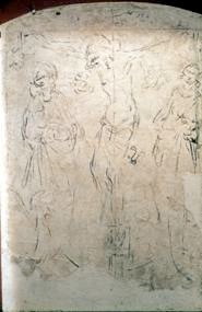
2-1 Parri Spinelli, Crucifixion 1440s. Sinopia on plaster, 121 x 90 cm. Palazzo Communale, Arezzo.
Some early drawings, once covered with paint, have reappeared only in modern times. Mural painters often made drawings on the preliminary coat of plaster (arriccio) which was then covered with a smooth layer of plaster (intonaco) for the final painting in fresco. Painters made these underdrawings in a red earth pigment called sinopia, perhaps over an initial charcoal sketch. Artists used other pigments, but in the twentieth century the term sinopia was applied to any underdrawing of this kind. In the 1950s and 1960s, as a conservation technique, the outer layer of plaster of a number of frescoes was detached from the wall, reveling the sinopie.
The lines that Parri Spinelli (1387-1453) drew in sinopia under his fresco Crucifixion (figure 2-1) have a remarkable freedom and energy. It is quite likely that Spinelli and medieval artists before him did not make small-scale preliminary studies of mural compositions but sketched the composition directly on the wall. As Spinelli’s brush swiped the wall with long, disjointed, and tapering lines, he assembled only the essentials of the design. Such freshness and spontaneity are unusual traits in this early period of the Renaissance, although the provincial Spinelli in fact employed an idiosyncratic and mannered style of pen drawing with abundant and delicate drapery folds. About 28 sheets of paper, most with pen and ink drawings on both sides, have survived—an exceptional number for the time. (See figure 2-15.)
In both the north and south of Europe, easel painters usually made underdrawings on panels before covering them with layers of paint. On occasion, the paint layers have thinned over the years to allow the underdrawing to be seen. In modern times, infra-red reflectography and other techniques have sometimes allowed cameras to record the underdrawing. Here too, it is unlikely that pre-Renaissance artists made small-scale compositional studies before drawing on the panel.
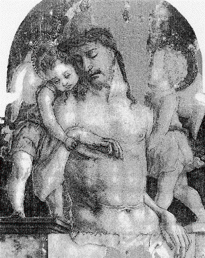
2-2 Carlo Crivelli, Dead Christ Supported by Angels, ca. 1470-75. Brush and ink underdrawing on poplar panel, 73 x 55 cm. National Gallery, London
The drawing underneath Carlo Crivelli’s The Dead Christ Supported by Two Angels (figure 2-2) was executed in brush and ink, the technique used in most panels that have been investigated. The infra-red camera revealed under the layers of opaque paint that Crivelli started to sketch the figures with imprecise short strokes of diluted ink. He switched to darker ink when he strengthened and simplified the contours.
Model Books Apart from these modern revelations of underdrawings in frescoes and panels, most artists’ workshops in both the north and south of Europe often preserved another kind of drawing. These were models or patterns of individual motifs (exempla in Latin) that were set down in books in order to maintain the traditions of the shop. Model books or, to use a more generic term, drawing books, occasionally contained samples of entire compositions as well.
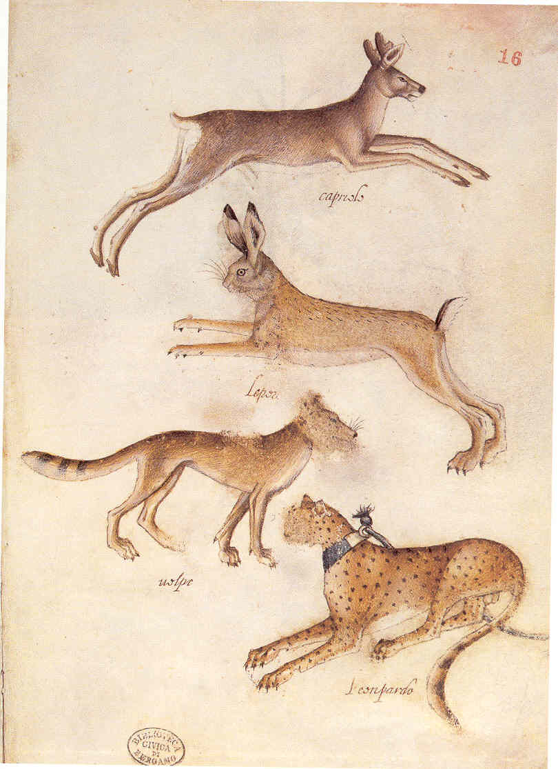
2-3 Giovannino de’Grassi, Roebuck, Hare, Wolf, Leopard, ca. 1389-98. Pen and washes, silverpoint with white heightening on parchment, 26 x 17.5 cm. Civica Biblioteca Angelo Mai, Bergamo.
The portfolio of drawings by the thirteenth-century French draftsman Villard de Honnecourt has sometimes been called a model book. In Italy, many more model books and parts of model books survive from late fourteenth and early fifteenth century workshops. A fine example of a model book from around 1400 (figure 2-3) bears the name of the Lombard artist Giovannino de’Grassi, although several hands may have worked on it. Bound collections like Giovannino’s typically contained drawings of animals and birds, costume studies, human heads, and sometimes decorative motifs.
They were usually more limited in their range of subject matter than Villard’s volume. The books preserved and perpetuated the traditions of an individual workshop to be passed on to the next generation. Since they were intended for prolonged and constant use, the drawings were usually made on high-quality parchment sheets that were bound as a book, sometimes before, sometimes after the drawing process. Apprentices studied from them by copying them, and a drawing in the book might be used at any time in a commissioned painting or relief. The drawings themselves—almost always in profile—were usually copies of other drawings. If an artist directly observed a subject, the drawing conformed to the restrictions and format of the typical model book exemplum.
Especially popular in Northern Italy, model books fostered in that region the idea of preserving drawings. Model books were eventually superceded by the sketch book—collections of drawings by an individual artist, not usually finished works, reflecting an artist’s personal style and experience.
In Giovannino’s model book, the silverpoint and pen drawing of four animals is carefully finished with colored washes—perhaps to impress clients who were shown these samples of the workshop’s skill. Typically, the animals are laid out harmoniously on the page, alternating left-facing, right facing. In this group, no setting is given. The animals were probably copied from older stock of traditional images, or at least their profile poses conform to those of traditional medieval images. The surface texture of these four appear more realistic than most—the artist may have posed dead game in the standard configuration, although the leopard, obviously a “pet,” wears a collar and leash.
Drawing at this time essentially meant the skill of reproducing such prototypes. In the opening pages of Il Lbro dell’ Arte (The Craftsman’s Handbook), dedicated to the materials of drawing, Cennino Cennini recommends that the young artist should devote a year to drawing. Occasionally, Cennini advises the apprentice what to draw. Although at one point Cennini encourages the student to copy from nature, which “outdoes all other models,” more often he urges the student to copy “the best things you can find done by the hand of great masters.” In short, Cennini thinks of drawing as an exercise in copying. He has the mindset of the model book maker.
Pisanello (ca. 1395‑1455/56) In early fifteenth-century Europe, two draftsmen stand out by reason of the quantity and quality of their work: Jacopo Bellini and Pisanello (Antonio Pisano). About 400 sheets by Pisanello and his workshop have survived. At least 100 of these are by Pisanello himself, although some connoisseurs recognize his hand in many more of them. No other artist of the period has bequeathed to us such a trove of drawings. Pisanello’s interests as a draftsman included animals, birds, people, costumes; and in several cases copies of antiquities.
The Pisanello corpus of drawings lets us see for the first time the figure of the master emerge, separate from the members of his workshop. It let us see the working methods of an artist’s shop as they were developing in the first half of the fifteenth century and lets us see drawing grow in importance in workshop practice. For Pisanello’s fame rests not only on the quantity and diversity of his drawings but also on his expansion of the practice of drawing in western art. In many respects, he invented the art of drawing. Francis Ames-Lewis has called him “the most imaginative and versatile of all early quattrocento draftsmen, whose drawings show an unparalleled range of both subject matter and treatment. Pisanello explored and extended the possibilities of drawing more than any other artist before Leonardo da Vinci.” [Drawing in Early Renaissance Italy, p. 70] It was Pisanello’s intense study of nature and his creative use of drawing that made him a forerunner of Leonardo, who in fact seems to have owned a large collection of Pisanello’s work (the Codex Vallardi, now in the Louvre).
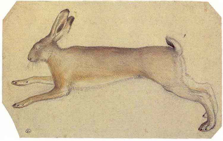
2-4 Pisanello, Hare, ca. 1430-32. Watercolor over black chalk, 13.7 x 22.3 cm. Louvre Museum, Paris.
The foundation of his art is that Pisanello’s drawing broke away from the medieval reliance on models and patterns and aimed at a direct contact with nature. Pisanello was lavishly praised in his lifetime for the kind of fidelity to nature seen in his drawing of a hare (figure 2-4), posed like an animal in a model book such as Giovannino de’Grassi’s. Indeed, Pisanello knew de’Grassi book and made his own copies from it. Pisanello assembled several of his own drawing books; in fact, the majority of Pisanello’s graphic work resembles the type of drawing found in model books. But to make the drawing of a hare, although he laid out a dead animal in the stereotyped configuration for running, he concentrated on the outward appearance of the animal, especially the texture of the pelt. His drawing is realistic in the same sense that a zoology illustration is realistic. Nevertheless, through the direct confrontation with nature, Pisanello altered the templates of the model book by changing the meaning of the model. The stereotyped model turned into a nature study. He obviously delighted in the world around him and was among the earliest Renaissance artist to discover the world. After this, everything became a subject for artistic exploration. A drawing such as this not only trained Pisanello’s hand and eye to observe nature precisely, it also opened up new paths for the artist.
Pisanello was the outstanding court artist of his day. In the 1420s he painted frescoes in the Ducal Palace in Venice, where he likely came in contact with Gentile da Fabriano. In the 1430s, for pope Eugenius IV, he completed Gentile’s series of frescoes in the nave of St. John Lateran in Rome. Pisanello worked for the Gonzaga court in Mantua, for the Visconti in Pavia and Milan, and the Este family in Ferrara, where he began making portrait medals in imitation of ancient Roman practice. Preliminary drawings exist for some of them.
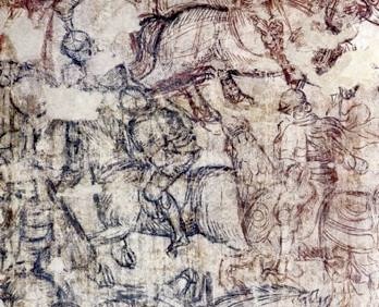
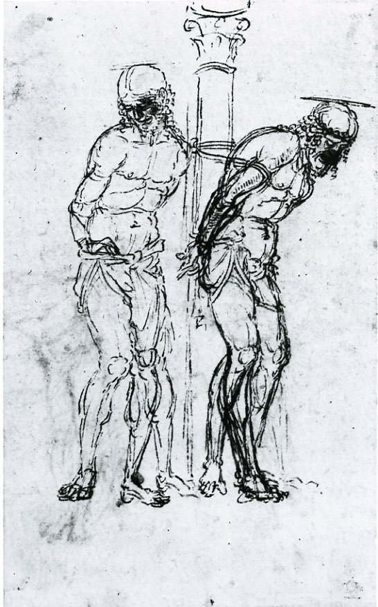
2-5 Pisanello, Scenes of War and Chivalry, sinopia detail, 1439-42, 1447? Sala del Pisanello, Palazzo Ducale, Mantua.
Only four panel paintings and three frescoes by Pisanello survive. One of the three, a fresco of a tournament, was discovered in the Ducal Palace at Mantua in the 1960s when eighteenth-century decorations were removed from the wall. As a conservation measure, Pisanello’s own frescoes were detached from the wall, exposing the preliminary layer of plaster on which he made sinopie. Over a large portion of the mural, he laid down a second layer of plaster over the first and redesign his composition a second time in new sinopie (figure 2-5).
The sinopie let us see another style of drawing by Pisanello, very different from his finished study of the hare. Using red and black pigment, he roughed out the composition with a vitality and freedom that resemble rugged sketches in pen and ink on paper. In vigorous gestures, thick, swinging, tapering lines model horses and men, build contours, and reveal essential shapes. The drawing has a vitality and freedom that resemble his roughest sketches in pen and ink. A contemporary of Parri Spinelli, Pisanello as well used drawing as a means of personal expression, in contrast to the medieval approach of merely copying and fixing an image on a surface. He did his creative thinking in drawing.
Surprisingly, most parts of the completed fresco do not conform to the elaborate composition designed in the sinopie underneath. With few exceptions, he relocated figures and continually adjusted poses. As Pisanello was using drawing to find his way to design solutions, his expectations for drawing brought the practice of making preparatory drawing in sinopie to the breaking point. To do this kind of creative research through drawing, he clearly needed a less intractable medium than brush on plaster. By the end of the century, artists will instead use sketches on paper and large-scale paper cartoons to paint murals.

2-6 Pisanello, Seated Pilgrim and Four Monkeys. Pen and ink, traces of black chalk, 25.5 x 18.8 cm. Musée du Louvre, Paris.
Pisanello indeed knew how to make spontaneous, rapid sketches on paper, such as his famous sketch of the Byzantine emperor John VIII Palaeologus, jotted down when the extraordinary guest visited Ferrara in 1438. It might be the first extant drawing documenting a historical event. On another occasion, he made four quick sketches in ink of a monkey (figure 2-6) in the empty space surrounding the figure of a hermit, perhaps St. Jerome, who quietly reads a book.
Dissatisfied with the drawing, Pisanello himself obliterated the head and front of the figure. The verso of the sheet contains five even more cursory sketches of a peacock. On a second sheet, Pisanello rapidly made nine more sketches of the monkey, indicating the belt around its waist and the leash that tethered it. With numerous short curved strokes of the pen, he drew the monkey again and again in the available space on the sheets, attempting to capture the animal’s slight variations in movement. Few other drawings of the period capture movement in this dynamic, almost cinematic way.
Another fresco by Pisanello covered the outer arch of the Pellegrini Chapel in the church of Sant’ Anastasia in Verona, his home town. The best preserved part of the Verona painting, St George and the Princess of Silena, illustrates the confrontation of the knight with the princess and her retinue. A number of drawings connected with the fresco allow us to piece together his working methods. He may or may not have begun the project with sketches of the general composition, although no such drawing for this work survives. In preparation for painting, he made a number of carefully rendered studies of horses, including Head of a Horse (figure 2-7) presumably drawn from life, although in a stilted pose like a model book illustration. These studies were collected by the workshop in a drawing book and sometimes used again.
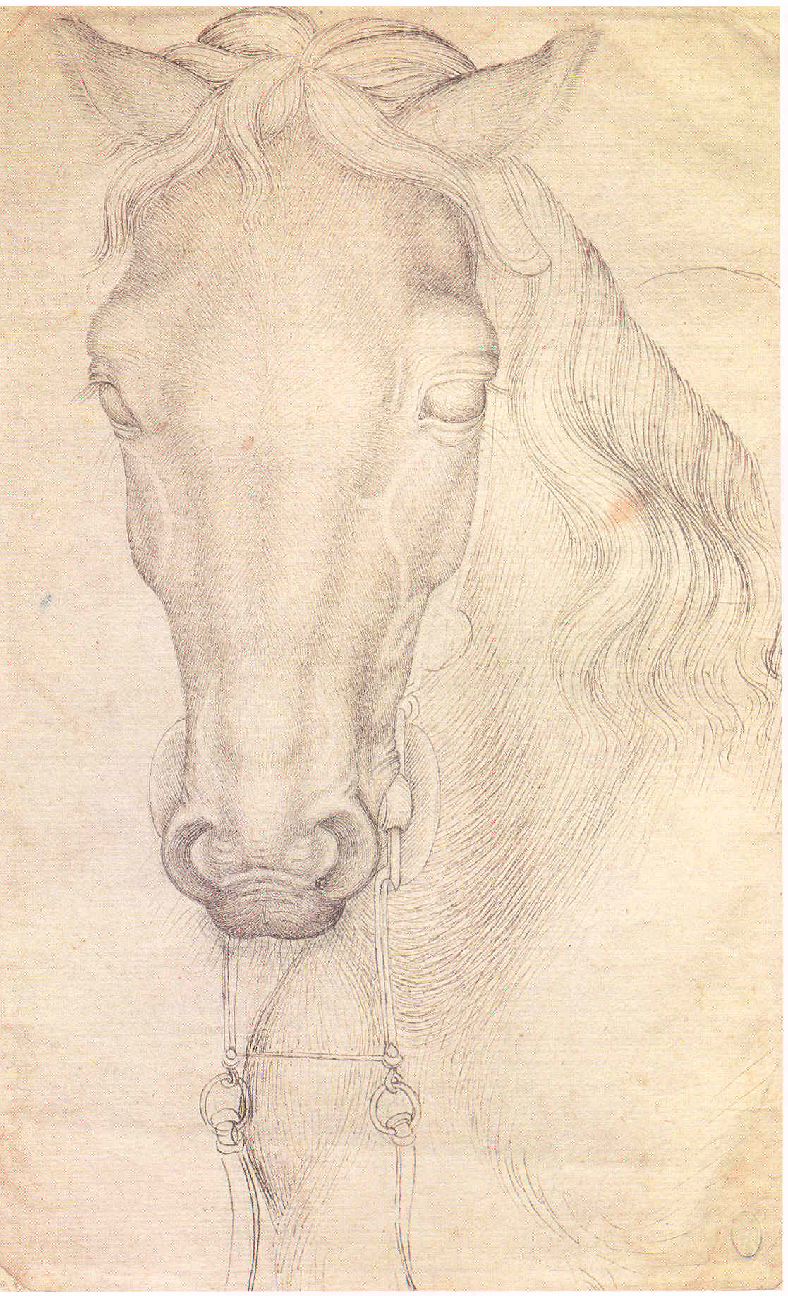
2-7 Pisanello, Head of a Horse, ca. 1434-38. Pen and ink over metal- or leadpoint, 26.8 x 16.8 cm. Louvre Museum, Paris.
Pisanello depicted the head of a horse with short pen lines that seem to reproduce individual horse hairs and the way they lie and curve around the head. The strokes convey a strong feel for the texture of the surface, and, at the same time, the increase and decrease in the number of the strokes lightly models the form, especially the veins and tendons. The drawing is accurate and precise and yet somewhat stiff and still relatively flat. It breaks from the profile format of the model book but retains its exemplary precision.
He also made sketchy life studies for this commission. For the profile head of the princess in the fresco, Pisanello first studied the head of a living model in a rapid metalpoint or black chalk sketch (figure 2-8) on one side of the sheet. On the other side, he perfected and refined the drawing in pen and ink over black chalk. The practice of making studies from life for a specific project will have an enormous consequences for the future of drawing.
2-8 Pisanello, Profile of a Young Woman, recto and verso. Pen and ink over black chalk,
ca. 1434-38. Musée du Louvre, Paris.
For some reason, Pisanello including a scene of a public hanging in the fresco. It seems that he had once made a gruesome drawing of three hanged men (figure 2-9), seen in pairs of studies.

2-9 Pisanello, Study of Three Hanged Men, Dwarf, and Child’s Head, ca. 1434-38. Pen and ink over metalpoint, 28.3 x 19.3 cm. British Museum, London.
This sheet, which also contains two views of a noblewoman, was certainly drawn from life and then no doubt preserved in a modelbook. Later, as a study for the Verona fresco, he selected two of the six hanged figures and made more refined drawings of them. In one of the drawings, Pisanello gave the figures greater solidity especially by refining the light and dark contrasts with more specific modeling. In the lower part of the sheet, he studied their legs again, redrawing the contours of the pair on the right. Then, in a final drawing (figure 2-10), he had a workshop assistant stand as one of the figures to improve the proportions and the pose.

2-10 Pisanello, Study of a Model with Hands Behind his Back, 1434-38. Pen and ink over metalpoint, 26.8 x 18.6 cm. National Gallery of Scotland, Edinburgh.
He developed the hands more carefully, placing them lower down the back. He gave more bulk to the shoulders. In this remarkable series of drawing, unique to the period, he used different kinds and even styles of drawing to develop the imagined motif in the painting. Again, combining real-life observation with a posed studio model will have enormous consequence for the future of drawing.

2-11 Pisanello, Study for a Crucifix (verso), ca. 1434-38. Pen and ink over black chalk, 26 x 19.5 cm. Louvre Museum, Paris.
For the panel, The Vision of St. Eustache, drawing played a new and creative roll. It became for him a method of creative exploration. To begin, Pisanello made a rough sketch of the saint’s horse—his first idea for the painting. On the verso he sketched even more freely several ideas for the crucifix that Eustace sees between the antlers of the deer (figure 2-11). The sheet also contains very finished studies of the hands. The freedom inherent in drawing allowed him to work out design problems as well as to find solutions to specific problems. The drawing shows not only his first thoughts but the process by which he created his image.
As a draftsman, Pisanello made exacting copies from life as well as freely drawn sketches from life. Whether he worked on complete compositions or studied individual motifs from a posed model, drawing became for him a means of exploration and discovery. It had a central place in his art. Because so few drawings by other artists of the period are preserved, it is not possible to say that Pisanello, exclusively, invented any of these possibilities himself. But it is probably no accident that so many of his drawings were preserved—because it was his drawings that pointed the way to the future. In his drawings we can see the important role that the drawing was to play in European art for the next several hundred years.
Jacopo Bellini (ca. 1400-1470) A second treasured group of quattrocento drawings came from the hand of the Venetian artist Jacopo Bellini. The drawings, which probably date from around 1450, are bound in the two most famous and most complete drawing books of the century. Unlike model or pattern books, Bellini’s two books contain mostly original compositional drawings, many of them spread across two pages. The drawings show little sign of being put to use by his workshop. Rather, they seem to have been a self-conscious display of the artist’s abilities and were preserved by his family as precious examples of Jacopo’s art.
The books originally looked very much alike, even though the sheets of the volume in the Louvre are of goat-skin parchment and the sheets in the volume in the British Museum are of paper. The Louvre book is believed to be the earlier of the two, reflecting the shift from parchment to paper in the fifteenth century. Each contained about 100 pages or folios. To assemble a book, five large sheets of paper or parchment were folded in half, then sewn together along the fold to produce bundles of folios known as quires. Jacopo Bellini drew on most of the sheets of both books in leadpoint. Bound after the drawings on the quires were completed, each book had five quires. In the London paper volume, where many drawings spread across the two pages, It seems that Bellini first drew most of them on the right page as independent vertical compositions, then extended the design onto the left to achieve a horizontal format.
The two books now appear very different. The leadpoint drawings on paper in the almost completely intact London book have faded extensively, and parts of Bellini’s drawings are barely visible. A workshop assistant or assistants inked over a few of the drawings to strengthen them, but the project was quickly abandoned. When the British Museum acquired the book in the late nineteenth century, it disassembled the pages and remounted each folio in a larger book.
The Louvre book is missing thirteen folios, and it also contains several sheets, or bifolios, from an older model book. More importantly, Jacopo or perhaps the artist’s son Giovanni and others in the Bellini shop inked over most of the faint leadpoint drawings. Consequently, the British Museum leadpoint drawings on paper often appear vaporous and mystical; the Louvre drawings in ink on parchment often appear intricate and delicate. Possibly, they were inked around 1479-80 when Gentile Bellini gave or sold the book to Mehmed II in Istanbul where it remained, like a precious manuscript, for about two centuries in the seraglio library.
Many drawings in the Louvre volume, such as The Beheading of John the Baptist (figure 2-13), are architectural fantasies that exhibit the latest achievements of linear perspective as established by Brunelleschi and Alberti. However, Bellini’s education in architecture must have come from secondary sources, including the painting of his son-in-law Fra Carnevale and the sculpture of Donatello.
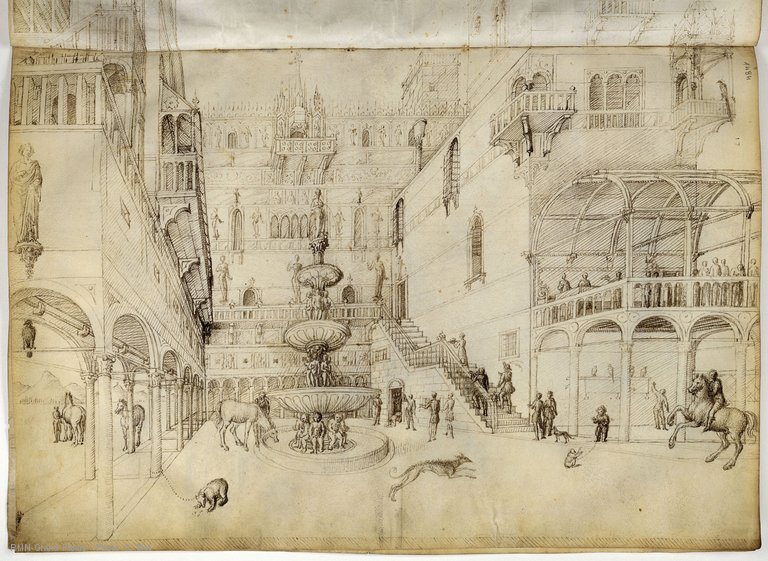
2-12 Jacopo Bellini, The Beheading of John the Baptist, ca. 1450. Lead point and ink. Paris, Louvre.
The drawing illustrates three parts of the story. The beheading of John takes place in the back of the courtyard next to the staircase. Salome climbs the stairs as she carries the severed head. And Herod enjoys his feast under the pergola on the second level. The leaping hound in the center of the courtyard was copied from a model book; the foreshortened horses on the left and the monkey on the right are no doubt from Pisanello. (See figure 2-6.) The small figures in the Louvre book often look like draped wooden clothes pins. The figures are clearly subordinate to the main protagonist, the architecture. The artist was more concerned about the placement of the figures within the architecture’s space.
Bellini designed the palatial residence in single-point perspective. With the vanishing point slightly to the left of center, more of the right wall of the building–where the story unfolds–is visible. Bellini’s architecture combines elements from a variety of styles: the traditional Venetian towered facade, the classical arcade, and the Gothic balcony at the top of the far wall. Sculpture adorns the walls, the balustrade, and the grand four-level fountain. Overall, the delicate intimacy of the drawing conveys a feeling of festive courtly elegance. Despite the religious subject matter, the scene aimed at satisfying the dreams of genteel aristocratic patrons. It is a fantasy that looks forward to the architectural capriccios of later Venetian art.
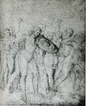
2-12 Jacopo Bellini, Nude Women in Combat, The London Sketchbook, ca. 1445-60. Leadpoint on paper, 41 x 32.5 cm. The British Museum, London. For a more accurate image, Google “British Museum Jacopo Bellini Nude Women in Combat”.
Many drawings in the London volume, such as Nude Women in Combat (figure 2-12), portray large-scale and weighty figures that fill the page as they occupy the foreground. The outlines of these classically idealized figures are firm, emphasized with many stokes of soft lead. Although there is little modeling, the volumes appear well-rounded. The rhythm of the figures across the page is extraordinary. The beat proceeds from the two figures set back on the left, to the dominant combatant with the foreshortened shield in the foreground, then to the woman raising her club seen from the back, and finally to the fleeing man, perhaps a satyr, exiting rapidly on the right. Perfectly choreographed as though by Raphael, gestures of torsos and limbs parallel or answer one another across the space. Bellini in Venice seems to have been well aware of foreign achievements such as the solidity of the figures in Masaccio’s frescoes and the animation of the figures in Uccello’s work in Florence. Abandoning perspective, Bellini built three-dimensional space by the volume of the figures alone.
Central Italy No Florentine artist of the early and mid-fifteenth century left behind a substantial body of drawings as did the north Italian artists Pisanello and Jacopo Bellini. Only Filippino Lippi, Domenicho Ghirlandaio, and Leonardo da Vinci, late in the century, produced a large group of drawings that have survived. Nevertheless, it can be stated that substantial change in the practice of drawing occurred.
Visual and verbal evidence indicate that mid-century Florentines knew the model books of northern artists such as Giovannino de’Grassi and Pisanello. Artists patronized by the Medici used modelbook prototypes in their work, especially after Gentile da Fabriano’s visit to Florence in 1423. Vasari remarked that Paolo Uccello made numerous “painted representations of birds, cats, dogs and every sort of strange animal of which he could get drawings.” Benozzo Gozzoli knew the Rothchild Modelbook (Louvre), a key conduit for the modelbook tradition to Florence.
Around 1460 Gozzoli’s workshop produced a drawing book similar to that of Pisanello’s, consisting primarily of student copies made as part of their instruction and kept for future applications (figure 2-14). The contents of the book include animals, architectural details, body parts, and especially human figures, both nude and draped.

2-14 Workshop of Benozzo Gozzoli, Nude Man, ca. 1460. Metalpoint with white heightening on purple-pink paper, 22.6 x 15 cm. British Museum, London.
Models in the studio may have taken poses to exercise young artists’ skills in anatomy and proportions and in the difficult task of foreshortening. But it is just as likely that the apprentices copied a clay, wax, or plaster sculptural model, based on classical examples and kept in the studio for the purpose of instruction. Posed like the classical Spinario in reverse, the seated figure still has a medieval pinched abdomen and no neck. And the legs do not connect with the hip. The silverpoint drawing with white heightening, typical of Florentine student work, confirms that one of the features of workshop training in mid-century Florence was the study of the nude in drawings, and as in Gozzoli workshop, artists examined antique art for lessons in anatomy, pose, and movement.
It is assumed that the founding fathers of Florentine art—artists such as Masaccio and Donatello—made drawings of the nude, but they have all vanished. Later in the fifteenth century, Florentine artists more and more made drawings of the nude in order to resolve one of the central preoccupations of Renaissance art, so-called history painting. Leon Battista Alberti in De Pictura (1435), a treatise based on Florentine practice of the time, made clear the importance of historia or narrative in art. He advised artists to “work out the whole historia and each of its parts by making sketch models on paper.” The stories from the Bible and Christian legend, for example, required the production of a kind of silent show that would not only tell the story but also reveal the character and motivation of the actors through their actions. Alberti realized that artists would have to study the nude because a narrative painting requires human figures whose poses, gestures, movements, and reactions convey meaning to the viewer. To produce such figures, the artist must be skilled not only in anatomy but also in the rhythm and flow of muscle groups. These investigations were best made in drawings.

2-15 Parri Spinelli, Foreshortened Male Nude, ca. 1440. Pen and ink on paper, 10.3 x 18.6 cm. Uffizi, Florence.
Isolated studies of the nude had been made in the first half of the century. Stimulated by a campaign to copy antique sculpture in Rome in the early 1430s, Pisanello seems to have used living models to make several nude studies, known to us through workshop copies. In the late 1430s or early 1440s, Parri Spinelli from Tuscan Arezzo put together a drawing book (or books) of elongated draped figures that included a unique drawing of a foreshortened and contorted, male nude (figure 2-15). Seen from above, with left leg, arms, and head foreshortened, the extraordinary man throws his head back and flails about. Parri modeled him in a network of crosshatching—maybe the earliest extant example of crosshatching.
Around 1440 in Florence Domenico Veneziano made a number of brush drawings—sixteen survive—modeled in white on blue colored paper (figure 2-16). Brush drawings on paper whose pulp had been dyed blue became popular especially among Venetian artists of the late fifteenth and sixteen centuries.
![2-16 Dominico Veneziano [or Luca della Robbia?], Studies of Three Figures, ca. 1440. Brush and brown pigment, with white heightening on blue paper, 18.3 x 32.4 cm. Musée du Louvre, Paris.](/wp-content/uploads/2015/03/DomenicoVenez768.jpg)
2-16 Dominico Veneziano [or Luca della Robbia?], Studies of Three Figures, ca. 1440. Brush and brown pigment, with white heightening on blue paper, 18.3 x 32.4 cm. Musée du Louvre, Paris.
Antonio Pollaiuolo’s drawing, Nude Man Seen from Front, Side, and Back (figure 2-17), also became a model for apprentices and other artists to follow.
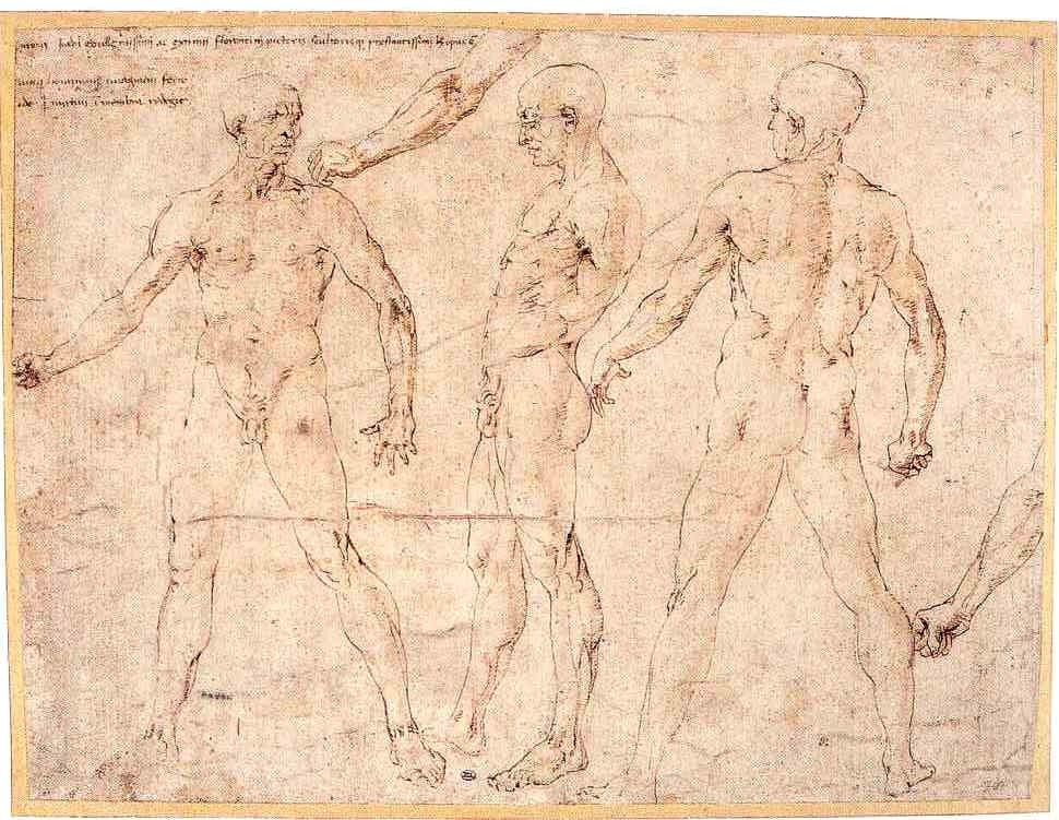
2-17 Antonio Pollaiuolo, Nude Man Seen from Front, Side, and Back, ca. 1465. Pen and brown ink with traces of brown wash and stylus incisions, 26.4 x 35.1 cm. Musée du Louvre, Paris.
The drawing was in fact copied frequently and served the same pedagogical purpose as his famous engraving, The Battle of Ten Nude Men, where he likewise paired the combatants in front, back, and side views of the same pose. Pollaiuolo was primarily a sculptor, and the systematic analysis of a figure from front, back, and side no doubt derived from his practice of rotating wax or clay maquettes for his bronze pieces. Conceived from different points of view, his nude has a new and rare three-dimensionality. This ink and wash nude possess sculptural weight. A few well observed lines convey muscular structure, clear proportions, and flow of muscle one into another. Moreover, his energetic pen line grows thick and thin to help model the taut muscles and give resilience and springiness to the man.
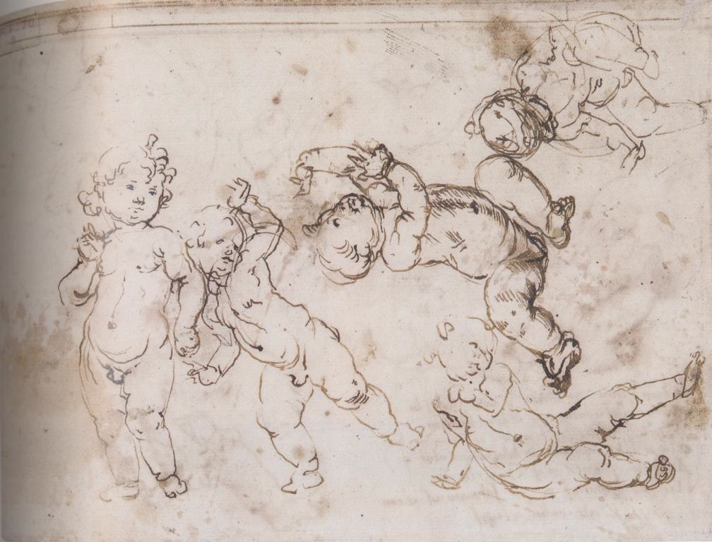
2-18 Andrea Verrocchio, Sketches of Infants, verso, 1470s. Pen and dark brown ink, over traces of leadpoint or soft black chalk, 15.8 x 21 cm. Musée du Louvre, Paris.
The sculptor Andrea Verrocchio made another kind of nude study (figure 2-18) in an attempt to depict movement. He filled a small sheet with five toddlers on one side and four on the other in a variety of positions. They stand, run, recline, and sit. The drawings may have resulted from the observation of a single active child, from the imagination of the artist, or any combination of the two. Whatever the case, the summary pen strokes as well as the casual placement of the figures on the page reveal that the artist worked spontaneous and rapidly, trying to capture one image after another in the space available. The curved and broken contour lines express the vitality of the children and capture the contrapposto pose of each of them with a sure touch. In several places Verrocchio’s pen established the arc of an arm or the circle of a head before it set down the actual contour. The fluidity of a pen allowed him to “doodle” and to release his imagination. Although the drawing was not a study for a particular project, several of the children were imitated by Verrocchio and his followers in sculpture and painting, and the drawing is linked to studies of children by his pupil Leonardo da Vinci.
![2-19 Filippino Lippi, Four Male Nudes; Two Clothed Men, Male Nude, Ear. Metalpoint heightened with white gouache on blue prepared paper, each sheet extended on left; top sheet, 20. 7 x 41.5 cm., bottom, 20.7 x 40.8 cm. Framed in Giorgio Vasari’s Libro de’ disegni. Pen and brown ink, brown and gray wash, 56.5 x 45.0 cm. Christ Church Picture Gallery, Oxford. [not in scale]](/wp-content/uploads/2015/03/Lippi0379.jpg)
2-19 Filippino Lippi, Four Male Nudes; Two Clothed Men, Male Nude, Ear. Metalpoint heightened with white gouache on blue prepared paper, each sheet extended on left; top sheet, 20. 7 x 41.5 cm., bottom, 20.7 x 40.8 cm. Framed in Giorgio Vasari’s Libro de’ disegni. Pen and brown ink, brown and gray wash, 56.5 x 45.0 cm. Christ Church Picture Gallery, Oxford.
Neither as animated as Verrocchio’s children nor as systematically observed as Pollaiuolo’s three-way nude, several of Filippino Lippi’s young men, like Pollaiuolo’s, hold their arms out to flare the chest, giving them a startled look. Filippino’s metalpoint drawings on blue paper resemble the medium of Domenico Veneziano’s previous work. The studies are early work by Filippino, shortly after his years of apprenticeship with Botticelli. Filippino drew each figure with a consistent curved outline—as did Botticelli did in his few surviving drawings—but he applied white highlights in distinctive quick and energetic strokes. Rather than suggesting touches of the brightest light, his highlighting models the figures. Like a flash of light, it conveys a sensation of sudden movement.
Filippino’s drawings are still attached to the page of one of the books of drawings that Giorgio Vasari assembled in the mid-sixteenth century to illustrate his famous Lives (second edition 1568). In Vasari’s Libro de’disegni, or Book of Drawings, he elaborated in pen a different frame for the drawings on each page. Vasari amassed one of the first collections of drawings by an individual and the largest collection of early Renaissance drawings ever assembled. Artists before him had collected drawings to pass them on to the next generation for use in their workshop. But Vasari collected drawings because he believed that disegno—the Italian word means both drawing and designing—was the essence of the visual arts. Drawing to him was not only the foundation of the other arts in a practical sense but also the visible expression of the artist’s inner conception and imagination. What better way then to illustrate the art of someone, whose biography he had written, than through his drawings.
Filippino Lippi was an avid draftsman. More drawings by this creative and versatile artist exist than from any other late-fifteen-century draftsman except Leonardo da Vinci. Scholars have identified about 150 of them. Filippino drew mostly in metalpoint before he took a sojourn in Rome in 1488, where he began sketching more frequently in pen. He almost never attempted drawings in chalk, a medium increasingly popular with his contemporaries in the last years of the fifteenth century. While in Rome he copied in pen and ink decorative motifs from emperor Nero’s Domus Aurea and later made adaptations of these designs in his painting. He is chiefly responsible for introducing so-called grotesque decoration into Renaissance art.
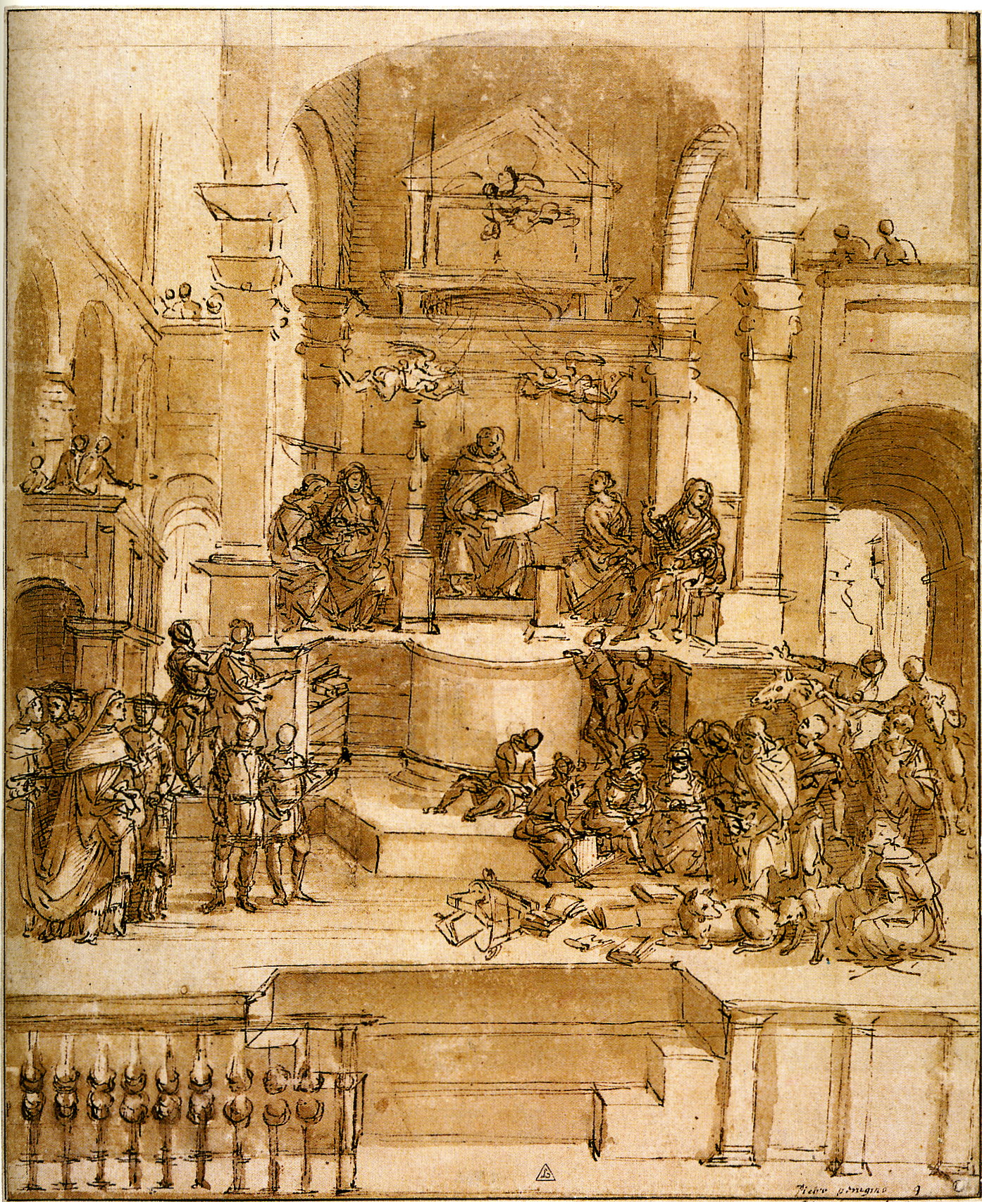
2-20 Filippino Lippi, Triumph of St. Thomas Aquinas, ca. 1488. Pen and brown ink and brown wash, 29.1 x 23.9 cm. British Museum, London.
In pen and ink Filippino practiced a number of styles, from refined copies to brilliant fireworks in line. His drawings in his later years include complete compositional studies, such as The Triumph of St. Thomas Aquinas (figure 2-20), very likely a drawing presented to a patron for his approval. In fact, the drawing is a study for a fresco Filippino painted in Rome for Cardinal Carafa.
In the drawing he arranged sketchy, small-scale humans within an imaginary architecture equal in breadth and weight to contemporary buildings by Bramante. The figures, move through the space, build a triangular design, and relate to one another with an ease and grace worthy of the High Renaissance. His architecture makes Bellini’s (figure 2-13) look medieval. Filippino obtained added relief in the composition through the application of light washes. The contrasts of light and dark, rather than conforming to a distinct source of light, push and pull the planes of the architecture through the third dimension.

2-21 Filippino Lippi, Two Women Conversing, ca. 1500. Pen and brown ink and brown wash over traces of leadpoint or black chalk on paper rubbed lightly with reddish chalk, 11.5 x 6.5 cm. National Museum, Stockholm.
Filippino sketched Two Women Conversing (figure 2-21) in a different style. On a small piece of paper (cut from a larger drawing?) two elongated women walk in balanced strides—right leg back, right leg forward—and turn to one another. Dazzling rapid pen stroke catch their shifting movements. The lines are all short—some thick, some thin, and some at angles to one another. They appear scratchy and jagged as though he pressed and relaxed a mushy old quill to create dark and light lines. At some point he washed light brown ink and rubbed red chalk on the paper to bring out the light emanating from between the two figures. The effect gives the couple a translucent airiness. Filippino’s free handling of the pen parallels work by Leonardo da Vinci. But Leonardo left Florence about fifteen years before Filippino drew Two Women and was not a likely influence. Basically, the drawing indicates the great freedom and flexibility in handling the pen that had developed in Florence by the end of the fifteenth century.
Northern Italy
Andrea Mantegna (ca. 1430 ‑ 1506) Andrea Mantegna lived, so to speak, at the crossroads of the Renaissance, between Florence and Venice. He worked in Padua in his early career and then, for the next fifty years, at the Gonzaga court in Mantua. The Florentine artists Filippo Lippi, Uccello, and Donatello left major works in Padua during Mantegna’s apprenticeship there to Squarcione, who is known to have assembled a collection of drawings for use by his pupils. It included drawings of nudes by Pollaiuolo. In Venice, Mantegna married Jacopo Bellini’s daughter. So presumably he was familiar with his father-in-laws work, especially his two drawing books.
2-22 Andrea Mantegna, Christ at the Column, 1465-70.Pen and ink, 23.4 x 14.4 cm. Trustees, Home House Society, London.
Mantegna’s twenty or so extant drawings divide into two categories: rough sketches and highly finished work in a very different manner. The rough sketches date from his early years. All of them, especially Christ at the Column (figure 2-22), indicate that he was aware of Pisanello’s discovery that drawing could be used to explore and invent. In the drawing, Mantegna quickly dashed down and developed his first ideas in numerous short strokes. On the recto of the drawing Mantegna tried out a pose for Christ seen from two slightly different angles. On the verso he also probed another pose in two versions. On both sides of the sheet, Mantegna investigated new positions for the legs, as the obvious pentimenti show. Searching for the right line, he repeated almost every contour two or three times with the result that the contours seem to vibrate. Normally he used long diagonal hatching lines, but his rapid sketching in this drawing left no time for modeling. Mantegna’s Christ is a tall, muscular figure based on classical sculpture—rather different from the adolescent garzone of Domenico Veneziano or Botticelli.
Mantegna’s experiments with the nude figure of Christ were made in preparation for a lost painting of the Flagellation, now known through engravings. Unlike Florentine draftsmen, Mantegna never made nude studies for their own sake—to study anatomy, proportions, and movement. His sketches of the nude figure, and those by other artists outside central Italy, were always done with a work in mind.
Andrea Mantegna also made finely wrought drawings, either carefully rendered modelli, which were faithfully copied in a painting, or presentation drawings, which were commissioned by or given to collectors. Both are works in which every feature is rendered sharply and every line or drapery fold is drawn with precision. Patrons treated his presentation drawings as small paintings (quatretti), lacking only color. His pupils and other artists collected Mantegna’s modelli.
Andrea Mantegna, Judith, 1491. Brush and wash slightly heightened with white, 38.8 x 25.8 cm. Uffizi, Florence.
The unusually large drawing, Judith (figure 2-23), signed and dated 1491, seems to have been a presentation drawing, a colorless painting. The tall figure of Judith, who drops the head of Holofernes into the bag, rises like a tower from the lower edge of the drawing. The maid, further back in space, stands on a slight elevation, facing her. Mantegna has transformed dramatic action into a statuesque pose. Judith is seen from the back, her hips thrust to the left in exaggerated contrapposto. On the right of the drawing, a ribbon of cloth spirals down from Judith’s head. The ribbon’s agitated curves match other decorative crumples, for example, in her cloak near her waist, and in the curls of her hair. Dark brown wash to the right of each figure creates contrasts for greater relief. But within the figures the modeling is extraordinarily soft, subtle, even translucent. In addition to wash, he placed a few white highlights on the left sleeve and left shoulder.
THE NETHERLANDS
Only 600 or so drawings by Early Netherlandish artists working in the fifteenth century have survived—far fewer than those that remain by Italian artists of the same period. Drawings by the famous great masters are very rare. One of the two certain drawings by Jan van Eyck, St. Barbara, is an elaborate finished drawing that may have been started as an underpainting on a panel. A few drawings have been attributed to the hands of Rogier van der Weyden, Petrus Christus, and Hugo van der Goes. The first major artists to leave posterity a sizeable graphic oeuvre are Hieronymous Bosch and Gerard David—artists whose careers run well into the sixteenth century.

2-24 Jan van Eyck, Portrait of an Unknown Man, ca. 1435-40. Silverpoint, 21.2 x 18 cm. Kupferstichkabinett, Dresden.
Fifteenth-century Flemish artists preferred the precision of metalpoint on the clarity of white or creamy white paper, most of which was imported. They seldom used the colored papers popular in Italy. Most early Netherlandish drawings before the age of Bosch are whole or partial copies of other works of art. Netherlandish artists seem to have been trained by drawing to stress exactitude and thus conditioned to think of drawing as exact reproduction. Studies or drawings made to solve some artistic problem are extremely rare, unless one includes portrait studies of an individual’s features.
In this sense, Jan van Eyck’s drawing of an unknown man (figure 2-24), once thought to be Cardinal Niccolò Albergati, is a rare study made in preparation for the painting, now in Vienna. With the man sitting before him, van Eyck searched with a series of lines for the right contour of his chin and collar. He drew straight lines along the bottom and at the right to change the proportions of the composition to those used in the painting. In contrast to the face, he roughly sketched in the jacket and on the left of the sheet wrote reminders to himself about color. However, the eyes, nose, mouth, and ears are reproduced in exacting sharpness and detail. Finally, he produced subtle changes of light and dark across the face with a dense system of fine diagonal hatching. It was a style of drawing that proved hard to imitate.
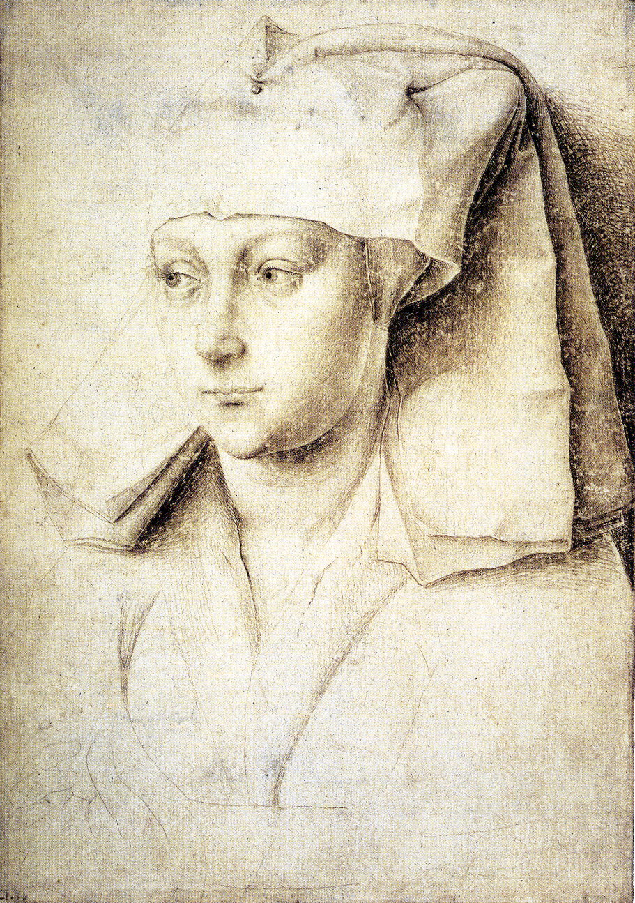
2-25 Rogier van der Weyden, Portrait of a Woman. Silverpoint on paper with cream-colored ground, 16.7 x 11.7 cm. The British Museum, London
A handful of drawings have been attributed to Rogier van der Weyden. The quality of one of them, Portrait of a Woman (figure 2-25), argues in favor of Rogier’s authorship. Probably another artist added the awkward hand in the lower left. As in all of Rogier’s art, precision and elegance characterize the lines his silverpoint stylus created in this drawing. He clearly marked the outlines of the headdress, and he subtly diminished the modeling of the lower cheek with a reflected light so that the cheek’s swollen contour stands out from the shadow on the neck. He achieved the smooth modeling of the face through layers of cross hatching—some of which, on the neck for example, follows the roundness of the form. Not far in date from van Eyck’s man, the woman’s head exhibits a different style of drawing, emphasizing strong lines rather than van Eyck’s painterly chiaroscuro. Rogier’s style proved popular and would be readily translated into engraved lines made by a burin.

2-26 Hieronymous Bosch, Disreputable Pair. Pen and gray brown ink, 19.3 x 13.7 cm. Lehman Collection, New York.
Hieronymous Bosch’s pen drawing, Disreputable Pair (figure 2-26), could not be more different from the silverpoint portraits by Jan and Rogier. The two faces border on caricature—more accurately, they have the kind of face that usually embodied evil in his paintings. With a simple gesture and a sideways glance, these men (or are they women?), conspire among themselves. Instead of meticulous detail and systematic modeling, Bosch invents these characters with only a few strokes of the pen. The short, irregular marks vary in thickness and in darkness to convey chiaroscuro and thus three-dimensionality. A few bold lines and little hatching construct their clothes while fine, soft lines build up the faces and hand. Although all his extant drawings seem to date from the early years of the sixteenth century, Bosch is the first Netherlandish artist to employ a sketch-like manner of drawing. Neither does he use drawing to make copies as did almost all his forerunners. Bosch used drawing to invent. Like some Italian artists before him, he used this mode of drawing to capture his inspiration or to develop new ideas and forms. The verso of this sheet contains an even sketchier first idea for a design of Eve and Satan.
About fifteen to twenty drawings by Bosch still exist. His style of drawing has been confirmed by comparison with the underdrawings that infra-red reflectography has revealed in many—but not all—of his paintings. Bosch seems to have been left-handed. His hatching strokes went from upper left to lower right. Although he broke with tradition, he had few followers.
In the Netherlands in the sixteenth century, artists still made copies of earlier masterworks in drawings meant for later use in their workshop. Collectors preserved finished drawings rather than sketches; consequently, the bulk of the drawings that survive are contract drawings or modelli for paintings, stained glass windows, tapestries, and prints. Collectable finished drawings also included presentation drawings, which became more and more popular as the century went on. Preparatory sketches for all these final compositions are extremely rare. In fact some scholars wonder whether many artists in the Netherlands ever made such studies at all, unless the artist was one of the northerners like Frans Floris who spent some time in Italy. Well into the sixteenth century, most artists still worked out their relatively traditional compositions on the underdrawing of the panel or canvas.
The outstanding Flemish draftsman of the sixteen century, Peter Bruegel, is today most famous for his paintings of peasant scenes. In the sixteenth and early seventeenth century, he was better know for his drawings of landscapes and allegories, many of which were reproduced in prints. At the beginning of the twentieth century, scholars had identified over one hundred drawings by Bruegel. By the end of the century, that number had been drastically reduced to about sixty. Some of Bruegel’s most admired landscape drawings have turned out to be late sixteenth-century forgeries by Jacob and Roelant Savery. Nevertheless, the impact of Bruegel’s drawings on the history of landscape was enormous.
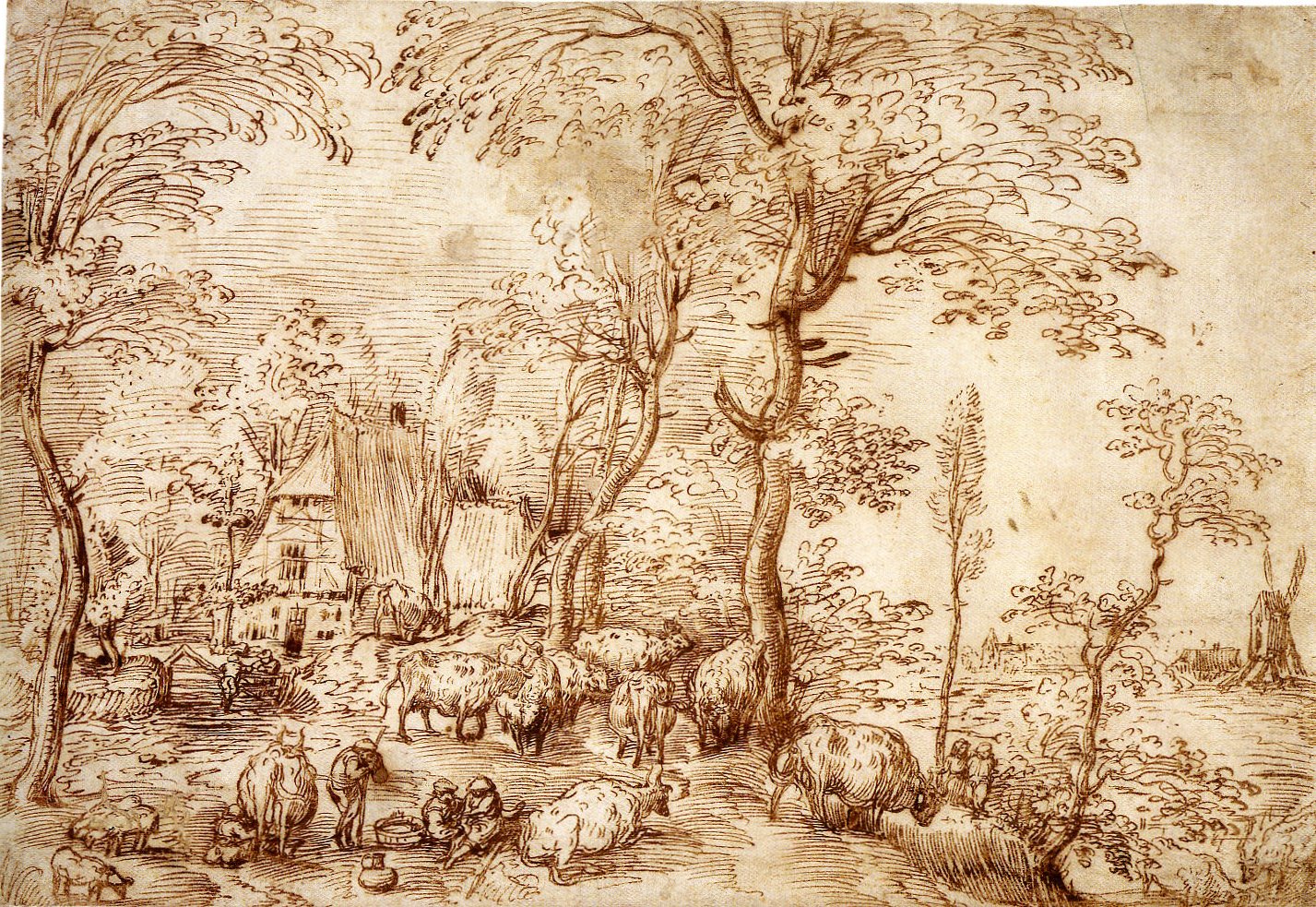
2-27 Pieter Bruegel the Elder, Cow Pasture before a Farmhouse, ca 1554. Pen and red-brown ink, 23.5 x 34.3 cm. National Gallery of Art, Washington.
After traveling across the Alps to and from Italy in 1552 and 1554, he collaborated on his return with print publishers in Antwerp. The collaboration started in 1555 with drawings for a series of twelve etched landscapes, many of them sweeping vistas based on his experience of the Alps. All but one of the drawings for the series are lost. A few of the earliest landscape drawings attributed to him—Cow Pasture before a Farmhouse (figure 2-27), for example—have a look of simplicity, realism, and immediacy that may suggest they were sketched at the site. Karel van Mander wrote in his 1604 biography of the artist that Bruegel sketched from nature frequently. Cow Pasture, however, is much too organized and rich in detail to be a quick impression. The artist has taken a position, fairly close to ground level, on a wooded hill overlooking a river valley. The spatial recession sweeps diagonally across the composition to a windmill on the right. As the cows graze, three couples talk across a fence, stroll up the hill, and in the foreground fondle one another as a cowherd leans on his staff and watches. In short, Flemish peasants act out a vision of leisurely, Arcadian pastoral life. The trees with their sinuous trunks and high foliage are typical of Bruegel’s landscapes. For clusters of leaves he also habitually used a penstroke like the number 3. Inspired by Venetian examples of landscape from the orbit of Titian, Bruegel applied parallel hatching across the sky, the ground, and the trees. The balanced and ordered composition also derives from Bruegel’s experience of Italian art.

2-28 Pieter Bruegel, The Beekeepers, ca. 1567-68. Pen and brown ink, 20.3 x 30.9 cm. Kupferstichkabinett, Staatliche Museen zu Berlin.
In addition to landscapes, Bruegel drew allegories of sins and virtues and satirical scenes of peasant life, peopled with numerous, small, sometimes fantastic figures in the manner of Bosch. In his lifetime, critics called Bruegel a second Bosch. Although it was never reproduced in an engraving, The Beekeepers (figure 2-28), a late work, is a detailed finished drawing ready to be copied by a burin. The faceless men create a bizarre and surreal impression. Three hefty figures wearing robes and masks to protect them from the bees furtively manage the hives. A young man climbs a tree in the upper right to steal a bird’s nest. An inscription at the lower left reads, “He who knows where the nest is, has knowledge; he who robs it, has the nest.” Scholars have offered nearly a dozen, different explanations of the allegory. In general, Bruegel probably intended that his drawing contrast the caution of the beekeepers with the boldness of the youngster in the tree.
The style of The Beekeepers is quite different from that of The Cow Pasture. In fact, all the allegories are markedly different in style and iconography from the landscapes, as though they are by the hand of a different artist. The massiveness of the figures in The Beekeepers is the most noticeable change. Around the figures and several of the objects Bruegel set down quite precise contours. He modeled the bulk of the drawing with thin parallel hatching and a stippling of dots and dashes. The technique affords a great range of subtle light, texture, and atmosphere. It almost seems to reproduce the buzzing of the bees.
By the end of Bruegel’s life, civil war had broken out in the Netherlands between the north and the south and between Protestants and Catholics. Many artists from the south migrated to the north to escape the oppression of the Spanish overlords. Among them were Hendrick Goltzius and Karel van Mander who joined Cornelis van Haarlem to form an academy in Haarlem, perhaps in imitation of the Accademia del Disegno that Vasari started in Florence in 1563. At first the trio adopted an extravagant Mannerists style, stimulated by drawings of Bartolomeus Spranger that Van Mander had gotten in Vienna. In the 1590s, after Goltzius returned from a year in Italy, they began to draw from the live model. Nothing further is known about their academy. Nevertheless, the drawing sessions mark a significant break from the artificial sophistication of Mannerism to an art based on the imitation of nature.
Of the three artist, Goltzius was the most versatile draftsman, capable of employing a variety of media. A chameleon, he could draw in several styles simultaneously, from an extravagant Mannerism to a closely observed naturalism. In the latter vein, he did a series of metalpoint, usually leadpoint portraits and head studies. He was adept with brush and wash. His pen work included swift mannered sketches, large elaborated modelli, touched with wash and color, and astonishing presentation drawings rendered with tapered lines and precise hatching in clever imitation of copper engravings. Chalk was little used in Netherlands, but in Rome Goltzius made a series of chalk studies of ancient sculpture, first in a black-chalk sketch and then in a highly finished study in red chalk prior to engraving.

2-29 Hendrick Goltzius, Portrait of Giovanni Bologna, 1591. Red and black chalk, slightly washed with brown in places, 37.0 x 29.9 cm. Teylers Museum, Haarlem.
During his trip to Rome, he also made a series of large chalk portraits of artists, including the remarkable Portrait of Giovanni Bologna (figure 2-29). Although Goltzius vigorously roughed in the chest, shoulder, and collar of the sitter with thick lines of black chalk, he delineated his hair and beard with sharp, precise strokes. In an even more startling shift, he softly modeled the head with red and a bit of black chalk as though he were applying thin glazes of oil paint. Instead of forming lines, the red chalk seems to coalesce and fold into the wrinkles about the eyes. The white of the paper became the sheen of the hair or graying at the temples and in the beard. The artist’s craftsmanship results in a immediate dramatic presence. Moreover, the contrast between the realism of the head and the presence of the artist, who is seen changing the tilt of the collar and bringing the right shoulder forward with five or six new thick lines, dazzles the imagination.

2-30 Jean Clouet, Portrait of a Young Woman (Queen Marguerite of Navarre?), ca. 1520-40. Black and red chalk, 28.9 x 19.6 cm. The British Museum London.
Goltzius was not the first to combine red and black chalk in portrait drawings in order to imitate more natural coloring. The French seem to have invented the method in the fifteenth century: Jean Fouquet left the earliest example (Guillaume Jouvenel des Ursins, ca. 1460-65, Kupferstichkabinett, Berlin). At the French court in the early sixteenth century, Jean Clouet perfected the technique in drawings such as Portrait of a Young Woman (figure 2-30). Like his other chalk portraits, this one is probably a sketch for a painting. Whereas Goltzius roughed in the clothing as a display of virtuosity, Clouet barely indicated the sitter’s dress because he would take care of it later in the painting. In contrast to Goltzius’s bold application of chalk even about the face, Clouet used a delicate touch that barely suggest a flesh color. Faint diagonal red chalk hatching models the face in chiaroscuro softer than in Leonardo’s Mona Lisa, which was in France at that date.