VENICE, PARMA, GERMANY
VENICE
Far fewer fifteenth-century drawings have been preserved from Venice and the cities of northern Italy than from Florence and central Italy—even counting the body of drawings by Pisanello and the drawing books by Jacopo Bellini. The evidence indicates that northerners simply drew less. Paradoxically, north Italians seem to have collected drawings sooner than central Italians. Northerners tended to collect finished and elaborated drawings—portrait drawings especially—rather than sketches or studies, genres more typical of central Italy.
By the sixteen century, some Venetian artists were unfairly criticized for not drawing and even for not knowing how to draw. The truth buried in the accusation was that many Venetian artists did not use the elaborate process of preparatory drawing, practiced so assiduously by Raphael and others. Few Venetian artists developed a project in drawings that ranged from first ideas through numerous studies and final cartoons. Quite likely, many Venetian artists never made cartoons because it was not their practice to faithfully replicate the final drawing or drawings in a painting as Tuscan artists usually did. Analysis of canvases confirm that Venetians frequently continued to rework the design on the canvas and modify it substantially in the process of painting.
Vittore Carpaccio (1472-1526) A few Venetian artists drew as much as their Florentine contemporaries, and Vittore Carpaccio is one of the exception. The relatively large number of his drawings that still exists indicates that he was an assiduous draftsman who made drawings for all stages of the creative process and took advantage of a wide variety of techniques. He was also a somewhat conservative artist who made finished and detailed simile or pattern drawings of figures, heads, and drapery that were preserved in his workshop so that they could be inserted in a later composition. In other words, he still worked in the tradition of the modelbook, with the difference that medieval modelbooks contained images copied from other sources whereas Carpaccio made his own simile designs for his later use.

3-30 Vittore Carpaccio, Portrait of a Middle-aged Man, 1495. Brush and brown pigment over black chalk, with white heightening on blue paper, 26.7 x 18.7 cm. British Museum, London.
Carpaccio’s Portrait of a Middle-aged Man (figure 3-30) may have been a simile drawing. It seems to have been drawn from life but also has been related to the portrait-like figures he incorporated in his cycle of paintings about St. Ursula. Brush drawings on blue paper were common in the north of Italy at the end of the fifteenth century. In modeling this portrait, Carpaccio does not take advantage of the brush to blend the brown ink and white heightening. Strokes of light and strokes of dark remain separate. The effect has been compared to a chiaroscuro woodcut, which uses separate woodblocks for each tone. However, the probable date of this drawing (the 1490s) precludes a direct influence from chiaroscuro prints, which were invented in 1508. Rather, Carpaccio applied his white strokes the way that white heightening had been applied for decades on top of, and somewhat independent of, an already complete silverpoint or pen drawing.

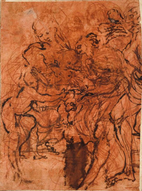
3-31 Vittore Carpaccio, Cardinal Bessarion Presents a Reliquary with a Fragment of the True Cross. Pen and ink over red chalk, 45 x 38 cm. Chatsworth House, Derbyshire.
Carpaccio’s oeuvre also contains a relatively high number of compositional drawings. Like most of the drawings in Jacopo Bellini’s books, they map out an arrangement of setting and figures in a cohesive design. His sketch for Cardinal Bessarion Presents a Reliquary with a Fragment of the True Cross (figure 3-31) records his first ideas for a painting in which the Cardinal, moving toward the center, begins to genuflect before an entourage coming from the right. The encounter is set in a sweeping river landscape perhaps inspired by the work of Giorgione. Over a preliminary, even rougher red chalk sketch, Carpaccio’s pen rapidly worked out the design, adding a foreground tree on the right, horses on the left, and a boat in the river filled with figures who are indicated by only a few vertical lines and some circles. Even though he left the figures indeterminate, he concerned himself with the clouds in the sky and the reflection of trees in the water.

3-32 Vittore Carpaccio, St. Augustine in his Study, 1502. Pen and ink with light brown wash, 27.7 x 42.7 cm. British Museum, London.
If the sketch for Cardinal Bessarion Presenting marks the beginning of the creative process, St. Augustine in his Study (figure 3-32) marks a stage close to the end of it. The sheet may be a contract drawing—a highly finished drawing shown to a patron for his or her final approval and then, if accepted, attached to the legal document binding the artist and patron. Carpaccio’s drawing clearly won approval because it was reproduced faithfully in the painting (Scuola di San Giorgio, Venice) with only a few minor changes: the relaxed cat became a small alert dog, and a few more books were strewn about the floor. Carpaccio probably also showed the patron a separate brush drawing of the saint to be inserted into the sketchy gap he left for it. St. Augustine’s study reproduces in perfect linear perspective a fashionable, high-class interior of the period. With some hatching and subtle variations of wash, the artist imagines the light that enters through the windows on the right and spreads around the room. His evocation of diffused interior light is worthy of Van Eyck or Vermeer.
Titian (d. 1576) In his life of Titian, Giorgio Vasari states that Giorgione did not make drawings [disegni] because he firmly believed that painting only with colors themselves, without studies drawn on paper [disegnare in carta], was the true and best way of working. Like other Venetian artists, Titian, who adopted Giorgione’s method, probably never replicated a cartoon or cartoons when he painted a canvas. But Titian did make other kinds of drawings, including first ideas, studies, and modelli.

3-33 Titian, Six Studies for St. Sebastian, c. 1520. Pen and brown ink, 16.2 x 13.6 cm. Kupferstichkabinett, Berlin-Dahlem.
About forty or so drawings have been attributed to Titian by experts who disagree among themselves about the authenticity of almost every one of them. Whatever the number, the sum is modest, given his long career. Nine or ten can be closely related to documented paintings by Titian; others are selected on the basis of a very personal and dynamic style.
In his early years, Titian vigorously sketched several figure studies in pen and ink. A pen drawing of about 1520, Six Studies for St. Sebastian (figure 3-33), chronicles Titian struggles to transform Michelangelo’s Rebellious Slave into an image of the dying St. Sebastian. Six times on the page he tried to change the slave’s tensely coiled anatomy into an S-curved ideogram of an exhausted body suspended from one arm. More aggressively than Mantegna, Titian repeated contour lines. Rather than make corrections over pentimenti, he drew the figure again and again as though he were trying to internalize how the hanging body felt more than how it looked.
Much more frequently, Titian studied the draped and undraped human figure in black chalk and charcoal drawings heightened with white on blue paper. The medium suited the painter in him. Soft black chalk and charcoal resemble the bold featheriness of a brush stroke of paint, and the three colors (black, white, and blue) come closer to a painting’s chiaroscuro. Furthermore, the bold lines of these drawings, such as the extraordinary Embracing Couple (figure 3-34), resemble the slashing brushstrokes of the underdrawings on the canvas of several of Titian’s late paintings as seen with x-rays.
3-34 Titian, Embracing Couple, 1560s. Charcoal and black chalk heightened with white on faded blue paper, 25.2 x 26 cm. Fitzwilliam Museum, Cambridge.
All the lines of the drawing, even some of the background hatching, tumble around the couple. Pentimenti appear to make the man’s arm move as it struggles to hold the woman. Countless lines on top of one another obliterate many of the contours until the drawing resolves itself essentially into the dark back of the man and the white of the woman’s body. The violent lines of Embracing Couple might be read as a symbol of sexual passion, if the same energy of line did not appear in other Titian chalk drawings—some of them religious. Peter Paul Rubens paid Titian the compliment of copying the figures in his painting Rape of the Daughters of Leucippos.
In addition to figure studies in pen, Titian also drew landscapes in pen and ink. About fifteen landscape drawings exist, nearly a third of his surviving output. They were the first of his drawings to be admired, collected, and reproduced. Titian’s earliest landscapes were inspired not only by Giorgione but by Northern art—Dürer was in Venice 1505-07. Unlike his problem-solving figure studies (figure 3-33), almost all the landscapes have a finished quality about them because they were likely intended for reproduction in woodcuts and engravings. Unfortunately, they have been entangled with the work of Giorgione’s followers, the printmaker Giulio Campagnola and his apprentice Domenico Campagnola, making Titian’s landscapes his most controverted drawings.
3-35 Titian, Landscape with Sleeping Nude, mid 1560s. Pen and brown ink, traces of black chalk, highlights in white, 19.5 x 30.2 cm. Getty Museum, Malibu.
Landscape with Sleeping Nude (figure 3-35)—and also Embracing Couple—date from the period of Titian’s poesie paintings for King Philip II of Spain. Sleeping Nude is one of a series of late landscape drawings with obscure allegorical or legendary subjects. The nude’s sleep may represent indolence that leads to erotic desire, hinted at by the prominent goat and boar. In this drawing, the movement into space jumps rapidly from lower right to upper left. The prominent diagonal contour of the hill divides the foreground from the background, and the bright countryside from the dark city. In his landscapes Titian used flexible pen strokes that vary from the long lines of the clouds in the sky to the short curves of billowing foliage and horizontal and vertical dashes for buildings.
Jacopo Tintoretto (1518-1594) Another prominent master of the golden age of Venetian painting, Jacopo Tintoretto, also drew frequently. About 130 sheets have survived, in part because his family workshop preserved them after his death. In addition, about as many sheets have been identified as copies or imitations of his style by students and followers. Despite the fairly large number of drawings, Tintoretto shared certain attitudes toward drawing with Titian and other Venetian artist. He may not have worked out compositions in sketches (only one such sketch still exists), and he did not paint from cartoons or modelli. According to Carlo Ridolfi’s 1648 biography of Tintoretto, the artist arranged small figures that he made out of wax or clay in doll-scaled houses or stages. He lit lamps to control the light source and even suspended some of his clay and wax figures on cords so that he could master foreshortening them from below. But it is unlikely that Tintoretto, a prolific painter, worked out his large compositions in such a tedious fashion.
Tintoretto’s drawings fall into two categories: studies of sculpture and drawings from life. Many of the former are drawings from small-scale copies of work by Michelangelo. Copies from sculpture constitute nearly half his extant drawings. Around twenty of them are studies of the Samson Slaying the Philistines, a modello Michelangelo made in 1528 or 1529. Tintoretto worked from a small wax or clay reproduction of it, which he easily examined from different angles. Like the Samson in the Morgan Library (figure 3-36A), all the drawings after sculpture were realized in charcoal or black chalk, heightened with white chalk, on blue paper.
![3-36A Jacopo Tintoretto, [verso] Two Studies of Samson Slaying the Philistines. Black chalk, heightened with wetted white chalk, on faded blue paper, 44.3 x 28.5 cm. Morgan Library, New York.](/wp-content/uploads/2015/03/247252v_0001_0.jpg)
3-36A Jacopo Tintoretto, [verso] Two Studies of Samson Slaying the Philistines. Black chalk, heightened with wetted white chalk, on faded blue paper, 44.3 x 28.5 cm. Morgan Library, New York.
Tintoretto (and then a student) rendered Samson three times on both sides of the Morgan sheet—in charcoal alone on one side and in charcoal and white chalk on the other. On that side he drew the entire group, and a student repeated the torso of Samson next to it. Tintoretto captured the rippling muscles of the giant with firm external contours but especially with vigorous internal modeling. Short dark strokes define each rounded knot on Samson’s chest, abdomen, arms, and legs, emphatically bringing Samson into solid relief. Touches of white give the appearance of light reflecting on hard gleaming marble. The middle value of the blue paper completes the progression of dark to light across the figure. The knotted, knobby musculature brings to mind Leonardo’s complaint that a nude with every muscle tightened can look like a sack of nuts or bundle of radishes.

3-36B Tintoretto, Archer, 1580s. Charcoal, 32.2 x 20.7 cm. Uffizi, Florence.
Tintoretto also drew constantly from the living model in a great variety of foreshortened poses, in a manner very different from his fully modeled studies of sculpture. The majority of his drawings are indeed studies of single figures in animated poses, most of them studies made in preparation for a specific painting. Tintoretto and his workshop sometimes employed a figure study in more than one painting. Archer (figure 3-36B), a typical single-figure drawing, has been squared so that it could be transferred to a canvas. To reinforce the meaning of the straining body, the torso and leg of the nude bend unnaturally in a curve similar to the curve of the bow, and the arms stretch in a diagonal parallel to the arrow. Tintoretto more than likely drew the figure from his imagination for the pose is impossible—the torso is frontal, the forward leg profile, and both legs join the torso awkwardly. With no internal modeling, the muscular nude seems flat, almost an abstraction of violent movement. In addition to the pose, wavy, bubbly contour lines ripple around the figure throwing every body part in flux. Tintoretto’s lines have less to do with anatomy and than with energy. Charcoal allowed the artist to draw boldly, broadly, and with ease.
Paolo Veronese (1528-1588) Unlike Tintoretto’s drawings, the works of Paolo Veronese illustrate the entire range of functions for drawings in the Renaissance from sketchy first ideas to finished modelli. Among his 150 plus drawings, only cartoons are lacking. In short, he used drawing to invent, to study, and to perfect a painting or a fresco before he picked up a brush. So many of his drawings survive because, like Tintoretto, he ran a family workshop in which his drawings were the stock in trade of the firm even after his death.

3-37 Veronese, Study for the Martyrdom of St. George, 1566. Pen and ink and wash, 28.9 x 21.9 cm. Getty Museum, Malibu.
Quite a number of his drawings are pen and ink and wash studies for many-figured compositions, including some of Veronese’s most famous paintings. In Study for the Martyrdom of St. George (figure 3-37), he set down his first thoughts for a painting now in the church of San Giorgio, Verona. In one spontaneous burst of the imagination, he envisioned dozens of figures who unite heaven and earth along zigzagging diagonals. Swift strokes of the pen developed appropriate poses, integrated groups, and set up the diagonal movements that link them. He then added wash to begin modeling the figures and to set up a pattern of alternating light and dark. Confident about anatomy, proportions, and foreshortening, he sometimes practiced a kind of shorthand—two curving crossed lines substitute for eyes and noses and direct the glance of many of the oval heads. The drawing is an early demonstration of Veronese’s mature style. In later years his ink compositional drawings get even more summary and more abstract.
3-38 Veronese, Study of a Seated Woman, 1573. Black chalk on blue prepared paper heightened with white, 30 x 19.3 cm. Musée du Louvre, Paris.
In addition to ink sketches for compositions, Veronese also made studies of individual heads, hands, and drapery, mostly in black chalk heightened with white on blue paper. One example, Study of a Seated Woman (figure 3-38), has been identified as a sketch for a minor figure in the artist’s Rape of Europa of 1573. Very different from Titian’s passionate application of chalk, Veronese handled chalk with a lightness of touch worthy of a Rococo master—but with less realism. A minimum of strokes of black and white is all he needed to nail down his vision. He concerned himself only with the problem of the foreshortening of the hand.
A little more than two dozen so-called chiaroscuro drawings fall into the third major division of Veronese’s graphic work. Many of them, such as the serene and majestic Virgin and Child Surrounded by Six Angels (figure 3-39), have been admired by collectors and critics from the beginning. Virgin and Child is a finished brush drawing, with some pen work, neatly modeled in wash and white heightening.
It has none of the brio of his sketches in pen or chalk. Despite appearances, his chiaroscuro drawings were not modelli for paintings. He seems to have drawn them in the 1550s and 1560s for his own satisfaction. He later collected the group for engravings that were never made.

3-39 Veronese, Virgin and Child Surrounded by Six Angels, ca. 1560. Pen and wash on blue-gray paper heightened with white, 37.7 x 28.9 cm. Musée du Louvre, Paris.
Palma Giovane (1548-1628) The most prolific draftsman of the Venetian Renaissance, Palma Giovane, has over a thousand sheets to his name. He never served an apprenticeship and in effect taught himself to draw. In 1567 Palma went to Rome for three years to study for himself the masterworks of the classical era and of contemporary art, especially Michelangelo and his followers. Older biographers in fact claim he went to learn central Italian disegno. Shortly after his return to Venice, he developed a fascination for the style of Tintoretto, whose drawings in chalk he imitated. But Palma found pen and ink more congenial, a preference that led him to the vivacious ink sketches of Veronese. The Massacre of the Innocents (figure 3-40), a drawing in Palma’s mature style, betrays the three sources of his graphic art.
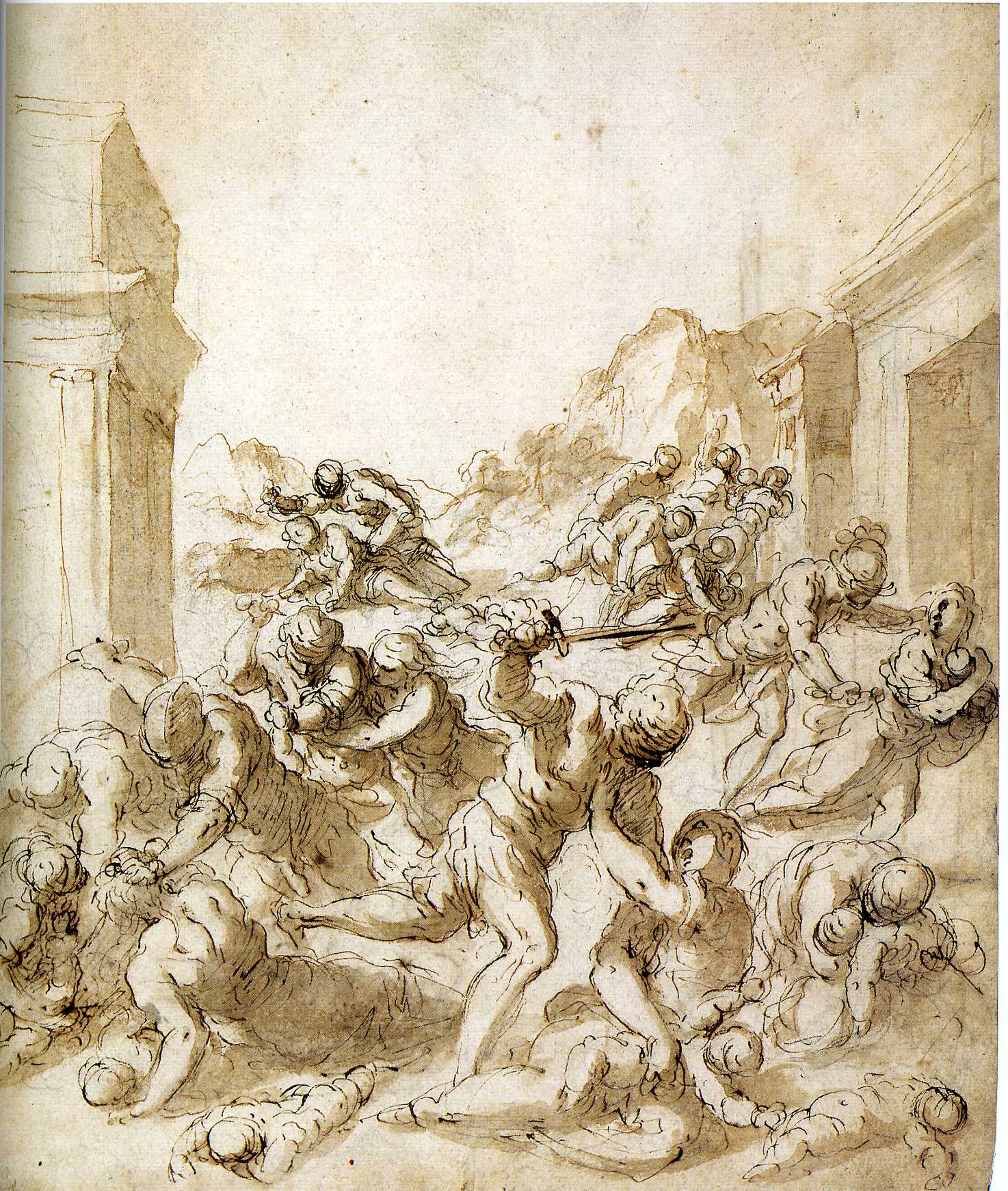
3-40 Palma Giovane, The Massacre of the Innocents, ca. 1600. Lead stylus, pen and brown ink, brush, brown wash, 31.6 x 26.4 cm. Albertina, Vienna.
Like a late sixteenth-century Roman or Florentine painting, the composition interweaves solid and hefty figures that blanket the landscape. With fluid pen stokes he crafts an entire composition in a sketch, as did Veronese. But since he wielded his pen over a preliminary sketch in leadpoint, he made few pentimenti and left few indications of the struggle to invent something new while drawing, as Veronese did in his Martyrdom of St. George. Finally, Palma borrowed the wavy contours of his figures from Tintoretto. But what were signs of energy in Tintoretto became for Palma a mannerism he imposed on solidly rendered figures. His handling of the pen has a sameness overall—nothing but short C-shaped, discontinuous contours. His formula concocted a flashy, yet superficial style.
PARMA
Correggio (d. 1534) The brief career of Correggio (Antonio Allegri) centered on the city of Parma. He first followed Mantegna’s art, but as years went by he moved closer to Leonardo da Vinci’s sfumato and his experimental approach to drawing. Vasari gave Correggio’s drawings low marks in contrast to his paintings. If Vasari had Michelangleo’s solidly drawn figures in mind, Correggio’s figure studies probably looked hesitant and unstructured. Vasari’s attitude may have retarded collectors from saving Correggio’s drawings. Unfortunately, only about 100 of them survive, yet what remains indicates that he drew avidly and prolifically, making multiple compositional and figural studies. The survival of six or seven studies for several single figures shows that drawing played a major role in his creative process. Only a few of Correggio’s drawings are finished and complete, the kind that he might have presented to a patron for approval. And yet, from the examination of even this small fraction of his output, it is surprising that there are no studies from life, no copies after the antique, no portraits, and no landscapes.
3-41 Correggio, The Madonna and Child with Saints, ca. 1523. Red chalk, brush and brown ink, on pink washed paper, 20.7 x 15.2 cm. Christ Church, Oxford.
The extant drawings show a great preference for red chalk. In the extraordinary drawing The Madonna and Child with Saints (figure 3-41), Correggio, holding a piece of chalk, let loose his first thoughts for the painting Madonna of St Jerome in Parma. Initially, he swirled red chalk over the page, building movement more than form. He then applied brown ink over it with a brush to clarify his ideas. Although none of them is as frenetic as The Madonna and Child with Saints, this sheet is one of a number of drawings in which he first sketched roughly in red chalk, then selected and emphasized the lines he wanted in ink. He seems to have followed Leonardo’s method of “brainstorming” with a frenzy of inspired lines until the image emerges. To Correggio, drawing was essentially a means to explore the imagination.

3-42 Correggio, Christ, ca. 1522. Red chalk, 23.9 x 18.0 cm. Ashmolean Museum, Oxford.
Another drawing, Christ (figure 3-42), comes from a series of seven studies he made for the figure of Christ in his fresco Coronation of the Virgin in San Giovanni Evangelista in Parma. Very likely, he made a similar series of studies, which evidently did not include a life study, for every major figure in every painting. The drawing of Christ is number four in the series, separated from three by a gap of a missing drawing or two. Each study builds upon the previous, trying out different options, varying the pose and drapery until a harmonious solutions is found. Drawings in a series were traced from one sheet to another or squared so that their essentials might be copied on another sheet. In most cases, no drawing by Correggio ever corresponds exactly to the finished painting, where he continued to adjust his design.
In Christ, as in all Correggio’s drawings, he applied hatching in a single diagonal direction as did Mantegna in his drawings and prints. Cross hatching occurred rarely. Unlike Mantegna, Correggio’s contours in this and other all-chalk drawings are by no means emphatic. They are often blurred by the Leonardo-like sfumato that suffuses the whole drawing. Correggio particularly softened the head and torso of this drawing, so that, in effect, it is tantamount to a drapery study. For Correggio, patches of light and dark over the whole often trumped statuesque modeling and precise anatomy.
The drawings of Correggio were dispersed after his death and were probably difficult to find. Consequently, the artists of later generations, who were said to have been influenced by Correggio, were more likely influenced by his paintings than by his drawings. Nevertheless, Correggio’s method of drawing stimulated one of the most original draftsmanship of the early sixteenth century, Parmigianino.
Parmigianino (1503-1540) In his late teens, Parmiginino (Francesco Mazzola) assisted Correggio on fresco decorations at San Giovanni Evangelista in Parma. The young artist also studied and copied a number of Correggio’s drawings. He did not adopt Correggio’s method of “brainstorming,” as in his Madonna and Child, nor did he to any great degree appropriate Correggio’s sfumato technique, as in his Christ. However, he did continue the older artist’s practice of developing a composition by means of numerous experimental studies, which rarely included a study from life. Even the three years he spent in Rome (1524-1527), where he soaked up the art of Raphael and learned Raphael’s methods of ordered preparation from his followers, did not dissuade Parmigianino from treating drawing as a series of experiments in imagining.
Parmigianino probably liked to draw more than to paint. (He was born to draw, said Vasari.) He finished relatively few paintings in his short career; yet he left behind nearly a thousand drawings—more than any contemporary artist, except Leonardo. He filled most of these sheets with studies for figures or groups of figures in which he repeatedly tried out pose and relationships. Many of these are studies relate to his paintings and prints, and many of them are personal experiments he did for the pleasure of drawing. He worked in a wide variety of techniques: pen, wash in different colors, red and black chalk and white heightening, colored papers, and even metalpoint. He explored a wide variety of genres: religious and mythological subjects, life drawings of the nude, characters from daily life, landscapes, still lifes, and even some scenes of erotic activity.

3-43 Parmigianino, The Virgin and Child with Saints John the Baptist and Jerome, 1526-27. Pen and ink wash, over red chalk, touches of white heightening on the Virgin and Child, 26 x 15.7 cm. British Museum, London.
Parmigianino drew The Virgin and Child with Saints John the Baptist and Jerome (figure 3-43) during his last full year in Rome, 1526-1527. The drawing is one of his earliest studies for his well-known painting The Vision of Saint Jerome in London and the only sketch of the entire composition—although it differs considerably from the painting. On most of the nearly thirty extant sheets that he covered in preparation for the painting, he drafted alternate arrangements of the figures. Despite Raphael’s example, he seldom used a living model for these variations. His primo pensiero, his original idea as it is represented in figure 3-55, did not dominate or dictate his inspiration. Even in this early sketch, he tried to break the symmetry of this traditional composition by juxtaposing the two saints in contrasting back view and front view and kneeling and sitting poses. Contemporaries prized the virtuosity and inventiveness that his drawings displayed.
In this drawing and in many of his rapid sketches from this period, Parmigianino shaped his figures with curved or looping strokes of the pen, whether the forms were clouds, clothing, or muscle groups. In the fashion of late Raphael and his followers, Parmigianino elongated his figures and gave them tapering proportions. Contemporary critics praised their grazia, or graceful elegance. The drawing also illustrates the peculiar anatomy he employed for rendering the lower leg. In his drawings, an overly large calf muscle often swells all the way to the ankle, or he might add a secondary bulge between the calf and the ankle. He often added wash to his pen drawings, more for painterly effects rather than for three-dimensional relief. He could sketch equally well in pen as in chalk, although, like his contemporaries in Tuscany and Rome, he more often preferred to sketch in pen. As an example of his adaptable talent, the sketch on the verso of this drawing, another variation of the composition, is in red chalk.
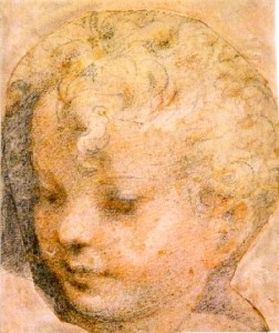
3-44 Parmigianino, Head of a Child, 1527. Black, red, and white chalk, 22.7 x 19.6 cm. Albertina, Vienna.
Parmigianino very probably drew Head of a Child (figure 3-44) in preparation for the Christ child in his painting The Vision of Saint Jerome. In both the drawing and the painting, the same tornado-shaped curl runs down the middle of the forehead. The drawing’s size and its degree of finish indicate that the drawing may have served as an auxiliary cartoon for the artist to refer to as he painted. He modeled the face in red and black chalk with great sensitivity for the softness of a child’s features. (A curator at the Albertina also sees touches of yellow chalk in the drawing.) It is one of a small number of drawings in which he mimicked Correggio’s sfumato. Although Parmigianino blurred the eyes and mouth of the child, the contour lines on the side of the head are firm and distinct.
The sheet with Three Studies of Saints Jerome and Francis (figure 3-45) is among the nearly fifty preparatory drawings connected with his famous painting The Madonna of the Long Neck.

3-45 Parmigianino, Three Studies of Saints Jerome and Francis, ca. 1535-39. Pen and ink, wash, 14.1 x 18.6 cm. Ashmolean Museum , Oxford.
Their spacing across the sheet implies that Parmigianino very likely contemplated drawing three groups of two figures from the beginning. The two pair on the left are variations of the same arrangement, in which the nude opening a scroll obscures St Jerome. In the third pair on the right, the figure of St. Jerome corresponds to the pose of the saint in the painting, but only the figure of Saint Jerome and the foot of Saint Francis appear in the (unfinished) painting. The figures in this drawing are even more elongated and spidery than those in the earlier compositional study for the Vision of Saint Jerome. The artist’s touch has grown more abrupt and jerky. He modeled the first pair in wash and the next two with very deliberate hatching. His hatching and cross-hatching, where it occurs, sometimes run in different diagonal directions.
Parmigianino collaborated extensively with printmakers who made engravings and chiaroscuro woodcuts from his drawing. He himself practiced etching. He made finished drawings for these prints of course; but more importantly, his familiarity with printmaking techniques led him to adopt their characteristic styles into his drawing.

3-46 Parmigianino, The Standard Bearer, 1530s. Pen and ink over traces of black chalk. 26.5 x 19.8 cm. British Museum, London.
His tight and orderly hatching lines often resemble those made by the burin of a reproductive engraver. But the light, delicate, and fluent lines in his drawing The Standard Bearer (figure 3-46) resemble those made by an etching needle effortlessly slicing through the acid-resistant ground of a plate. As in an etching, the lines are regular and sure and show no hesitation or pentimenti. (He never made an actual etched version of the Standard Bearer.) Contour lines are so thin they seem to disappear in places. Because of its high degree of finish, it is often called a presentation drawing, although there is no evidence that it or any of the many other drawings in the same “etching” manner were ever presented to someone as a gift.
When German soldiers threatened Parmigianino during the Sack of Rome in 1527, he won his safety by giving them a bundle of his drawings. A dozen years later, back in Parma, church officials had him arrested for spending too much time drawing (and practicing alchemy) instead of painting the vault and apse of Santa Maria della Steccata. Ironically, his obsesssion with inventing and perfecting alternate designs in endless numbers of drawings was both his strength and his undoing. Yet his virtuosity as a draftsman always attracted collectors, and his refined and exaggerated style (widely reproduced in prints) influenced a number of Italian Mannerists and, through them, the School of Fontainbleau in France.
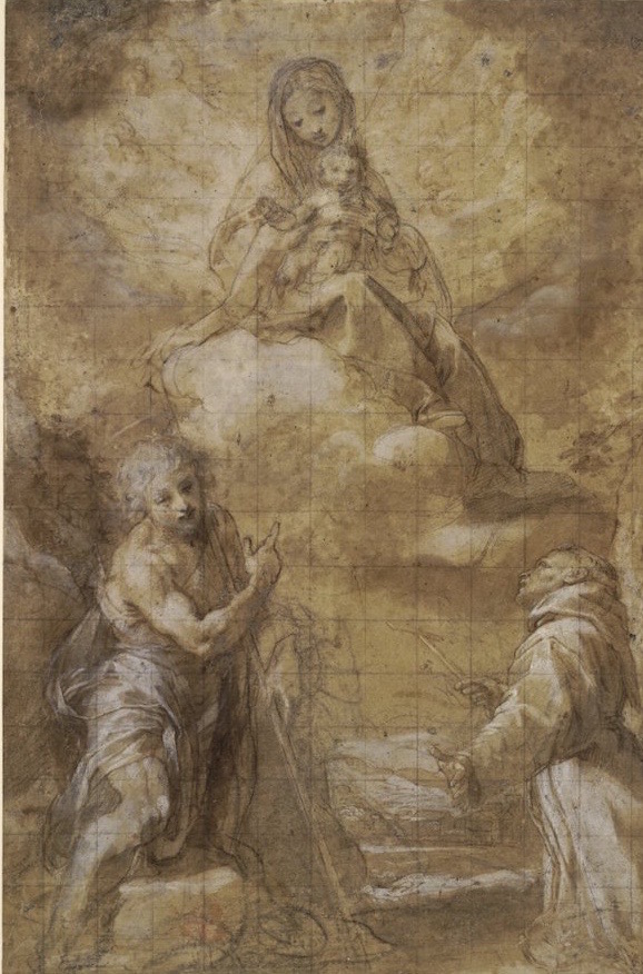
Federico Barocci (ca. 1535-1612) Early in his career, a painter from Parma showed Federico Barocci some drawings by Correggio, including some large-scale studies of heads in multi-colored chalk. These drawings would have taught the young artist to draw from nature with color and light. Barocci lived in Urbino, Raphael’s birthplace, and on two occasions (ca. 1555-57 and 1560-63) he worked in Rome where he studied Raphael’s art and also Raphael’s elaborate method of preparation through drawing. In the next century, Pietro Bellori in his life of Barocci described his working methods in considerable detail. Bellori assumed that Barocci followed Raphael’s stages of preparation in his own drawings, and to a great extent he did. But Barocci drew in a style that emphasized the pictorialism of Correggio and of Titian in Venice. Nevertheless, almost all the 2000 or more drawings by Barocci are indispensably bound to the methodical creation of his paintings and prints.

Federico Barocco, Study for the Deposition, 1568-1569. Pen and ink, wash, and white heightening, 20.4 x 27 cm. Louvre Museum. Paris
Barocci always began with a spirited and free-wheeling primo pensiero in ink, such as Sketch for the Deposition (figure 3-47), the start of a early masterpiece still in Perugia Cathedral. His sketch for it shows only the most dramatic part of the painting, the collapse of Christ’s mother beneath the cross. With quick, thin strokes of the pen, he orchestrated a complex grouping of well proportioned figures arranged in a circle of coordinated poses. He rehearsed the pose of the Virgin several times more on the same sheet, still without arriving at the solution seen in the finished painting. The drawing was an early, but not the only inspiration for the composition: in fact, he considerably changed all the figures by the time he finished the painting. Like Raphael’s preliminary studies, the actors are basically nudes. Even at this early stage, he applied areas of wash and white heightening to parts of the composition to effect dramatic patterns of light and dark–not modeling. In addition to the thin pen lines, Barocci also covered areas of the sheet with hatching lines in distinctively long parallel strokes, not to model the figures but to create areas of light and dark.

3-48 Federico Barocci, Study for the Virgin Standing beneath the Cross, ca. 1566. Black and white chalks on blue-green paper, 40.0 x 27.4 cm. National Gallery of Art, Washington, D.C.
For his paintings, Barocci also made studies of individual figures to determine the appropriate anatomy, pose, and expression. Like Raphael, he often had a studio assistant (garzone) pose for these nude studies, as he did in Study for the Virgin Standing beneath the Cross (figure 3-48) (Galleria Nazionale, Urbino). The sitting and standing figures belong to two different projects—he almost never simultaneously studied two or more models arranged together as did Raphael.
Barocci depicted the young man on the right as seen from below, standing in pronounced contrapposto. Pentimenti in the legs, arms, and head record his efforts to find a natural and meaningful pose. He softened the contours and hatching with stumping, an indication that he thought of lighting effects at every stage. Although Bellori insisted that Barocci always worked from life, he often reused or copied drawings. In fact, on a second sheet of paper placed on top of this drawing, the artist ran a stylus along the contours of the drawings. From the faint indentations on the second sheet, he elaborated another drawing. In this case, he used the copy for a drapery study.
3-49 Federico Barocci, The Virgin and Child Appearing to Saints Francis and John the Baptist, 1560s. Pen and brown ink, brown washes, heightened with white, over black chalk, squared in black chalk and incised for transfer, on beige paper, 38.0 x 24.4 cm. British Museum, London.
Barocci made a modello of the entire composition, or a disegno compito as Bellori called it, a drawing in a more finished manner. The Virgin and Child Appearing to Saints Francis and John the Baptist (figure 3-49) served as the disegno compito of a now lost painting. Over a preliminary drawing in black chalk on beige paper, he translated the basic outlines of his nude and drapery studies to this sheet. He then concentrated on rendering the entire composition in modulated tones of brown wash and extensive white heightening over the beige color of the paper. It is a drawing of chiaroscuro much more than of line, and his rendering of two light sources is the main factor that separates the natural and supernatural realms. The drawing was squared for transfer, probably to a large cartoon. (He usually made full-scale cartoons for his oil paintings.) Barocci made many separate, even more precise studies of chiaroscuro, an element of his concern even in his initial drawings.
One of the most distinctive and remarkable achievements of Barocci’s drawing are the large-scale heads he drew in colored chalks on colored paper. These materials allowed him to integrate the preparatory drawing more fully into the color scheme of the painting. The very fine Head of a Woman (figure 3-50) might have served as an auxiliary cartoon for his painting Madonna del Gatto (National Gallery, London).

3-50 Federico Barocci, Head of a Woman, ca. 1574-75. Black, red, and white chalks; ochre and brown pastels; on gray-blue paper, 33.0 x 24.6 cm. Smith College Museum of Art, Northhampton.
The Smith College drawing is one of the best preserved of such heads although the blue paper has faded to gray. Supposedly, both Barocci and Parmigianino (figure 3-44) were following the example of Correggio in the use of colored chalks, but no such drawing by Correggio is known. A more likely source may lie in the Venice area, especially the studio of Jacopo Bassano.
In fashioning the woman’s head, Barocci used more colors than did Parmigianino or northern artists such as Holbien or Clouet. He outlined the head in black chalk and rendered the eyes, nose, and mouth in red chalk. He probably combined red and white chalk for the pale flesh of the face and then thoroughly stumped the area to obliterate hatching lines. He colored the hair in ochre, brown, and black, except for the stray curls in red across her temple and cheek. The original blue of the paper and the ochre would have made a vibrant contrast. Bellori wrote that Barocci made use of pastelli, chalks manufactured by compressing pigment, filler, and a binder into sticks. Red, white, and black chalks are found in nature. Only the ochre and brown were pastels. Nevertheless, Barocci covered almost the whole the surface of the paper with color as artists did over a century later when using pastels.
Collectors in subsequent centuries were very fond of Barocci’s head studies. More immediately, his art affected the artists who invented the Baroque style at the end of his own century and the beginning of the next. They emulated his drawing from life, his absence of Mannerist distortion, his methodical dependence on drawing to create, and his synthesis of northern and central Italian traditions.
GERMANY
The explosion of printmaking in German-speaking countries was not matched by an outburst of activity in drawing. At least the relatively few drawings that we have from the fifteenth century do not suggest extraordinary developments in drawing alongside printmaking. For example, Master ES, who produced over 300 prints, has left us only two drawings at the most. And The Master of the Housebook, who “invented” drypoint engraving to reproduce his delicately drawn silverpoint lines, has 89 prints to his name, but only two drawings, outside the few by the same hand in the Housebook itself.
As in the Netherlands, German artists in the fifteenth and well into the sixteenth centuries probably did not make a series of studies and sketches in preparation for work in another medium. Exceptions to the norm include the Holbeins, Dürer, and Dürer’s pupil Hans Baldung, who has over 200 drawings to his name, some of them studies, practice sheets, and sketches. A great many of the drawings that we have from the period are relatively finished and complete compositional designs for panel paintings, stained glass windows, tapestries, and so forth. In other words, they were modelli (Visierungen or visualizations) shown to the patron for approval and kept in the workshop for copying or for future reference. Also, as in the Netherlands, artists in fifteenth-century Germany made copies in drawings of works in other media. The Master of the Drapery Studies, perhaps a Strasbourg glass painter active in the last decades of the century, has many copies of paintings, sculpture, glass, and engravings among the 180 or so sheets attributed to him. In the sixteenth century, compared with artists in Italy, German artists seem to have made many more finished drawings that were meant to be acquired by collectors. The habit of collecting prints undoubtedly fed the habit of collecting drawings.

3-51 Martin Schongauer, The Madonna with a Pink, ca. 1475-80. Pen and brown ink; traces of squaring in black chalk, 22.7 x 15.9 cm. Kupferstichkabinett, Staatliche Museen zu Berlin-Preussischer Kulturbesitz.
Martin Schongauer (d. 1491) The earliest German artist with a sizable number of drawings to his name is Martin Schongauer, active in the Upper Rhine region in the 1470s and 1480s. Close to one hundred drawings were once attributed to the artist. Experts now realize that his work was heavily copied and imitated, and they give him credit for fewer than twenty survivors. His splendid pen and ink drawing, The Madonna with a Pink (figure 3-51), illustrates why so many artists, including Dürer, were attracted to him. Despite their northern Gothic features, the Madonna and Child are well proportioned and substantial figures. She fills out the drapery, as evidenced by the strong contrasts of light and dark. With the light source at the left, Schongauer used delicate strokes of the pen about the knees, then with much denser lines of cross hatching modeled the crinkled drapery on the right and rendered the shadow cast on the wall. The variety of pen strokes resembles the versatile burin work in his engravings. But this drawing is not a copy—the faint marks of his initial sketch are still visible in places, such as Mary’s right hand and the edge of the drapery on the ground, where he did not follow his preliminary lines. The Madonna with a Pink served as the model for one or more paintings.
Grünewald (1470/80-1528) When Joachim Sandrart wrote his Teutsche Akademie in 1675, he reminisced about being shown, as a student, the magnificent sketches of Matthaeus of Aschaffenburg (Grünewald,) that were in the possession of a collector who lived nearby. They had been gathered in a book by the artist’s widow and handed down through several generations of collectors. Sandrart recommended that his readers and all art lovers go see them. Sandrart did not know much about the artist he mistakenly called Grünewald, but he treasured his drawings.
Somewhere between thirty to thirty-five Grünewald drawings still exist. Some of them may have come from the album Sandrart saw. They are all in black chalk, which he often heightened with white to achieve a more painterly effect. A gifted painter, Grünewald never made prints and, as far as we know, he never made pen drawings with strokes that look like the lines of woodcuts or engravings. Many of his drawings are obviously preparatory studies for paintings, although modern examination of his paintings shows that he often made changes while painting and may not have followed the preliminary drawings.

3-52 Grünewald (Mathis Gothart Nithart), Woman Mourning, ca. 1515. Black chalk, ca. 41 x 30 cm. Oskar Reinhart Foundation, Winterthur.
Grünewald probably drew Woman Mourning (figure 3-52) in preparation for the Virgin of the Crucifixion in the Isenheim altarpiece. The arms and hands of the large-scale drawing correspond to those of the painting, but the rest of the figure does not. If the mourning woman in the drawing was meant to participate in a Crucifixion, she would be looking up at the cross. Finished and complete, the drawing was more likely an auxiliary cartoon, which the artist referred to while painting, rather than an investigation of form. Even if it was not entirely useful in the painting, it was preserved in the shop for another time.
Grünewald probably began Woman Mourning with a light and hesitant contour line, but the real act of drawing began when he started to hatch. His hatching lines always follow the form, and in the sleeves especially, the lines circle the arms as though the woman wears hundreds of bracelets. Final contour lines often seem to be the rugged edges of the many circular lines. Chiaroscuro is achieved by spacing the “bracelets” of chalk lines. He drew as though the chalk did not make lines but blended light and dark as with a soft brush. His technique captures distinctive facial features, bone structure beneath the flesh, and the feel of solid, weighty, and rounded figures. Ultimately, his technique was in the service of body-wrenching emotional expression, unlike the human figures of most contemporary Italian artists, which never seem to go beyond a look of antique pathos.
3-53 Grünewald (Mathis Gothart Nithart), St. Dorothy, ca. 1511/1512. Black chalk with touches of gray wash heightened lead white, 35.8 x 25.6 cm. Kupferstichkabinett, Staatliche Museen zu Berlin-Preussischer Kulturbesitz.
With the exception of one compositional sketch, The Madonna, Child, and Saint John in Berlin, Grünewald’s surviving drawings fall into two categories: (1) expressive, portrait-like heads and bust-length figures such as Woman Mourning, and (2) drapery studies, such as St. Dorothy (figure 3-53). In the latter drawings, heads are lightly sketched in, because the artist concentrated on elaborating drapery folds.
Dorothy wears a voluminous candy-striped dress, with each stripe folded in a pleat. For this complex rendition of drapery, Grünewald likely used a mannequin to support the clothing, then placed it on a platform near a doorway in the artist’s studio. Grünewald set himself the difficult task of illuminating the tumble of dozens of parallel folds with a strong supernatural light emanating through the doorway behind Dorothy. Considerable white heightening nearly obliterates the heaven-sent child who stands in the doorway against the bright light. Strokes of white makes Dorothy’s dress come alive and glow alongside the aura of light behind her on the right and around her sweet head.
Albrecht Altdorfer (ca. 1480-1538) During the sixteenth century German collectors became fond of small finished drawings in black and white on darkly colored paper. In 1506 Albrecht Altdorfer made an early example of the type, Two Lansquenets Watching a Pair of Lovers (figure 3-54). In the drawing, two stocky young soldiers, swords drawn, stand guard while an officer gropes under the dress of a woman.
3-54 Albrecht Altdorfer, Two Lansquenets Watching a Pair of Lovers, signed with artist’s monogram and dated 1506. Pen and black ink heightened with white bodycolor on reddish-brown prepared paper, 17.6 x 13.7 cm. Den Kongelige Kobberstiksamling, Statens Museum for Kunst, Copenhagen.
The lovers hide in the tall grass of a woods outside a small village whose church steeple pokes up above the grass. Altdorfer was the first of the Danube School artists to depict the untamed forces of nature dominating the activities of man. Like his drawing Preparation for a Witches Sabbath (Louvre) of the same year, Altdorfer provides viewers with glimpses of shameful behavior both for their titillation and disapproval. Altdorfer drew in an impulsive manner, first the figures and then their surroundings, unconcerned that the tree which seems to be in the foreground does not correspond to the scale of the lovers in the distance.
Hans Holbein the Elder (ca. 1465-1524) From 1490 on, Hans Holbein the Elder ran a large workshop in Augsburg. The drawings from the shop that survive shed some light on northern artistic practice. They include a model book of scenes from the life of Mary and Christ, large finished modelli for paintings and other works, and two small silverpoint sketchbooks. The first book of ca. 1502 once contained at least twenty-two sheets—it now has fifteen—of portrait and figure studies and of detail studies such as Study Sheet with Seven Hands (figure 3-55) The second book of ca. 1512-1515, taken apart in the early nineteenth century, had at least twelve sheet, drawn usually on both sides. The drawings in the second book were almost all portraits or portrait-like character studies. The portraits in each sketchbook were not sketches in preparation for a painted portrait, but were used while painting the characters in biblical scenes to give them an air of realism.
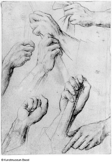
3-55 Hans Holbein the Elder, Study Sheet with Seven Hands, ca. 1502. Silverpoint on blue-gray prepared paper, 14.1 x 10.0 cm. Kupferstichkabinett, Basel.
Holbein drew Study Sheet with Seven Hands in preparation for painting scenes of the Passion in the high altar of the Kaisheim monastery (now Alte Pinakotheka, Munich). Discrepancies between the drawing and the corresponding hand in the painting would seem to prove that the rather cautiously rendered hands were not copied from the painting. And yet, in comparison with Pisanello’s Study for a Crucifix (figure 2-11), the balanced placement of the hands on the page seem to indicate that the purpose of Holbein’s drawing was to preserve the motifs for future reference by the shop rather to explore artistic ideas—a look that springs immediately from Pisanello’s page.
Hans Holbein the Younger (1497/98-1543) Whereas Hans Holbein the Elder made portrait drawings to create lifelike characters, his son Hans made his reputation as a genuine portrait painter. He obviously learned from his father how to capture a likeness. The silverpoint and red chalk Portrait of Jakob Meyer zum Hasen (figure 3-56) is one of his earliest portraits.
3-56 Hans Holbein the Younger, Portrait of Jakob Meyer zum Hasen, 1516. Silverpoint on white prepared paper, red chalk. 28.1 x 19.0 cm. Kupferstichkabinett, Basel.
Since the painting corresponds so closely to the drawing, young Holbein must have traced the drawing unto the ground of the panel. In the Meyer drawing Holbein paid more attention to the intimacies of the face, where the essential character traits reside, than to the hat and clothing. The sharpness of the lips and eyes make Jakob Meyer look more alive in the drawing than in the painting. Holbein increased the impression of vivid lifelikeness by subtly blending red chalk with the delicate modeling of the parallel silverpoint lines. In later portraits, he combined black, red, and other colored chalks to achieve effects even closer to the paintings he was preparing.
Holbein might have seen the colored chalk drawings of Jean Clouet when he journeyed to France in 1524. But the idea that the red chalk represents a natural color, rather than a choice of technique as, say, in the chalk drawings of Raphael is already present here in this 1516 portrait of Jakob Meyer.
Albrecht Dürer (1471‑1528) Albrecht Dürer, the greatest artist of the Northern Renaissance, had high regard for his own drawings, including the Self-Portrait (figure 3-57) he drew at age thirteen. He preserved hundreds of his drawings, and he signed, dated, and even annotated many of them in later years. In effect, he catalogued his own works and stored up his visual information in them. The inscription on his Self-Portrait reads, “This I drew of myself in a mirror the year 1484, when I was still a child.” He made the drawing before the start of his apprenticeship, when the influence of his father was still strong.

3-57 Albrecht Dürer, Self-Portrait, signed and dated 1484. Silverpoint, 27.5 x 19.6 cm. Albertina, Vienna.
Dürer’s father was a goldsmith who, according to his son, had trained with the great masters of the Netherlands. In other words, the father imparted to his son the tradition of Roger van der Weyden whose bust-length Portrait of a Woman (figure 2-25) is also in silverpoint. Dürer’s half-length Self-Portrait has the same precise contours but more helter-skelter, more freely expressed cross hatching. The eyes with overly emphatic lids like Rogier’s were added, unsuccessfully, without the aid of a mirror—as was the concealed hand that held the silver stylus. Faint preliminary contours around the hat, arm, and hand are still visible.
Dürer’s drawing may be the earliest isolated self-portrait ever made. On the one hand, copying oneself in a mirror is a reasonably straight forward exercise for a student; on the other, it indicates a precocious awareness of self, a concern he reinforced over the years in many more self-portraits. His long index finger somehow seems to point to himself in the mirror, that is, to the center of his art.

3-58 Albrecht Dürer, The Holy Family, 1492-93. Pen and black ink, 29.0 x 21.4 cm. Kupferstichkabinett, Berlin.
After his apprenticeship in Nuremberg with Michael Wolgemut, Dürer set out to discover the world—as well as himself. At the start of his Wanderjahre in 1492, he went to Colmar to study with the engraver Martin Schongauer (d. 1491), whose work he already admired. Dürer’s drawing, The Holy Family (figure 3-58), set out to rival Schongauer’s achievement (see figure 3-51). The drawing includes an idyllic landscape which recedes behind Mary and Joseph by means of the perspective of the row of trees and by the atmosphere (the thin pen lines creating diminished chiaroscuro). Dürer imitated Schongauer’s variety of pen strokes and variety of hatching in his own less elegant and more determined hand. However, the human intimacy evident in his rendering of the subject, as well as the sketchiness of many of its lines, Dürer owed to the Housebook Master, the first northern artist to exploit drypoint. Many of Dürer’s drawings in pen and ink, such as this, have a clarity of line and a completeness to them as though they could be transcribed by a burin onto a copper plate or by a knife onto a woodblock. The drawing in fact immediately precedes his engraving Holy Family with a Butterfly.
Only months after he returned to Nuremberg in 1494, Dürer traveled to Venice, the first of two trips he made to that city to discover the secrets of the Italian Renaissance. In Venice, Dürer copied in pen and ink Pollaiuolo’s active nudes (after his lost engraving The Rape of the Sabines) and Mantegna’s mythologies (including his engraving, Battle of the Sea Gods). He probably traced their contours, then modeled the figures with a free hand. They are thus rather faithful copies, except that he changed their straight-lined diagonal hatching into hatching that usually curves around forms. The change made the nudes bulkier, more statuesque. When the Venetian painter Jacopo de’ Barbari showed him nudes constructed with geometrical principals, Dürer began his lifelong study of human proportions—set down in numerous drawings.
On his second trip to Venice, Dürer learned to draw with a brush on blue prepared paper, a method common in Venice.

3-59 Albrecht Dürer, Head of an Angel, signed and dated 1506. Brush and black ink, heightened with white, on blue Venetian paper, 27.0 x 20.8 cm, Albertina, Vienna.
His Head of an Angel (figure 3-59) is a study for the angel who sits at Mary’s feet in his painting The Feast of the Rose Garlands, commissioned for the church of San Bartolomeo in Venice. At least 22 studies of figures, head, and hands for this painting still exists, many of them, such as the angel’s head, the same scale as the painting. He continued to use brush and ink on blue or green prepared paper for similar final studies for other paintings. With nearly the same care with which he employed a burin, Dürer fully modeled the angel’s head with meticulous brush strokes—in contrast to the sketchier, almost schematically placed areas of light and dark in Carpaccio’s head of a man (figure 3-30). Dürer’s fine, tapered lines describe subtle modulations of light and dark that reveal textures such as the silkiness of curly hair.

3-60 Albrecht Dürer, The Artist’s Mother, dated 1514. Charcoal, 42.1 x 30.3 cm. Kupferstichkabinett, Berlin.
Unlike his Italian contemporaries, Dürer made numerous portrait drawings, including The Artist’s Mother (figure 3-60). As we have seen, portrait drawings were common in the Netherlands and in Germany, but not in Italy, in the fifteenth century. Although Dürer no doubt surrendered many portrait drawings to the sitter, he preserved many of them for his own “gallery” of notable people. About 1503 he may have seen large charcoal heads by Grünewald. From then on, charcoal became his favorite medium for portraits. The boldness of charcoal suited the speed required for taking a likeness from life. The medium lent itself to working in a large format, alla prima or directly at one go, while concentrating on essentials.
He never exploited those characteristics of the medium more fully than in his mother’s portrait. The rough-textured lines of the charcoal describe perfectly the wrinkly cloth of her headpiece and the prominent sinews of her neck. Dürer sharpened the charcoal to render details around the eyes and the line of the mouth that expresses so much character. He lightly applied charcoal on her face for veins in her temple or for the rubbed modeling of the sunken flesh around her cheek bones. Dürer wrote on the drawing, “From life. This is Albrecht Dürer’s mother when she was 63 years old.” Two months later he added, “and she died in the year 1514, on Tuesday before Rogation week, about two hours before nightfall.” Her enlarged eyes already seem to face her future with fierce determination.
3-61 Albrecht Dürer, Two Studies of a Lion, 1521. Silverpoint on pinkish prepared paper, 12.2 x 17.1. Kupferstichkabinett, Berlin.
From mid 1520 to mid 1521, when Dürer was an internationally famous artist, he toured the Netherlands. He took with him a 7 ½ x 5 inch booklet that he filled with drawings of the people, places, and things (figure 3-61) that attracted his attention. Fifteen of the pink prepared sheets survive with drawings front and back in silverpoint. In the decades since his Self-Portrait (figure 3-39), he had used the medium infrequently. He took up silverpoint again because it was the appropriate tool for traveling and, perhaps, because silverpoint was still popular in the Netherlands. In Ghent, he saw a lion and rendered it from two different positions. He conveyed its majestic bearing through the flowing lines of its mane, which he modeled in large masses.
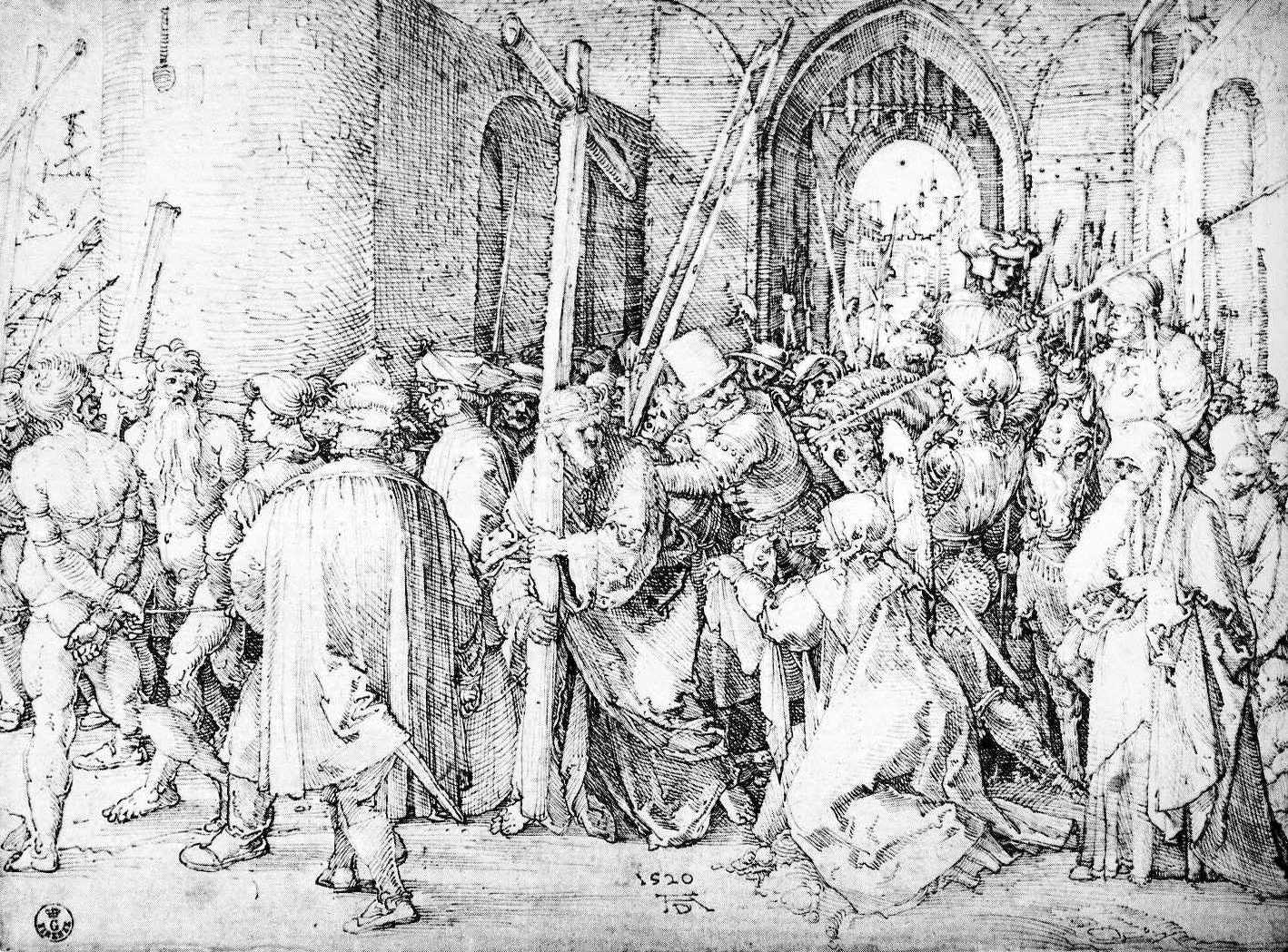
3-62 Albrecht Dürer, Christ Carrying the Cross, signed and dated 1520. Pen and black ink, 21.0 x 28.5 cm. Uffizi, Florence.
The pen, nevertheless, remained Dürer’s favorite instrument throughout his career. During his sojourn in the Netherlands, Dürer also worked on pen drawings for a new passion series to be executed in woodcuts. He made three drawings of Christ Carrying the Cross (figure 3-62), two of Christ on the Mount of Olives, and three of The Entombment—all of them in a rare horizontal format. Each of these drawings is a complete, fully rendered design, ready to be cut on a woodblock. There are no corrections on the pages, and no preliminary studies for them exist. Furthermore, each drawing in the passion series is an entirely different composition, not a development of, or variation on, an earlier one. A few sketchy compositional studies do exist for other works—for example, six pen sketches for a projected painting of the Virgin and Child enthroned with saints. Most of the six are bare outlines of the figures, yet with almost no pentimenti. Once again the six composition sketches differ considerably one from the other. In short, no drawing by Dürer shows the artist generating his ideas on paper. Only when he finished the design before him did he correct and alter it in a completely new drawing. Dürer explored his imagination through drawing very differently from Leonardo.
Christ Carrying the Cross is one of his most profound religious works. In this version, a solemn procession emerges from the city gate and wends its way to the hill of Golgotha behind the massive wall on the left. However, Dürer arranged the figures across the front plane of the sheet like a flat classical relief in poses that balance or answer each other. The naked thieves, in matching contrapposto, look back and stop the action on the left. Figures and architecture are thick and block-like, but glances cut diagonally across the composition, especially the glances between Christ, the henchman who pushes him, and Veronica. The thieves, the figure in the left foreground, Mary on the right, and the spear establish other visual diagonals that focus on Christ. For the most part, Dürer abandoned hatching that curves around forms and returned to the straight-line, evenly spaced diagonal hatching of Mantegna. Cross hatching is minimal in Dürer’s austere late style. Its clarity allows the viewer to join the people in the composition who quietly contemplate the suffering of Christ.