THE SOUTHERN AND NORTHERN NETHERLANDS
Peter Paul Rubens (1577‑1640) Soon after he became a master painter in Antwerp, Peter Paul Rubens spent eight years (1600-1608) in Italy, where he copied in drawings all that he could see of antique and Renaissance art. Many artists before him made copies to record the inventions of others and to absorb their style through the discipline of drawing, but never to the extent that Rubens copied. Before his sojourn in Italy, Rubens himself had faithfully copied (in pen and ink) engravings by Holbein, Goltzius, and several other northern artists. In Italy, it soon became Rubens’s life-long obsession to amass a paper museum, an anthology of classical art from ancient times and modern. For the rest of his life, he used his drawings as inspiration for his own art, or, as the seventeenth-century critic Roger de Piles put it, “to stir his blood and warm his genius.” His collection drove his art. He kept his drawings in a cantoor, a cabinet or closet, in his studio where his own students could learn from them and work from them as well. Probably in the late 1620s, Willem Paneels and some other pupils copied more than 500 of them, a collection now in State Museum in Copenhagen.
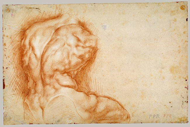
4-27 Peter Paul Rubens, Copy after the Belvedere Torso, verso, ca. 1601-02. Red chalk heightened with white, 39.5 x 26 cm. The Metropolitan Museum of Art, New York.
Rubens drew all the famous ancient sculpture then visible in Rome, including the Belvedere Torso (figure 4-27), the Farnese Hercules, and the Apollo Belvedere. We know of over two hundred drawn copies of statues, reliefs, busts, gems, cameos, and more. He often drew famous pieces several times, from as many as six different angles. For example, he made over a dozen drawings of the whole and parts of the Laöcoon seen from different angles, including some unlikely foreshortened views. Five or six of the original drawings of the group or its figures still exist. In short, he treated ancient statues like studio models who might be told to turn or strike a different pose for the master.
Rubens usually rendered Roman sculpture in black chalk, but for a back view of the Belvedere Torso he used red, a color that approximates the appearance of flesh. (A black chalk drawing of the front view of the Torso exists in Antwerp, Rubenshuis.) Like most of his copies of the antique, the drawing of the back seems highly finished and free of pentimenti, although the dark hatching around the torso would have obliterated any tentative preliminary lines. Rubens gave the nude torso a narrower waist and more knotted muscles than the original marble. But he deviated from the original mainly by modeling the back with delicate and softened hatching that mimics the subtler chiaroscuro of flesh rather than the harsh lights and darks of marble. His impulse to bring the statue to life also made him sketch a new head for the torso.

4-28 Peter Paul Rubens, Nude Youth Turning to the Right, after Michelangelo, ca. 1601-1602. Red chalk, 38.8 x 27.8 cm. British Museum, London.
In copying Renaissance art, Rubens favored artists working in the early decades of the sixteenth century: Polidoro da Caravaggio, Giulio Romano, and especially Raphael and Michelangelo. He normally used pen. Nevertheless, he made eight large, carefully rendered red and black chalk drawings of the prophets and sibyls of Michelangelo’s Sistine Chapel ceiling, as well as a red chalk copy of one of the ignudi, Nude Youth Turning to the Right (figure 4-28). As he did in his copies after the antique, Rubens carefully finished his rendition of Michelengelo’s nude. He obviously wanted the drawing to reflect the painting accurately for his own data base of Renaissance art. Yet here too he applied delicate modeling that gives greater definition to the muscles while imitating the texture of human flesh. Rubens copy looks more like the knotty anatomy of Michalangelo’s drawings than it does the flaccid flesh of the ignudo in the fresco. About thirty years later, Rubens made a counterproof of this drawing by rubbing the back of it, transferring the design to another sheet. He then reworked this pale image, now facing left, in a free manner with a brush. The reversed ignudo eventually became the figure of Bounty on Rubens’s Whitehall ceiling in London.
In addition to Rubens’s own copies of Renaissance art, he also purchased a much greater quantity of copies drawn by other artists to take with him to Antwerp, and he occasionally hired artists in Italy to copy work for him. Over the years he did not hesitate to retouch several hundred of these drawings, usually a little, sometimes a lot, to bring them into conformity with his own style and adapt them to his needs. He might apply opaque body color to obliterate lines and rework the whole, or he might paste on additional paper to extend a composition. Despite what we may think of his habit of changing another artist’s work, it underscores how essential these drawings were to his creativity.
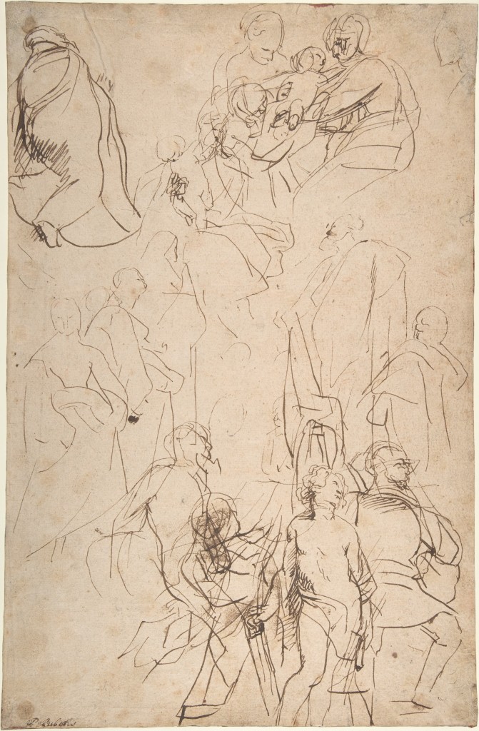
4-29 Peter Paul Rubens, The Virgin and Child Adored by Saints, late 1627-early 1628. Pen and brown ink, 39.5 x 26 cm. The Metropolitan Museum of Art, New York.
Of the contemporary Italian artists working in Rome, Rubens had the greatest respect for Annibale Carracci. He paid Annibale the compliment of imitating not only his style of drawing but also his design process. Annibale restored to drawing the essential creative role it had for Raphael: developing compositions through a series of drawings from primi pensieri to figure studies and modelli. For many years Rubens adopted the same procedure. On the reverse of the sheet on which he drew the Belvedere Torso (figure 4-27), twenty-six or twenty-seven years later Rubens made a quick sketch of his first ideas for the composition of his painting Virgin and Child Adored by Saints in Antwerp (figure 4-29). He rapidly blocked out the majority of figures in pen with simple, faint outlines and then began to adjust and darken the lines in the figures at top and bottom. Despite the vagueness of some figures and the reworking of others—the Madonna and Child appear twice—the massive figures display complex actions, and the emphatic spiraling design of the painting is evident from the beginning. Old Flemish inventories called such quick pen sketches crabbelingen, scratches or scribbles. As he did in this sketch, Rubens usually made his primi pensieri in the fluid medium of pen and ink, often enhanced with brush and wash.
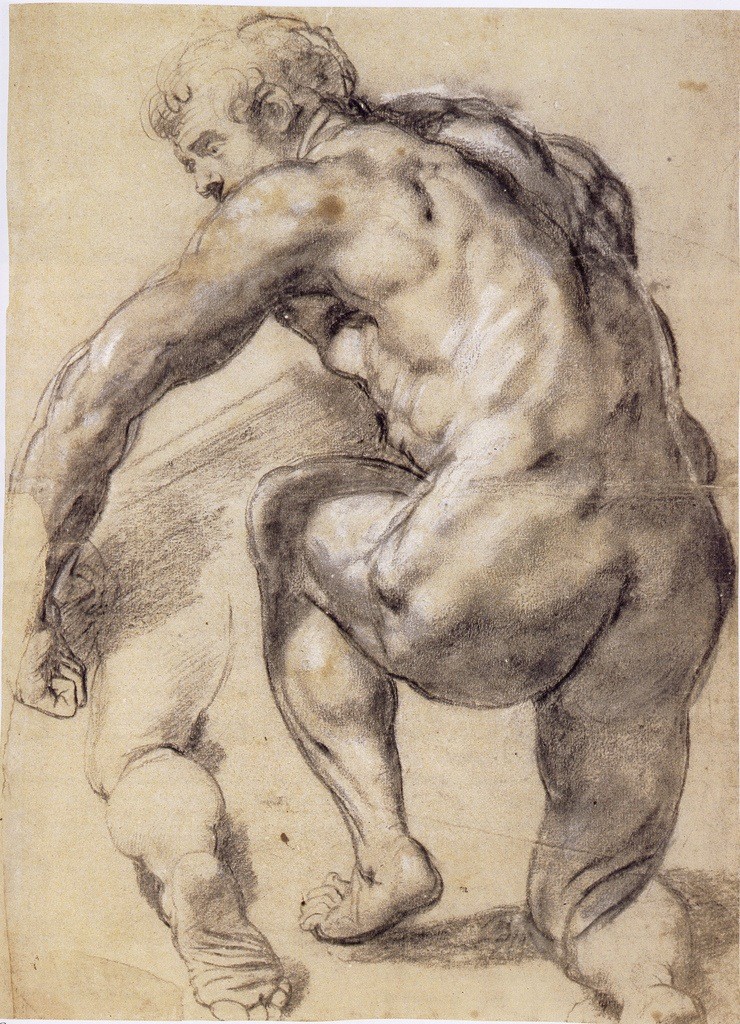
4-30 Peter Paul Rubens, Kneeling Male Nude Seen from Behind, ca. 1609-10. Black chalk heightened with white, 52 x 39 cm. The Museum Boijmans Van Beuningen, Rotterdam.
Once the composition had been resolved in a modello, Rubens, like Annibale, proceeded to draw studies of the model in black chalk to refine the pose, anatomy, and expression of the important figures. He made the study Kneeling Male Nude Seen from Behind (figure 4-30) to clarify one of the porters carrying treasure in the foreground of the painting Adoration of the Magi (Prado). Presumably, he used the services of a living model. Pentimenti around the periphery of the figure reveal how his eye searched for the exact contour that he then nailed down with a bolder line. He appears to have covered over an early contour on the far right with opaque white to give the man a thicker waist and a more powerful appearance. As Michelangelo had done in his Libyan Sibyl (fig 3-14), Rubens redrew the leg which extended beyond the sheet. On other sheets, he often studied only the hands, feet, or head of a model. Clearly, the proportions and knotted muscles of Kneeling Male Nude come straight from his copy of the Belvedere Torso. In drawing antique sculpture, Rubens converted marble into elastic flesh. When he drew the model, he gave him the proportions and physique of ancient sculpture. (He almost never employed a female model.)
Rubens wrote about this two-way transformation in a small treatise, De Imitatione Statuarum, “On the Imitation of Sculpture.” In it, he highly recommends that an artist imitate ancient sculpture because, in the present “degenerate” age, no one could find heroic models like those in antiquity. He has several reasons why a good model is nearly impossible to find. For one, the world is growing old, “decay’d and corrupted by a succession of so many ages, vices, and accidents.” (He believed that there was some truth in the fable of a Golden Age.) However, he concludes that “the chief reason why men of our age are different from the ancients, is sloth, and want of exercise.” Rubens goes on to extol the benefits of sweaty exercise with allusions to classical writers and with words that sound like an infomercial for a gym membership. Without adequate models, an artist must possess a thorough knowledge of antique statues, Rubens writes, so “that it may diffuse itself everywhere,” as it did when he studied the model in figure 4-30.
Nevertheless, when some artists imitate antique statues, they make their figures “crude, liny, stiff, and of harsh anatomy.” They “smell of the stone.” Instead of copying the great many outlines, the sharp breaks, and the gloss of stone, artists should imitate the soft, diaphanous nature of flesh and the flexibility of skin which can expand and contract, especially by observing the differences of light reflecting from stone and flesh. In short, Rubens carefully considered the nature of imitation and had well-thought-out reasons for making men like heroic statues and statues like living men.
Soon after his return from Italy, Rubens engaged a number of assistants who helped him turn out a larger and larger body of painted work. No doubt he brought his studies of the nude model like figure 4-29 to a fair degree of finish so that his assistants could use them to work up a painting. But by 1620, Rubens was making very few studies after the model, even though he began at that time to produce large series of paintings for the ceiling of the Jesuit church in Antwerp, for the life of Marie de’Medici, and for other projects. For example, only two or three rapid compositional sketches exist for the Medici series of twenty-two paintings. To save time, his assistants undoubtedly used Rubens’s enormous collection of drawings of classical and Renaissance figures and his own well-wrought, earlier studies of the model. However, in the 1630s, Rubens returned to a model when he drew nine or more large red and black chalk studies of the richly garmented figures in his Garden of Love, perhaps because of the unusual nature of the subject matter. The prominent zigzag hatching of these drawings is quite different from the blended modeling of his nude studies twenty years earlier.
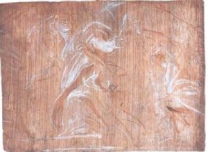
4-31 Peter Paul Rubens, St. Barbara Pursued by Her Father, 1620. Oil on Panel, 15 x 20.7 cm. Ashmolean Museum, Oxford.
As the number of figure studies and also compositional sketches on paper declined in the 1620s and 1630s, Rubens made more and more oil-sketches on wooden panels. He sketched St. Barbara Pursued by Her Father (figure 4-31) in 1620 or 1621 in preparation for one of the thirty-nine ceiling panels commissioned for the Jesuit church in Antwerp. This sketch, quickly drawn with a brush, using only two colors, possibly displays his first thoughts for the composition—at least no scribbly crabbelingen for it, like figure 4-29, survives. For many oil sketches, Rubens first roughed out the design in chalk on the streaky brownish undercoat, or imprimatura. In the St. Barbara sketch, a few pentimenti tell us that he was still uncertain about the placement of the arms. The two colors against the middle value of the imprimatura allowed Rubens to study the highlights and other light and dark contrasts on the figures. On a larger panel, he later made a full-color modello of the design (now in the Dulwich Picture Gallery, London), which Van Dyck and other assistants subsequently painted on the final panel.
Of the approximately 450 oil sketches by Rubens that survive, most of them seem to be modelli presented to the patron for his or her approval. Artists had produced modelli in oil paint for generations. But some of Rubens’s oil sketches, whether drawn by the brush with limited color, like figure 4-31, or painted in a number of colors, seem to be very early stages in the creative process, which other artists would normally have rendered in chalk or ink on paper. By sketching directly in oil, Rubens obviously cut short the number of steps leading to the finish work. Preliminary oil sketches indicate he was superbly confident in his drawing skills and power of invention.
Are they drawings? It is often impossible to tell merely from appearances the difference between his bozzetti in oil (first drafts or preliminary sketches) and his modelli in oil. Rubens and nearly everyone else in the early seventeenth century called all his oil sketches disegni (in Italian) or tekeningen (in Flemish), words that mean “drawings.” He himself once coined the term “disegno colorito”—a phrase that combines the Tuscan tradition of line with the Venetian tradition of color.
Rubens made several other types of drawings, including over forty title pages for books, many landscape motifs and animals, and numerous portraits. Rubens accepted requests for portraits with great reluctance, except from the aristocrats he courted as a diplomat. Their portrait heads were usually studies for painted portraits. He most often caught the heads of his family, including his seven- or eight-year old son Nicolaas (figure 4-32), for his own pleasure, not to start a painting. As Goltzius did in his portrait of Giovanni da Bologna (figure 2-29), Rubens enlivened the boy with red chalk for the face and contrasting black chalk for the hair—but without the showmanship of Goltzius’s change of pace from flashy hatching to intricate detail. Rubens’s intimate portrait of his son is, for the most part, loosely drawn except for the face where delicate strokes of chalk render the smooth skin of a child.

4-32 Peter Paul Rubens, Nicolaas Rubens Wearing a Red Felt Cap, ca. 1625-27. Red, black, and white chalk, 29.2 x 23.2 cm. Albertina, Vienna.
Anthony Van Dyck (1599-1641) Although trained by Hendrik van Balen, Anthony van Dyck so thoroughly assimilated Rubens’s style of drawing that experts today sometimes have trouble telling their drawings apart. Like Rubens, van Dyck learned by copying. In van Dyck’s case, he attempted to understand Rubens by reproducing the bulk of the older artist’s “Pocket-Book.” In his so-called Antwerp Sketchbook, the teen-age van Dyck copied figures from the “Pocket Book”—figures that Rubens had copied from Italian and German engravings and from some paintings by Titian or copies of paintings by Titian. Van Dyck’s Antwerp Sketchbook also contains pages about arithmetic, architecture, physiognomy, and other topics. Because of its clumsy style of drawing and deficient grasp of anatomy, some scholars have rejected the attribution to van Dyck, although many drawings exhibit mannerism peculiar to van Dyck’s later work. Van Dyck himself soon rejected the broad range of learned interests (arithmetic, architecture, . . .) that Rubens had pursued in his “Pocket Book” and in the rest of his art.
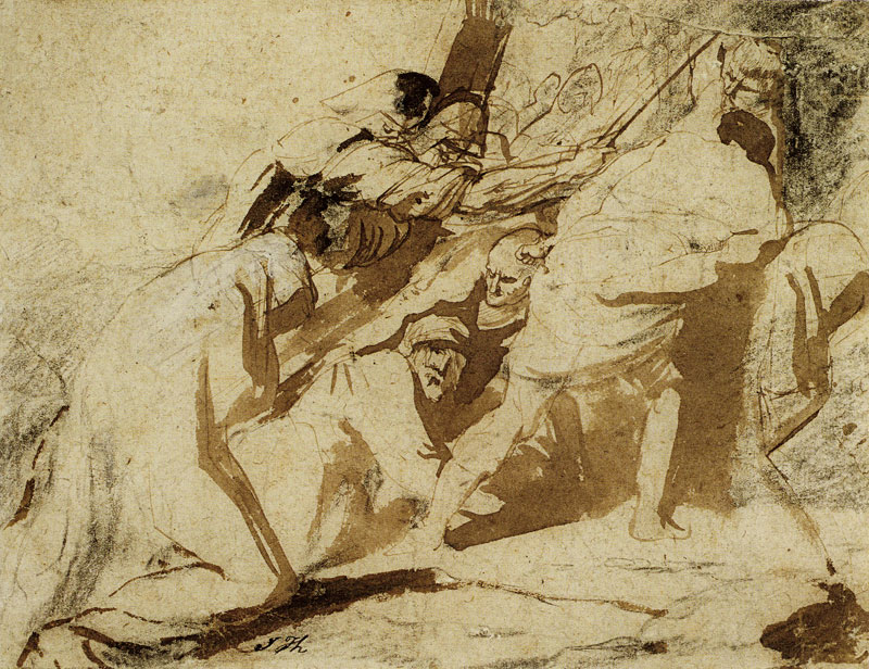
4-33 Anthony van Dyck, The Carrying of the Cross, ca. 1617-18. Black chalk with pen and brown ink and brown wash, some white bodycolor on the robe of the Virgin, 15.9 x 20.5 cm. Musée des Beaux-Arts (Wicar Collection), Lille.
By the age of nineteen, Anthony van Dyck, admired as “the best of his pupils,” had became Rubens’s chief assistant. While he worked alongside Rubens in his late teens and early twenties, he painted a number of religious compositions on his own. For each of these projects, including The Carrying of the Cross (figure 4-33), van Dyck dashed down a series of first ideas, experimenting in every sketch with new characters, new movements, and new lighting. These drawings are characterized by bold lines in brush or pen and by strong contrasts of light and dark. Seven compositional sketches for the painting The Taking of Christ exist, in addition to five sketches of figures. There are ten drawings for The Carrying of the Cross and six for The Crowning with Thorns. By repeatedly testing new possibilities, van Dyck fought to gain his own independence. He found his own way by working out intensely emotional interpretations of these religious subjects.
In The Carrying of the Cross, van Dyck reversed the direction of the procession toward Calvary from that of an earlier drawing in the series (at the Rhode Island School of Design). He made Christ’s head the focal point in the center of the sheet, while every line formed by most of the limbs and torsos thrusts up the hill along a diagonal to the right. The soldier’s powerful arm and the nude back of a man throwing his weight forward are especially emphatic movements. They all counter Christ’s glance up to his sorrowing mother in the opposite direction. As in other drawings in the series, van Dyck began the drawing with a preliminary sketch in black chalk, then vigorously worked up the sketch with swift strokes of a pen and a brush filled with dark brown ink made from gallnuts. (Rubens preferred ordinary bistre.) The patches of dark emphasize the flat planes of the figures, which are not modeled into solids by hatching, as Rubens might have done. Van Dyck had no time for small details like hands or feet or for correct proportions—even at this early date he tended to elongate limbs. He hunted only for the emotional drive of the lines and the drama of light and dark.
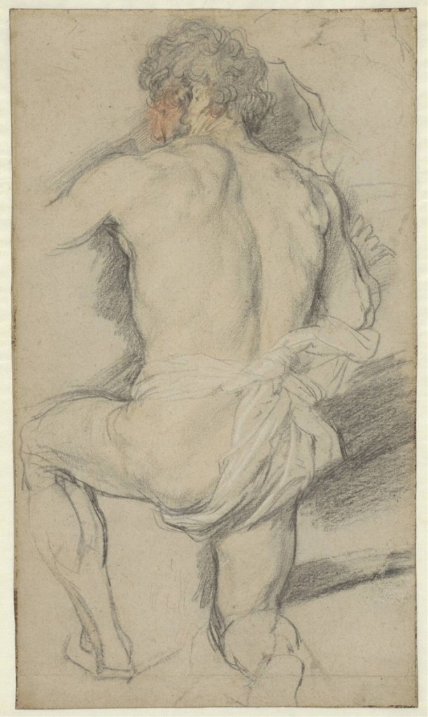
4-34 Anthony van Dyck, A Kneeling Man, Seen from Behind, 1618-21. Black, red, and yellow chalk, heightened with white. 46.3 x 27 cm. The Museum Boijmans Van Beuningen, Rotterdam.
It was van Dyck’s usual practice throughout his career to investigate further some of the individual figures in his preliminary pen studies with finished chalk studies from the model. He drew A Kneeling Man, Seen from Behind (figure 4-34) in preparation for a figure in the foreground of the painting, The Crowning with Thorns (formerly Berlin). Van Dyck must have seen Rubens’s similarly posed Kneeling Man (figure 4-30), but van Dyck took a different approach. In contrast to the dark modeling with white highlights by which Rubens exaggerated the model’s muscles and bulk, van Dyck concentrated on the contours of his figure. His modeling is light and the heightening is restricted to the loin cloth. (Another hand dabbed red and yellow chalk on the face.) Pentimenti on the right arm and left leg document his search for the appropriate lines. He repositioned the profile of the man’s face further to the left and, in the upper right of the sheet, he tried out other contours for the chest and shoulder of the man. As usual, hands and feet do not interest him. Whereas Rubens made his Kneeling Man a piece of living sculpture, van Dyck’s Kneeling Man has more normal proportions and seems closer to the model. Characteristically, his drawing is flatter relative to Rubens’s, and it avoids the allusion to antiquity that is so typical of Rubens.
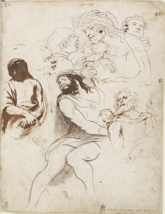
4-35 Anthony van Dyck, Copies after Titian and Annibale Carracci, Italian Sketchbook, folio 21r. Black chalk, traced over by later hand in black ink, 19.9 x 15.4 cm. The British Museum, London.
Only a few loose sheets have survived from van Dyck’s travels in Italy between the fall of 1621 and the fall of 1627. Yet he was careful to carry back with him to Antwerp the 122 pages of a sketchbook he worked on around the time that he visited Venice (August/September, 1622). His Italian Sketchbook, now in the British Museum, contains only four preparatory studies, only two copies after the antique (How different from Rubens!), several copies of Renaissance and contemporary masters, and an overwhelming number of copies after Venetian artists, especially Titian.
He copied these works very freely, sometimes adding notes about color, as an aide to remember how the Italian artists had posed and lit their figures. He grouped the drawings according to various categories, as in figure 4-35, one of two pages he covered with scenes of the passion of Christ by Giorgione, Annibale Carracci, and Titian.He selected and combined motifs from the Italian Sketchbook in subsequent paintings in Italy, Flanders, and England. By drawing after Titian in his sketchbook, van Dyck absorbed the Venetian artist into his blood. Years later, a glimpse at these sketches must have quickened his pulse.
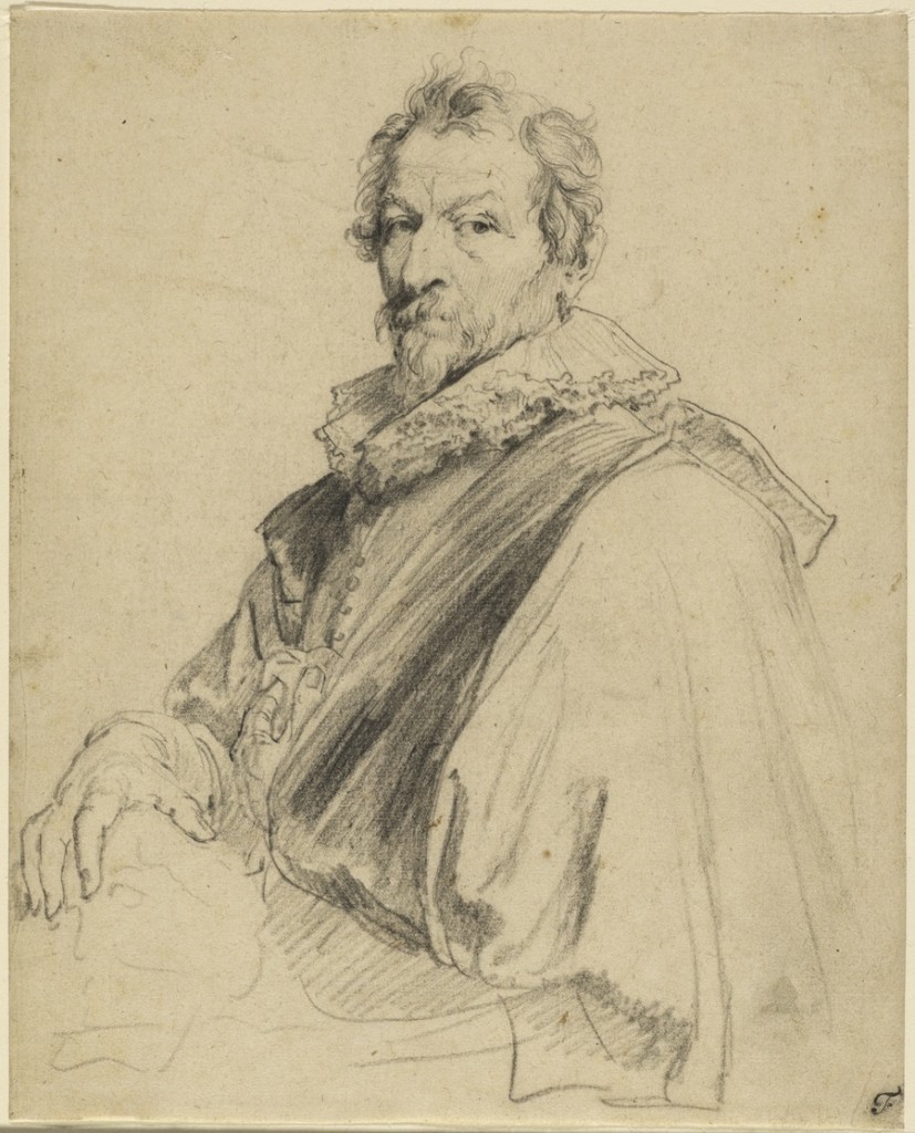
4-36 Anthony van Dyck, Hendrik van Balen, between 1627 and 1632. Black chalk, 24.3 x 19.8 cm. J. Paul Getty Museum, Malibu.
Van Dyck made his reputation as a portrait painter, and many portrait drawings by him still exist. Especially sensitive are the black chalk drawings of contemporary artists that van Dyck made for the print series The Iconography. In the portrait of his teacher, Hendrik van Balen (figure 4-36), van Dyck created a striking characterization of the man.
On top of the intense dark hatching on his jacket sit his wisps of unruly hair, his (probably gray) beard described with faint touches of chalk, his prominent bumpy nose and arched eyebrows, which frame one eye focused on his former student and another eye that wanders. For a change, van Dyck elaborated the refined and sensitive hands of the older artist.
Because of the demands on his time in England in the 1630s, he usually painted the head of a client directly on the canvas in the sitter’s presence, and then made workman-like chalk drawings for the costume and pose. Drawings such as the preparatory study James Stuart, 4th Duke of Lennox (figure 4-37) were used by studio assistants to work up the rest of the canvas.
One sitter recorded that “with his gray paper and black and white chalks, he drew the figure and clothes with a great flourish and exquisite taste for about a quarter of an hour.” The strong black chalk lines in figure 4-37 also record van Dyck’s hand darting about the sheet, imparting life to the Duke’s costume.
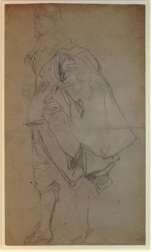
4-37 Anthony van Dyck, James Stuart, 4th Duke of Lennox, ca. 1633. Black chalk with white chalk highlights on light brown paper, 47.7 x 28 cm. The British Museum, London.
Jacob Jordaens (1593-1678) When Rubens died in 1640 and Van Dyck died in 1641, Jacob Jordaens was already running the most important studio in Antwerp, comparable in size to Rubens’s own facility. Jordaens employed six assistants and several apprentices in 1641. He had for many years adopted Rubens’s style of drawing and followed his creative procedures that depended on drawing.
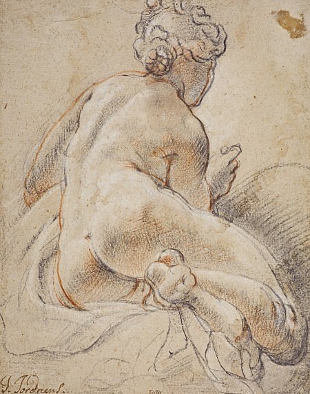
4-38 Jacob Jordaens, Female Nude Seen from the Back, ca. 1641. Black, red, and white chalk, 25.7 x 20.3 cm. National Gallery of Scotland, Edinburgh.
Most of Jordaens’s 400 to 500 extant drawings are compositional sketches and more-finished modelli. He also made chalk studies of heads full of character and chalk studies of the nude model from life, especially after 1640, when his studio assistants needed these designs to speed along productivity. Female Nude Seen from the Back (figure 4-38) is a study for a nymph milking Capricorn, one of the signs of the Zodiac, which decorated a ceiling in his own house. Jordaens liked to give nudes, the female nude in particular, large swinging curves that create robust, rounded forms. Especially in the nude’s thigh, we can see his curved lines expanding the nude’s bulk as he coped with foreshortening a figure seen from below. The red contours he drew on top of the black chalk correspond to the lines in the painting. Also, he modeled her back, legs, and arms in a blend of red and black chalk, highlighted with white chalk. The combination of three chalks, usually reserved for portraits, has here a striking painterly effect.
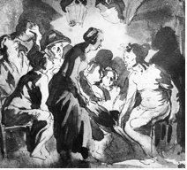
4-39 Jacob Jordaens, The Peasant Family and the Satyr, ca. 1620. Pen and brown ink, brush and brown ink, 15.8 x 17.8 cm. Crocker Art Museum, Sacramento.
From the start, Jordaens drew compositional sketches in pen and ink and wash, usually over a preliminary chalk sketch. In the 1620s, he fell sway to Caravaggio and his followers more than Rubens ever did. In Satyr and Peasants (figure 4-39), figures seen from a low point of view fill up the foreground. The lantern above them makes patches of bright light and deep dark, which the artist set down with a broad brush loaded with dark ink over broken, spontaneous contour lines in pen.
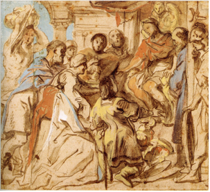
4-40 Jacob Jordaens, The Continence of Scipio, after 1636. Brush and brown wash, body color, 22.0 x 24.2 cm. The Museum Boijmans van Beuningen, Rotterdam.
A later drawing, The Continence of Scipio (figure 4-40), illustrates a common characteristic of his compositional drawings of the 1630s and 1640s: the application of watercolor or gouache (body color) to the ink drawing. The coloring obviously aided his assistants as they roughed out the design on a canvas. Jordaens based the composition of The Continence of Scipio on a lost painting by Ruben, as it appeared in an engraving. The drapery breaks in angular folds, a characteristic of Jordaens’s late drawings.
THE NORTHERN NETHERLANDS
In the seventeenth century, most Dutch artists specialized in a certain subjects, both in their painting and in their drawing. For example, Hendrik Averkamp, famous for his paintings of winter scenes, also made drawings of the frozen canals and rivers of Holland, as well as lots of figure drawings of ordinary people. Paulus Potter and Albert Cuyp in their paintings and in their drawings focused on animals. Landscapists, of course, specialized in drawings of nature, but Nicolaes Berchem and many others also made sketches of shepherds and peasants—drawings they could use again and again, sometimes reversed, to staff a hillside. Similarly, the genre painter Adrian van Ostade sketched figures to equip his tavern scenes. Balthasar van der Ast and other still life painters made precise drawings in watercolor and gouache of shells, flowers, birds, or insects. The marine painters, Willem van de Velde and his son, traveling with the Dutch and British navies, executed innumerable sketches of ships—from harbor scows to majestic warships. Pieter Saenredam, famous for his architectural interiors, usually started a painting with a freehand drawing of the site. Later, in the studio, he worked out a measured rendition of the same view with straightedge and compass. Some important Dutch artists may have drawn very little. There are no drawings by Frans Hals or Jan Vermeer.
The majority of Dutch artists produced paintings for the open market, instead of on commission. So too some Dutch artists made drawings for the purpose of selling them to potential buyers. These were drawings not connected to the production of a painting and not part of the work-related stock of drawings kept in the studio. Collectors might place their drawings in an album or frame one of them and hang it on the wall. Averkamp, Adrien van Ostade, Cornelis Dusart, and several other Dutch artists often tinted their finished drawings with watercolor, probably to make them more saleable.
Perhaps more than other types of drawing, landscape drawing in the early seventeenth century contributed prominently to the development of the realistic character of Dutch art. Dutch landscape artists demonstrably based their imitation of reality on the close contact with nature made possible through drawing. They traveled the countryside, making sketches of the distinctive ambling rivers, small forests, flat fields, and wavy dunes of Holland. The direct observation of nature, which drawing allowed, fostered a realistic approach in Dutch art for years to come.
At the turn of the century, Hendrick Goltzius, who normally produced fantastic mountain vistas derived from Bruegel’s Alpine prints, marked the start of something new with several realistic studies of trees, in brush and gouache, and two panoramas of Haarlem, in pen and ink. They are still bird’s eye views, but their long flat horizon line captures the essential nature of The Netherlands. Soon Claes Jansz. Visscher in Amsterdam and then Esaias van de Velde in Haarlem turned their back on the artificial conventions of landscape that dominated the sixteenth century and led the way toward naturalism in their drawings. They were influenced by fourteen engravings made after drawings by the Master of the Small Landscapes, published by Hieronymous Cock in 1559.
In 1612, Visscher published etched copies of these simple village scenes, attributing the designs to Bruegel. In the previous decade, Visscher was one of the first landscape artists in the northern Netherlands to make sketches from life, and in 1611 published an influential series of twelve etchings of views near Haarlem in the same style.
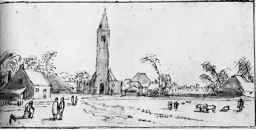
4-41 Esaias van de Velde, Spaarnewoude, ca. 1615. Pen, brown ink, and wash over traces of black chalk, 8.7 x 17.8 cm. Rijksmuseum, Amsterdam.
Esaias van de Velde (ca. 1591-1630) Esaias van de Velde’s drawing Spaarnewoude (figure 4-41), from the same period, illustrates the shocking freshness of simple and direct confrontation (quite different from Annibale Carracci’s carefully arranged landscape—figure 4-7). As in so many Dutch landscapes, a road leading into the picture space invites the viewer to accompany van de Velde’s three travelers on a walk. The foreground space—a continuation of the observer’s space—lies completely open. In the drawing no coulisses artificially frame the scene; no alternating bands of light and dark set up a contrived rhythm. The village lies nearly parallel to the picture plane—the house on the left affords another diagonal toward the focal point of the church door. The sky is featureless, but a light wash on the buildings indicates late afternoon sunlight. Van de Velde’s shorthand notation of rapid and abbreviated pen strokes is evidence that the artist sketched the scene from life. Spaarnewoude is the only preparatory study left for his etchings, Series of Ten Landscapes, published around 1615-16.
Jan van Goyen (1596-1656) In his earliest years, the prolific landscape painter Jan van Goyen imitated the pen and ink landscape style of his teacher, Esaias van de Velde. However, in 1628 he took up black chalk as his only drawing tool and soon developed a personal style that he maintained for nearly thirty years of avid drawing activity. Now and again, he stopped painting and started traveling. Some years he did almost nothing but draw; other years he did almost nothing but paint. He seems to have needed direct contact with nature through drawing to stimulate his imagination. Motifs from a drawing campaign one year would turn up in his paintings and in his finished drawings in subsequent years.
Among his more than one thousand drawings, five sketchbooks, which van Goyen certainly carried with him as he traveled, still survive. Two of them remain in their original condition; the others can be assembled from scattered drawings. A typical sketchbook held between 100 and 200 drawings, produced over two or more campaigns. Van Goyen may have known that Esaias van de Velde, after he moved to The Hague in 1618, had compiled sketchbooks of chalk drawings. Dry chalk, perfect for travel, affords the landscapist a more rapid, more pliable, more nuanced, more atmospheric medium than ink.

4-42 Jan van Goyen, House with Outbuildings and Trees on the Right Bank. Black chalk, 13 x 19 cm. Staatlichen Kunstsammlungen, Dresden.
House with Outbuildings and Trees on the Right Bank (figure 4-42), from the sketchbook in Dresden, is a typical example of the kind of brief notations he made on his travels. It appears that he only wanted to capture the motif of a farmhouse framed by trees, whose fluid lines are echoed in the wavy lines of the house as though both were one organic growth. Most sketchbook drawings are equally hasty, fluid, figureless, and simple, though observed with an experienced and keen eye. Back in his studio, he used House with Outbuildings and Trees as the basis of a more finished drawing.
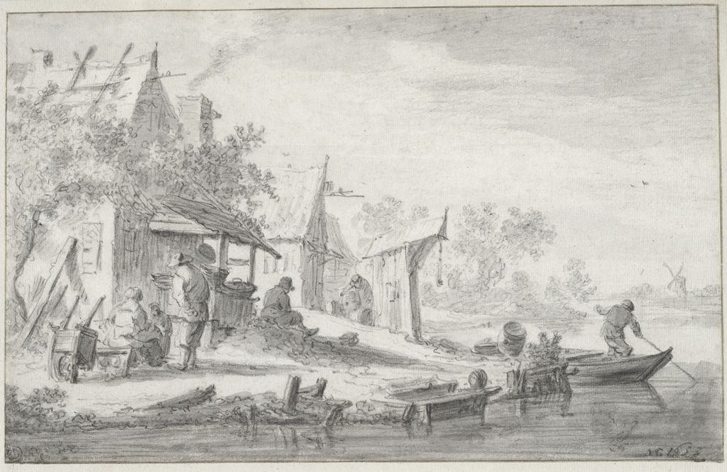
4-43 Jan van Goyen, A River Landscape, 1653. Black chalk and gray wash, framing lines in brown ink, 16.8 x 26.8 cm. Fogg Art Museum, Cambridge.
Van Goyen created many of his chalk drawings as self-sufficient artworks that he sold in a series, introduced in some cases by a titlepage. A River Landscape (figure 4-43) must have once belonged to such a series. The drawing still preserves its framing lines even though the margins were cut away by a collector. Like the vast majority of his finished chalk drawings, van Goyen signed A River Landscape with his initials VG and the date, In 1653, his most prolific year as a draftsman, he produced about 250 drawings.
A River Landscape depicts a ramshackle group of buildings that slope toward the riverbank. A half dozen people busy themselves along the river’s edge. Van Goyen tended to include genre motifs in his drawings more than most Dutch landscape artists did. Some of his early drawings consist mostly of relatively large-scale, stiff figures in outdoor folk festivals and market scenes, surrounded by a minimum of landscape.
Even in a late finished drawing such as A River Landscape, van Goyen handled chalk with a loose touch. He reproduced foliage with a flurry of lobes that tumble over one another as they explode upward. Long diagonal lines, punctuated with alternating bands of light and dark, lead the eye toward pale gray horizon on the right. He started adding wash to his drawings six years earlier, in 1647. Wash configures clouds in the sky, and streaks of wash in the foreground suggests that a light breeze has ruffled the surface.
Jacob van Ruisdael (1628/29-1682) The great landscape painter Jacob van Ruisdael had a variety of interests as a draftsman: woods, windmills, watermills, ruins, bridges, and more. Out of this mix in his 130 extant drawings, two distinctive kinds of drawings stand out. One group consists of about thirty large, elaborate drawings intended for sale. He usually began his finished drawings in black chalk, then brought out the foreground elements in pen, brush, and gray wash. As indications that they were made for sale, two of them are on parchment and several he tinted with watercolor.

4-44 Jacob van Ruisdael, Trees at the Edge of the River, ca. 1655. Black chalk, 14.5 x 19.1 cm. National Gallery of Art, Washington, D.C.
The other group consists of thirty small, quick studies of nature in black chalk, such as Trees at the Edge of the River (figure 4-44). None of his sketches were, strictly speaking, preparatory drawings for paintings or etchings. Nevertheless, many of them supplied the artist with motifs found in later work. Ruisdael may or may not have sketched Trees at the Edge of the River from nature. He was certainly capable of reproducing trees, water, and sky in convincing compositions from his imagination. Ruisdael’s diagonally receding riverbank resembles the design of numerous river scenes by Van Goyen. However, Ruisdael had much less interest in genre and reduced the man-made to one small boat. What attracted Ruisdael was the thick, old oak tree clinging to the eroding riverbank, its dark lines silhouetted against the sky. He drew the limbs of this kind of tree with strong, short, flattened curves. The joints connecting the short curved lines form knobs along the gnarled old branches. He used an equally harsh zigzag line as a shorthand for foliage. His manner imparted to the tree in this drawing a heroic character.
Cornelis Poelenburch (ca. 1586-1667) A number of Dutch landscape artists in the seventeenth century traveled as young men to Rome where they stayed for an extended period of study. Even after they returned to Holland, these artists specialized in painting the rolling hills, ancient ruins, and rural life around the eternal city, based on the drawings they made while in Italy. Cornelis Poelenburch was one of the first of these artists to arrive in Italy (in 1617), and he seems to have been the first to develop a style of drawing appropriate for the light and atmosphere of the south. As we have seen, Claude Lorraine and Nicolas Poussin were aware of the work of Poelenburch and his compatriot Bartolomeus Breenberg.

4-45 Cornelis Poelenburch, Interior of a Ruin with Figures, ca. 1621-23. Pen and brown ink, brush and brown and gray ink, traces of black chalk, 42.7 x 38.5 cm. Rijksmuseum, Rijksprentenkabinet, Amsterdam.
As evident in Interior of A Ruin with Figures (figure 4-45), the style is characterized by extensive use of brush and wash, which fashioned a landscape by means of a few stark, and also many subtle, contrasts of light and dark. Areas of the sheet left blank become by contrast bright Italian sunlight. In this relatively dark drawing, a small-scale figure, dressed incongruously in classical garments, approaches what appears to be the mouth of a cave, but must in reality be a massive Roman arch, perhaps on the Palatine. Poelenburch touched the drawing here and there with pen to detail some foliage and rocks. The shadows and patches of light that ripple over the stones lend a curious aura to the scene. Unfortunately, a later hand added some distracting gray wash in the lower left. The crease that runs down the middle of the large sheet of paper indicates that Poelenbruch folded it for easy transport outdoors. At the same time that Bartolommeo Manfredi sparked a renewed interest in Caravaggio’s style, a Dutch artist in Italy demonstrated how to see nature in terms of light and dark, rather than lines.
Rembrandt (1606-1669) When Rembrandt got into financial trouble in 1656 and had to auction the contents of his house and studio, an inventory was made. The inventory listed twenty-four books of drawings and two parcels of sketches, which he kept in the cupboards of his studio. Most of the drawings were systematically arranged between the blank pages of books according to subject: figure sketches, landscapes and views, nude men and women, animals, and one described as “A book bound in black leather with the best sketches by Rembrandt.” Just as he arranged the drawings in his collection according to topics, so too he seems to have pursued drawing over the years according to certain themes—themes which today allow us to trace the development of his draftsmanship.
Despite his early success as a portrait painter, Rembrandt made only a few portrait drawings that were sold or given to others. He also made surprisingly few compositional studies or even preliminary studies of single figures and groups that were later incorporated into his paintings or etchings. Both in function and in style Rembrandt’s drawings were a far cry from drawings such as Annibale Carracci’s An Angel Playing the Violin (figure 4-2).
Most often, Rembrandt designed the preliminary composition on the panel or canvas itself. The relatively few studies that relate to paintings or etchings were usually variants of figures or groups, made while he worked on the plate or canvas. Unlike Rubens, he never prepared a painting or etching with numerous drawings as Italian artists in the Renaissance and Baroque had done. Also unlike Rubens, Rembrandt did not fill his drawing collection with copies of classical sculpture and Renaissance art. Although he owned many reproductive engravings, his inventory listed only one “packet of drawings from the antique by Rembrandt.” Instead of preparatory studies, Rembrandt constantly drew the life around him, stimulating his imagination for biblical and historical characters with spontaneous and fresh drawings.
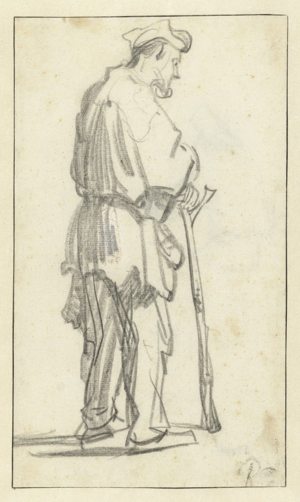
4-46 Rembrandt, Man Standing with a Stick, ca. 1628-29. Black chalk, brush in white, 29.0 x 17.0 cm. Rijksmuseum, Rijksprentenkabinet, Amsterdam.
At the start of his career in Leiden, about 1627, he began a series of drawings featuring poor people—the first three sketched in red chalk, then about a year later, six more in black chalk. Man Standing with a Stick (figure 4-46) belongs to the second group. He drew the men presumably from life, but he also had in mind Jacques Callot’s twenty-five etchings of beggars, Les Gueux (1623), in which Rembrandt could have seen plenty of long, vertical hatch marks. More concerned with capturing the image than with keeping the chalk sharp, Rembrandt used a rather blunt piece of chalk—except for the darkest lines on the legs. And the relatively large sheet of paper allowed his arm to gesture freely up and down the surface. As did many other artists, Rembrandt usually began a drawing with a faint preliminary sketch, then he strengthened and adjusted it with darker lines. In this and many other drawing, Rembrandt did not so much adjust lines to refine a beautiful contour. Instead, he built the image predominantly with lines that are like hatching lines. He obviously defined solids primarily by the contrast of light and dark rather than by outlines. The darkest lines on the back of the man’s legs represent chiaroscuro rather than his final decision about a contour.

4-47 Rembrandt, Old Man Seated in an Armchair, 1630-31. Red and black chalk, 22.6 x 15.7. Staatliche Museen Preussischer Kulturbesitz, Kupferstichkabinett, Berlin.
In his last years in Leiden, 1629‑31, Rembrandt did another group of drawings in the same media, red and black chalk. For the mostly red chalk drawing Old Man Seated in an Arm Chair (figure 4-47) and other drawings in the series, he used the same model with his full beard, balding head, and wispy hair.
Rembrandt as usual began with a faint sketch of light lines, then fully filled in the clothing and the large cast shadow behind the man with a broad, diagonal application of chalk of middle value, and finally added the darkest and most powerful lines. They illustrate the freedom in drawing that young Rembrandt had already acquired as well as the strength of the gestures he used in drawing. Sunlight strikes the old man’s clasped hands and bald head, and dark shadows hide his eyes which seem lost in contemplation. In contrast to the rough and vigorous application of chalk, Rembrandt rendered the features of the head with some delicacy. The combination of significant details with bold gestures in chalk or ink characterizes almost all Rembrandt’s drawings.
In subsequent years Rembrandt adapted several of the drawings from these two series for figures in his paintings or etchings. Real people became for him the biblical characters. Life experience stimulated his imagination.
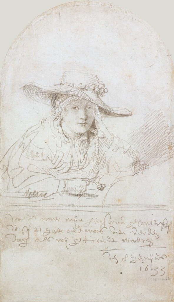
4-48 Rembrandt, Portrait of Saskia van Uylenburgh, 1633. Silverpoint on parchment, 18.5 x 10.7 cm. Staatliche Museen Preussischer Kulturbesitz, Kupferstichkabinett, Berlin.
Shortly after he moved to Amsterdam, Rembrandt married Saskia van Uylenburgh,. To celebrate their betrothal, he made a silverpoint portrait of her (figure 4-48). She wears a straw hat with a large brim and holds a flower in her hand. She is dressed as a shepherdess, perhaps an allusion to pastoral love poetry. Silverpoint had all but disappeared as a drawing medium by this time. Rembrandt’s use of it and the expensive sheet of parchment gave Saskia’s portrait an air of something traditional or even old-fashioned. The delicacy of the silverpoint attests to her charm and to the happiness that Rembrandt found in the idea of marrying Saskia. Even in the sketchy lines of her arms and shoulders, Rembrandt’s touch is sure and certain. Soft shadows caused by the hat veil her eyes.
About the same time, Rembrandt rendered his own features (figure 4-49) in pen and ink and brush and wash. In Amsterdam, he preferred to use pen or brush and picked up chalk less frequently. As a young man, in a series of etched self-portraits, he made faces in the mirror to study how to render emotional expression.
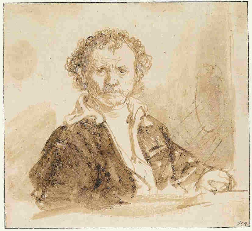
4-49 Rembrandt, Self-portrait as an Artist, ca. 1633. Pen and ink, brown and white wash, 12.3 x 13.7 cm. Staatliche Museen Preussischer Kulturbesitz, Kupferstichkabinett, Berlin.
Throughout his career, in many of his painted self-portraits, he dressed up and assumed a role, but the small number of self-portraits that he drew in pen or brush seem more straight forward and probably describe more closely what he looked like as a working artist. His open shirt, wrinkled forehead, and the palette hanging on the wall tell us that he is professionally engaged. Yet if he were copying his image in a mirror, his blurred, active right hand would be on our right, not on the left, as an ordinary observer would see it. In other words, he reversed what he saw, as he often did while etching. In the drawing, Rembrandt applied dark wash to his jacket as though he were using strokes of paint but covered the rear wall with transparent washes of very diluted ink. He very likely delineated his facial features, hair, and open shirt with the tip of a pointed brush.
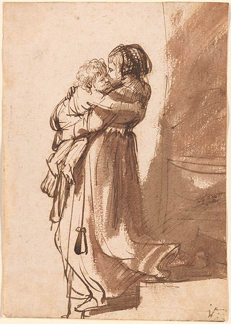
4-50 Rembrandt, Woman with a Child Descending a Staircase, mid 1630s. Pen and wash, 18.7 x 13.2 cm. The Pierpont Morgan Library, New York.
Shortly after Rembrandt’s death, an artist-collector had in his possession a portfolio of 135 drawings representing the “Life of Women,” mostly scenes of mothers, grandmothers, and servants caring for children. The subject clearly interested Rembrandt even though the inventory of 1656 did not list it as a category. The drawing A Woman Descending Stairs with a Child (figure 4-50) was probably in that posthumous portfolio and possibly among Rembrandt’s “best sketches” in the earlier inventory. The woman is not Saskia because her first three children died soon after they were born, and Titus, who survived her, was born eight months before she died of tuberculosis.
For these drawings of women Rembrandt employed mostly pen and ink, and also brush and wash. The flexible quill pen allowed him to capture the constant movement and bustle of women and children around the house. No one could have posed descending stairs while carrying a child, nevertheless Rembrandt’s rapid strokes express the spontaneous movement perfectly. Several final emphatic lines—the bend of a knee, the flip of the skirt up the stairs—tell it all. The figures stand out against the light made stronger by the brown wash on the right.
Drawings of woman’s life appeared mostly in the late 1630s and early 1640s, then petered out. The remarkable drawing, A Young Woman Sleeping (Hendrickje Stoffles) (figure 4-51) is a late addition to the series.
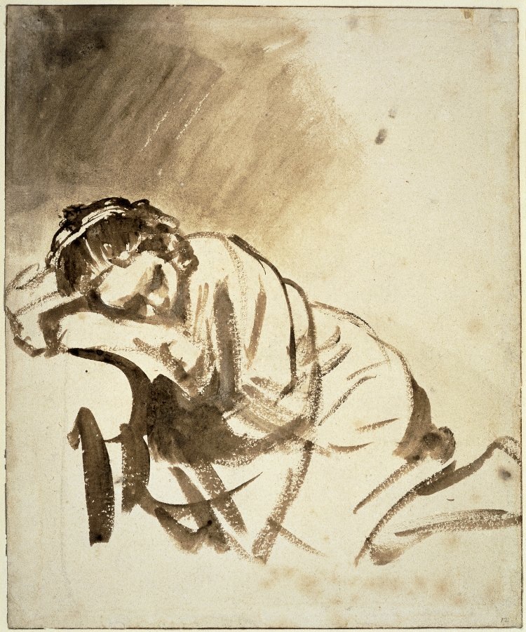
4-51 Rembrandt, A Young Woman Sleeping (Hendrickje Stoffels), ca. 1654. Brush and wash, 24.6 x 20.3 cm. The British Museum, London.
Hendrickje’s bare leg suggests that she had been modeling in her husband’s studio and, wrapping herself in a blanket, fell asleep from the boredom of posing. At that moment, Rembrandt grabbed a brush to capture her new pose. With broad, short strokes of scumbled ink, his brush slashed the sheet like a sword. No matter the speed, every slash hit its mark sure and true. A large patch of gradually darkening wash, brushed diagonally toward her, hovers over her head like the weight of sleep itself.
During the 1640s and early 1650s Rembrandt took long walks into the countryside surrounding Amsterdam and recorded in hundreds of drawings the farmhouses, waterways, and flat horizons of Holland. In short, he took up the Dutch tradition, popularized earlier in the century by Claes Jansz. Visscher and Esaias van de Velde, of illustrating the pleasant places and picturesque spots that city dwellers could visit on walks outside their city.

4-52 Rembrandt, The River Amstel at Kostverloren, late 1640s. Pen and wash, 13.6 x 24.7 cm. Chatsworth.
In The River Amstel at Kostverloren (figure 4-52), the lavish manor house Kostverloren (“a waste of money”) hides behind the trees. Two riders travel the towpath that ran along the river from Amsterdam to the house six kilometers away. Rembrandt whited out the two horizontal lines of the embankment in the middle foreground so that the perspective would sweep more emphatically from the darkness on the right to the distant horizon, which he indicated by only a few dots and dashes. At some point he attached a strip of paper on the right to add room for a clump of darker, taller trees. The billowing outlines of the trees, overlapping one another as they retreat into the distance, suggest a breeze in that direction. With a few strokes of the pen and some light wash he created extensive space and a bright light diffused throughout the sky. Rembrandt’s landscapes almost never show clouds. Whether he finished the landscape on the spot or in the studio, the vibrant touch of his pen gives the impression that he actually experienced the scene.
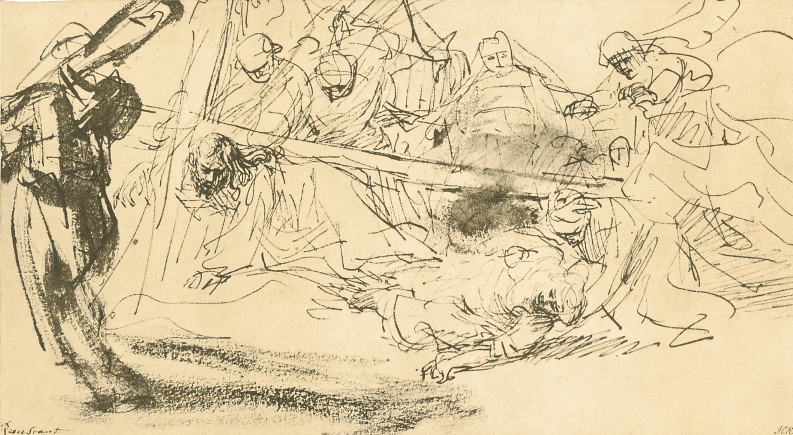
4-53 Rembrandt, Christ Carrying the Cross, mid 1630s. Pen and wash, 14.5 x 26.0 cm. Staatliche Museen Preussischer Kulturbesitz, Kupferstichkabinett, Berlin.
The majority of Rembrandt’s drawings, which the inventory listed simply as sketches, depict figures or scenes from the Bible. Rembrandt drew one of them, Christ Carrying Cross (figure 4-53), during the 1630s, his most Baroque period. With a frenzy of pen lines he roughly suggested Christ groveling on his knees, Mary collapsing on the ground, John lurching forward to assist her, a holy woman racing to their aid, and another woman falling backwards. A smudge of wash behind the stem of the cross established a dark center around which all the activity swirls. With a few swift strokes of a broad dry brush, he darkened the form of Simon of Cyrene, who carries an oar and a pail, to push the main group back in space. Thick or thin, his lines express movement and emotion more than they build solid bodies. Superficially, Rembrandt’s excited pen lines resemble Guercino’s penwork of fifteen years earlier (figure 4-9), but Guercino’s pentimenti and arabesques do not really construct emotion and drama as Rembrandt’s lines do.

4-54 Rembrandt, The Mocking of Christ: Matthew 27:27-29, 1650/53. Pen and ink, 15.6 x 21.7 cm. The Pierpont Morgan Library, New York.
Some years later, Rembrandt rendered another scene from the passion, The Mocking of Christ (figure 4-54), this time with exceptional calm and classic equilibrium. For example, the hefty pillar on the right, at which Christ was disrobed and scourged, balances the two standing figures on the left. Christ and the two soldiers in effect mirror one another. The essential lines of the design are almost all horizontals and verticals; and forms have a block-like stability. Although Rembrandt used a small amount of hatching, he projected three-dimensional space chiefly by thickening and darkening the lines of the foreground figures. The scene of mocking, which often in the past had a carnival atmosphere, has become static and quiet, a time for reflection.

4-55 Rembrandt, Hendrickje Stoffels Seated in a Window,
ca. 1655. Pen and wash, 16.2 x 17.4 cm. Nationalmuseum, Stockholm.
In the late 1640s and throughout the 1650s, Rembrandt often picked up a reed pen instead of a quill. The broad, short, jagged lines in Hendrickje Stoffels Seated in a Window (figure 4-55) betray the use of a reed. Since a reed pen holds little ink, the centers of its broad lines often run dry, as in the outline of Hendrickje’s arm. No one will ever know why Rembrandt switched from a quill. Perhaps he liked the resistance that a reed pen offered: it hindered beautifying a drawing with calligraphic flourishes. Or perhaps he felt that a reed pen could imitate the marks of a paint brush. Many of his drawings, including this one, resemble his brushstrokes on canvas. Despite the differences between the drawings of an old man (figure 4-47) and Hendrickje’s portrait thirty years later, Rembrandt was still attracted to someone sitting in the light, dreaming.

4-56 Rembrandt, Seated Female Nude, ca. 1660. Pen and ink, brown and white wash, 21.1 x 17.4 cm. The Art Institute, Chicago.
Seated Female Nude (figure 4-56) and a number of other drawings evidence that Rembrandt, at various times, drew from the nude model, male or female. Using the same kind of pen, brush, and ink, his students studied the model with him—although from different angles—and made drawings markedly similar in style. In their drawings, they also employed a scratchy pen line and liberally applied transparent wash in the area around the figure. But in Seated Female Nude, Rembrandt’s contours are even more indeterminate than his pupils’. In places like her hip and legs, they are perhaps as tentative and suggestive as the lines of his early Man Standing with a Stick (figure 4-46). What distinguishes Rembrandt’s drawing in this and in so many other cases is the subtlety of the light. His washes are expressive and suggestive, rather than descriptive of a value observed in nature. For example, the wash darkens behind her back to set up a strong contrast with her white-washed body so that it gleams with light. In the large area on the right, he applied wash so sparingly that the space becomes transparent and seems to glow from within. The strokes made by the brush, like rays of light, point to the woman who slumps in the glorious atmosphere. His washes have little to do with the realism of cast shadows or modeling.
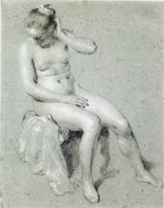
4-57 Jacob Backer, Seated Female Nude, ca. 1650. Black and white chalk on blue paper, 28.8 x 22.8 cm. The Maida and George Abrams Collection, Fogg Art Museum, Cambridge. [not in scale]
A portrait and history painter with classical tendencies, Backer drew only studies of the model, almost all of them single figures, either nude or clothed. As in all his drawings, the contours of Seated Female Nude are clear, although not all that precise. Backer scattered highlights across her rounded forms—the effect resembles a texture rather than a focused reflection of light. Vague touches of the chalks define the hair and the lost profile of the face. There are only a few cast shadows. Without the customary and arbitrary patches of dark behind the figure, she blends into the paper as into a soft mist. Her charm and sensuousness had a special attraction for eighteenth-century collectors.