FRANCE
Antoine Watteau (1684‑1721) Few artists in the past had as many biographies written about them as did Antoine Watteau. Some writers, who knew him personally, were attracted to his enigmatic character as well as to his new kind of art. One biographer and friend, Jean de Jullienne, admired his industriousness, for Watteau drew constantly. He drew everywhere he went. “In fact,” wrote Julienne, “even his hours of recreation and of walking never passed without his studying nature and his sketching her in the situations where she appeared to him more admirable” (Abrégé de la vie d’Antoine Watteau, 1726). The Comte de Caylus, who watched Watteau at work, recalled: “His custom was to draw his studies in a bound book, in such a way that he always had a large number at hand. He had some gallant clothes, some of them comical, which he used to dress persons of the one sex or the other, depending on whom he could find willing to hold still, and he captured them in the poses that nature offered him, intentionally choosing the simplest over the others” (Abrégé de la vie des plus fameux peintres, 1745). He did not study at the Academy.
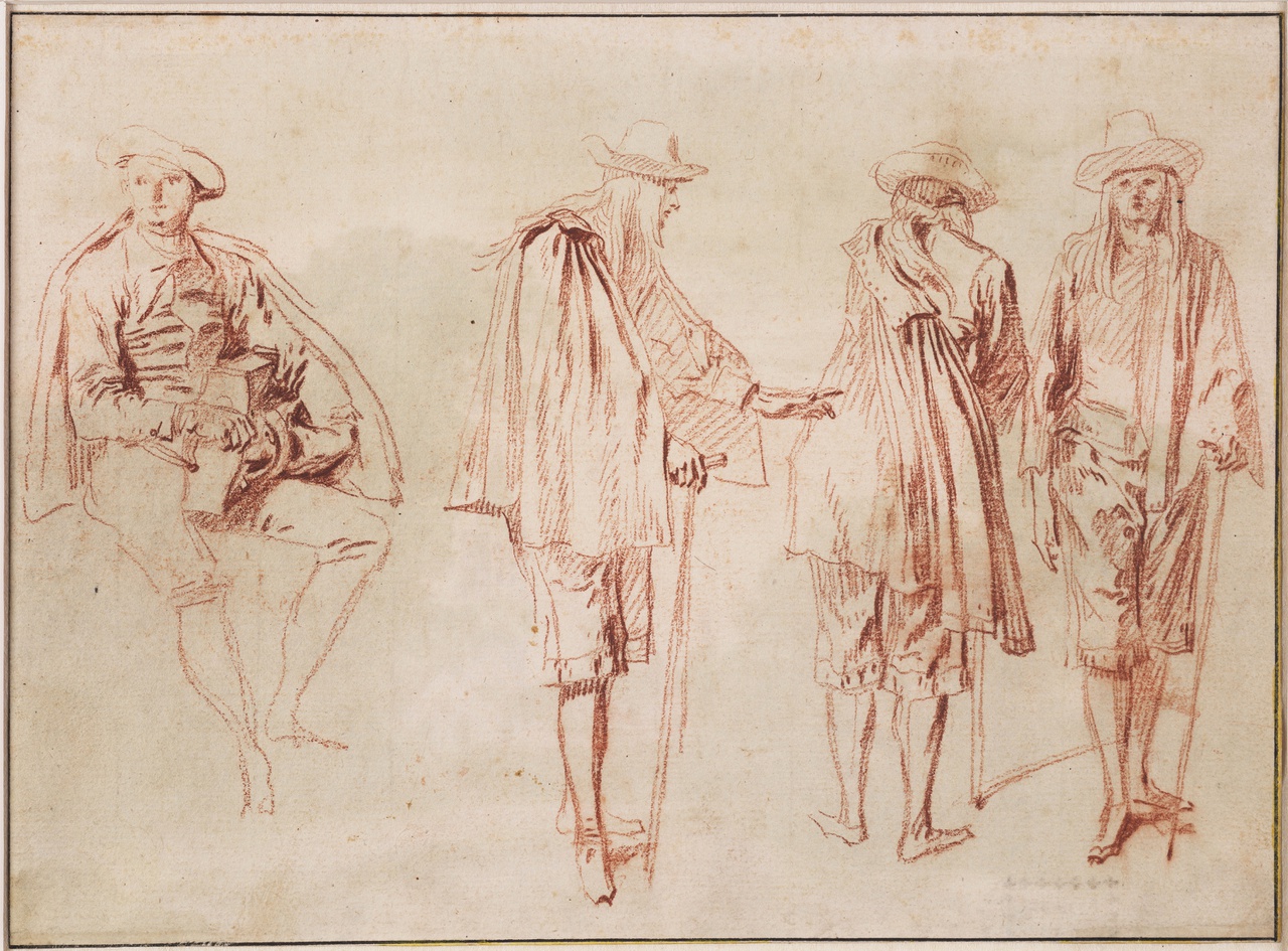
5-1 Antoine Watteau, A Hurdy Gurdy Player and Three Sketches of a Man, ca. 1714. Red chalk on cream paper, 16.2 x 22 cm. Teylers Museum, Haarlem.
An early work, A Hurdy Gurdy Player and Three Sketches of a Man (figure 5-1), surely is one of the quick sketches Watteau made of gentlemen, ladies, entertainers, soldiers, and beggars who were willing to hold still for the artist as he walked the streets of Paris. His models hold natural, unpretentious, everyday poses. Watteau generally used red chalk in his early years, especially when working to seize a momentary position. He never used pen even though the artists who influenced him in other ways, Claude Gillot and Claude Audran, worked with pen.
Watteau’s figures in this period of his short career are typically thin with tapering legs. Their facial features are schematic and almost mask-like. The artist concentrated on defining contour lines and drapery folds, which are usually made with a number of short strokes. He favored neatly arranged, sometimes vertical hatching, which does not build rounded, earth-bound forms. On the verso of figure 5-1, Watteau drew a landscape in red chalk, wash, and watercolor, one of only four such nature studies that confidently belong to him.

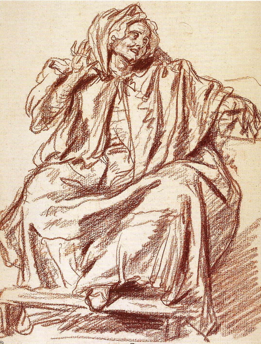
5-2 Antoine Watteau, Bearded Savoyard Standing, ca. 1715-16. Red and black chalk on cream paper, 36 x 22.4 cm. The Art Institute, Chicago.
A few years later, Watteau drew a series of beggars, including Bearded Savoyard Standing (figure 5-2). Diagonal eyebrows, a steady gaze, and tight lips give him a sympathetic, somber, and perhaps ironic look, which Watteau saw in the paintings of the Le Nain brothers. The Savoyard has the same simple dignity as Rembrandt’s beggars and old men (figures 4-46 and 4-47). Even though Watteau’s drawing is more highly finished than his previous sketch, it is executed with more gusto. About this time Watteau began to add black chalk accents to his completed red chalk drawings. The black chalk deepened shadows and added color to the beard, hair, and ragged clothes. Although he probably secured contours in the initial stages of the drawing, the black accents and vigorous hatching, stumped in places, replicate textures and built a more solid individual.
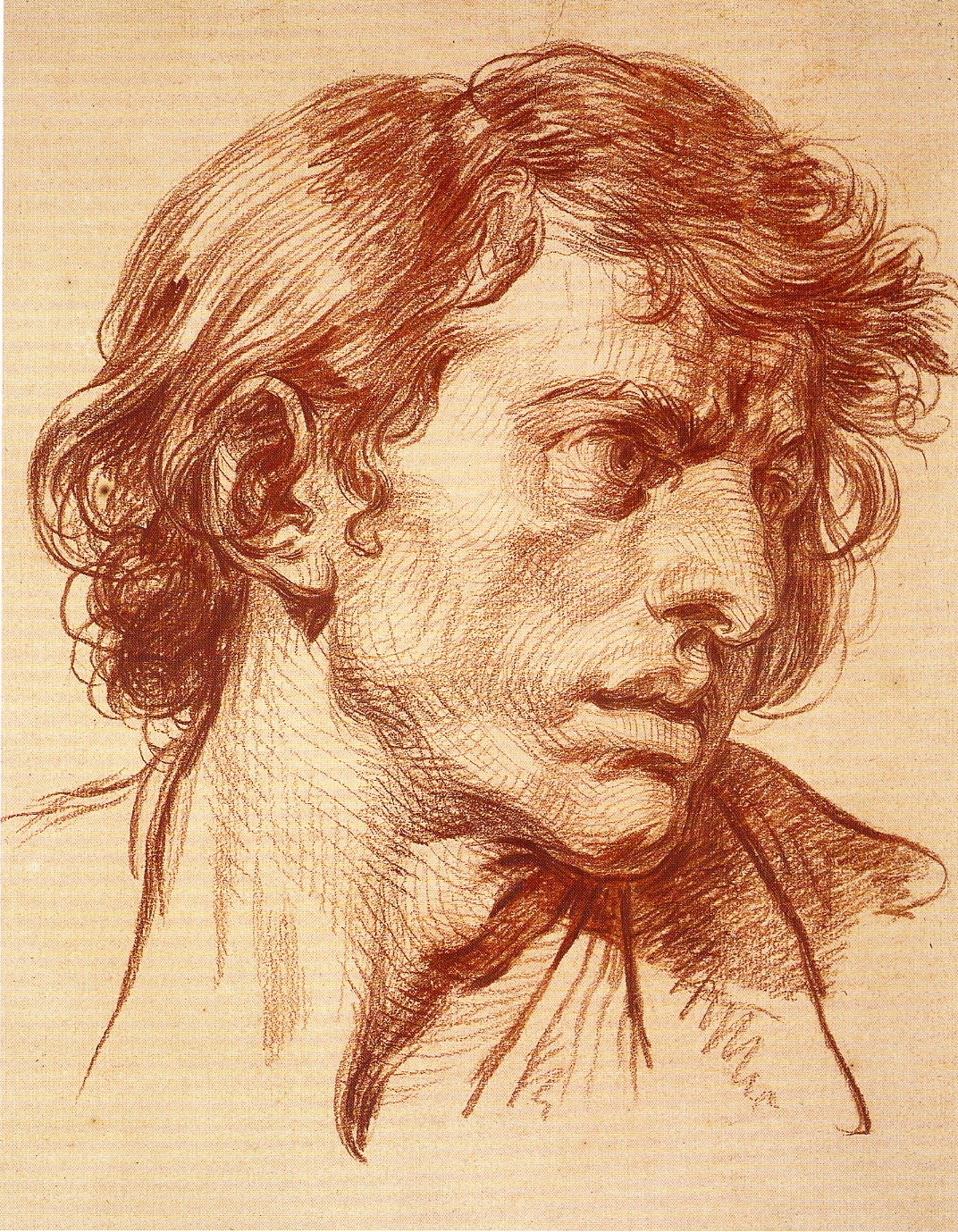
Nine Studies of Heads (figure 5-3) would seem to be another of his drawings that embodies his amazing ability to capture in passing, as it were, the liveliness of individuals moving about and changing expressions. Both the arrangement on the page, as they turn their heads now this way now that, and the freshness of execution give the illusion of spontaneity. Facial features are sharply drawn, but he seems to have dabbed at hair and clothes with his chalk the same way a painter might initially touch a canvas with a brush. (In his paintings, however, he generally applied paint in lines, more like a draftsman.) His biographers in the eighteenth century praised drawings such as this for their “freedom of execution,” “delicacy of contour,” “lightness of touch,” and “grace of expression.” Their praises still ring true.

5-3 Antoine Watteau, Nine Studies of Heads, ca. 1716. Red, black, and white chalk on gray-brown paper, 26.2 x 41.6 cm. Musée du Petit Palais, Paris.
Although the poses seem casual and natural, the degree of calculation in the drawing is high. He neatly arranged the same man and woman, with slight differences in dress, in two rows. They constantly turn their heads, but pairs of heads, by their contrapposto, also balance one another across the page, while a continuous rhythm moves from head to head. Nothing overlaps anything else—except the man’s hat, which might have been an afterthought.
Contemporaries were well aware that Watteau was onto something very different—both in iconography and style—from the plethora of nude studies that artists like Le Brun mainly produced (figure 4-25). Jullienne may have had Le Brun in mind when he wrote that Watteau’s drawings “belong to a new taste; they have graces that are so much a part of the author’s spirit that they can be considered inimitable. Each figure from the hand of this excellent man has a character that is so true and natural that all by itself it can hold and satisfy one’s attention, seeming to have no need for a supporting composition on a greater subject” (Abrégé de la vie d’Antoine Watteau, 1726).
Drawings such as Nine Studies of Heads made famous Watteau’s use of trois crayons, the combination of red, black, and white chalk—against the beige color of the paper. Earlier, Clouet, Barrocci, Goltzius, Rubens, and Charles de la Fosse, an older artists who greatly admired Watteau’s work, combined colored chalks to give greater life to their images. Unlike earlier uses of different colored chalks, Watteau’s handling of them reinforced his tendency to “paint” with them, dabbing on the sheet light and texture rather than defining contours. Although he copied paintings by Rubens, Watteau, as far as we know, did not participate directly in the debate between those who championed line and those who extolled color—between Poussinistes and Rubenistes. Since in that debate “color” included chiaroscuro and all the effects of light, Watteau in fact sided with the Rubenistes.
When he painted, Watteau did not follow the centuries-old system of preparatory drawings, but reverted to practices similar to the use of model books. Caylus described his unusual method: When he took it into his mind to make a painting, he had recourse to his collection. From it he chose the figures that suited best his needs of the moment. He formed his groups from them, most often according to a landscape background that he had conceived or prepared. Rarely did he do otherwise (Abrégé de la vie des plus fameux peintres, 1745).
It often happened that an interval of years separated a drawing in his “collection” from its use in a painting. Also, since he often made counterproofs of his red chalk drawings, the figure or group from some drawing may turn up reversed in a later painting.

5-4 Antoine Watteau, The Pleasures of Love, 1717-18. Red chalk and graphite on cream paper, 19.5 x 26.4 cm. The Art Institute of Chicago.
The compositional drawing The Pleasures of Love (figure 5-4) was the preliminary “landscape background” for the painting of the same name now in Dresden. His compositional sketches are rare, and few of them correspond as closely to a painting as this one does. The four major couples in the drawing reappeared roughly in the same location in the painting, but, except for the standing couple, their configuration in the painting derived instead from drawings in his collection. A rhythm of curved lines runs through the trees and the lovers, giving the drawing a music that the painting lacks.

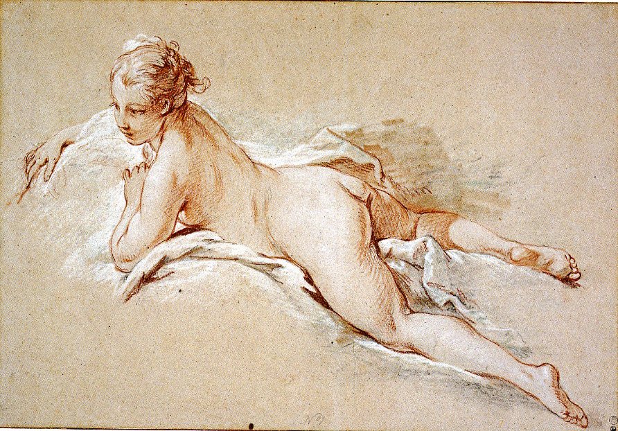
5-5 Antoine Watteau, Seated Young Woman, ca. 1716-17. Red, black, and white chalk on cream paper, 25.5 x 17.2 cm. The Pierpont Morgan Library, New York.
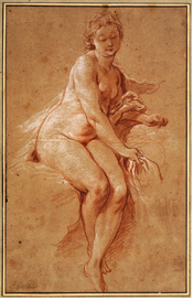
About 1715 the wealthy collector Pierre Crozat commissioned from Watteau four relatively large allegorical paintings of The Four Season. For this project Watteau broke his normal routine and posed a nude female model to make life studies. Watteau was able to employ a woman to pose nude because he could count on the privacy and safety of a wealthy gentleman’s house. Seated Young Woman (figure 5-5) does not correspond to the goddesses as portrayed in The Four Seasons, but captures the same model in a relaxed moment between posing sessions. She seems to be fingering her toes although her right foot is missing from the drawing. Her face in sharp profile, she looks up, thoughtful and alert. She has a natural, classical beauty evident in many young people—in contrast to the older, introspective nude woman drawn by Rembrandt (figure 4-56). With abundant highlights in white chalk and faint hatching in red chalk, Watteau treated the woman’s flesh with the sleekness typical of academic nudes, but he rendered the drapery primarily with dabs of black and white hatching rather than flowing contour lines.
Watteau had great regard for his own drawings. Gersaint, another friend and biographer, testified that he “was more satisfied with his drawings than with his paintings and I can affirm that in this matter he was not blinded by self‑esteem to any of his defects. He found more pleasure in drawing than in painting. I have often seen him sulking because he could not render in paint the spirit and truth that he could express with his pencil [chalk]” (Catalogue for the Augran de Fonspertuis sale, 1747).
At his death, Watteau bequeathed more than 4000 drawings to four of his friends. Less than a fifth of them still exist. One of the inheritors, Jullienne, paid his drawings an extraordinary compliment by publishing two volumes of etchings that reproduced 351 of them (Figures de différents caractères, de paysages, et études dessinées d’apres nature par Antoine Watteau. (Human Figures of Different Types, Landscapes, and Studies Drawn from Nature by Antoine Watteau), 1726 and 1728). Of the 351 reproduced drawings, two-thirds of them still exist. In the preface to volume one, Julienne declared “that the least morsels produced by him are precious and cannot be preserved with too much care.” Collections of drawings had normally been private and not very accessible, but Jullienne’s publication spread the knowledge of Watteau’s drawings to a wide audience.
Rosalba Carriera (1675-1757) In 1720, the internationally famous Venetian artist Rosalba Carriera visited Paris, staying at the home of Pierre Crozat, Watteau’s patron. Watteau met her there several times, and they made portraits of each other. He had known and admired her work for some time, although perhaps too late for her work to affect his. Rather, they were soul mates who both sought naturalness, intimacy, and delicacy in their work. Historically, they belong together.
Carriera made her reputation by drawing pastel portraits of British, French, and German ladies and gentlemen who visited her studio while they made a tour of Italy. Some of her earliest pastel portraits resemble the style of her brother-in-law Giovanni Antonio Pellegrini and of Joseph Vivien, who was received into the French Academy in 1698, as a pastelist, on the basis of pastel portraits of the sculptor François Girardon and the architect Robert de Cotte. (Recall that Charles Le Brun made pastel portraits as studies for his paintings and tapestries.) Vivien introduced the practice of making pastel portraits, not only life-size in scale, as did Le Brun, but also completely finished, smoothed, and polished, covering the paper entirely, as a painter would apply oil to canvas.

5-6 Rosalba Carriera, Allegory of Painting, ca. 1720. Pastel, 45.1 x 34.9 cm. National Gallery of Art, Washington, D.C.
Carriera’s personal style emerged in the second decade of the eighteenth century, the period in which she drew Allegory of Painting (figure 5-6). She was highly praised in her day for the liveliness of her figures, their grace of expression, and the beauty of her colors. The turn of the head, the poised fingers, and the luminous colors in this drawing confirm that praise. Surely she had taken note of the art of Correggio. The soft modeling of the idealized face, the blurred contours, and the delicate shadows around the upturned mouth suggest that in France she had also looked at Leonardo’s Mona Lisa. To reproduce his sfumato, she thoroughly stumped the high-key strokes of flesh color. In her hand pastel sticks also celebrated textures. The broad application of pastel on the girl’s dress creates the illusion of a fluffy, transparent material. Deft touches of pastel as highlights make the hair silky, the earrings sparkly, and the lips moist. Carriera not only made pastels fashionable in the eighteenth century, she also established in her work models of lightness and charm that became standards for the Rococo style.
Maurice-Quentin de La Tour (1704-1788) Maurice-Quentin de La Tour arrived in Paris about the same time that Rosalba Carriera visited France. Her triumph convinced him to take up pastels exclusively. In 1737, when the Academy started regular exhibitions, or Salons, La Tour began showing his work there with enormous success.
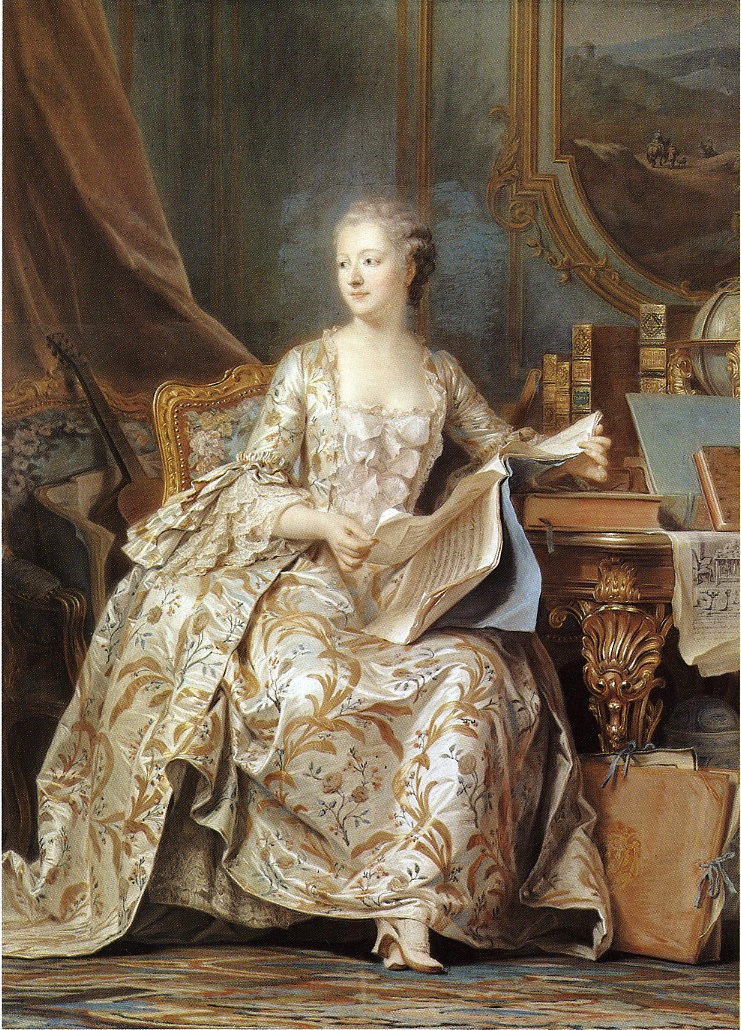
5-7 Maurice-Quentin de La Tour, Portrait of Madame de Pompadour, 1752-1755. Pastel on blue-gray paper mounted on canvas, 175 x 128 cm. Musée de Louvre, Paris.
His brilliant virtuosity was on display at the 1755 Salon when it exhibited his life-sized Portrait of Madame de Pompadour (figure 5-7). The accessories that accompany her—the musical instruments, books, and prints–declare that Pompadour was at this time the arbiter of fashion and taste at the royal court. Like Carriera, La Tour knowingly modulated highlights which convince the eye that it is looking at a silky dress or polished wood. In contrast, her idealized head fairly glows in the soft shadows in the corner of a room as she turns sharply away from the music she was reading—a gesture that animates the composition. Her portrait was rendered on several sheets of paper pasted together, including a separate sheet for the head.
The vast majority of La Tour’s portraits are half-length or bust-length. He attempted only several tour-de-force full-length portraits like that of Madame de Pompadour. A slow worker and a perfectionist, he spent three years on her portrait. When Pompadour’s brother inquired about the delay, La Tour replied how wearying it was to capture a face, which reflects constantly changing thoughts and feelings. He also listed some of the difficulties working in pastel: the dust, the weakness of some pigments, the need to blend colors on the paper (not beforehand on a palette), the impossibility of erasing errors. He also alluded to his nearsightedness, which caused him to scrutinize his models at a distance of only two or three feet, all the while making adjustments for a more distant perspective for the whole. His perfectionism caused him to take back a number of portraits and rework them. By his own admission, the reworking usually ruined them because the corrections destroyed the unity of the picture.
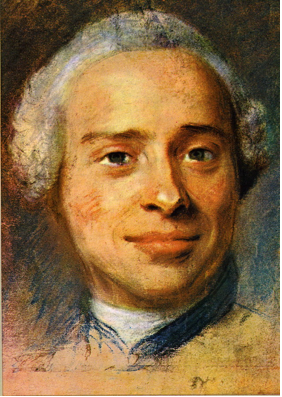
5-8 Maurice-Quentin de La Tour, Portrait of Jean Le Rond d’Alembert, 1753. Pastel, 32 x 21 cm. Musée La Tour, Saint-Quentin.
For the portrait of Madame de Pompadour and for most of his commissions, La Tour made as many as a half dozen sketches, which he called préparations. Like most sketches, they are more roughly drawn. The study of the face of Jean D’Alembert (figure 5-8) was made in preparation for La Tour’s portrait of the prominent philosophe. Almost all his préparations concentrated on the face, to such an extent that some of them seem like masks. He searched not only for a likeness but also the expression of the person’s character. D’Alembert was a pugnacious scholar but also a popular favorite at Madam Geoffrin’s salons. In this case, La Tour chose to depict the persona that D’Alembert projected in public and gave him a slight smile. To animate faces, La Tour may have employed that agreeable feature too often in his portraits.
Jean-Baptiste Perroneau (1715?-1783) Over the years La Tour did twenty or more self-portraits, and at the Salon of 1750 one of them hung alongside another pastel portrait of La Tour by his contemporary and rival Jean-Baptiste Perroneau. Critics recognized immediately that Perronneau had a livelier, more spontaneous touch and an eye for striking color harmonies. Unlike La Tour, Perronneau worked in oils as well as pastels. And whereas La Tour made his reputation with portraits of royalty, Perronneau’s clients were other artists, the middle class, and provincial French men and women.
5-9 Jean-Baptiste Perroneau, Portrait of Charles-Nicolas Cochin, ca. 1759. Pastel, 55.6 x 45.7 cm. Speed Art Museum, Louisville.
His Portrait of Charles-Nicolas Cochin (figure 5-9), engraver, draftsman, royal arts administrator, and art theorist, illustrates Perronneau’s strengths quite well. Cochin, shirt open and casually dressed, holds the tools of his trade. Posed almost in profile, he turns to the viewer. His open mouth is ready to speak—a fitting gesture for a man who frequently expressed his opinions about the contemporary art scene. In the tradition of Carriera and La tour, Perronneau details the intricacy of the lace collar, and the many highlights on his purple jacket turn the material into silk. But rough strokes of pastel are visible throughout, including diagonal lines that color the head. In short, for the portrait of a fellow artists, Perronneau left clear the process of drawing. Furthermore, he shades forms with strokes of green—especially evident on the neck. Like Rubens before him and Cézanne two hundred years later, Perronneau realized that warm colors advanced and cool colors receded, so that he could model a neck or a shoulder with vibrant color—in this case, cool green and warm reds—instead of dulling darks.
François Boucher (1703-1770) From the beginning of his career around 1720 to his death in 1770, François Boucher drew constantly. Toward the end of that period, he calculated that he had produced 10,000 drawings. From the start, he realized that critics and collectors admired his drawings as much as they did his paintings, and he therefore devoted himself to producing finished drawings that satisfied the market for them. He got his first taste that money could be made from the graphic arts at the very beginning of his career when he reproduced 115 drawings by Watteau, in etching or perhaps in dry-point, for Jean de Julienne’s Figures des différents caractères. He had a flare for capturing Watteau’s fugitive effects of line and light. Obviously, Boucher got to know Watteau’s drawings intimately by such intelligent copying.
Although Boucher may have learned a great deal from Watteau, the two probably never met. Moreover, Boucher never adopted Watteau’s practice of filling notebooks with sketches for later use. Some early examples of Boucher’s own drawing, especially those in black chalk on blue paper, resemble the drawing style of Boucher’s teacher François Lemoyne, even though, later on, Boucher tried to convince Jean-François Mariette, Boucher’s biographer, that he did not get much out of the three months he spent with Lemoyne. Mariette, in evident exasperation, exclaimed: who then was Boucher’s teacher! The correct answer is probably that Boucher, a born draftsman, learned from several people.
A sample of Boucher’s native manner survives in the drawing Daniel Testifying to Susanna’s Innocence (figure 5-10). It documents his first thoughts for his earliest known painting (also in Ottawa). Supposedly, he presented the painting to Lemoyne for his approval, which Boucher promptly received.
5-10 François Boucher, Daniel Testifying to Susanna’s Innocence, ca. 1722/23. Red chalk with touches of black chalk, 24 x 32.4 cm. National Gallery of Canada, Ottawa.
In the drawing, Boucher imagined a wide-screen dramatic narrative with a large cast filling the stage, including young Daniel who rushes in to save Susanna’s virtuous reputation. In contrast to Lemoyne, who usually filled a sheet of paper or a canvas with a few large-scale figures, Boucher arrayed a crowd of mid-sized figures across the middle distance. Boucher rendered his figures with cursory lines, many of them repeated for emphasis. Accuracy was less important than capturing the movement and excitement of the group when Daniel interrupted the trial of Susanna. Broad diagonal hatching overrides many of the carelessly drawn figures and creates bands of light and dark that pick out swooning Susanna at the bottom of the steps. The drawing attests that Boucher had an inborn inventiveness and vitality. It is also one of the very few drawings of Boucher’s “first thoughts” that has survived.
5-11 François Boucher, The Miracle of the Beggar Born Blind, ca. 1725-1727. Pen and ink, wash on red chalk sketch, 23.2 x 32.4 cm. École Nationale Supériore des Beaux-Arts, Paris.
In his twenties Boucher continued to support himself with income from printmaking. For that purpose he made several dozen pen and ink and wash drawings, including drawings illustrating the life of Christ such as The Miracle of the Beggar Born Blind (figure 5-11). Unlike Watteau, Boucher often drew with a pen, especially in his early years. The continuously fluttering pen line betrays the influence of Venetian art, especially Sebastiano Ricci and Antonio Pellegrini, both of whom worked in Paris, 1716-1718 and 1720-1721 respectively. The scene is diagonally set against the bases of gigantic columns—a motif frequent in Venetian art. Over a rapid red chalk underdrawing, Boucher’s nervous pen animates the lively figures. His brush places alternating areas of wash across clusters of them. Rather than modeling individuals, the lights and darks push and pull groups of figures in and out of space.
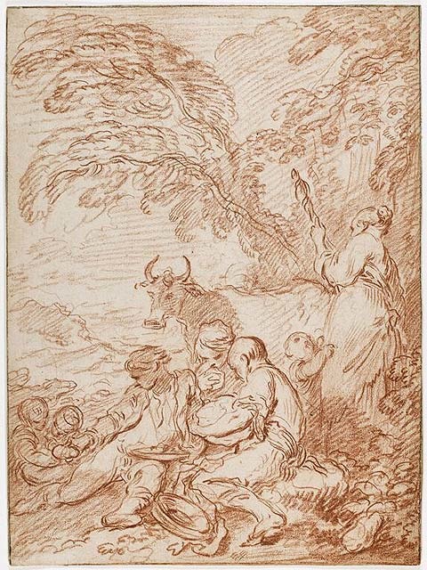
5-12 François Boucher, A Rustic Repast in the Open Air, ca. 1728/31. Red chalk on cream laid paper, 32.3 x 23.7 cm. National Gallery of Canada, Ottawa.
Between 1727 and 1731, Boucher spent at least two years in Rome, where he took no interest in classical antiquity or the High Renaissance, but instead made copies of much livelier Baroque models such as the sculpture of Bernini and the ceiling paintings of Giovanni Bautista Gaulli. In Rome, Boucher also came across drawings of peasants in landscapes by the Dutch artist Abraham Bloemaert (d. 1651). (In 1735 he published etchings of them.) Boucher supported himself in Rome by making small paintings in the “Flemish” manner based on Bloemaert’s vision of country life.
A Rustic Repast (figure 5-12) is a compositional study for one of these paintings. In many places in the drawing, Boucher still used the same wavy line so characteristic of his pen work. Nevertheless, the drawing is as solidly constructed as a composition by Lemoyne: witness, for example, the triangle of three boys and the diagonals that cross the whole design. The idyllic sentiment in this early pastoral scene is closer to the beggar boys of the Spanish artist Murillo than to the elegantly dressed lovers in Watteau’s landscapes or to Boucher’s own later vision of amorous shepherds, as in the canvas Are They Thinking of Grapes? (Chicago).
5-13 François Boucher, Study for Aurora, ca. 1733. Red chalk heightened with white chalk on brown laid paper, 36.8 x 24.1 cm. National Gallery of Art, Washington.
When Boucher returned from Rome, he had yet to establish himself as a painter. To show off his skill, he installed a quasi-exhibition of rather large mythological works in the Paris residence of a collector, François Derbais. His drawing Aurora (figure 5-13) is a study from the model for a principle figure in one of the paintings, Aurora and Cephalus (now Nancy). The evidence of this and other studies of figures and parts of figures, as well as of a rare compositional study for another painting in this project, shows that Boucher the painter followed a traditional method of preparation that involved numerous drawings at every stage—the method of Lemoyne, not Watteau.
Clearly, a model posed for the drawing Aurora. He observed the slight lumpiness of the woman, her sagging belly, even her double chin, and also the kerchief she used to tie up her hair while modeling. All these features are eliminated in the painting, where he also solved the problem he had with foreshortening her thighs in the drawing. He still used wavy lines for the bit of fluttering drapery behind her back, but for the most part he smoothed and refined the contours of her torso and limbs into continuous lines. He kept modeling to a minimum, except for the strong white heightening that indicates the bright light of morning hitting her flank. The motif of parallel arm and legs suggests a reference to Michelangelo’s ignudi, but everything else describes an actual human—if not quite the casual and off-guard presence of Watteau’s female model (figure 3-62).
More than any other artist in the eighteenth century, Boucher’s graphic art stimulated the appreciation of drawings as works of art for their own sake. The majority of his later drawings are not functional drawings that grow out of a project for a painting or tapestry. They are finished drawings completed for their own sake or for transfer by a craftsperson to a printing plate. Many of his late drawings reprise a head, figure, or group of figures from a finished painting, or from another drawing, rather than prepare for it. Indeed, in his old age, Boucher boasted that he no longer needed a live model to draw a figure. He could draw the nude in any position from memory, especially since he often repeated poses. Also, in his last decades, he seems to have prepared most of his compositions for paintings with sketches in oils rather than with chalk drawings on paper.
5-14 François Boucher, Recumbent Female Nude, ca. 1742-1743. Red, white, and black chalk, 31.6 x 46.2 cm. Boston, collection of Jeffrey E. Horvitz.
Boucher made académies of the male nude both to enhance his own skills and to instruct student at the Academy when he was professor there. However, like other French artists of his generation, Boucher made the female nude his specialty. From decade to decade, his vision of the female nude changed. In contrast to the matter-of-fact Aurora, Recumbent Female Nude (figure 5-14), drawn ten years later, is a lithe and graceful figure. It is the kind of erotically charged drawing that male collectors eagerly sought for their portfolios.
She sprawls with the languid elegance of a cat—legs spread apart and backside up on rumpled sheets and pillows. (A number of similar nudes from this period lie on billowy clouds.) Like so many of his females, she has a small chin and mouth, long thin nose, large horizontally stretched eyes, and brows that are permanently arched. Her contours are sharp and wire-thin. Boucher’s chalk barely touched her—the modeling is so faint. Only the abundant white chalk strokes that surround her separate her from the tone of the background. Despite the precision of this drawing, Boucher did not use a living model; instead, he distilled this phantasm from his painting The Dark-Haired Odalisque now in the Louvre.
5-15 François Boucher, Study of a Nude Young Woman on Drapery, 1763. Black, red, and white chalk on tan (formerly blue) laid paper, 29 x 37.8 cm. Museum of Fine Arts, Boston.
Twenty years later, Boucher drew Study of a Nude Young Woman (figure 5-15) in order to have a print made of it. Instead of the nimble and graceful nudes of his earlier years, this nude is ponderous, fleshy, and rather Rubenesque. Although seen in a lost profile, her face seems fuller than the nude in figure 5-14. Like the previous nude, she too sinks into sheets and pillows. However, she pulls herself up and looks aside in one direction and points in the opposite direction. Actual contour lines in some places are almost non-existent. Boucher made scant use of black chalk in the earlier drawing; here black chalk darkens her hair and builds somber shadows around her. He applied it in broad strokes with a very blunt piece of chalk as though the lines were brushed on. The soft modeling resembles the “crayon manner” of engraving that contemporary printmakers developed to reproduce the appearance of drawings.

5-16 Edmé Bouchardon, Boy Delivering Bread (Garçon Boulanger), ca. 1737. Red chalk on buff paper mounted in an album, 23 x 17.5 cm. British Museum, London.
Edmé Bouchardon (1698-1762) The most important sculptor in France during Boucher’s lifetime, Edmé Bouchardon, was also a prolific and admired draftsman whose drawings fetched high prices from collectors. Although he worked slowly and methodically as a sculptor, he turned out hundreds of drawings, including three sketchbooks of red chalk copies of ancient and Renaissance art in Rome (Morgan Library), numerous red chalk designs he made over many years for the royal mint (Metropolitan Museum), over three hundred sketches (Louvre) for his most famous work, the equestrian statue of Louis XV, and sixty drawings (British Museum) for the five etched suites The Cries of Paris (Les Cris de Paris). Contemporary critics appreciated truth to nature, nobility, and simplicity in his sculpture, and the same qualities appear in his drawings, such as Boy Delivering Bread (figure 5-16) from the first suite. Unlike Watteau’s Savoyard beggar (figure 5-2), the somber and earnest delivery boy is well dressed in a frock coat and apron. Bouchardon drew with the precision and sensitivity of a sculptor. Solid and evident lines, chiseled and polished like those of a marble statue, clearly defined contours. Exceedingly regular and dense diagonal hatching to the wall on the left, as well as much lighter hatching on the boy, bring him emphatically into relief. Bouchardon’s straight-forward, no-nonsense style offered collectors an alternative to the elegance of Boucher.
Jean Honoré Fragonard (1732-1806) Boucher in effect taught himself to draw. Jean Honoré Fragonard, after assisting Boucher for several years (1748-1752) in his studio, where he certainly made drawings, received an extensive training in drawing at the Royal Academy, first at the École Royale des Élèves Protégés in Paris (1752-1756), then at the French Academy in Rome (1756-1761). Unfortunately, only a handful of red chalk drawings of the model, draped in monk’s robes, survive from all that time in the classroom. In spite of his formal training, Fragonard became one of the most spontaneous and dazzling draftsmen of the century. Charles Natoire, the director of the Academy in Rome, recognized that a fire burned within his student and tried not to extinguish it.

5-17 Jean Honoré Fragonard, The Great Cypresses of the Villa d’Este, 1760. Red chalk, 47.8 x 35.4 cm. Musée des Beaux-Arts et d’Archéologie, Besançon. [not in scale]
The Great Cypresses is nearly symmetrical, organized around a single vanishing point, and structured by means of receding planes of dark-light-dark-light. Within this order and regularity, Fragonard’s chalk lines zigzag, leap, curl, and rush from one cluster of leaves to another. In the left foreground, his lines are particularly jagged and tense. Heavy or feint diagonal hatching across the masses of the trees conveys a variety of light and dark areas, including the pale villa itself, which looms like a mirage in the haze of a hot summer day. Two tiny figures conversing in the shade make the trees seem twelve to fourteen stories tall. The cypresses surge up like an irresistible force, shaking with the life Fragonard has given them.
The following year, 1761, Fragonard accompanied Saint-Non back to Paris by way of Naples, Bologna, Florence, Venice, and other cities. Along the way, Fragonard produced hundreds of black chalk drawings of masterworks of art and architecture that they visited over the course of six months. Saint-Non got the originals; Fragonard made counterproofs for his own collection. The tour was another important learning experience for Fragonard, and by the end of the trip, in Venice especially, he found ways to bring his copies to life.
5-18 Jean Honoreé Fragonard, Working Girls Getting Ready for Bed, ca. 1769. Brush and wash, pen and ink over graphite, 23.9 x 36.7 cm. Fogg Art Museum, Cambridge
In Paris, Fragonard quickly developed a clientele who were eager to possess his witty and risqué scenes of daily life behind closed doors. Working Girls Getting Ready for Bed (figure 5-18) once belonged to a fermier général (tax agent) who owned several similar subjects by Fragonard. The artist first roughed in the seven figures, their beds, and a dog in graphite. Over this, he lightly brushed people and things with wash to secure his free sketch with a pattern of light and dark contrasts. (As time went on, Fragonard drew more and more with the brush alone.) In this drawing, he accented his lines with wash, touches of the pen, and the long flowing strokes that characterize many of his brush drawings. With little apparent effort, he built a nearly symmetrical design around the two standing figures. They are silhouetted against the central source of light that illuminates the room. One girl holds the other’s nightgown out against the light, making the gown transparent and adding to the titillation of the Boucher-inspired bare bottoms on either side. Supposedly, Fragonard and another artist friend, sitting at the same table, drew Working Girls and other similar drawings as a joke.

5-19 Jean Honoré Fragonard, Artist in the Studio, 1773-1774. Red chalk, 38.2 x 48.6 cm. The Fine Arts Museums of San Francisco.
A dozen years after his first visit, Fragonard traveled once more through Italy, this time with the financier Bergeret de Grancourt, who also expected the artist to make copies of what they saw. The artist drew a great number of landscapes, street scenes, and figures such as Artist in His Studio (figure 5-19). The man in the drawing is perhaps a self-portrait of Fragonard, conversing with his wife over the back of a chair. He may hold a stick of chalk in his right hand, if it were reversed in a mirror, although the man is not looking into a mirror. Nevertheless, in this instance, the drawing seems to replicate a real, rather than an imagined scene. Like a portrait by Frans Hals or similar Dutch artist, the man is posed casually, arms going this way and that, legs spread apart, and head turned sharply to speak with the woman who bends over him. (Or is it a parody of the contorted poses of Michelangelo’s ignudi?)
Fragonard applied his chalk with a vigor to match the informal and down-to-earth scene. Contours, of the legs and arms especially, zig and zag in choppy strokes. Then over the entire drawing, he set down diagonal hatching that throws the corners into darkness and, by contrast, shines a bright light on the man. In other words, he updated the chiaroscuro of Rembrandt and his followers. In his chalk drawings, Fragonard almost always drew hatching lines in the same diagonal direction, he almost never used cross hatching, and he very seldom combined red, black, or white chalk as did Watteau and Boucher.
5-20 Jean Honoré Fragonard, A Shaded Avenue, ca. 1774. Brush and wash over black chalk, 45.5 x 34.7 cm. Musée du Petit Palais, Paris.
In Italy Fragonard also drew ambitious landscapes, this time in brush and ink, rather than red chalk. A Shaded Avenue (figure 5-20) is an outstanding example of his vision of nature. Like The Great Cypresses, A Shaded Avenue depicts trees lining an allée in a park seen in single point perspective. Unlike the earlier drawing, the new scene is probably imaginary, a fantasy based on close observation of reality and the paintings of the Dutch landscapist Ruisdael, which Fragonard also admired. Fragonard’s tree branches make knobby, gnarled patterns in the sky like those of the Dutch artist (see figure 4-44).
The amazing part is not the exactitude of the trees, but the control that he exhibited in apply wash to relay subtle distinctions of light and dark—from the strong light and dark contrasts in the lower right to the tree limbs at the top left, silhouetted against the sky yet vaporized by its strong light. The tunnel of trees is by no means a solid mass but an intricate weaving of dappled light. Because a drawing like this was not a mere souvenir of Rome, this time Fragonard did not surrender his drawings to his patron at the end of the trip.

5-21 Jean Honoré Fragonard, Instead of Virtues, St. Michael Finds Vices Rampant in the Church (Orlando Furioso XIV, 81), 1780s. Black chalk, pen and ink, brush and wash, 38.1 x 24.2 cm. National Gallery of Canada, Ottawa,
In the 1780s, Fragonard attempted to adapt his art to the up and coming Neoclassical style with some religious subjects and a few quasi-mythological subjects like The Vow of Love. He also sensed there was a market for illustrations to Ariosto’s Orlando Furioso, which was attracting considerable interest in France at the time. Instead of Virtue, St. Michael Finds Vices Rampant in the Church (figure 5-21) is one of the over 160 black-chalk and brown-wash drawings that Fragonard made to illustrate the epic poem. Far from the restrained look of Neoclassicism, they are among his wildest and most energetic drawings in style. The Archangel St. Michael appears in a burst of light in the upper right. A monk on the lower left steals alms from a bowl at the base of the column. A proud nun balances him on the right, while between them a pig runs out from behind the column. Little else can be identified amid the melee of swirling lines, clarified somewhat with patches of light wash. No doubt, he planned to have the series engraved, but an eighteenth-century printmaker would have been hard put to translate his pulsating lines into solid forms on a plate. Fragonard illustrated roughly the first third of the poem, then stopped.
The style of Vices Rampant in the Church differs considerably from the naturalism of Artist in His Studio. At the French Academy in Rome, Natoire was annoyed that Fragonard changed his style from one day to the next. But Natoire might be pleased that his student, twenty-five years later, had not lost the fire that burned within him.
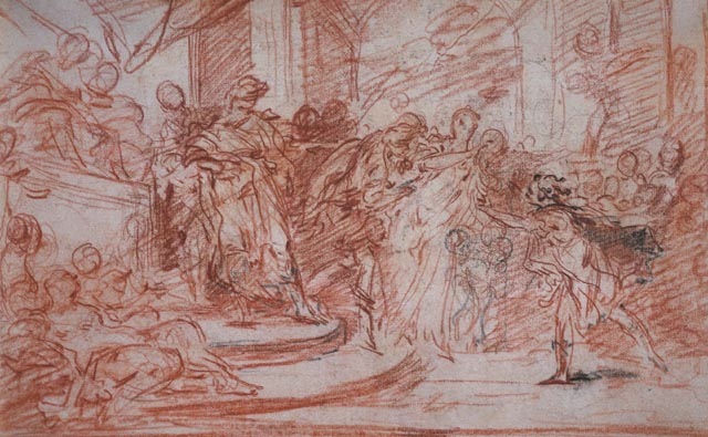
Jean-Baptiste Greuze (1725-1805) In the eighteenth century, collectors and critics admired the drawings of Jean-Baptiste Greuze as much as they did his paintings. In this regard, he resembles Watteau, Boucher, and Fragonard. While Fragonard and a few other artists occasionally exhibited drawings at the Salon, from 1759 to 1769 Greuze frequently exhibited several drawings at a time at the biennial exhibition. Reviewing the Salon of 1763, Denis Diderot exclaim that Greuze drew like an angel. Mariette noted that, even when Greuze was young, some collectors paid prodigious sums for his drawings.
Greuze came to Paris at the relatively advanced age of twenty five to study at the Royal Academy, but because he had not competed for entry, he had to sit in the back of the life drawing class, far from the model. At thirty, Greuze stayed for a year (1755-1756) at the French Academy in Rome, although he had not competed for the scholarship there either. Yet despite his short acquaintance with Academy training, he embraced the traditional place of drawing in the creation of art that an Academy education fostered. For each of his major paintings, including the genre scenes that made him famous, Greuze produced numerous compositional studies, sketches of individual figures from the model, studies of hands, studies of individual heads to secure the appropriate character and emotion, and modelli. Greuze also produced dozens of académies, many of which went to the Imperial Academy of Fine Arts in St. Petersburg, where Russian art students copied them.
5-22 Jean-Baptiste Greuze, Seated Elderly Woman, 1765. Red chalk, 37.8 x 28.9 cm. Paris, Musée du Louvre, Département des arts graphiques.
Seated Elderly Woman (figure 5-22) is a study for the grandmother in the painting The Beloved Mother, now in Madrid. He also made a separate study of her right hand, whose gesture expresses her delight at the sight of her six grandchildren surrounding their mother. The marquis who commissioned the painting requested that the artist depict his mother-in-law in the role of the grandmother, but it is doubtful that the vicomtesse posed for this sketch.
Greuze drew the figure with unusual muscular vigor. Contour lines are rough, and he thickened many of them with six or eight more heavy strokes. The hatching is likewise bold and irregular. The sketch makes Fragonard’s Artist in His Studio seem reserved and refined by contrast. The exuberance of his lines caused Greuze to expand the drapery of the figure so that she became grandiose in her proportions. In the painting, the figure is much more granny-sized.

5-23 Jean-Baptiste Greuze, Compositional Study for ‘The Beloved Mother’, 1765. Pen and brush with black and brown ink over graphite, 33.2 x 37.8 cm. Albertina, Vienna.
Compositional Study for ‘The Beloved Mother’ (figure 5-23) corresponds to only the right half of the completed painting (Madrid) although it differs from it in many other, smaller ways. The grandmother in the previous chalk study is actually closer to the pose of the grandmother in the painting. Like most of Greuze’s compositional sketches, he executed this study in brush and ink over a graphite underdrawing. Here he added deft pen lines, which trace rather precise contours. Combining black and brown ink makes the drawing unusually colorful. The degree of finish and completeness of the drawing indicate that it may have been the middle of a series of compositional studies for the painting—neither his first thoughts nor the modello.
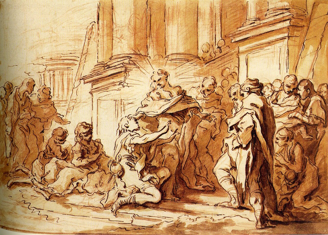
5-24 Jean-Baptiste Greuze, The Ungrateful Son, ca. 1777. Red chalk, 41.9 x 32.4 cm. Washington, D.C., National Gallery of Art.
For his paintings, Greuze also made chalk studies of individual heads, such as The Ungrateful Son (figure 5-24), a drawing related to his painting The Father’s Curse:The Ungrateful Son (Louvre).
However, this drawing, which conveys the strong expression of emotions and character that Denis Diderot and other critics of the time found in his work, was not made for the painting, but after the painting. He sometimes rendered similar expressive heads in stumped three colored chalks and in pastels too, which he successfully exhibited and sold. By thoughtfully studying the emotional character of a head, Greuze once again built upon academic discipline, as taught a century earlier by Charles Le Brun, who codified the characteristics of human emotions for Academy students. The widely spaced cross hatching across the surface of the face and neck in The Ungrateful Son resembles the network of lines that reproductive engravers employed for modeling. It also produces a veritable netting, which can be read as a relief map of the jaw bones, cheek bones, and Adam’s apple underlying the skin. As a relief map, it resembles a modern wireframe drawing used as the matrix for three-dimensional computer animation.
Jacques Louis David (1748-1825) Jacques-Louis David also believed that an extensive program of drawings was fundamental to the art of painting. At his death, he left behind a considerable body of drawings, including numerous composition studies and figure studies for almost every one of his major works. Compared to most other artists in the past, relatively few of the drawings related to his paintings have been lost. Unlike Greuze, David never exhibited his drawings, and in the eighteenth and nineteenth centuries collectors did not seek them out. His drawings were to him primarily a part—the essential part—of his working process.

5-25 Jacques-Louis David, Album 11, folio 7, 1775-1780 or 1784-1785. Pen and ink, wash, chalk, and pencil, 5.1 x 33 cm. Research Library, The Getty Research Institute, Malibu. [not in scale]
The Roman albums gave David a storehouse from which he could always derive figures based on classical precedent. He also thought of his albums as a teaching tool in his studio where his students had free access to them. The Roman albums confirm that David was swept up in the enthusiasm for classical sculpture felt by his fellow students at the Academy and by Italian and English artists, connoisseurs, and collectors in Rome.
More importantly, in making these copies, David taught himself a new style. In the sales catalog of 1826, his sons wrote that the Roman albums not only became the repository of the inspiration for his art but that they demonstrated how he regenerated the French school with a severe and pure style, abruptly rejecting the languid and elegant style of the emulators of Boucher.
On his way back to Paris in 1780, David copied a low relief that he saw in Venice: Four Draped Figures in Conversation (figure 5-26). The drawing illustrates how classical sculpture inspired his new style. He pasted it on a page that contains three other drawings of figure groups, also in pen and ink.

5-26 Jacques-Louis David, Four Draped Figures in Conversation, 1780. Pen and black ink, gray wash over black chalk, 15.4 x 21.0. cm. Musée du Louvre, Paris.
In copies such as this, David learned to accentuate the contours of a human figure with a firm and solid line—not a pure outline, but something approaching it. His line is the unambiguous, steady line of classical sculpture, and such a line would be the basis of his art. In this small drawing, the line is a bit hesitant, even as he traces over his light underdrawing. His lines deliberately lack the flair, the gesturing, and the virtuosity of lines made by Fragonard in Rome only a few years earlier. By emphasizing line, he also sought to make poses and gestures—the lines of the body—the chief means of expression. He ridiculed the emphasis that Greuze and most other eighteenth-century French artists put on the features of the face. He went back to what the Carracci and their followers would call the affetti-–body lines that conveyed character and thus morality.
In the drawing Four Draped Figures and in many other ink drawings in the albums, David applied a gray wash of a uniform shade. The wash serves only to model the figures, that is, to bring them into relief. Put another way, David rejected any appearance of flickering, reflected, or transient light, and with it he rejected the drama, the atmosphere, the unifying contrasts, and the textures created by Baroque chiaroscuro. In contrast, when Poussin copied a classical relief (figure 4-24), he observed and reproduced the sunlight passing over the stone.

5-27 Jacques-Louis David, Four courtyards. Album 9. Musée du Louvre, Paris. [not in scale]
In these drawings, the staffage wears classical robes. The planes of his architecture tend to lie parallel to the picture plane, and strong light and dark contrast help establish the recession of the planes into space. These drawings inspired the settings in paintings such as The Death of Socrates and The Oath of the Horatii.
In 1826, David’s heirs offered for sale twenty-four sketchbooks in addition to the twelve Roman albums. Fourteen bound sketchbooks still exist. Starting with his second trip to Rome in 1784-85, David made extensive use of sketchbooks throughout his entire career. Each book contains anywhere from two dozen to seven dozen pages, although it is evident that he (and others) frequently tore pages out of the books—perhaps, in some cases, because the drawing displeased him. Some of them, especially the sketchbook in the Art Institute of Chicago were considerably rearranged at some point. The sketchbooks contain a total of more than 800 sheets of white paper that measure about eighteen by thirteen centimeters or about eight by five inches. David used pen and ink and gray wash in the two earliest sketchbooks, which date from his second trip to Rome. Thereafter, he used black chalk almost exclusively. The first two also contain sketches of Roman antiquities; and so in both content and technique, they resemble the Roman albums of five years earlier.
5-28 Jacques-Louis David, Two Studies for ‘The Distrubution of the Eagles,’ Sketchbook, page 10, recto, nos. 14 and 15, ca. 1808-1810. Black chalk, ca. 19 x 24 x cm. Art Institute, Chicago.
The sketchbooks contain mostly drawings of single figures or small groups of figures which David used or intended to use in his major compositions. Figure 5-28, a page from the Chicago sketchbook, is one of 21 studies in the book for figures in his painting The Distribution of the Eagles. It is a typical illustration of his everyday drawing style. Most often he drew the figure from a studio model—or from a Roman relief—first in the nude and then clothed; or, as in the figure on the left, he drew clothing over the nude figure. The figure on the right is a variation on a study of Michelangelo’s Battle of Cascina. Many of the sketchbook drawings have been squared for transfer.
Hatching or other forms of chiaroscuro are completely absent. In the nude on the right David was still using a scratchy and hesitant line as he searches for the correct contour and the outline of a few major muscles. His process of drawing made his lines devoid of any expressiveness—except the expression of his own stubborn campaign to drain drawing of every trace of the Baroque style.
For centuries, many artists made nude studies of the major figures in their paintings. Few, if any of them used bound sketchbooks for this purpose. True, Watteau kept sketchbooks with drawings which, years later, inspired his painting. In a more typical contemporary example, Gabriel de Saint-Aubin (1724-1780), wandering the streets of Paris, filled sketchbooks (and the margins of books and catalogues) with the sights and activities he observed. Unlike them, David used sketchbooks for his preparatory studies. He entered them in the books as if he were an accountant, keeping record of each and every transaction relating to his business. Another anomaly is the small scale of these drawings and the large scale of his paintings.

5-29 Jacques-Louis David, Study for ‘The Oath of the Horatii,’ 1784-1785. Black chalk, white heightening, 46.5 x 51 cm. Musée d’Angers, Angers.
As part of the long creative process for a major painting, David also made stunning drapery studies, which are in a league with Leonardo’s (see figure 3-1). Study for ‘The Oath of the Horatii’ (figure 5-29) is an exercise in pure modeling. No highlights reveal the character of the light source or suggest the textures of the cloth. The study is an abstraction, combining hyperreal precision with unnatural light.
5-30 Jacques-Louis David, Compositional study for ‘The Sabine Women’. Pen, brown and black ink, over black chalk, gray wash and white heightening, 47.6 x 63.6 cm. Musée du Louvre, Paris
Along with precise drapery studies, David also made highly finished drawings toward the end of his preparations. The drawing of his painting The Sabine Women (figure 5-30) was not a repetition meant for sale, as Greuze often made. Significant differences between the drawing and the painting—the principle male figures are nude in the painting—indicate that the artist continued to develop the painting after this drawing was done. Another indication that this was a working drawing is that several sections of the drawing were cut out, replaced with pieces of paper pasted on the back, and then reworked by the artist. Even a few pentimenti are visible here and there, and several contours were reworked with black ink. Nevertheless, the monumentality and the dramatic poses of The Sabine Women have already been achieved in the drawing.
John Flaxman (1755-1826) Two years after David returned from Rome to Paris, the British artist John Flaxman (1755-1826) arrived in Rome for a seven-year stay (1787-1794). A sculptor by profession, he studied the same works of classical sculpture that David had drawn a few years earlier. But since David took his Roman albums with him to Paris, Flaxman could not have seen David’s drawings. Previously, Flaxman had worked as a designer in Josiah Wedgwood’s ceramics factory, where he very likely examined the illustrations of Sir William Hamilton’s Greek vases published by d’Hancarville, which David had also studied.

5-31 John Flaxman, Diomed Casting his Spear at Mars, 1792-93. Pencil, pen and ink on gray laid paper, 16.7 x 36.7 cm. Royal Academy of Arts, London.
While in Rome in 1793, Flaxman illustrated Homer’s Iliad and Odyssey (figure 5-31) in a style, similar to, yet starker than David’s. The illustrations have emphatic continuous contours, very little modeling, and no cast shadows. As in Greek vase painting, figure movements are coordinated rhythmically across the front plane, and there is little depth. His sketches for the engravings show that drawing was for Flaxman a process of eliminating or smoothing over non-essentials. He referred to these drawings as “outlines,” an indication that he thought of them as different from his other drawings. Appropriately, they were considered primitive, as were Homer’s epics at the time. In contrast to the impact of the drawings that David kept in his notebooks in his studio, the influence of Flaxman’s drawings, as spread through his engravings, was enormous.