ITALY AND FRANCE
ITALY
Ludovico Carracci (1555-1619) and Annibale Carracci (1560-1609) In the years before and after 1600, four artists, Ludovico Carracci and his cousin Annibale, Caravaggio, and Peter Paul Rubens, changed the course of art when they put forward a new style, the Baroque. They were stimulated in part by the demand of the Counter Reformation for a religious art that was both understandable and moving. Drawing played a major role in the reform that the Carracci and Rubens affected because it was the means by which art returned to the natural and the normal. However, drawing on paper meant nothing to one of the four, Caravaggio. As far as we know, he never made any drawings in preparation for painting. Instead, he drew directly on the canvas, sometimes scoring the wet underpainting with the back end of his brush.
In 1582, Annibale Carracci, his brother Agostino, and his cousin Ludovico established in their native city, Bologna, an academy, first called Accademia delli Desiderosi, then Accademia degli Incamminati (The Academy of Those on the Road). From the beginning, they insisted that their students learn to draw from the living model, nude or clothed. As painters, they prepared their own works with numerous drawings of the model.
The Carracci and their academy set an example for the next two centuries of how to produce great art through drawing. By returning to the Renaissance practice of drawing from nature, the Carracci made a decisive break with the previous style of Mannerism. Mannerist artists, starting with Pontormo, fashioned their art by following an inner image (disegno interno) rather than by copying what they saw before them. Many of them stopped using a model. The unusual poses of Michelangelo and the sophistication and grace they found in the late work of Raphael inspired their imagination, and they delighted in their own virtuosity, artificiality, and courtly elegance.
From the mid 1580s to the mid 1590s, the three Carracci worked jointly on a number of projects in Bologna. They deliberately buried their individual personalities to present a united front against the competition. Consequently, it has often been difficult to tell their early drawings apart. The attribution of landscape drawings to the Carracci and their followers is still in turmoil.
Agostino, who was primarily a printmaker, worked mostly in pen when he drew and made ample use of hatching and cross hatching as though he were cutting an engraving. A fastidious draftsman, he sometimes labored over studies of feet, hands, or ears. For many years, academic instructors employed engravings of his drawings as textbooks for such repetitive analysis of body parts.
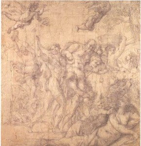
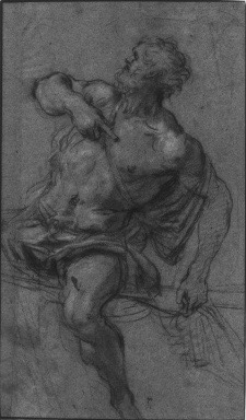
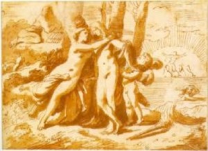
Ludovico made many chalk studies from life, as did his cousins, during the period they worked together in Bologna. After the cousins left, Ludovico concentrated on pen and ink and wash, with which he produced mostly finished compositional drawings. The earlier red chalk Nude Boy Sleeping (figure 4-1), universally attributed to Ludovico, takes the study of foreshortening to a bizarre length. (Annibale’s drawings of the nude seldom revealed genitals).
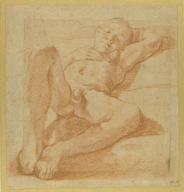
4-1 Ludovico Carracci, Nude Boy Sleeping, ca. 1588-1590. Red chalk, 23.7 x 22.3 cm. Ashmolean Museum, Oxford.
The coincidental resemblance to Pontormo’s drawing of a boy (figure 3-27) confirms the often-made observation that Mannerist tendencies were always latent in Ludovico’s art. The drawing’s chief stylistic concern is the effect of a specific strong light source on the left, which casts prominent shadows on the bed and on the boy. The parallel hatching does not model the figure into rounded forms but establishes patches of light and dark across the drawing. To counter the flattening effect of the patches, he thickened many contours considerably. Whether handling ink or chalk, Ludovico had a strong feeling for the emotional and dramatic potential of chiaroscuro. In his drawings as in his early Baroque paintings, light and dark may flicker across the surface, create patterns and movement, or build drama rather than model solid bodies in space.
By most accounts, Annibale, the youngest of the three Carracci, led the way to the reform of art. To make a decisive break with the past, Annibale began drawing genre subjects—boys and men eating, drinking, and working—and character “portraits” never intended for further development in oil. A series of drawings representing the tradespeople of Bologna eventually were engraved as Le arti di Bologna. Annibale’s genre drawings are appropriately inelegant and rough. In line with their investigation of the particular, Annibale and his brother Agostino also made caricatures, exaggerations of a person’s distinctive features.
4-2 Annibale Carracci, An Angel Playing the Violin, ca. 1583-1585. Red chalk on ivory paper, 16.4 x 20.1 cm. British Museum, London.
At the beginning of his career in Bologna, Annibale re-established the Renaissance practice of making extensive chalk studies to prepare for a painting. For an early painting, The Baptism of Christ, in 1585, Annibale positioned himself at the feet of a model who posed as a music-making angel seen in the sky above. Looking up at the model, Annibale sketched An Angel Playing the Violin (figure 4-2) with swift and sure strokes of chalk, the result of years of practice and consummate inborn skill.
Annibale’s undulating contours are consistently elegant, simplifying anatomy with flowing curves. A few pentimenti are visible, but no line ever seems uncertain. While the forward arm was carefully modeled with traditional diagonal hatching, the torso and rear arm received flat areas of light and dark, as in his cousin’s drawing Nude Boy Sleeping (4-1). Annibale may have rubbed the chalk here and there to soften the chiaroscuro further, and the lower edge of the boy’s triceps muscle grows slightly paler because of light reflected from underneath. More remarkably, the contour lines themselves express variations of light and dark. For example, the top contour of the extended forearm almost disappears in the light; the bottom contour, away from the light, is emphatically dark.
As commentators from the Baroque era forward have noticed, Annibale’s half-dozen music-making angels in the painting The Baptism of Christ are modeled on the slew of angels in the upper reaches of Correggio’s fresco in the cupola of Parma cathedral. Annibale traveled to Parma in 1582 precisely to study the work of Correggio. Back in Bologna, Annibale did not make variations on his recollections of Correggio but, as we have seen, had the model pose in the manner of Correggio. In other words, his exercise in the art of Correggio was based on the study of reality. Annibale probably never saw drawings by Correggio. If he had, he immediately rejected Correggio’s sfumato or general blurriness in the handling of chalk. (Ludovico was more likely to blur his chalk lines.) More importantly, Annibale rejected Correggio’s Leonardesque methods of stimulating the imagination with “brain storming”—repeated variations that probably never derived from examining a model.

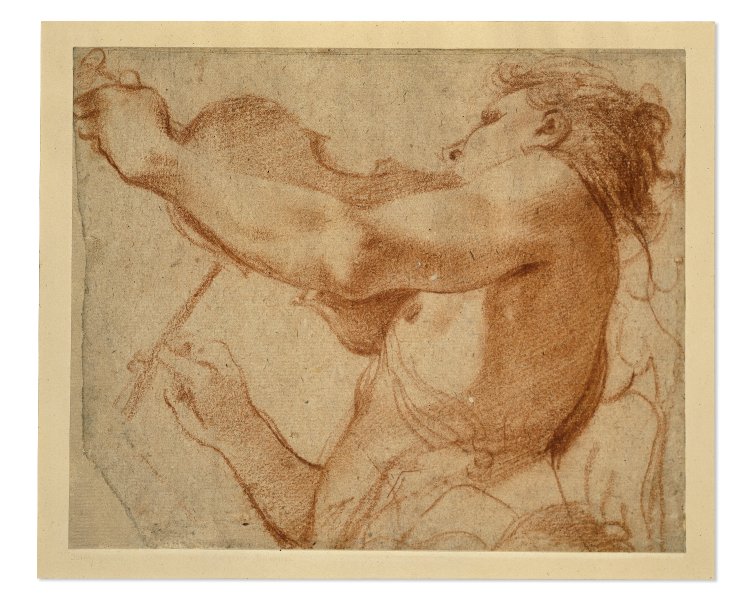
4-3 Annibale Carracci, Male Nude Seen from Behind, ca. 1593-1594. Charcoal heightened with white on gray-blue paper, 36.5 x 20.8 cm. Szépmüvészeti Müseum, Budapest
Male Nude Seen from Behind (figure 4-3) is a study for one of the many figures in The Almsgiving of St. Roch, the last picture Annibale painted in Bologna before he settled in Rome in 1595. Around that time, Annibale began to switch from red to black chalk. The material (charcoal or possibly black chalk on blue-gray paper) and the influence of Tintoretto and Titian in this and other drawings of the period confirm that Annibale had been to Venice, where he admired Veronese, Titian, and Tintoretto. Annibale is recorded in Venice in the early 1580s, but the allure of its art becomes evident only in 1590s, after his brother Agostino returned from a long stay in Venice, where he made engravings after Tintoretto. Perhaps he brought back some Venetian drawings for the members of the Accademia degli Incamminati to study.
For his drawing Male Nude, Annibale directed the model to hold his arms behind him in order to mimic pushing a wheelbarrow. The pose knotted his prominent back muscles which Annibale brought into relief with vigorous strokes of black and white that flicker across his back. He reinforced the apparent energy of the young man with knobby contours that vibrate in the manner of Tintoretto. Whether Annibale worked in the manner of Correggio, as in figure 4-2, or in the manner of Tintoretto, as in figure 4-3, he kept his drawing based on reality.
4-4 Annibale Carracci, Triumph of Bacchus, 1597-1598. Pen and brown ink on cream paper, 16.8 x 22.3 cm. Her Majesty Queen Elizabeth.
In Rome, Annibale continued to make scores of drawings in systematic preparation for a major commission. Dozens of drawings connected with his magnum opus, the Farnese Gallery ceiling in Rome, still exist. They attest to the months of assiduous preparation in drawing that came before the application of fresco. Scholars estimate that he made over a thousand for the project. Triumph of Bacchus (figure 4-4) represents an early attempt at resolving the pseudo-architectural framework for the lower part of the vault as well as the composition of a major panel. The drawing does not strictly represent his very “first thoughts” about either issue because decisions about them had already been made in other surviving drawings. He dashed off this drawing in such rapid and blotted strokes—holding a thick pen, perhaps a reed pen—that the drawing may have been useful only to test the scale-relationship between decorative figures like the herm or atlas at the left and the narrative figures within the frame. Even at this evident speed, his pen fleshed out fat, tipsy Silenus, a dancing maenad, and a figure pointing to the sleeping Ariadne. It is significant that Annibale does not use wash to initiate some chiaroscuro in his design as Veronese did in his first sketches (see figure 3-37), for even in such a cursory sketch Annnibale considered his actors as individual pieces of sculpture spread across the surface. In Bologna, Annibale made pen sketches with long, flowing, decorative lines. In Rome, he usually changed to a more energetic, almost ugly pen line—an abrupt, graceless, economic shorthand that got the job done. These “ugly” pen drawings (like figure 4-4) stay far away from the refinement of Raphael in his roughest sketches.
4-5 Annibale Carracci, A Seated Ignudo with a Garland, 1598-1599. Black chalk heightened with white chalk on gray paper, 41.2 x 41.0 cm. Musée du Louvre, Paris.
After compositional decisions were finalized in modelli, Annibale made many studies of each figure, such as A Seated Ignudo with a Garland (figure 4-5). Annibale’s nude makes explicit reference to Michelanglo’s ignudi on the Sistine ceiling who are similarly stationed in facing pairs around the base of the ceiling’s imaginary architecture. He did not copy any one of Michelangelo’s nudes, but once again studied a model posed in the manner of Michelangelo. The use of a living model relaxed the tensions present in Michelangelo’s bent-like-a-pretzel poses and brought the anatomy back to normative proportions. Annibale’s ignudo, which fills and crowds the large sheet, also has the heroic build of a statue. His nude is a piece of sculpture come to life. In Rome, Annibale absorbed classical sculpture so thoroughly that he could reproduce famous masterpieces of classical sculpture, such as Laöcoon, from memory. Such living sculpture is a major theme of the ceiling in a room that housed the Farnese’s collection of antique statues.
Over a light chalk sketch in A Seated Ignudo, Annibale developed well defined contours which flow continuously from one muscle group to the next. He did not hesitate to adjust them as the drawing progressed. Changes are most obvious in the legs, which he tightened or expanded. He modeled the nude thoroughly with short strokes of hatching and crosshatching. Unlike his earliest drawing with a few flat light and dark areas, this nude is solidly three-dimensional and sculptural. The precision of the hatching and the white heightening lend a feel of polished marble to the flesh. Drawings of individual figures from the Farnese Gallery project have long been considered the finest examples of Annibale’s draftsmanship. They established what might be called a classical manner of drawing that was imitated for centuries. They are classical because they are normative and because they seem devoid of personal eccentricities.
4-6 Annibale Carracci, A Bacchic Procession with Silenus, ca. 1598. Black chalk heightened with white on more than fifty joined sheet of formerly gray-blue paper. 345 x 332 cm. Galleria Nazionale delle Marche, Urbino.
When Annibale had studied each of the two dozen figures in the central panel, The Triumph of Bacchus and Ariadne, and had presented a modello of the composition to the patron for his final approval, he glued together over one hundred large sheets of paper on which he drew the cartoon (figure 4-6). Normally a cartoon is destroyed when it is cut into the smaller pieces that correspond to a day’s worth of fresh wet plaster (giornato) on which an artist can paint. Remarkably, the entire right half of Annibale’s cartoon, nearly 12 feet square and in the same scale as the fresco, remains intact. (The cartoon is still intact because Annibale pricked and pounced it with charcoal to transfer the design to smaller, expendable cartoons.) Although Annibale followed his own studies for individual figures rather closely in the cartoon as in the fresco, a cartoon of the whole composition allowed him to coordinate their scale to one another and to cast a rhythmic arrangement of light and dark over the figures so that the foremost volumes stand out in relief.

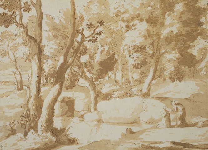
4-7 Annibale Carracci, Coastal Landscape, ca. 1599. Pen and brown ink over traces of black chalk, 14.9 x 37.6 cm. Teylers Museum, Haarlem.
Despite problems attributing landscape drawings to the Carracci and their followers, experts agree that Annibale drew Coastal Landscape (figure 4-7) because it can be related to landscape elements in several of his drawings for documented projects. The subject is a small stream that meanders to the sea where sails on the horizon fill with wind. The stream creates diagonals that lead the eye across the foreground to the clump of trees on the left and then to the hills on the distant right. Sweeping lines cut off by the margins suggest a panorama that continues beyond them. Nevertheless, the trees and hills stabilize the composition and give the land a feeling of serenity. Thin curved lines and broadly spaced hatching convey the same feeling of extensive space. Their thinness and the amount of empty paper, especially in the sky, imply a bright light. In some of the hatching, for example in the trees, Annibale employed a distinctive hair-pin like loop. Although members of the Carracci academy were reported to have sketched in the countryside outside Bologna, it is likely that Annibale drew Coastal Landscape from his imagination, where he could organize, if not idealize nature. By comparison, Fra Bartolommeo’s A Wooded Ravine (figure 3-24) was probably sketched at the site since the majority of his landscapes depict specific views. His vignette, in which his pen shunned the margins of the sheet, has the rough and tumble of random nature.
Guercino (1591‑1666) The Carracci had many followers who spread their manner of drawing around Italy and beyond. Although he never studied at the Carracci academy in Bologna, Guercino developed a personal style of Baroque painting and drawing by imitating the manner of Ludovico Carracci. Ludovico himself remarked about Guercino’s originality and his ability to draw in a letter of 1617: “There is a young man from Cento [Guercino] who paints with remarkable invenzione. He is a great draftsman and a terrific colorist [i.e., talented painter]; he is a freak of nature, a true miracle who dumbfounds everyone who sees his works. I’m speechless; even the top painters are awestruck.” In his native Cento, Guercino had a series of teachers of little consequence—he was in effect self-taught. He taught himself by imitating Ludovico’s work in Cento and the work of the Carracci academy on visits to Bologna.
4-8 Guercino, Seated Young Man Looking Down, ca, 1619. Oiled charcoal with white chalk highlights on gray-brown paper, 57.2 x 42.7 cm. J. Paul Getty Museum, Malibu.
The year before Ludovico’s letter, Guercino had set up his own Accademia del nudo in Cento and soon had nearly two dozen pupils of his own. During these years, before he left Cento for Rome in 1621, Guercino made a number of drawings of the nude, including presumably Seated Young Man Looking Downward (figure 4-8), to serve as models for his students to imitate. As befits teaching aids, these drawings are large in size and executed with broad lines on rough-textured paper in oiled-soaked chalk, a technique he saw the Bolognese artist Pietro Faccini use. Soaking chalk in oil makes the image darker and more permanent. The young man in the drawing, with rather thick forearms and lower legs, fills the sheet and consequently presses forward, as do some of Annibale’s drawn figures (see figure 4-5). With little hesitation, Guercino established contours by means of a few flowing curved lines. Instead of a study in the fine points of anatomy, this and other drawings in the series of similar nudes study light and dark, as Ludovico did in his chalk Nude Boy Sleeping (figure 4-1). Everywhere in Guercino’s drawing, dark patches of cast shadow contrast with the lightly modeled bright limbs. Guercino stopped doing life drawings entirely after the fame of his work in Rome made increased demands on his time.
4-9 Guercino, Jacob Blessing the Sons of Joseph, 1620. Pen and ink and wash over traces of black chalk on ivory laid paper, 1 8.2 x 24.5 cm. The Art Institute of Chicago.
From the very beginning of his career, Guercino developed an altogether different manner of drawing in pen and wash. A matter of months or at best a year separates the ink study Jacob Blessing the Sons of Joseph (figure 4-9) from the oiled-chalk Seated Young Man. Drawing tools (pen and chalk), scale (the nude sheet is twice as large as the biblical scene), and purpose account for many of the differences; for Guercino made Jacob Blessing the Sons of Joseph as a primo pensiero, a Leonardesque rapid storming of the artist’s imagination in search of solutions. The biggest difference between the two drawings is that, instead of the confident line of the chalk drawing, the pen line hesitates, corrects itself in pentimenti, grows short and jagged or swirls in calligraphic flourishes—his usual shorthand for drapery. The lines and the touches of light wash proclaim the speed of execution he needed to strike the page while his vision was still hot. Neither Ludovico nor Annibale drew in a similar manner. Perhaps Venetian drawing impelled him in this free-wheeling direction. In 1618 Guercino took some of his drawings to Venice to show to Palma Giovane who in turn showed him the work of Titian. Perhaps Guercino knew that Correggio created his works by the brainstorming method.
Faced with a biblical or mythological composition, Guercino typically drew any number of primi pensieri, rearranging individual figures or groups of figures, trying out new gestures and poses, or reversing the entire design. He could create only as he worked, and he was seldom satisfied with only one possibility. In sketch after sketch he searched for the most effective grouping of the figures and the right gestures. Drawing, in short, was the source of his remarkable inventiveness (invenzione) that left Ludovico speechless. Only occasionally did he more carefully render an individual or a group in red chalk. Unlike Annibale Carracci, he did not record the finished design in a modello, and he did not often affirm a figure’s pose with a life study. Nor did he employ cartoons. He brought his rapid pen studies together when he painted the composition directly on the canvas. The cost of paper was no object. His trial and error method of creativity made him one of the most prolific draftsmen of the century. He continued the same method of invention and the same dynamic style of drawing to the end of his fifty-year career when he, more and more, switched from ink to red chalk.
4-10 Guercino, Landscape with a Waterfall, unknown date. Pen and ink on laid paper, 28.8 x 42.7 cm. National Gallery of Art, Washington, D. C.
Like the Carracci, Guercino delighted in drawing landscapes. However, his Landscape with a Waterfall (figure 4-10) presents a much different image of nature from Annibale’s (figure 4-7) peaceful Coastal Landscape. In Guercino’s drawing, jagged rocks frame a spectacular waterfall, which strikes awe in its tiny viewers. Hatching in every direction facets the rocks and gives them a rugged texture. Finally, a strong contrast of light and dark dramatizes the unusual scene.

4-11 Guercino, Girl Carrying a Sleeping Nude Baby, mid 1640s. Pen and brown ink and dark brown wash, 19 x 14.8 cm. Windsor, Royal Library.
For his own enjoyment, Guercino turned to genre subjects, such as Girl Carrying a Sleeping Nude Baby (figure 4-11), in which he observed bizarre aspects of everyday life, but did not satirize them. The child’s weight pulls against the two straps that support him, and his head slumps unto his shoulder. The scale of the infant suggests that the figure carrying it is a girl, but she is more likely a mother who strides forward with great purpose. If she is the mother, the large scale of the infant signifies the burden she is carrying. Guercino built forms with a few swirls of a pen and a few broad strokes of a brush. The shadow cast on the ground and the sharp contrast between light and dark elsewhere suggest strong mid-afternoon sunlight. Guercino never put his depictions of everyday people to any use; in fact, his painting grew increasingly idealized after the mid 1620s.
4-12 Domenichino, St. Peter, ca. 1626-28.Black chalk heighten with white on blue paper, 40.1 x 23.0 cm. Windsor Castle.
Domenichino (1581-1641) Bolognese artists such as Guido Reni and Domenichino, Annibale’s favorite pupil, practiced a style of figure drawing not far removed from the manner Annibale practiced when he worked in the Farnese Palace.
For example, Domenichino’s St. Peter (figure 4-12), a sketch for large-scaled frescoes on the vault of the church of San Andrea della Valle, also idealized humanity. It is one of six or eight drawings preserved at Windsor—two of them life studies—for the figure of St. Peter scurrying from his boat at the invitation of Christ. With vigorous strokes, Domenichino constructed contours—hesitating where to put them on the left side of the chest and botching them in the foreshortening of the thigh and knee that projects over the edge of the boat. His head seems too small for the enormous body. Yet a variety of hatching strokes and white heightening modeled the heroically proportioned saint in a very three-dimensional manner. Domenichino probably did not bother to check his drawing against a model. Like Annibale, he could draw variations of the Hellenistic Laöcoon statue in his sleep. Domenichino also did landscapes.

4-13 Lanfranco, Moses, ca. 1624-25. Black chalk and white lead on light brown paper, 29.3 x 25.6 cm. Museo di Capodimonte, Naples. [not in scale]
4-14 Lanfranco, Martyrdom of St. Matthew and Martyrdom of St. Jude, detail of top half, ca. 1640-44. Pen, wash, red chalk, and traces of black chalk on ivory paper, 24.1 x 20.6 cm. Uffizi, Florence. [not in scale]
Claude Lorraine (1600 -1682) The most famous landscape artist of the seventeenth century, Claude Lorraine, first came to Rome in his mid-teens. Except for a sojourn in Naples and another in his native Lorraine, he stayed in Rome for the rest of his long life. In the 1630s and 1640s, Claude travel into the countryside around Rome to sketch from nature. His Tiber Valley (figure 4-15), one of several hundred drawings after nature, dates from that period.
![4-15 Claude Lorrain, Tiber Valley, 1635-1640. Pen and brown and black wash, 19.8 x 26.6 cm. Albertina, Vienna. [not in scale]](/wp-content/uploads/2015/03/ClaudeTiber.png)
4-15 Claude Lorrain, Tiber Valley, 1635-1640. Pen and brown and black wash, 19.8 x 26.6 cm. Albertina, Vienna.
The most remarkable thing about Tiber Valley is that it is executed almost entirely in wash. It is almost a pure wash drawing focused exclusively on chiaroscuro. He borrowed the technique of pen and wash, not from his teacher Agostino Tassi, but from Dutch landscape painters such as Cornelis Poelenburch and Bartholomeus Breenburgh, who earlier, in the 1620s, likewise sketched outdoors in Rome. In Tiber Valley, Claude applied wash with broad and spontaneous brushstrokes. However, he carefully modulated light and dark by adjusting the opacity or transparency of the ink, diluting it like watercolor. On the left, the dark silhouette of the cliff stands out against the light of the sky and the river; in the middle, gentler contrasts ripple across the land on the opposite bank. An application of heavy wash appears even in the sky. It must have been a gloomy, overcast day on this excursion north of Rome.
The inventory of Claude’s possessions made after his death listed twelve books of drawings. They included bound sketchbooks that he carried with him on his excursions and also albums in which related drawings were assembled and bound or pasted in the pages of a blank book. The Tivoli Book from 1639-1641, the finest of the six or seven books that have been partially reconstructed in modern times, contained several dozen oblong nature drawings, among them, Wooded Scene (figure 4-16).

4-16 Claude Lorrain, Wooded Scene, from the Tivoli Book, 1640-1645. Pen, brown wash, 21.0 x 29.7 cm. Tyler Museum, Haarlem.
Claude constructed most of his landscape drawings with a series of planes that mark off the distance. Wooded Scene also has a Baroque design: the bright path recedes diagonally toward the left and is crossed by diagonals in the opposite direction. A dark tree on the right frames the composition, as does the pale foliage on the left. A second dark tree, under which two very small people stand, is silhouetted against the sky. Trees or clumps of tress set against the light are the most frequent and most important subject of Claude’s nature drawings. In Wooded Scene, highlights on the trees and on the ground indicate that the light is coming from the lower left distance, the goal of the pathway through the woods. Of equal importance, atmospheric perspective defines the recession of space. The lack of chiaroscuro on the distant trees, drawn with much diluted wash, signals a projection into space.
Tiber Valley and Wooded Scene do not necessarily record what Claude actually saw. Instead of faithfully rendering the world before him, as would a nineteenth-century Impressionist facing a motif, he constantly selected and transformed what he saw into a vision. He sought the atmosphere of the place. The German painter and writer Joachim van Sandrart, who sometimes accompanied Claude on his excursions in the early 1630s, has left us valuable remarks about Claude’s approach.
He [Claude] found me painting from life and saw that I painted many works from nature itself, making nothing from imagination. [Sandrart’s and Claude’s “painted” sketches from nature do not survive.] But while I was only looking for good rocks, trunks, trees, cascades, buildings, and ruins, which were great and suited me as fillers for history paintings, he on the other hand only painted, on a small scale, the view from the middle to the greatest distance, fading away towards the horizon and the sky. The sun plays over the ground in all parts and lights up the grass, bushes, and trees almost as if in life, showing everything perfectly in natural light and shadow, including the reflections, so that the distance of each object can be, as it were, measured in proportion and found correct, as in life itself.
Sandrart remarks confirm that Claude focused on the play of light over the land. Light, shadow, and reflections not only created the reality of the scene; light and atmosphere put everything in correct perspective. Pierre‑Jean Mariette, an outstanding eighteenth‑century connoisseur of drawing who once owned Tiber Valley, summed up Claude’s art, “Of all the landscapists, Claude Lorraine put the most air and freshness into his landscapes.”
4-17 Claude Lorrain, Reposo (Rest on the Flight into Egypt), 1660. Chalk, pen, brown and dark gray wash, white heightening on grainy yellowish paper, 27.4 x 38.0 cm. Albertina, Vienna. [not in scale]
In order to protect himself from forgeries, about 1635 Claude began to make reproductive drawings of almost all his paintings and compiled them in his Liber Veritatis or “Book of Truth.” Riposo is not from the Liber. Although Claude made a painting of the same subject (Hermitage, St. Petersburg), Riposo is not a reproduction of it. It is one of several drawings of the subject in which he made variations on a composition that he obviously liked. One of these drawings reverses the composition; another excludes the figures. The blue-gray tonality and linear delicacy of Riposo impart a serenity to the scene absent in the stronger colors and light of the painting. Such painting-like drawings were not often sold. Drawing for its own sake obviously delighted Claude–nearly twelve hundred drawings by him survive.
FRANCE
Simon Vouet (1590-1649) When Simon Vouet returned to France in 1627 after spending fifteen years in Italy, he brought with him a fully developed Baroque style that completely overwhelmed the last traces of Mannerism in French art. In short order, he established a studio where many assistants helped him realize an enormous number of altarpieces, mythological paintings, tapestry designs, and mural decorations for the royal court and other aristocratic patrons. In his studio, he literally trained the next generations of artists in his style and manner of working, communicating his lessons to them through drawing.
Only a meager handful of drawings remain from Vouet’s years in Italy, where he made his reputation in part through character portraits. In France, his most famous portraits are a series of pastel drawings of members of the royal court, dating from 1632-35, made at the request of king Louis XIII who watched Vouet draw them. In these pastels Vouet enlivened the Clouet tradition of three colored chalks, abandoning its frontality and dry abstract lines. He gave his sitters more animated poses and employed a sketchy manner, exploiting a “new” medium that will have a brilliant future in the eighteenth century.
4-18 Simon Vouet, Fainting Magdalen Supported by Two Angels, ca. 1640. Black chalk heightened with white on beige paper, 31 x 23.3 cm. Musée du Louvre.
For the hundreds of projects that Vouet and his studio completed, only about twenty composition studies still exist. A few of these hasty and ungainly designs are in red chalk, and many of them are emphatically squared for transfer. The vast majority of the hundreds of drawings in Vouet’s corpus are figure studies in black chalk heightened with white, which were in all likelihood given as guides to his assistants. He seems to have made one or more studies for each figure in a painting or tapestry. Vouet and his studio used the drawing Fainting Magdalen, Supported by Two Angels (figure 4-18) for a painting now in the Musée des Beaux- Arts, Besançon.
Vouet evidently adopted his style from Annibale Carracci’s chalk figure studies, which the French artist must have examined in Rome. He also followed the Carracci tradition of thorough preparation through drawing from the model, although it is hard to imagine that Vouet had models hold poses for the gymnastics of Fainting Magdalen, Supported by Two Angels.
Although it is not squared, the drawing has the completeness of a compositional study—it established the arrangement of the three figures in the painting—but it just as forcefully exhibits the refinement of his best figure studies. The three grand, big-shouldered figures fill the entire surface of the sheet as they lunge forward or fall backward in energetic and choreographed movement. Vouet’s blunt, slightly greasy chalk swiftly found gently curving contour lines. He hesitated only in the foreshortening of the angels’ backs. The broadly spaced hatching and the white heightening reinforce the massiveness of the figures. Bolder lines and modeling inject Baroque excitement into the drapery.
Vouet maintained his style of energetic elegance and a confident and vigorous touch with little change for more than twenty years.
Contemporary critics and patrons also praised the talent of Vouet’s Italian-born wife, Virginia da Vezzo. She gave lessons in drawing to female members of the royal court and probably assisted Vouet in his studio. Unfortunately, only a copy of one of her drawings still exists, although perhaps some drawings by her are hidden in collections under Vouet’s name. The loss is also unfortunate because so few women draftsmen are known in the Renaissance and Baroque periods. Moral restrictions kept them from learning to draw alongside male apprentices when they were studying the nude model. Famous exceptions, such as Artemisia Gentileschi, learned their skills in disegno from their father or other relative. So too, Virginia da Vezzo, in her late teens in Italy, learned to draw and to paint from her husband.
Nicolas Poussin (1594-1665) In 1624, Nicolas Poussin reached Rome after nearly a dozen years of study and work in Paris. By then, he was almost thirty years old. In Paris, Poussin had haphazardly acquired a drawing style derived from the (Mannerist) Second School of Fontainbleau and from early seventeenth-century Flemish art available in Paris. He retained aspects of that style—especially the preference for pen and wash—up to the end of his career, which he spent mostly in Italy. In short, Poussin brought a liking for ink from Paris to Rome shortly before Vouet brought the use of black chalk from Rome to Paris.
4-19 Nicolas Poussin, Acis, Galatea, and Polyphemus, ca. 1627-1630. Pen and ink, wash, over light black chalk, 13 x 18 cm. Musée Condé, Chantilly.
The style that Poussin employed in Paris can be seen in fifteen controversial drawings, most of them illustrating Ovid, which were executed for the poet Marino. Poussin applied this style to five other mythological drawings in his early years in Rome. One of them, Acis, Galatea, and Polyphemus (figure 4-19), like many of his drawings, is a finished compositional study, unrelated to any known painting.
It seems that his fertile imagination, steeped in classical literature and art, teemed with inventions that he constantly brought out in drawings. He often set his mythological or biblical subjects in landscapes that reinforce the narrative. Here the trees anchor and emphasize the group of lovers stationed between the rocky hill on the left and the distant horizon on the right.
Typically, Poussin outlined figures with unbroken pen lines over a light sketch in black chalk. He seldom drew internal lines within the figures and sometimes omitted facial features altogether. He employed widely spaced hatching lines sparingly, but instead applied broad strokes of wash to create contrasting areas of dark. In some drawings, especially in the late 1640s, he omitted pen work altogether and designed whole compositions entirely in brush and wash.
In a somber study for The Holy Family on the Steps (figure 4-20) from that period, he kept pen lines to a minimum, perhaps because a recurrent illness was causing his hand to tremble.
4-20 Nicolas Poussin, The Holy Family on the Steps, ca. 1650. Pen and ink, wash, 18.4 x 25.1 cm. Pierpont Morgan Library, New York.
More importantly, the strong washes accentuated the building blocks of shapes that he piled up into a stable triangle resting on a graph of horizontals and verticals. The astute connoisseur Mariette caught the essence of Poussin’s drawing in a sentence: “A simple line, sometimes accompanied by a few strokes of wash, was enough for him to express clearly what his imagination had conceived.”
In contrast to his relatively complete compositional studies, devoid of pentimenti, Poussin sometimes made rapid pen sketches, such as The Massacre of the Innocents (figure 4-21) with much more energetic lines and often with little or no wash. Pentimenti and thick, re-worked lines in this kind of drawing indicate that Poussin was struggling to visualize fleeting ideas. His lines are neither accurate or graceful. The mechanical lines of the hatching are, as usual, so widely spaced that they can be mistaken for stripes. Harsh drawings like The Massacre of the Innocents show that Poussin was not by nature a suave and elegant draftsman. He struggled to refine his impulsiveness or awkwardness for the sake of balance and narrative clarity.
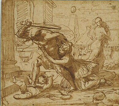
4-21 Nicolas Poussin, The Massacre of the Innocents,
ca. 1628. Pen and ink, wash, 14.6 x 16.9 cm. Musée des Beaux-Arts, Lille.
Missing almost entirely from the hundreds of drawings in Poussin’s oeuvre are chalk studies of an individual figure made from the posed model. (A couple of them have recently been found on the verso of sheets that had been mounted on a backing for a century or more.) Figure studies dominate the work of Vouet and Annibale Carracci and his followers, and Poussin experts presume that he made more than a few of them. To draw from the nude, he is know to have gone to the studio of Domenichino in the late 1620s, and subsequently to the studio of Andrea Sacchi, artists with whom he shared views about the prominence of disegno. It seems obvious that he went to the studio of these sympathetic Italian artists to practice drawing from the model, rather than to make use of one of their models for his own purposes.
There are so few life drawings by Poussin probably because he was never very good at it and seldom did it. Instead, after Poussin had made preliminary sketches of his first ideas, he sometimes arranged small wax figures, about nine inches high, on a board in a box to study and adjust his compositions. He made drawings from these staged shows. He also studied the fall of drapery on larger mannequins, but seldom posed a living model.
4-22 Nicolas Poussin, The Aventine, ca. 1650. Brown wash over black chalk, 13.4 x 31.2 cm. Uffizi, Florence.
Starting in the 1630s Poussin accompanied his good friend Claude Lorraine on excursions into the countryside around Rome, where they sketched from nature. Poussin probably drew The Aventine (figure 4-22), from nature because it is one of the few landscapes by him of a recognizable site. (Of course, he may have reworked the composition in his studio from a more cursory outdoor sketch.) Like Claude, Poussin adopted a wash technique that the Dutch artists Poelenburch and Breenbergh had pioneered for their landscapes in Rome a decade earlier. And as Claude did in many of his paintings, Poussin looked into the sunlight. The source of light in the drawing is behind the trees lined up along the hillside path that leads to the monastery on the bank of the Tiber. Shadows are cast towards the viewer, and haloes of light around the trees make them glow in the strong daylight. In this drawing, Poussin had as keen an interest in light as Claude. To reproduce sparkling light the artist here and there used almost a pointillist touch—a stroke uncharacteristic of Poussin. As an indication of the uncertain authorship of this drawing, initials at the bottom of it at some point in time were changed from CL to NP.
4-23 Nicolas Poussin, St. Mary of Egypt Receives Communion from St. Zosimus, mid 1630s. Pen and ink, wash, 22.5 x 31 cm. Royal Library, Windsor.
Other landscapes by Poussin, for example St. Mary of Egypt Receiving Communion from St. Zosimus (figure 4-23), look very different, and it is hard to reconcile the two disparate styles, except that they both share a concern for light. This landscape, a completed compositional study, was obviously intricately constructed in the studio. Delicate pen lines here and there merely suggest a form. Instead, a gamut of washes, often one over the other, convey very well the flickering light of a thinly wooded forest and the faint reflections in the central pool of water.
Out of the several hundred drawings by Poussin that still exist, about seventy five of them are copies of antique sculpture or architectural decoration, such as The Triumph of Titus (figure 4-24), a view of one of the high reliefs within the Arch of Titus. Poussin normally copied engravings of classical work, but in this instance he may have worked from the original.
4-24 Nicolas Poussin, The Triumph of Titus, 1640s. Pen and brown wash, 15.1 x 27.7 cm. National Museum, Stockholm. [not in scale]
Charles Le Brun (1619-1690) When Charles Le Brun died, Louvois, minister to Louis XIV, seized the contents of his studios and residences. At a blow, about three thousand drawings by Le Brun entered the royal collection. They are now in the Louvre and are one of the largest and most complete collections of drawings by any artist. The Louvre drawings represent every phase of his activity except his student work. As an artist, Le Brun excelled at designing imposing decorations for urban hôtels and country châteaux, such as Vaux-le-Vicomte. From 1661 to 1683 he was responsible for all the paintings, tapestries, interiors, fountains, and sculpture at Versailles and other royal residences. For all these projects, he religiously made drawings, specifically a nude and, if need be, a draped study of each and every human figure. They were usually complete and rather finished studies which his assistants could readily translate into the larger work without much change.
Around 1633-34, Le Brun studied for a short time under Vouet in Paris and later was attracted to the ideas and art of Poussin in Rome. But it was the style and procedures of Vouet that he followed throughout most of his career. Le Brun had an even larger studio than Vouet, and he communicated, so to speak, with his teams of artists by means of drawings.
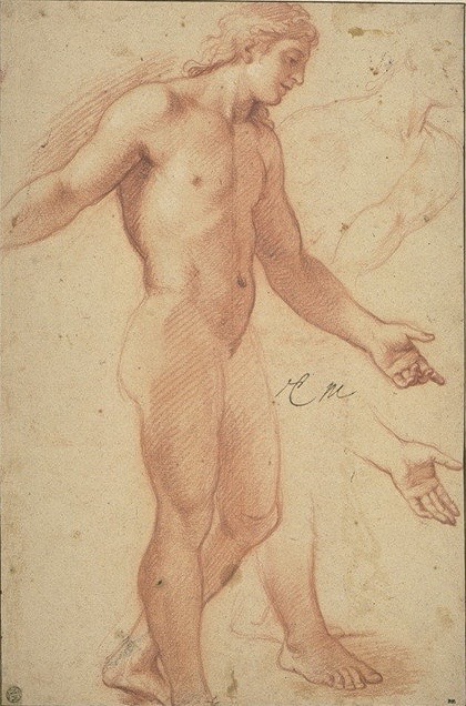
4-25 Charles Le Brun, Study for Alexander, 1660-1661. Red chalk heightened with white, 43.3 x 28.8 cm. Louvre Museum, Paris.
Le Brun drew Study for Alexander (figure 4-25) in preparation for Alexander in the Tent of Darius, a painting commissioned by Louis XIV. Le Brun studied the clothed figure on a separate sheet. On this sheet he reworked the hand with extended fingers, as it appears in the painting, and completed the foot cut off by the lower edge of the sheet. The nude is classically proportioned without being inflated like Vouet’s (figure 4-18). Study for Alexander has a very strong outline surrounding the entire figure so that, in effect, it could be more easily “cut out” and reproduce in the painting. Le Brun also employed very obvious and regular diagonal hatching that separates light from dark with clarity. The work pleased the king who now ordered from Le Brun an endless stream of projects.
His hundreds of figure drawings in red or black chalk testify that Le Brun had a sure sense of proportion and anatomy. He had the ability to invent an endless variety of poses and had an eye for grouping figures—as is evident in the relatively few, rapidly drawn compositional studies that exist. Still, there is something business-like or pedestrian about Study for Alexander and his other figure drawings. As the eminent connoisseur of drawings P.-J. Mariette wrote in 1741: “If M. Le Brun had put more soul and finesse in his drawings, if he had seasoned them with the spice that makes those of the great masters of Italy so piquant, there certainly would not have been more beautiful drawings than his.”
In his drawings, Le Brun used pen and ink only to correct or to emphasize a part of a design already work out in red or black chalk. Occasionally, for a presentation drawing, he might redo all the black chalk lines in pen. He used a gray wash for preparatory studies for sculpture to give the work more relief. Finally, having learned to make pastel portraits in Vouet’s studio, he made pastel studies of the king and his entourage for tapestry designs or for the ceilings at Versailles where the king appears.

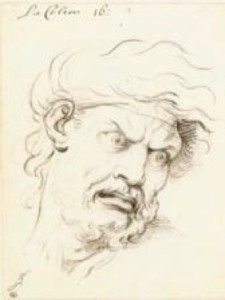
4-26 Charles Le Brun, La Colère (Anger), 1670s . Left: Schematic head. Black chalk, pen and black ink, 19.5 x 25.4 cm. Right: Sample head. Black chalk, 23.4 x 18.1 cm. Musée du Louvre, Paris.
Today, Le Brun’s best known drawings are the those he made to illustrate his lectures on human expressions, given at the Royal Academy for the first time in 1668. Artists since the Renaissance had conquered anatomy, proportions, and other areas that give a natural appearance to a human figure but had neglected the fleeting movements of the face that communicate emotion. Caravaggio, Bernini, and other artists had made faces in a mirror to capture an emotion, but a posed emotional expression usually turns into a grimace. Le Brun attempted through rational analysis to devise a system for the students at the Academy to recognize the characteristic traits of emotions such as awe, laughter, and anger (figure 4-26) so that they could re-create them. Le Brun illustrated at least 16 emotions with both lined diagrams in pen that measured the positions of the features on the face and also with finished heads in black chalk. Engraved after his death, the illustrations were examined by art students for the next two centuries.
 Le Brun was a founding member of the Royal Academy in 1648 and its president from 1663 to 1683. He and other artists formed the Academy to receive the support and protection of the king and to separate themselves from the workshop rules of the guilds. The founders also sought to raise the social status of its members by teaching art as a liberal discipline. This desire to elevate art led to Le Brun’s lectures.
From the beginning, the Academy emphasized drawing, which, they declared, in theory and in practice was the foundation of all the arts. After their Academy training in drawing, students still had to join the workshop of an established artist to learn how to paint or make sculpture. The twelve members of the governing board of the Academy supervised the life class where student learned to draw. Each month a different member of the board was responsible for posing the model, and they were also responsible for critiquing and assisting the students.
In 1655 the Academy was given a monopoly on life drawing—no one else in France was allowed to pose a model. (The Academy banned female models.) Changes in the rules in 1663 divided drawing into two courses, the lower class for copying engravings, drawings, and plaster casts, and the higher class for life drawing. The Academy regularly awarded prizes for the best drawings; one prize went to the best drawing of the live model. The prizes endorsed and promoted for two centuries a type of drawing known as an académie, a detailed and polished life study usually in red chalk. Laboriously corrected and perfected according to the flowing contours and smooth surfaces of classical sculpture, an académie nevertheless stressed anatomical accuracy. It tested the student’s ability to model with the fine hatching he had learned by copying engravings, and it tested his skill at reproducing the smooth transitions of light and dark he had observed on the sculpture he had copied. An académie differed from an étude, or study, of a nude not only in the degree of finish, but also because the expressions and gestures of an étude communicated emotion and made it part of a narrative. An étude had a function. An académie—handsome and heroic, introverted and introspective—had no function outside itself.