POST-IMPRESSIONISM
GEORGES SEURAT (1859 – 1891) In the 1880s, as the Impressionists held their final group exhibitions, George Seurat developed a distinctive style of drawing based almost exclusively on chiaroscuro. By reaffirming this essential element of art, he was countering the ephemeral appearance of Impressionism, which downplayed the contrast of values.
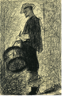
6-39 Georges Seurat, Drummer at Montfermeil, 1881. Conté crayon, 17.4 x 11.3 cm. Collection André Bromberg.
An early drawing in his personal manner, The Drummer at Montfermeil of 1881 (figure 6-39), still makes use of contour lines around the man’s head and clothing. However, in most places on the figure, the forms have been filled with dense, dark strokes so that the man becomes virtually a silhouette against the gray background.
Even at this early date, the drawing exhibits other characteristics of his style. The figure stands in profile and, despite some modeling on the drum, he is flattened against the surface. Three-dimensional space scarcely exist, nor is there a natural source of light. The background appears dark in the lower left, then grows light around the head, torso, and legs of the man as if an aura surrounded him. The drummer is motionless like almost every other figure drawn by Seurat and unlike the gesticulating performers in Daumier’s drawings (figure 6-16).
From 1880 until his death about a dozen years later, Seurat drew almost exclusively with black conté crayon on course Michallet paper, a type of handmade drawing paper. Added pressure on the crayon increased the darkness of any line as the crayon filled more of the tiny holes in the rough texture of the paper. For the figure of the drummer, Seurat still applied the crayon with vertical parallel strokes. For the background, he created the shifting gray tone with a net of criss-cross gray strokes similar to the brushstrokes he used in some early oil sketches. Over the years he refined the same crayon strokes and made their application more subtle and less noticeable. From the beginning he must have realized that his helter-skelter hatching method eliminated linear direction and movement inherent in traditional parallel hatching. His drawings would focus on chiaroscuro.
Previously, in 1878-1879, Seurat had studied drawing with Henri Lehman, a follower of Ingres. During those two years, he faithfully copied plaster casts of antique sculpture and drew meticulously finished académies from the studio model. He suddenly found a different path during a year of military service at Brest, where he began to fill small notebooks with pencil images of ordinary people. Four notebooks from that period, 1879-1881, remain intact (figure 6-40). One can already see in them the straight and angular contours of the Drummer. (Straight contours also appear in certain sketches by Millet, figure 6-18).

6-40 Georges Seurat, Man Lying on a Parapet, 1880-1881. Graphite, 10 x 16 cm. New York, Ann and Peter Rothschild.
Perhaps a popular drawing manual in those years encouraged drawing students to sketch essential contours in straight lines rather than fuss over anatomically correct curves. In the notebooks, Seurat also broadly applied parallel hatching which, instead of modeling, created flat facets of different values in somewhat the way Delacroix did in figure 6-7. As a consequence, Seurat’s forms lie on the surface. One could say that, as soon as he left school, Seurat set out to revolutionize drawing.
Seurat always had an interest in artistic theory and read books about design, color, and light, including Ogden Rood’s Théorie Scientifique des Couleurs, Paris, 1881 (Modern Chromatics, New York, 1879). In Rood’s book and in other texts, he learned about simultaneous contrast, the ability of a color to induce in its neighbor the opposite in value and hue. As far as value is concerned, simultaneous contrast means that a dark area makes the area next to it seem lighter and that a light area makes the area next to it seem darker. Artists have understood the principle for centuries. Just as Prud’hon arbitrarily darkened the background behind his nude (figure 6-5) to make the highlights along her flank seem lighter and just as he lightened the background next to her dark left arm, so too Seurat lightened the background behind his drummer as it approached his dark silhouette. But it was Millet’s essays in chiaroscuro (figure 6-16) that had the strongest influence on young Seurat’s drawings. They both built darks with visible strokes that formed a textured surface.
In a letter of 1888, Seurat committed to paper a very rare and very cryptic declaration of his own esthetic principles. In it he wrote that art is a harmony between contrasting elements, that is to say, contrasts of value, hue, and line. Although these three essential elements operate in concert in works of art, Seurat attempted to analyze each one separately, beginning with value contrasts in his conté crayon drawings. (He explored color contrasts in his oil paintings, and at his untimely death, he was beginning to examine contrasting line directions).

6-41 Georges Seurat, Seated Boy with a Straw Hat, 1882. Conté crayon, 24.1 x 31.1. New Haven, Yale University Art Gallery.
Most of Seurat’s drawings are not directly related to his paintings. Even when they are related, as in Seated Boy with Straw Hat (figure 6-41), a study for the painting Une Baignade, Asnières, they are not incomplete sketches but finished compositions. Unlike the silhouetted drummer and most of his previous drawings, Seurat modeled the hat, torso and limbs of the seated boy with velvet-like chiaroscuro. The modeling gives him roundness and weight, and his large scale—his hat and toes spill beyond the sheet—gives the motionless young man grandeur. Once again, to accentuate value contrasts, the background shifts arbitrarily from light to dark, even though in the painting, the boy sits in bright sunlight. As in many other Seurat drawings, the dark background does not depict dusk and, therefore, should not suggest a mood of gloom and desolation. Rather, in Seated Boy, Seurat achieved a harmony of contrasting values—dark/light, dark/light, dark/light, dark—across the entire surface. To paraphrase Josef Albers: it is a homage to chiaroscuro.
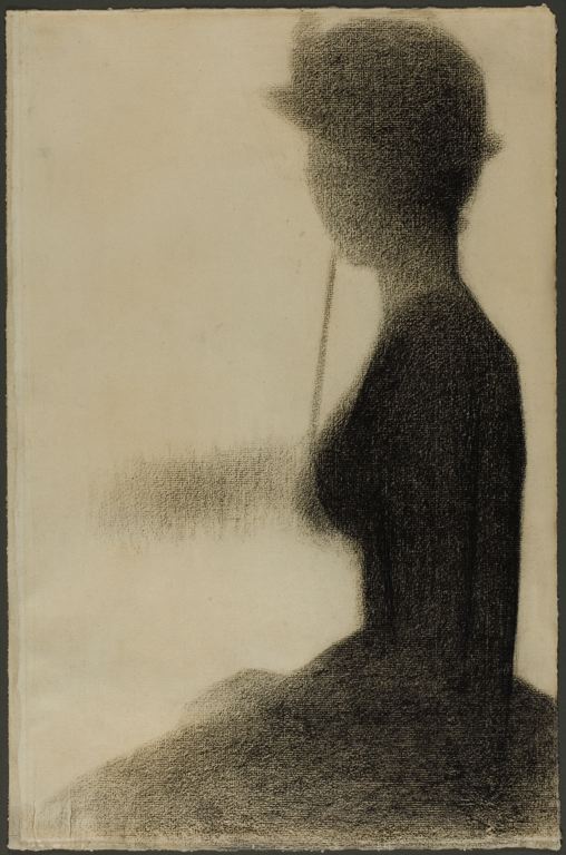
6-42 Georges Seurat, Seated Woman with a Parasol, 1884-85. Conté crayon and white chalk, 47.6 x 31.5 cm. Chicago, Art Institute.
In some drawings connected with A Sunday Afternoon on the Island of La Grande Jatte, Seurat seems to have stopped exaggerating the effect of simultaneous contrast. In Seated Woman with a Parasol (figure 6-42), the background stays as light as it is in the painting, where the grass behind her is in full sunlight. He did not model her torso because she sits in shade, and her parasol blocks all direct sunlight. Light reflecting from the grass models her face slightly.
Most of the contours around her silhouette are blurry as though the light is eating at them. She seems surrounded by a mist. Some writers feel that she sits behind a theatrical scrim that softens her appearance and gives it an air of mystery. The feeling that something more lay beyond the reality that Seurat depicted attracted Symbolist writers and painters to his drawings. They knew them because he exhibited drawings more often than paintings.
VINCENT VAN GOGH (1853‑1890) After Vincent Van Gogh decided to become an artist in 1880, he taught himself how to draw. He began by following the exercises found in drawing manuals with titles like “The Alphabet of Drawing,” “Anatomical Sketches for Artists,” “Exercises in Charcoal,” and “Progress in Drawing” (Guide de l’alphabet du dessin, Esquisses anatomique à l’usage des artistes, Exercises au fusain, Cours de dessin). Although he had few contacts with established artists, he spent three weeks in The Hague in 1881 with Anton Mauve who taught him basic watercolor technique by day and critiqued his drawings at night. In Antwerp in 1886, he drew from plaster casts at the Royal Academy of Fine Arts for six weeks, and in Paris in 1887, in the studio of Fernand Cormon, he drew from plaster casts for several more weeks. For the most part, he practiced drawing by enticing local people to pose or by sketching what was available in and around the half-dozen towns he lived in.
6-43 Vincent Van Gogh, The Parsonage Garden, Nuenen, sketchbook 1, 123, pencil, 12.4 x 7.4 cm., and Female Figure, sketchbook 1, 122, lithographic chalk, 12.4 x 7.4 cm. Amsterdam, Van Gogh Museum.
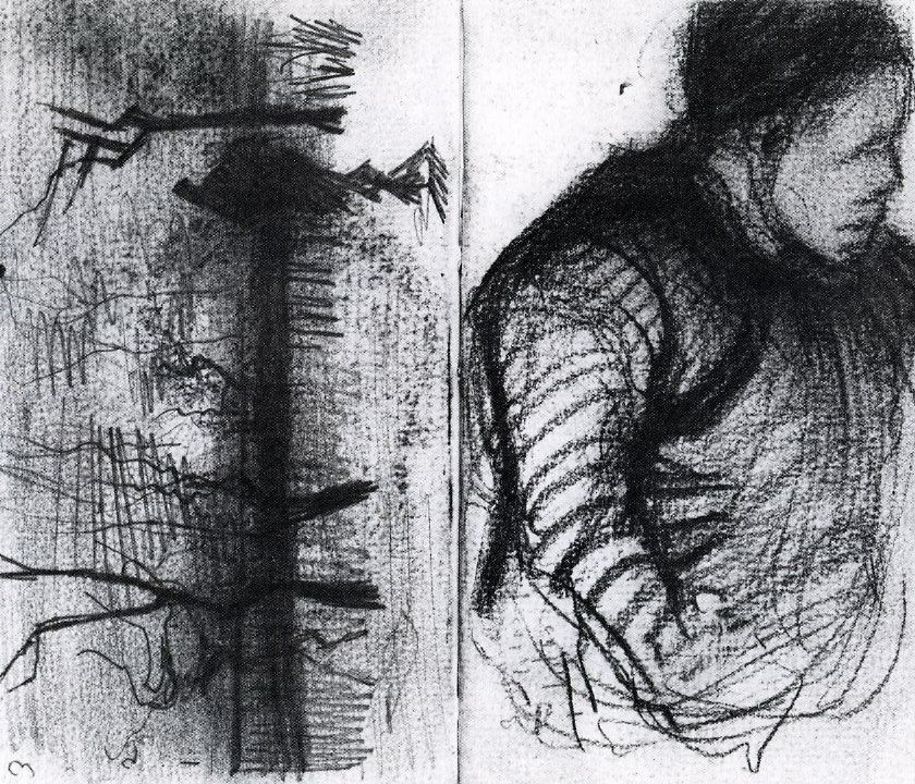
He discarded most of his student work, but he did keep six pocket-size sketchbooks in which he worked during his middle years in Nuenen, Antwerp, and Paris (1884-1887). A final seventh sketchbook dates from the last months of his life in Auvers. Like Rembrandt, Van Gogh loved to take long walks. He filled the books mostly with sketches of people and place he saw in passing (figure 6-43), and he occasionally used the sketchbooks for studies of a cast or a nude model. The style throughout is rough and cursory—he called them scribbles (krabbeltjes). Out of about 350 pages of drawings in the sketchbooks, only about three dozen of them relate to paintings or more finished drawings on separate sheets. In the pages of his sketchbooks or even on separate sheets, he seldom made preparatory drawings in any traditional sense.
Van Gogh was also inspired by the hundreds of magazine illustrations he collected. They were mostly scenes of daily life and of ordinary working men and women—wood engravings, for the most part, whose many lines were chiseled into a wood block with a graver. He also collected reproductions of the work of Millet, whose art he admired greatly. From the beginning, Van Gogh wanted to be an illustrator who sold his drawings to publishers or collectors. Consequently, drawing was for him a primary activity which he pursued parallel to his painting. Moreover, his best drawings are relatively finished, publishable compositions, which he often produced in series.

6-44 Vincent Van Gogh, Pollard Birches, 1884. Pencil, pen and ink, heightened with white, 39 x 54 cm. Amsterdam, Van Gogh Museum.
By the early spring of 1884, he was capable of outstanding and characteristic work. Pollard Birches (figure 6-44) belongs to a series of seven pen and ink drawings of the landscape near Nuenen. He thought highly of the series and sent a number of them to his brother Theo to sell. In the drawing, there is still an overcast, wintry feel to the land. Last year’s new growth erupts as vertical lines from the gnarled and heavily pruned trees. The trees march in perspective toward the center of the horizon, while on the periphery a women with a rake and a shepherd move away from us in that direction too. He once compared pollard birches to poor old men and last year’s down-trodden grass to the tired and dirty people of the slums. It looks like he remembered those words when he drew this scene.
Van Gogh began his sketch in pencil; then with a rather fine pen nib he completed it in black ink, which has now turned dark brown. In some places— for example, the far left, behind the tops of the trees, or in the foreground—the pencil lines are still quite visible beneath the once black pen lines. They contributed a gray tone to the once black drawing. Because the light from an overcast sky was diffused, modeling and cast shadows are not pronounced. Instead, the relatively short strokes of his hatching and perpendicular cross hatching creates a mosaic of patches—patches which resemble in places loosely woven gauze. The meshes of lines represent grasses in some areas, but they also create textures and light/dark contrasts. He seems to have turned the regularized hatching of Millet (figure 6-16, which he had seen) into lines that have more personal expression.
Next year, In the summer of 1885, probably in anticipation of devising a harvest scene, Van Gogh made over fifty large drawings of peasants, among them Digger in a Potato Field (figure 6-45).

6-45 Vincent Van Gogh, Digger in a Potato Field, 1885. Black conté crayon with gray wash, 54 x 42 cm. Amsterdam, Van Gogh Museum.
Inspiration came to him of course from Millet’s scenes of male and female farm workers. He also turned to the drawings of Delacroix for help and discovered his “system of eggs.” (See figure 6-10.) Van Gogh felt that his earlier drawings of the human figure were too flat; friends told him they were disjointed. He learned that Delacroix was able to capture and integrate the essential masses of figures by first describing limbs, head, and torso as ovals.
The preliminary ovals that Van Gogh drew can no longer be seen, but they can be felt in the rounded back, buttocks, and legs of the man digging in a field. Conceived on a grand scale—if he stood, his head would be off the sheet—his torso thrusts in and out of the picture’s space. Van Gogh went over the jagged, concave contours again and again to make them emphatic. And he generously modeled the man with some hatching (this time without mesh-like cross hatching) and mostly with broad strokes of crayon, some of which he rubbed smooth. He added highlights with strokes of very diluted gouache. The setting is quite perfunctory because Van Gogh drew the digger and his other peasant laborers in his studio. Despite the realism of the subject’s activity, we know that Van Gogh, like Rembrandt, kept props and clothing in his studio for his models.
In 1887, Van Gogh went to Paris to practice drawing the human figure, but on his arrival he soon realized that his dark painting style was out of date and needed more attention than his drawing. He consequently concentrated on painting rather than on drawing. The few outstanding works on paper from the period are watercolor cityscapes, made in imitation of Japanese prints, which he had begun to collect. In Paris he abandoned diluted gouache for genuine watercolor. His enthusiasm for drawing in ink returned when he settled in Arles the next year.
In the late spring of his first year in Arles, Van Gogh went to the small fishing village of Les Saintes-Maries-de-la-Mer, where he produced three paintings and nine drawings. Shortly before he left, he wrote to his brother Theo, “What’s always urgent is to draw, . . . one never does enough of it. I’m now looking to exaggerate the essential, to deliberately leave the banal vague” (26 May 1888). One of those drawings, Cottages, Les Saintes-Maries-de-la-Mer (figure 6-46), more than satisfies his quest for calculation, exaggeration, and concision. It breaks dramatically from his previous manner of drawing.

6-46 Vincent Van Gogh, Cottages, Saintes-Maries-de-la-Mer, 1888. Reed pen, pen and brush, 30.5 x 47 cm. Private collection, on deposit at the Pierpont Morgan Library, New York.
Instead of the classical perspective of figure 6-34, in which the trees begin to recede a few paces away from the frame, the cottage and foliage in the foreground of figure 6-36 loom large and spill out of the frame, as though Van Gogh had stepped into the scene that surrounds him. Furthermore, he interpreted the scene before him with nothing but broad, short lines. The fleeting appearances of nature, so dear to the Impressionists, become for Van Gogh a systematic code of lines: short straight lines for the cottages and radiating swirls and blobs for the foliage. With shocking directness, his lines open a viewer’s eyes wide to a revelation of the essential in nature. The new forcefulness stemmed in part from his adoption of the reed pen, which has a wide nib and releases its ink quickly in short strokes.
The patterns of lines in his drawing resemble the brushstroke patterns in the painting (private collection) that he made of the same street scene during the few days he was in Les Saintes-Maries-de-la-Mer. Earlier in Paris, under the influence of Seurat’s and Signac’s painting, he starting painting with brushstrokes that move in coordinated directions. But the lines in figure 6-36 are more regular and emphatic than the brushstrokes in his painting of the same subject from Les Saintes-Maries-de-la-Mer.

6-47 Vincent Van Gogh, The Zouave, 1888. Reed pen, pen, 32 x 24 cm. New York, Solomon R. Guggenheim Museum.
Two months later Van Gogh made a drawing of a Zouave (a French soldier in an Algerian uniform) (figure 6-47). He gave every area in the drawing a different penstroke: short, thick, curving strokes on his jacket (darker on the left, lighter on the right); thin, pale vertical strokes behind the man’s head; patches of mesh-like cross hatching on his hat; and dots placed systematically on his face and neck—the only area of modeling in the drawing. The lines of the drawing have great emotional force, and yet they are the result of a deliberate contrivance. Although the pen lines approximate the direction of the brushstrokes in the painting he made of the Zouave a few weeks earlier (Amsterdam, Van Gogh Museum), perhaps he also felt that the patterns of lines in the drawing produced an intensity equivalent to the colors in the painting: that the mesh of lines in the hat felt like bright red; that the feint vertical lines behind his head operated like green; that the thick lines of the jacket affected the imagination like black.
Van Gogh’s style of drawing changed once again during the period he spent in the hospital at Saint-Rémy. In July, 1889, he sent his brother Theo ten drawings that reproduced recent paintings. They included Cypresses (figure 6-48), which copied a painting now in the Metropolitan Museum, New York.
6-47 Vincent Van Gogh, The Zouave, 1888. Reed pen, pen, 32 x 24 cm. New York, Solomon R. uggenheim Museum.
As he did in most of his pen drawings, he began the drawing in pencil. Some pencil lines were incorporated in the finished drawing—the horizon on the right for example. He reworked the graphite lines with a reed pen filled with an ink that was originally close to black. He either went over some pen strokes with a darker ink or used a mixture of different inks that deposited themselves along a stroke at different rates. Because the two inks faded differently, the light and dark contrasts are stronger than they once were. Typical of a reed pen, the strokes are short, but they do not form isolated patterns as in his drawing of a Zouave. Instead, whether they depict the trees, the landscape, or the sky, the lines all participate in a single sinuous rhythm that runs throughout the drawing, as though a single life force energizes all of nature.
Only a few contemporary artists devoted themselves to drawing as ardently as Van Gogh. In a mere ten years time, he produced over a thousand drawings, including thumbnail sketches that illustrated his letters. Every drawing bears his unmistakable personal imprint. Furthermore, his drawings, which were widely exhibited in Europe in the decades after his death, had more impact on twentieth century draftsmanship than anyone else’s. For example, his drawings had an “electrifying effect” on Paul Klee. Realizing that Van Gogh had transformed the expressive potential of drawing, he exclaimed in his diary in 1911, “Progress possible in line!”
Odilon Redon (1840-1916) In the 1880s, the drawings of Odilon Redon became the most visible manifestation of the Symbolist Movement. In those years, men of letters—Hennequin, Huysmans, Mallarmé—recognized him as a kindred spirit and were the first to publicize his work. His art puzzled most of his artist colleagues. Redon exhibited drawings at the final Impressionist exhibition in 1886, but his art was nothing like Monet’s. Whereas the Impressionists faithfully documented the light of the visible world, Redon worked from his imagination and reproduced his dreams and visions. It is no surprise that he knew the Caprichos of Goya.
Redon painted in oils and also spread his art to a wide audience in lithographs that resemble his drawings, but drawing itself was his metier. He is famous for two kinds of drawing: charcoals and pastels. He concentrated on charcoal drawing in the late 1860s, the 1870s, and 1880s (figures 6-39 – 6-41) and on pastel drawing in the 1890s and early 1900s (figures 6-42 and 6-43). He could and did make small-scale graphite or ink drawings that rival the precision of Holbein, yet the softness and rich tonality of friable charcoal and pastel better suited his aims: to explore chiaroscuro and the invisible. He made hundreds of finished drawings in those two media.
Redon studied drawing for a short time in 1865 with Jean-Léon Gérôme who, he said, “tortured” him, because “he recommended that I enclose in an outline a form that I saw palpitating. . . . He made me close my eyes to light [i.e., chiaroscuro] and neglect the vision of substances [masses]. . . . I feel only shadows” (À Soi-Même, 23). Redon’s preference for chiaroscuro over line was reinforced by the art and methods of Camille Corot, whom he met in 1864.
Redon’s drawings in two sketchbooks from 1864-1865 resemble the style of Corot, who encouraged him to combine the real and the imaginary in landscape drawing. In the late 1860s Redon produced highly finished Romantic landscapes, such as Landscape (figure 6-49), in a tonal charcoal technique that imitated the rich painterly effects of oil on canvas as well as the soft light-and-dark transitions of photography. Tonal landscape drawings in charcoal became increasing popular at the Paris Salon in the decades between 1860 and 1890.
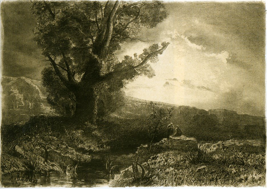
6-49 Odilon Redon, Landscape, 1868. Charcoal, black chalk, and black conté crayon, 53.6 x 75.5 cm. Chicago, Art Institute.
In Landscape (figure 6-39) and many other charcoal drawings, Redon essentially worked from dark to light. He once wrote to a friend that a sheet of white paper horrified him, enervated him, and shocked him into scrawling charcoal on it to give it life. To start Landscape, he laid down broad areas of value by spreading powered charcoal over the surface with a cloth. He defined clouds and rock formations by stumping the charcoal and by erasing it, and he delineated trees and shrubs with sticks of the material and touches of black conté crayon. In some of the darkest areas near the figures, to simulate the rugged terrain, he applied coarsely ground charcoal with a brush. Drawing manuals of the period recommended all these methods for working in charcoal.
Redon saw combat in the Franco-Prussian War of 1870, and the defeat of France by Germany freed his imagination to expose a monstrous and fantastic side of humanity, as for example in Eye Balloon (figure 6-50). The weird subject capitalized on the extensive use of balloons in the war and the popularity of ballooning in the period.

6-60 Odilon Redon, Eye-Balloon, 1878. Various charcoals, heightened with traces of white chalk, on yellow-cream wove paper, 32.2 x 33.3 cm. New York, Museum of Modern Art.
But this balloon doubles is the socket of an eye, which has turned sharply up toward the sky. (Giant eyes and enormous heads floating in space frequently appear in Redon’s imagery.) Four years later, in 1882, he published a lithograph of the subject with a title that interprets the scene as a symbol of human aspirations: “The Eye Like a Strange Balloon Mounts toward Infinity.” Nevertheless, the balloon carries a platter on which rests the top half of a dark-eyed human head. Beyond the swampy foreground, the shoreline in the distance resembles the desolate area of western France where Redon grew up and where he made most of his charcoal drawings. He later regretted the rather explicit title of the lithograph because he believed that viewers should interpret his work for themselves.
Redon drew Eye Balloon with essentially the same technique as Landscape, stomping and erasing broad areas of charcoal. He called all his finished charcoal drawings noirs (blacks). However, as in Eye Balloon and most of his charcoal drawings, he drew on colored paper, usually a creamy yellow turned a darker golden yellow by applying a resin-based fixative to it. He felt that the color gave his drawings a patina like that of an aged Rembrandt painting.
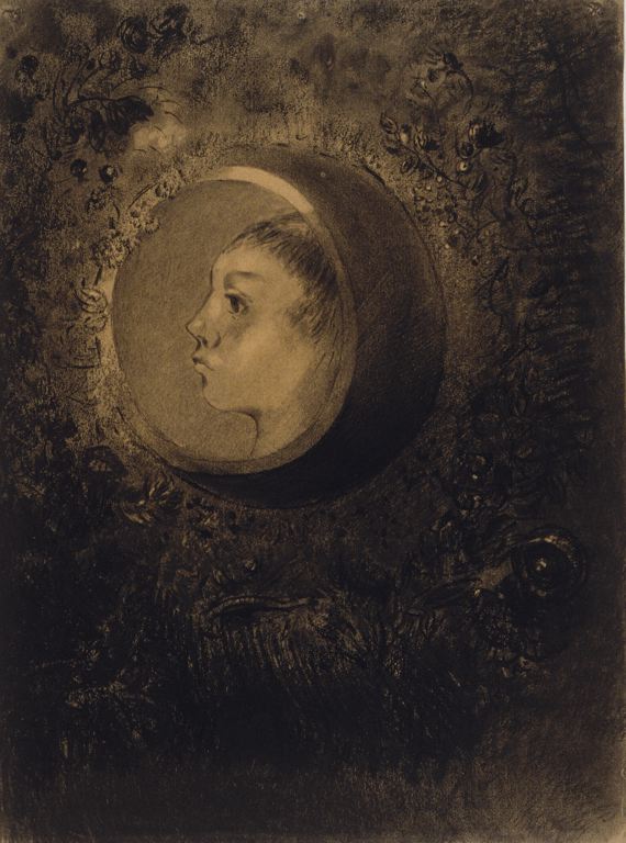
6-51 Odilon Redon, Cell, 1880s. Charcoal, black chalk, and black pastel, 50.8 x 37.8 cm. Chicago, Art Institute.
The charcoal drawing Cell (figure 6-51) is one of Redon’s many works inspired by Gustave Flaubert’s The Temptation of Saint Anthony, published in 1874. (In 1888, 1889, and 1896 he printed three albums of lithographs prompted by the book. Cell was not reproduced in any album.) In the charcoal, a profile head appears in the window of an egg-shaped sphere suspended in a wreath of flowers. The sphere descends, or perhaps rises, in the murky depths of a sea where creatures move amid bottom grass. Flowers, sphere, and head all appear perfectly normal, but the sphere has no room for the rest of the figure, and the formation of flowers has no physical explanation. Light radiates from the face while the world outside it is darkened in mystery.
As Redon understood Charles Darwin, a cell, the basic unit of life, has a vital force, a soul that witnesses, each time it is born, the embryonic evolution of life. As mentioned above, Redon did not want his imagery interpreted too precisely; he preferred that the play of shadows and rhythm of lines evoke in each person’s heart the realm of mystery. (Redon’s aims and methods were quite different from those of Seurat, despite the attraction Symbolists felt for his drawings also).
Redon began Cell, as he did his other noirs, with broad areas of dark. He established lights within the darks by removing charcoal with an eraser, stump, or cloth. He added objects and figures with the point of the charcoal stick. In the final stages, he redefined lines with sharpened hard charcoal, and he deepened blacks with softer charcoal or conté crayon. In fact, in Cell Redon delineated the features of the face and the oval around it sharply; the rest of the drawing is rather vague. The contrast helps his vision of reality became plausible. In a brief autobiography, he once wrote, “All my originality consists then of making improbable beings come to life humanly according to the laws of the probable, putting, as far as possible, the logic of the visible at the service of the invisible” (“Confidence d’artiste,” in À Soi-Même, 1922, 29-30). He constructed a fantasy out of a spiritually enlightened cell and flowers because he saw them as living organisms behind the illusion of appearances.
In 1894 Redon included for the first time (ten) pastels in his exhibition at the Durand-Ruel gallery in Paris. The use of rich color disconcerted Symbolist friends who understood him as an illustrator of ideas. He had started using pastel about 1890 and by the end of that decade he abandoned charcoal. He wrote to a friend that pastel “has rejuvenated me.” In the early nineties, he often applied pastel over earlier charcoal noir drawings, as he did in Sita (figure 6-52).

6-52 Odilon Redon, Sita, ca. 1893. Pastel over charcoal, 53.6 x 37.7 cm. Chicago, Art Institute.
Redon exhibited the pastel Sita at the Durand-Ruel gallery in 1899. It interprets an event in the Hindu epic poem The Ramayana in which Sita, the wife of Rama, was abducted and carried through the sky. She threw her jewels down from the sky to alert Rama to her location. (Redon depicts five “jewels” falling on the lower right and stardust falling on the left.) An aura of golden light radiates from her head—perhaps a reference to the fire she passed through as a test of her virtue. In the drawing, the artist focuses more on her role as an earth goddess who contemplates a golden egg, a symbol of the source of life and light in the Hindu Veda. Strong color contrasts—his favorite was cobalt or ultramarine blue and complementary orange—intensify the mystery of Sita.
In his later pastels, profile heads and flowers continue to appear. His pastels include many bouquets, such as Flowers in a Green Pitcher (figure 6-53). In this large-scale pastel, the brightly colored life-size flowers are offset by a dark green vase that floats shadowlessly, enigmatically on a light colored ground, similar to the aura around the head of Sita. Redon worked from real bouquets, but most often he re-imagined them. They have the feel of Japanese art, while the intense colors and irrational space place them half-way between reality and dream.

6-53 Odilon Redon, Flowers in a Green Pitcher. Pastel, 74.3 x 62.5 cm. Boston, Museum of Fine Arts.
Paul Cézanne (1839-1906 In the late 1860s, images of sex and violence occupied Paul Cézanne’s imagination. On a page of a sketchbook in Basel, he developed an elaborate compositional study for a painting called The Eternal Feminine (figure 6-54), a mock-serious version of Delacroix’s Death of Sardanapalus.
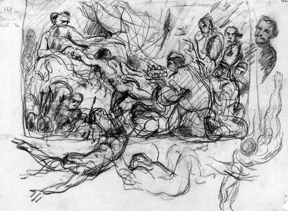
6-54 Paul Cézanne, The Eternal Feminine, late 1860s. Pencil and black crayon, 17.7 x 23.6 cm. Basel Kunstmuseum.
The worshipers of the female sex include a king offering his crown and a bishop dressed in robe and miter. On the right, a smirking man emerges from behind this parody of Delacroix. Three robust nudes like those in Michelangelo’s Last Judgment cavort around the main composition—or spill out of it. The drawing is a tangle of curving lines swirling over and around themselves. To make sense out of this stew of lines, he thickened some of them. The lines have the boldness and impetuosity of the palette knife strokes he used in several paintings at that time.
In The Eternal Feminine, Cézanne surely tried to match Delacroix energetic swirling lines and repeated contours—though not his “system of eggs.” (See figure 6-10.) (Some of Daumier’s drawings also come to mind. See figure 6-16.) Cézanne had the chance to see Delacroix’s drawings in Paris when they were first exhibited in public in February, 1864. Their passionate gestures enabled him to rid himself of the amateurish and the clumsy style of drawing evident in his earliest sketchbook (Carnet de jeunesse, Louvre).
He also free himself from the academic tradition. From 1857 to 1861, Cézanne had been trained to draw in an academic style when he attended drawing school (Ecole Municipale de Dessin) in Aix-en-Provence. And he continued to draw from the nude model in 1861 and 1862 at the Académie Suisse in Paris, where he met Camille Pissarro. The six or so académies that survive from those years show smooth unbroken contours and softly blended modeling in a factual rendering of the model.
Cézanne abandoned Delacroix’s Romanticism when he worked outdoors alongside Pissarro in 1872 and 1873 at Pontoise. On canvas, Cézanne adopted the Impressionists’ method of painting from nature and imitated their brushstrokes. On paper, neither Pissarro nor Cézanne developed a drawing method that mimicked an Impressionist handling of paint. Pissarro’s influence shows up instead in the portraits Cézanne drew of himself and his young son. A sketchbook from the 1870s and early 1880s, now in the Chicago Art Institute, has several examples of the style (figure 6-55).

6-55 Paul Cézanne, Self-portrait and Portrait of Son Paul, ca. 1880. Pencil, 12.4 x 21.7.
Chicago, Art Institute.
In these portraits, patches of parallel hatching, running now this way now that, create facets that model the face. The manner resembles Pissarro’s method of drawing from years earlier on St. Thomas (figure 6-33), a method that Pissarro, a pupil of Corot, probably recommended to his friend so that he might build forms out of observed value contrasts rather than with an artificial tangle of lines, as he did in the 1860s (figure 6-54).
Also in the Chicago sketchbook, Cézanne used the same style of hatching for most of the nine copies he made in that book of a plaster cast he owned of L’Ecorché (Flayed Man). (He copied the cast ten more times in other sketchbooks.) And he sketched several landscapes, including View of Houses in L’Estaque (6-56), a composition also built with the same small, carefully placed patches of hatching.
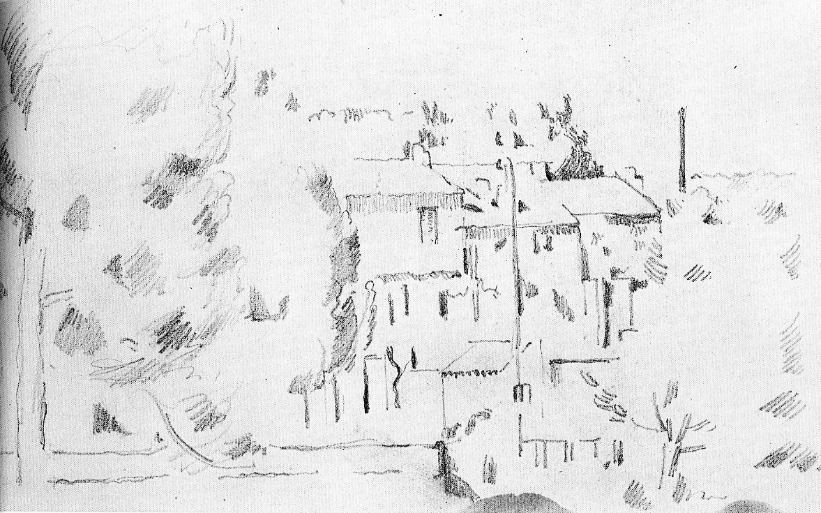
6-56 Paul Cézanne, View of Houses in L’Estaque, 1882-85. Pencil, 12.4 x 21.7 cm. Chicago, Art Institute.
Except for a few diagonal roofs, the lines in the drawing are only horizontal or vertical. With the patches they form a grid across the surface, uniting foreground and background by giving things far and near the same importance. With drawings like these, it might have been Cézanne who taught Pissarro a new way of constructing a landscape. In the early 1870s Pissarro still followed the Dutch seventeenth-century landscape compositional scheme based on a road leading into a village. (See figure 6-35.) Although View of Houses in L’Estaque probably dates from the early 1880s, other drawings like it may have influenced Pissarro to flatten his treatment of landscape for a time. In short, the two artists influenced each other.
Like Monet, Degas, and Pissarro, Paul Cézanne often carried with him pocket-sized sketchbooks. He used them in museums to copy paintings and sculpture, he used them at home for self-portraits and portraits of his wife and son, he used them outdoors for landscapes, and he sometimes used them to draw from memory single nude figures or groups of figures. As a draftsman, he concentrated on the human form, much more than on landscape or still life. Cézanne scholars have identified about nineteen sketchbooks; only seven of them remain intact. The drawings in them, almost all in pencil, became known to the public only in the 1930s. Before then, it was reputed that he could not draw. Yet the sketchbooks tell us that he drew constantly from his teens to his sixties and that he explored in his drawings, often sooner than in his paintings, the revolutionary style for which he is famous.
Cezanne occasionally used sheets of paper larger than the dimensions of a sketch-book page. Sometimes he merely filled the larger space with many small-scale sketches; other times he used them for a relatively formal portrait. Most often he used the larger sheets to draw landscape compositions that are often parallel to, but not in direct preparation for, his oil paintings. There does not seem to be much difference in breadth or complexity between his large or small composition drawings. He often felt compelled to enlivened drawings like these with washes of color.

6-58 Paul Cézanne, Standing Male Bather, early 1890s. Pencil, 21.6 x 12.7 cm. Philadelphia Museum of Art.
Only a modest number of Cézanne’s drawings have a direct relationship with a particular painting—except for drawings related to his canvases of bathers, a topic that fascinated him from the 1870s until his death. With bathers in mind, he constantly drew from his imagination nude male and female figures that might eventually turn up on canvas. Standing Male Bather (figure 6-57), a figure he drew more than sixteen times, eventually appeared in several paintings of bathers in the 1890s. He derived the pose—a nude see from the back with his arms raised—from a drawing by Signorelli, of which he had a reproduction, and from a statue of a Roman orator in the Louvre. When Cézanne worked from his imagination, he drew with vigorous short strokes, as though he were forcing the image out. Disconnected curves construct bold contours, and hatching is negligible.
In this and the great majority of his drawings, he often built each contour out of three, four, or more repeated lines. The multiple lines are the most characteristic feature of his drawing style. Millet, Pissarro, and other artists in the late nineteenth century constructed contours with repeated strokes, but no one employed them as consistently and deliberately as Cézanne.
Since David in the late eighteenth century, many artists developed a contour with, at first, a few faint, tentative strokes and then one dark, definitive line over them. In Cezanne’s practice, he did not choose a correct line or the best line from hesitant or provisional strokes—all the lines he set down are equally valid. The constant repetition scarcely represents pentimenti—changes in the pose or corrections to the anatomy and proportions. Rather, the multiple lines block the eye from seeing the contour as an artificial wire-thin boundary between a form and the space around it. As Cézanne once noted, lines do not exist in nature, only the boundaries between light and dark that occur at the edges of forms. Cézanne saw this change from light to dark as quivering, shifting, living. His repeated contour lines declare that the rounded forms of the body are turning in space and receding away from the viewer. Also, the blurred contours help incorporate a form into its surrounding. Like the fuzzy contours in Velázquez’s late oil paintings, Cézanne’s contours breathe in the air and light around them.
In addition to single bathers, Cézanne’s sketchbooks also contain an occasional compositional sketch, such as Four Female Bathers (figure 6-58), a study for the left side of a painting of the early 1890s.
6-57 Paul Cézanne, Four Female Bathers, early 1890s. Pencil, 12.7 x 21.6 cm. Philadelphia Museum of Art.
In this drawing as in that of the single male bather, he formed contours with multiple strokes of disjointed curved lines. A few pentimenti—for example, the rear legs of the two crouching figures—are clearly visible. Like Pissarro, Cézanne was attempting in his bathers to integrate the human figure into a landscape. He reverted to the example of artists like Poussin who employed a rhetoric of reciprocal poses and gestures that would tie a group of figures together and unite them with their surroundings. The two crouching nudes, both seen from the back, mirror each other. The nudes who confront each other on the left complement each other’s pose with raised and lowered arms.
After years of life drawing as a young man, Cézanne seldom, if ever, employed a model to pose in the nude. Scholars have faulted his shyness or the conservatism of his family and of his town of Aix. Instead of hiring someone, he frequently copied nude figures in museums. A statue could hold a pose without fatigue and could be studied from different angles and on different occasions.

6-59 Paul Cézanne, Milo of Crotona (after Puget), 1897-1900. Pencil, 21.2 x 13.1 cm. Basel Kunstmuseum.
Of the nearly 1300 drawings by Cézanne in existence, copies of other works of art form the largest group. His favorite models were the Baroque paintings of Rubens and the Baroque sculpture of Pierre Puget. He copied the sculptor’s most famous work, Milo of Crotona (figure 6-59), a dozen times. The big-muscled energy caught in the stone obviously appealed to the artist.
In this late drawing, he tried to capture that movement in a cascade of circular strokes that transforms straining muscles of the torso and legs into spheres. His design illustrates the advice he sent in a letter to Emile Bernard in 1904 to “treat nature by means of the cylinder, the sphere, and the cone.” As in most late drawings, hatching is minimal. Most contours quiver with repeated lines. In copying Puget and Rubens with such gusto, he could indulge the love for Baroque exuberance that he had found in the drawings of Delacroix.
In the late 1870s and early 1880s Cézanne enriched some of his drawings with watercolor, as had Pissarro at the same time. (See figure 6-37.) As time went on, Cézanne produced more and more watercolors. Unlike his drawings, which he kept private, he exhibited his watercolors (especially at Ambroise Vollard’s gallery in 1895 and 1905) and indeed began to sell some of them. Sales encouraged him to produce more.
Although the history of watercolor is beyond the scope of this survey, many of Cézanne’s watercolors, such as Pistachio Tree in the Courtyard of the Chateau Noir (figure 6-60), tend to be colored drawings or at least a watercolor in which the pencil lines are not just guidelines that disappear under the washes of color but marks that interact with them. In Pistachio Tree and in most of his watercolors, a great part of the sheet remains untouched—as commonly happens in drawings. In many places one can still see the multiple lines that Cézanne employed in order to barely suggest the contours of rocks or trees. Instead of modeling these solid objects with pencil strokes—or with different values of the same color—his brush modeled them with touches of warm and cool colors, which psychologically project toward or recede from the viewer. (He preferred the word “modulation” to “modeling.”) With the addition of watercolor, he synthesized in a single drawing the essential elements of line, value, and hue as he strove to capture all his “sensations” in front of a motif.
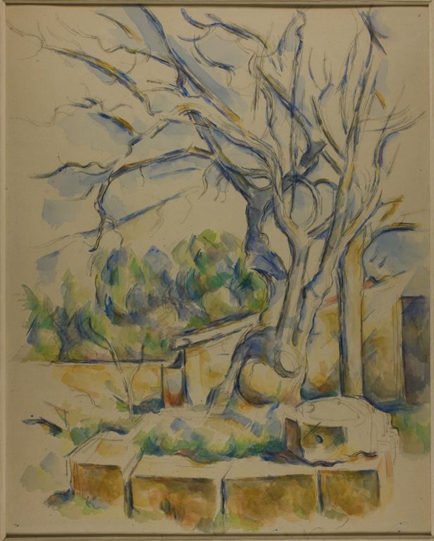
6-60 Paul Cézanne, Pistachio Tree at Chateau Noir, ca. 1900. Pencil and watercolor, 54.2 x 43.3 cm. Chicago, Art Institute.
Auguste Rodin (1840-1917) The renown sculptor Auguste Rodin was a prolific draftsman. The Musée Rodin in Paris has over 7000 of his drawings in its possession, and a sizable number exists in other museums and private collections. Rodin drew day and night, from age fourteen when he enrolled at the Ecole Spéciale de Dessin et de Mathématiques, known as the Petite Ecole, until his death sixty-three years later. From this stream of work, two groups of drawings stand out: the Black Drawings (also called the Dante Drawings) from the early 1880s and his drawings of the model from the turn of the century.
Instructors at the Petite Ecole taught their students to imitate and memorize different historic styles of drawing, but they focused their instruction on the manner of the eighteenth century so that students might design commercial decorative work in the style of Boucher and Clodion. A few drawings by Rodin from his early years survive, including eight carefully modeled académies and, notably, the more spontaneous sketches of the Mastbaum Album, now in the Philadelphia Museum. It appears that Rodin used the sketchbook from the late 1850s through the 1860s. Its fifty or so drawings in graphite, ink, and wash include sketches of the nude in extreme hipshot poses, lovers kissing, horses and other animals (a leopard and a tiger), and even a few landscapes. Some subjects were observed; some came from his memory. In most of the drawings, Rodin employed a thin scratchy pen line and drew tenuous humans with tapered legs that often end in pointed triangular feet. Wherever Rodin learned these traits and shortcuts, they confirm his bias toward the eighteenth century—for tapered legs and triangular feet also appear in the early drawings of Watteau. See figure 5-1.
A few years later, sometime after 1863, Rodin adopted a very different manner when he studied at the Museum of Natural History with the animal sculptor Antoine-Louis Barye. Through Bayre, he must have come in contact with the drawings of Delacroix and his “system of eggs.” See figure 6-10. (Delacroix and Bayre were friends and together had sketched animals at the Paris zoo.) Rodin and Barye may both have gone to see some of the thousands of drawings at the posthumous sale of Delacroix’s work in 1864.
Rodin’s Ugolino’s Feast, a drawing of the 1870s, illustrates the change in his sketching method. Instead of scratching out a contour bit by bit as he did in the early drawings of the Mastbaum Album, Rodin now roughed in the basic shapes or masses of each figure with a series of ovals, which he then converted with pen and ink into anatomical features. Rodin even outlined many muscles as ovals, giving rise to the misconception that his nudes were meant to be seen as ecorchés or flayed. Delacroix’s system gave Rodin’s drawing a taste for Romantic freedom, and Delacroix’s drawings taught him that the purpose of a drawing was to express feeling.
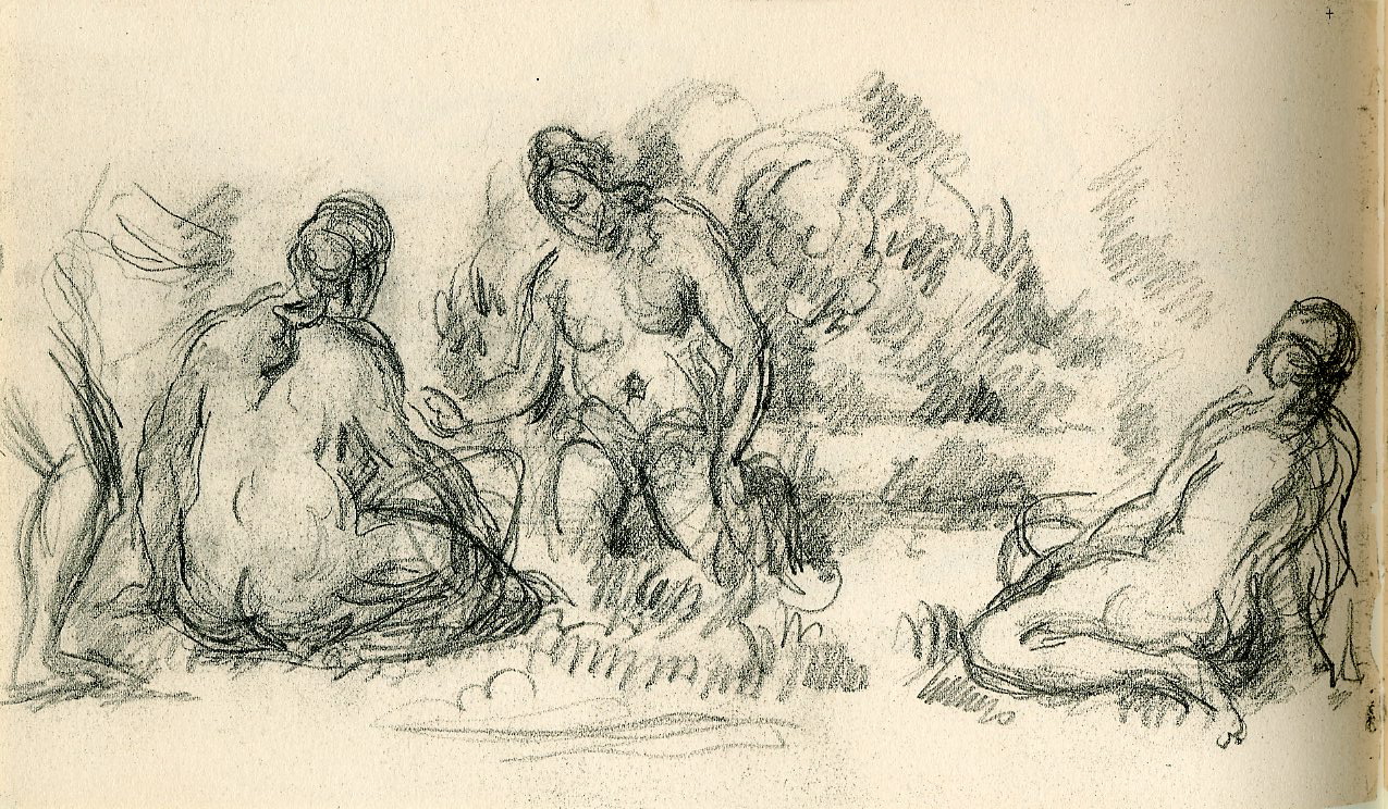
Rodin, Virgin and Child, Louvre.
When Rodin received the commission for The Gates of Hell in 1880, he reworked with sepia, ink, and gouache many earlier drawings that must have resembled Ugolino’s Feast. A typical example of a reworked drawing, one of his so-called Black Drawings, is Virgin and Child with Infant Saint John in the Louvre. Although The Gates of Hell depicts scenes from Dante’s Inferno, many of the Black Drawings of the early 1880s derived not only from the Inferno but also, as in this case, from Renaissance painting and sculpture or from mythology (drawings of centaurs, for example). Only a couple of the drawings were translated into the sculpture of the door. Almost all the groups in these drawings came from an inner vision of struggle and confrontation. In the Black Drawings he dug into his imagination for ideas and tried them out in striking chiaroscuro rather than in line. The function of the drawings was to liberate his creativity.
Like many of the Black or Dante Drawings, Virgin and Child is small in size (14.5 x 10 cms., less than 6 x 4 ins.), yet monumental in scale. The page was probably torn from a pocket-size sketchbook when Rodin decided to rework the drawing on it. Over the lines of that drawing, he applied layers of black and gray wash with highlights of white gouache to model the essential forms and establish dramatic light and dark contrasts. The drawing has a thick and crusty texture. Just as a sculptor builds three-dimensional masses by applying clay to an armature, Rodin in his Black Drawings molded his vision of a group out of light and dark. Finally, a few fluid and continuous pen strokes clarified the contours. Sometimes Rodin cut a figure or a group out of a drawing and pasted it onto another sheet where he reworked it with additional figures and more chiaroscuro.

Rodin, Pivoting Nude. Chicago, Art Institute.
Rodin later claimed that he did not use his Dante Drawings for The Gates of Hell because they were not close enough to reality. After the 1880s, he no longer drew from his imagination but from the live model. By the end of the century, he had developed a new drawing method, evident in Pivoting Nude Seen from Above . In pencil and wash drawings like this, he sought to capture the live model as she moves. (He had been interested in movement since 1875 when he went to Italy to study the Manneristic poses of Michelangelo.)
In Pivoting Nude, Rodin looks down on his model as she kneels on her left leg and extends the right. In contrast, she holds her right arm behind her back and extends the left. Pivoting on her knee, perhaps to stand up, she balances herself by means of the extended leg and arm. They form an arc across her back that stabilizes the image on the page. As in many of his late drawings, the pose is unconventional and fleeting, suggesting movement both before and after it. He must have known that, a few years earlier, Degas had drawn models performing natural movements in his studio (see figures 6-29 and 6-30)—although Degas required his poor models to hold their transitory poses.
To arrest the transitory as it happens, Rodin kept his eyes on the model moving about the studio. He demanded natural movements from the models, but they always wanted to strike classical poses. He told them “do the gesture of brushing your hair . . . no, not like that, really brush your hair. (1898) As he drew their movement, never once did he look at his paper. In less than a minute he had produced a flurry of rapid, irregular strokes, capturing a succession of gestures with vibrating lines. He then went back over the drawing, condensing, adjusting, and purifying the lines, searching for the essence of the movement.
Most of the time, he took his sketch to a window where he traced his corrected version and transformed it into the fluid continuous contours we see in Pivoting Nude and in numerous other late drawings. In the tracing he eliminated pentimenti and drew contours with a steady pressure on the pencil. A quick translucent wash of beige watercolor turned the image into a faint silhouette, as though cut out and pasted against the once white paper. Sometimes he later added drapery or wrote a name on the sheet that changed the model into a goddess or allegorical figure. The name often served as a convenient cover for a sexually explicit pose.
Since, as a sculptor, Rodin rotated his maquettes on a turntable as he modeled them in plaster, he had to understand human form from every aspect. It was his drawings that gave him such deep seated knowledge of the human body that, as he once said, he could feel the forms in his fingertips [1906. See Varnedoe, p. 85]. His new method was also an attempt to break old habits of drawing by focusing on natural movements instead of conventional poses and predictable anatomy and by simplifying the human figure to a few pure and essential lines.
Around 1900, Rodin began to realize the value of his works on paper and spent more and more time drawing. In 1897 the Goupil company published an album (Les Dessins de Auguste Rodin) of 129 Gates of Hell drawings reproduced in high quality photogravure. In 1899 Rodin exhibited dozens of his later drawings in one-man shows of his work in Belgium and The Netherlands. At the Universal Exhibition in 1900, Rodin built his own pavillion (Pavillon de l’Alma) for a retrospective of his work. The building had a room at the entrance devoted exclusively to the display of his drawings. He showed drawings alone in Paris in 1907 and 1908 and in New York in 1908 and 1910 at Stieglitz’s gallery 291. His drawings were especially popular in the early 1900s in Germany. Rodin exhibited his drawings, he said in 1898, to teach other artist to follow their own impulses. In the early years of the twentieth century, many young artists learned this lesson from the drawings of Rodin.