Because of copyright restrictions, links are provided to many of the illustrations.
Pablo Picasso (1880-1973) In 1956, at an exhibition of children’s drawings, Pablo Picasso remarked to the critic Herbert Read, “When I was their age, I could draw like Raphael.” He did not mean that his youthful drawings looked like those of Raphael since they do not. More likely, the artist, at seventy-six years of age, recalled that he had been endowed as a child with a precocious talent that rivaled one of the greatest masters of drawing.
He also told Read that it took him a lifetime to learn to draw like a child—in other words, to repudiate his inner Raphael. Nevertheless, Picasso did resemble Raphael, not only in his innate talent but also in his ability to absorb different styles with ease, just as Raphael absorbed Leonardo’s manner of drawing in Florence and assimilated Michelangelo’s in Rome. And like Raphael, Picasso made drawing the engine of his creativity.
From early childhood, Picasso drew constantly: in the margins of his schoolbooks and, from age fourteen to eighty seven, in the 175 sketchbooks that he carefully preserved. For the most part, they remained intact at his death. In his sketchbooks, Picasso tried out different solutions for major paintings. And he also developed in them variations after individual figures or groups of figures from his finished paintings or prints. In short, his sketchbooks became the diary of his creative activity. Aware of his place in history, he eventually dated every page. Some sketchbooks are small enough to have been carried in his pocket; more frequently they are the size of small sketchpads, which were at hand in his studio.
In his early teens, Picasso perfected an academic style of drawing that had not changed in a century or more. For five years he studied at academies of art in La Coruña and in Barcelona, schools where his much less talented father taught drawing. The curriculum required young Picasso to copy prints, plaster casts, and the live model. (The Museu Picasso in Barcelona and the Musée Picasso in Paris have examples of his student work.)
His charcoal and conté crayon drawings from plaster casts have thin, precise contours and softly modeled transitions between distinct areas of strong light and dark. Several full-length académies drawn from life still exist: one is of a standing black man and another of a seated middle-aged male model. Unlike the idealized drawings from casts, they both portray individuals, recognizable in face and body. Exacting modulations of the light reflections that he observed on the models enhance the lifelike quality of these finished drawings.
Even though Picasso never regretted his father’s academic training, he practiced a variety of styles from the beginning. Aside from innumerable artless drawings of everyday life and aside from hundreds of slap-dash caricatures, Picasso developed a modern style of drawing during his last years in Spain at the end of the nineteenth century. The style can best be seen in the series of approximately 150 portrait drawings of writers and artists. (Throughout his career, Picasso tended to produce work in series.) He exhibited the drawings in February, 1900, at the bohemian café Els Quatre Gats in Barcelona. Only a third of them survive. There are examples in the Museu Picasso in Barcelona and the Fogg Art Museum in Cambridge.
The subjects all share a mood of melancholy and sadness—they look older than they were. Yet with minor adjustments of clothing, gestures, and background, each drawing lays bare a different character. He drew them in charcoal or conté crayon against a vague watercolor or oil-wash background. The figures all have thick, repeated contour lines and pronounced hatching in the form of long, usually vertical striations that do not model the light but assert flat areas of dark. Strengthening a line through repetition and broad hatching that keeps forms flat were common traits in late nineteenth-century draftsmanship. Picasso made contact with modern trends through popular illustrations in the manner of Henri Toulouse-Lautrec, Théophile-Alexandre Steinlin, and Aubrey Beardsley.
When Picasso began living in Paris in the opening years of the new century, he gradually abandoned the modernist style of thick contours and vigorous hatching and replaced it with a manner founded on purity of line. The change is evident as early as the studies he made for the Blue Period painting La Vie (1903, Cleveland). Even in drawings full of pentimenti and tentative sketchiness, it is clear that he was aiming at a single unbroken contour as in a Greek vase painting or in a perfected drawing by Ingres. He reinforced that artistic goal by traveling to southern France in the spring of 1904 to study Ingres’s drawings at the artist’s Museum in Montauban. He also saw Ingres’s drawings at a retrospective of his work at the Salon d’Automne the following year.
Picasso’s depictions of the downtrodden from his Blue Period usually exhibit tall and emaciated figures in poses of fatigue, loneliness, and despair. His sheet of studies of a gaunt woman, Mother and Child and Four Studies of her Right Hand (1904, Fogg Art Museum), is among his best known drawings.
The mother’s proportions were influenced by El Greco whose art, rediscovered at the end of the nineteenth century, Picasso had examined in the Prado. This and many similar drawings from the period have only tenuous contour lines with little or no modeling. In general, the seeming ease and smoothness of an unbroken line tend to hide the process and the facture of drawing, which the repeated contours of his former style had emphasized. Like the cliché that a true artist can draw a straight line free handed, Picasso strove to draw anatomy in one unbroken line on the first try. He revealed that as his goal in 1905 when he began making drypoints—that is, drawings made with a sharp stylus directly into a copper plate without the possibility of preliminary underdrawing or subsequent correction.
In the summer of 1906, while staying in the remote village of Gósol in the Pyrrennes, Picasso’s thin, elongated, and flat figures gradually took on thickness and weight. One of the masterpieces of that transition is the drawing Woman Seated and Woman Standing (late 1906/ early 1907, Philadelphia Museum), a large finished drawing over 26 inches high, a variation on his large oil painting Two Nudes (1906, Museum of Modern Art, New York). From 1900 to1904, Picasso drew primarily to make studies for paintings. By 1906 he had begun to realize the value of independent drawings, especially when they allowed him to develop new versions of completed work.
Both the painting and the drawing were inspired by early Iberian sculpture on display in the Louvre. In both works squat, massive nudes fill up the available space, although there is a little more breathing room in the drawing. The modeling is lightly applied and softened by stumping the charcoal, but it is sufficient to suggest the solidity and bulk of the women. Picasso achieved the grandeur of primitive sculpture by simplifying anatomy into blocks, cylinders, spheres, and cones. But he ran into trouble trying to invent a harmonious composition out of such rigid forms.
In the Philadelphia drawing, a standing nude balances a sitting nude—the forearm of one lines up with the high breasts of the other, and their outstretched hands make reciprocal gestures. One nude is frontal, the other is profile. One leg belonging to the sitting nude is frontal, the other is profile. But this last contrast made it impossible to attach the nude’s profile leg to her frontal hip in any credible way. For the next several years, in drawing after drawing, Picasso struggled to make a figure, built from basic geometry, have movement so that it could relate to other figures across and within a composition.
In 1907, challenged by the art of Matisse, Picasso decided to turn his studies of two nudes into a multi-figured narrative composition that would become the painting Les Demoiselles d’Avignon. According to his good friend André Salmon (“Histoire anecdotique du cubisme,” 1912), Picasso at first threw down his paintbrushes, turned his canvases to the wall, and began to draw in his sketchbooks. An exhibition that focused on Les Demoiselles d’Avignon (Musée Picasso, Paris, 1988) counted sixteen sketchbooks containing hundreds of drawings (all reproduced in the exhibition catalog) in which Picasso developed this bordello scene. In sketch after sketch he revised the composition from seven figures, including two males, to only five female nudes. And on hundreds of other pages he studied each figure—not to adjust the pose or refine the proportions but to discover a new, modern-primitive mode of representation. The sketchbooks were his laboratory, and after several months, when the experiments were nearly complete, he attacked the canvas.
The first two sketchbooks, which also contain a few studies for the Philadelphia drawing discussed previously, translated those stocky figures into line drawings of females with narrow waists and broad, masculine shoulders. By the third sketchbook, devoted mostly to head and compositional studies, the figures have become linear abstractions. In the fourth sketchbook, he filled nearly every page with an outline of a single nude whose torso is a triangle, whose upraised arms form a rectangle, and whose breasts and hips are arcs of circles. The rigid geometry and symmetry repeat the primitive look of ancient Egyptian art. In the fifth sketchbook—actually the empty pages of an exhibition catalog—Picasso made measured studies of the proportions of a nude constructed with diamond shapes.
In the seventh sketchbook, Picasso switched from pencil to pen for individual figure studies in order to draw them more rapidly and spontaneously—and in a new style. Many of them swing and sway in diagonal, asymmetrical poses. Their limbs become curved lozenge shapes like those of the women in the paintings Les Demoiselles d’Avignon and in Nude with Drapery (Hermitage) that immediately preceded it. The drawings document his struggle to reconcile his new primitive style with the demands of interrelating a group of figures. Their curved outlines will eventually be arranged in a rhythmic pattern across the canvas.
The next year, 1908, Picasso found that by reintroducing chiaroscuro into his drawing he could reconcile basic geometric shapes with movement across the surface and into space. These strong contrasts of light and dark opened the way to the new style called Cubism. In ink, graphite, or crayon drawings—often combined with gouache or watercolor—he filled the linear geometry of his drawings with harsh parallel striations, even bolder than the hatching he had used in Barcelona. For example, in Head of a Woman (1909, Chicago Art Institute), he broke down the model’s head and her shoulder into an array of triangles, then filled most of them with rigorous hatching in a range of values. The contrast of light and dark from the black and ochre chalk and from the colors of the gouache separates the triangular planes from one another and pushes and pulls them in and out of three-dimensional space, giving the head mass. The direction of the striations adds to the sense of movement in the pose of the model who tilts her shoulders and twists her head. While the striations are often said to derive from markings on African tribal art, which Picasso saw at the Trocodéro museum, they more closely resemble the flat hatching he used in drawings from the late 1890s.
A year later, Picasso rejected the appearance of sculptural mass in his drawings in favor of a flatter looking relief, achieved by means of a lighter, almost transparent chiaroscuro. His series of eight pen and ink sketches of a standing nude from the summer 1910 culminated in the polished charcoal drawing, Female Standing Nude (autumn 1910, Metropolitan Museum), which Alfred Stieglitz exhibited in his New York gallery in 1911. Within a year’s time, Picasso had gotten rid of an all-encompassing contour that bound the planes of a body within an outline of roughly natural proportions. It had been the norm for drawing the human figure for millennia.
Instead, rectangular or circular facets, which vaguely resemble body parts, form a lattice that extends into, and becomes part of, the surrounding space. Horizontal hatching and some stumping of the charcoal help separate the facets onto individual forms which, tilting this way and that, intersect and overlap one other. In many places, because of the transparency of the chiaroscuro and the arbitrary direction of the cast shadows, it is impossible to tell whether one form is in front of or behind another. Spatial relationships are ambiguous, subordinate to the demands of art. Picasso had broken the tradition of closed forms which were perceived to be in a rational picture space. He had invented a new language.
Two years later, in the last two months of 1912, Picasso diminished his new style’s dependence on chiaroscuro when he began pasting rectangles cut from newspapers on large sheets of drawing paper. He made a series of male heads (one example, Fogg Art Museum) and still life arrangements (Metropolitan Museum of Art).
The once pale newspaper, now faded light brown, originally produced a very restrained chiaroscuro against the white of the sheet. The drawings have very little additional shading. Over or “under” the pasted paper, he drew freehand a few elegant, perfectly straight lines or arcs of a circle to suggest still life elements or the features of a head. The reality of the newspaper contrasts sharply with the minimal and ethereal drawing. The discrepancy between real newspaper and the artist’s lines lays bare the fundamental illusion of drawing: that a mere line can transform areas of paper into discernible shapes of another reality—even though the drawing sheet is still visible between the lines as mere paper. Later papier collés became more elaborate and their chiaroscuro more prominent.
In 1915, Picasso startled his followers by making realistic portraits of his friend Max Jacob (Musée Picasso, Paris) and of his dealer Ambroise Vollard (Metropolitan Museum of Art).
These drawings clearly imitated the famous pencil portraits by Ingres (figure 6-3), which Picasso knew quite well. (In 1911 Picasso could have seen 119 of Ingres’s portrait drawings at the gallery Georges Petit in Paris.) After spending eight breathtaking years in the pursuit of Cubism, Picasso’s sudden shift seemed like a betrayal. However, Picasso had never lost his representational drawing skills and his fascination for Ingres. A critic examining the portrait of Vollard observed that Picasso did it to show that he could do it (The Picasso Museum, Paris, 1986, 289-95). In short, style was a choice left to the artist. Throughout his career, he frequently alternated between drawing styles that either emphasized value contrasts or emphasized line. The portrait drawings began a new period that emphasized line.
Picasso drew the flattering Portrait of Ambroise Vollard to ingratiate himself with the dealer. Picasso had painted a Cubist portrait of him five years earlier. The casual pose in the drawing nearly repeats that in Ingres’s portrait of the Duke of Bedford (figure 6-3) in reverse, yet the differences are many. Whereas Ingres focused sharply on the head and sketched in the rest, Picasso articulated both head and body of his subject—perhaps because he drew Vollard (and Max Jacob) from photographs, a medium that can put everything in focus within its depth of field.
Although Picasso used a sharp, hard pencil, his lines seem softer than Ingres’s since most of them blur into the modeling. The modeling, made with fine parallel hatching, helps clarify forms like arms and legs by establishing differences of light and dark between overlapping shapes. (The tops of the coatsleeves are dark to separate them from the lighter coat behind it.) The modeling in short does not follow a consistent natural light source. The rear foot of the sitter and the rear leg of the chair lack modeling of any kind. The quirky chiaroscuro and the disconnected wooden molding behind Vollard also suggest that the drawing is more than just an example of academic realism. Just as the papier collé drawings test the boundaries of realism, Picasso reminds us that realism itself consists of illusions.
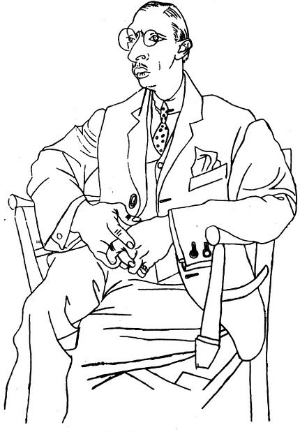
In the following years, Picasso made other portraits, often eliminating modeling or any kind of value contrast altogether. The sitters were patrons and friends, like Igor Stravinsky, whom Picasso met while he collaborated with Serge Diaghilev. In some of the drawings a sketchy underdrawing is still visible, which Picasso either went over with a heavier, darker line or erased. To a great extent, Picasso reverted to his Blue period style of drawing, a style that blended the art of El Greco and Greek vase painting.
Despite his doggedness in inventing and developing the Cubist style, in the late teens and into the twenties Picasso easily switched at any moment between a representational and a Cubist style. He claimed he was indifferent to style and felt he could create art in any style. He had the drawing skills to do so.
To counter the adroitness he had from his talent and training, he tried to make the simplest task difficult for himself. For example, he sometimes practiced drawing his left hand with one continuous contour, as though he never lifted his pencil from the paper and never varied the pressure on it. In similar line drawings of the full human figure, anatomy seems to come fully formed out of his imagination without any preliminary trial and error. For decades until the end of his life, Picasso continually made seemingly freehand drawings of the nude with unbroken contour lines of unchanging thickness and value. Even as he distorts proportions, the lines themselves have as much character as the lines Charles Shultz used for depicting Charlie Brown.
In the drawing The Bathers (1918, Fogg Art Museum), the launch pad for his ironic restoration of the classical tradition in the postwar period, Picasso transferred to the nude the linear style he had developed for portraits. It is the most ambitious and complex composition of human figures in any work of his between The Women of Avignon and Guernica.
He took the idea of a plethora of female nudes from Ingres’s Turkish Bath (1862, Louvre), which he saw at the Salon d’Automne in 1905. In the drawing Picasso grouped the nudes mostly in pairs. As on a Greek vase, there is little overlapping—and no perspective. Depth is suggested only by an abrupt and inconsistent decrease in the size of the figures. A single, uniform, unbroken pencil line outlines each figure. However, in this early manifestation of his new drawing style, faint preliminary sketch lines are still visible. He also drew the illusion of water in the foreground differently, with repeated pale lines.
The proportions and style—often compared to Botticelli’s—transform Ingres’s male fantasy into an ambiguous arcadia. In the early twenties, with a single fluid outline and no chiaroscuro, he frequently made finished drawings of one, two, or three nudes on a beach. (There are several in the Metropolitan Museum.) Their proportions more closely resemble classical sculpture or his own inflated nudes of 1906 than those of Botticelli.
In later years, Picasso continued to make finished drawings in pencil and charcoal, but increasingly he turned to ink. In those subsequent decades and into the sixties, his graphite lines tended to be unbroken, smooth, even, and regular—whether they represent the curves of the human body or the straight edges of an abstract still life. His pen lines, however, tended to be more expressive: they break and swell; they can be rough and textured; they vary in size.
In the summer of 1928, he filled a sketchbook with finished drawings of figures made from what seem like weathered stones or rounded bones. They crowd the surface of the page and indeed seem like sketches for a gargantuan piece of sculpture. A strong, harsh light strikes the forms—often from the right side, as in de Chirico’s paintings. Picasso darkly and thickly modeled the “bones” with a helter-skelter cross-hatching that gives them an abrasive texture. Preliminary sketch lines could not be erased under the ink so that modifications to the proportions are sometimes still visible.
Liquid ink often impelled him to pick up a brush, either to make lines or to apply the ink as a wash. Brush in hand, his ink lines give force to the swirling, swollen forms of The Rape (Embrace of the Minataur) (1933, Art Institute of Chicago), one of his countless images of aggressive male sexuality. Emerging from the black areas of wash on the left, the two figures are tangled up so tightly, it is visually hard to pull their poses apart. The confusion of limbs lets Picasso place the right knee and lower leg of the minotaur under the head of the woman, yards away from his hip. Other distortions abound.
In the 1950s he developed a distinctive style of brush drawing for a series of scenes from the bullfight. Blots and blobs of ink render the imagery as silhouettes, which makes the fight between man and animal look like an aboriginal form of rock painting.
Picasso had always found his way toward major works with numerous drawings. Despite a gap in his use of sketchbooks between 1931 and 1939, he started work on Guernica (1937) with about fifty drawings of individuals and groups before he approached the canvas. Hundreds of drawings preceded the appearance of his sculpture Man with a Lamb (1943). But in the last three decades of his life, he explored important themes primarily in autonomous drawings, for example, images of an old artist taking pleasure in watching explicitly erotic nudes. He never unlearned his father’s lesson that art is essentially drawing.
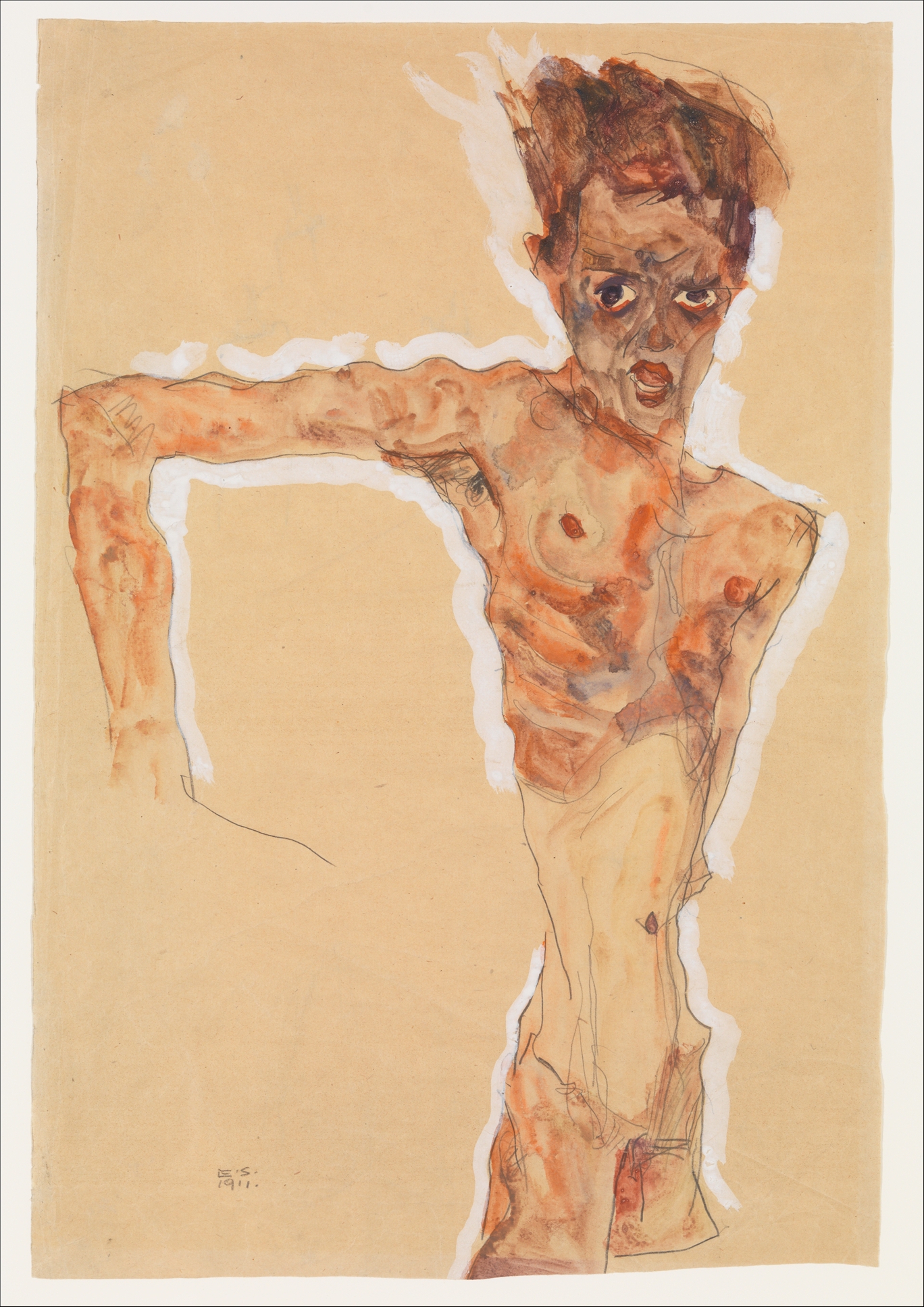
Henri Matisse (1869-1954) At age twenty nine, Henri Matisse decided to develop a modern style of his own. He had spent the 1890s learning the rigors of academic drawing by copying casts and perfecting studies of the living model under a series of respected artists: Adolphe William Bougereau, Gustave Moreau, Fernand Cormon, and Eugène Carriere. He rejected their academicism because, as he often said, he wanted to express himself.
At least Moreau had encouraged Matisse to seek his inner vision. Standing Nude (1901-03, New York, Museum of Modern Art) reveals that the drawings of Van Gogh set him free from tradition. (By 1899, he owned two Van Gogh drawings and saw more Van Gogh at a retrospective of the artist’s work in Paris in 1901.)
To facilitate free expression in his drawing, Matisse turned from the graphite and charcoal, which he had used as a student, to pen and brush and ink. These tools encouraged big, spontaneous, bold marks since, paradoxically, there was almost no way to rethink an ink line. His impetuous lines are analogous to the impulsive colors he used in his paintings at the time.
A thick contour outlines Standing Nude, and equally thick hatching lines on the left radiate from behind the figure, setting up a pattern of lines as in the drawings of Van Gogh. On the right they reverberate the curves of her torso and leg—perhaps a reflection of Cézanne’s drawings in which multiple contours spread forms into the space around them. Hiding her face behind a raised arm, the thickset figure steps out of a cocoon of darkness into strong light.
In Standing Nude, the body language of the model telegraphs distress, even though the pose may have been standard academic gestures. The harshness of the lines and the crudeness of the drawing reinforce the emotion. In the rush to express himself, Matisse also mangled the scale and anatomy of the raised arm.
For the next fifty years, Matisse never again explored such intense emotion. In later work, his models usually sit peacefully or recline languidly. Some of them sleep. Except for studies of dancing figures, Matisse consistently shunned anything stressful or any hint of a narrative in the poses of his models. As early as 1908 he stated explicitly that he avoided “troubling or distressing subject matter” (“Notes of a Painter,” 1908).
Matisse changed his style of drawing immediately after the notorious Fauve exhibition in October, 1905. In a study for his painting Bonheur de vivre, for example, Nude Girl Playing Flute (1905-06, Fogg Museum), he switched to the more versatile medium of pencil and adopted a linear style derived from the school of Ingres. In opposition to his previous use of strong value contrasts and thick, emotionally charged lines, lines became thin, and modeling was kept to a minimum. More important was the S-curve formed by the contours of the figure’s back, abdomen, buttock, and legs. Like a caduceus, it snakes around the vertical line running through her right leg. He often called such curves an arabesque. Not all drawings in the pre-war period are as linear as Nude Girl Playing Flute, but in lithographs published in 1906 he eliminated modeling altogether.
From then on, instead of a spontaneous style of drawing, Matisse now reworked and clarified his sensations of the model, refining the memory of his feelings in order to make them more permanent. In “Notes of a Painter,” 1908, he contended that he was still after expression, but he redefined the word’s artistic meaning: “Expression . . . does not reside in passions glowing in a human face or manifested in violent movement. The entire arrangement of my picture is expressive.” In other words, to Matisse, expressing one’s feelings in art meant organizing a composition by applying the fundamental principals of design in order to achieve unity and harmony.
During the war years, Matisse concentrated on making portraits of patrons and fellow artist, who in turn brought him in contact with Cubism. For a few years he abandoned his typical arabesques for Cubism’s straight lines and geometric shapes. For example, see the charcoal Study for Portrait of Sarah Stein (1915-16, San Francisco Museum of Modern Art). As in many of Matisse’s charcoal drawings throughout his career, he incompletely erased his preliminary lines so that their smudges form a tone that hovers around and under the lines. After some free exploratory strokes, he severely reduced the drawing to only a few thick lines. Her head became a semicircle squeezed into the top half of the sheet so as to press her face up against the picture plane. Her torso became a V-shape; her nose and eyebrows two vertical lines. This austere style is the closest Matisse ever got to Cubist abstraction. Unlike Cubism, however, his shapes do not overlap or intersect one another to create an ambiguous third-dimension; instead, Matisse’s forms lie flat on the surface.
After the World War and through the 1920s, Matisse spent his winter months in Nice. At the start of his Nice period, he published Cinquante dessins (1920), a book that reproduced (in dot-less collotype) fifty of his recent drawings, including a series of seventeen showing a girl in a plumed hat. See for example The Plumed Hat (ca. 1919, Baltimore Museum). Like most of his drawings from the twenties, they are among his most realistically observed and carefully rendered drawings since his student days. He never again replicated nature so faithfully.
The slightly off-center placement on the sheet of the nineteen-year-old model makes her appearance seem somewhat casual. He framed her somber face between a large asymmetrical hat, decorated by Matisse with feathers and loops of ribbons, and a large yoke, embroidered with flowers, leaves, and curlicues. A rhythm of large and small curves or “arabesques” unites human forms and decorative embellishments across the surface. In many other drawings of the 1920s he dressed his model as an odalisque, delighting in the interplay of large-scale human form and small-scale decorative patterns.
Only a few years after the thick lines of Study for Portrait of Sarah Stein, he returned to fine, thin lines in drawing The Plumed Hat. He carefully sketched the drawing with a medium hard-pencil and lightly modeled it with parallel hatching which, for the most part, follows the curves of the forms. However, the modeling does little to overcome the flatness of the design. Preliminary sketching has been either erased or is hidden underneath the finished drawing. One alteration remains visible: he widened her torso by suggesting that she wears puffed-out sleeves of a transparent material underneath her tunic.
Between the years 1922 and 1924, Matisse departed from line to explore value contrasts in a series of charcoal drawings. As in Seated Model with Guitar (Toronto, Art Gallery of Ontario, 1922), they often include an interior setting and a light source coming from a specific direction, in this case an open window on the left. He used an estompe to blur the charcoal strokes and to create areas of tone from dense darks to transparent grays. He learned the technique years ago in academy classes. He also used an eraser to create highlight on the model’s dress and bare arms. Nevertheless, the modeling of these forms creates a pattern of small-scale light and dark contrasts, similar to the striped tablecloth next to her—not a broader contrast of values that might establish three-dimensional volume.
Matisse fitted the model between the aligned rectangles of wall, window, picture frame, and table as precisely as a seventeenth-century Dutch master might set his model in an interior. Despite the value contrasts, everything lies flat on the surface of the sheet, including the tilted floor and the tilted tabletop. In this drawing, as in most others from the twenties, Matisse balanced naturalism and abstract design as skillfully as a tightrope walker takes his steps.
Matisse continued to use charcoal for portraits, studies for easel paintings, and studies for murals, including the mural (1930-32) that Albert Barnes commissioned for his private museum in Merion, Pennsylvania, and the murals (1948-51) in the Chapel of the Rosary, Vence. Nonetheless, in the late twenties and through the thirties, Matisse returned line to preeminence, and in his finished drawings he favored pencil and pen over charcoal. In 1939 he asserted that “my line drawing is the purest and most direct translation of my emotions” (“Notes of a Painter on his Drawing,” 1939).
The Rumanian Blouse (Baltimore Museum, 1936) belongs to a series of finished pen and ink drawings of the nude and clothed model rendered in “pure” line. Taking advantage of mass-media means of reproduction, as he did with Cinquante dessins in 1920, he reproduced many of them in the magazine Cahiers d’art the following year. Lacking the virtuosity of Picasso, Matisse prepared for each ink drawing with studies “made in a less rigorous medium than pure line, such as charcoal. . . . It is only when I feel that I am drained by the work, which may go on for several sessions, that my mind is cleared and I have the confidence to give free rein to my pen” (“Notes of a Painter on his Drawing,” 1939). Only when he had thoroughly grasped the object before him, would he attempt a free-hand version of it in ink.
Matisse inked Rumanian Blouse with light, thin lines. Some of them at the bottom and top of the drawing are so feint they almost disappear. Everywhere, curves or “arabesques” swirl around the sheet: the lines of her face have the same puffy curves as those outlining the billowing sleeves of her blouse. Ornamental patterns in darker lines, especially the serpentine embroidery on her sleeves, jump forward and stick to the surface. The drawing covers the entire sheet, weaving a web of lines that seduces the eye. It was Matisse who first compared himself to a spider.
In 1941 Matisse underwent two intestinal operations that left him confined to bed for long periods. While convalescing, he began another drawing series called Themes and Variations, published in 1943 as a portfolio of 158 drawings (Dessins: Thèmes et Variations). He labeled each theme with a letter of the alphabet from A to P. Seven were still lifes of flowers and fruit; the rest the female model. He began each theme with a charcoal study, full of pentimenti and the usual smears of erased charcoal that hover around every final line. He then drew freehand from three to as many as nineteen variations of the theme in pen or pencil, purely line drawings without corrections or modeling. After fifty years of effort in drawing, he felt his draftsmanship was now in full bloom.
To make the charcoal studies, he observed, analyzed, and got to know his models at a slow pace, over three or four sessions. For the pen or pencil variations, he worked intensely and rapidly, as though inspired or in a trance. He claimed that the spontaneity of these variations allowed him to completely express what he felt. Much earlier in his career, he assiduously adjusted and corrected a drawing into a harmonious composition in order to get at what he had originally felt about a model. Now, the variations on a theme allowed him to express himself directly. Such spontaneity had its perils: not all of the variations are masterpieces.
Later in the 1940s, Matisse experimented with another series: large brush and ink still-life drawings. In contrast to the light touch of his previous pen and ink variations on a theme, his brush and ink still-life drawings employed thick, ponderous, forceful lines. The design usually covers the entire sheet so that the drawing looks like an iron gate welded together from thick bars. He had not used a brush to draw so forcefully since the Fauve period. For some time, Matisse had been concerned with the unadulterated whiteness of the paper unsullied by modeling of any sort. He wanted his drawings to generate light. Nowhere does the luminosity of the sheet come through more than in the series of brush drawings made with grand black lines. Several years later, In the late forties, Matisse turned to brush and ink again to draw a series of dancing acrobats.
In the same period, Matisse devised a new method of drawing: cutting figures out of colored paper with a scissors. He had used paper cutouts to help him design the Barnes murals in the early thirties, and during the War he made collages of colored cutouts for the series printed as Jazz in 1947. After Jazz, paper cutouts became his foremost means of expression. Matisse considered his new method a form of drawing, as he clearly states in a letter he wrote in 1948: “instead of drawing an outline and filling in the color . . . I am drawing directly in color.” Like his spontaneous variations on a theme, he thought his cutouts were a breakthrough because the medium allowed him to unite line and color in one motion. Just as Michelangelo pulled a human figure out of a block of marble with a chisel, Matisse freed his nude from the colored paper with a scissors.
Matisse used colored cutouts for a considerable amount of decorative work (designs for stained glass windows, vestments, etc.) in which the cut-out elements form a repetitive, grid-like pattern. But in 1952 the cutting process culminated in the series Blue Nudes. In them he distilled human form to its essentials: simplified, generalized, curved images of figures in motion. He was fond of calling these and all his late drawings “signs,” that is to say, a personal shorthand of the essential character of a thing.
Matisse was not an experimental draftsman. Except for scissors, he stuck to traditional media: charcoal, pencil, pen and ink, brush and ink. Despite his reputation as a colorist, he almost never used watercolor, gouache, pastel, or other color medium while drawing. Normally, he prepared his paintings with drawings to establish a design on a canvas to which flat colors were added between the lines so to speak. Sometimes he drew lines over his painted colors.
He often contended that drawing was the essence of art, and in this sense, he was more like Raphael and Ingres than Titian and Delacroix. He devoted considerable time—whole periods of his career—to series of finished drawings that were as important to him as his paintings. They include Cinquante dessins (1920), the charcoal interiors of the early twenties, the ink drawings published in Cahiers d’art in the late thirties, Themes and Variations in the early forties. And in the last years of his life he did nothing but draw. A diligent and determined draftsman, his immense output has never been catalogued.
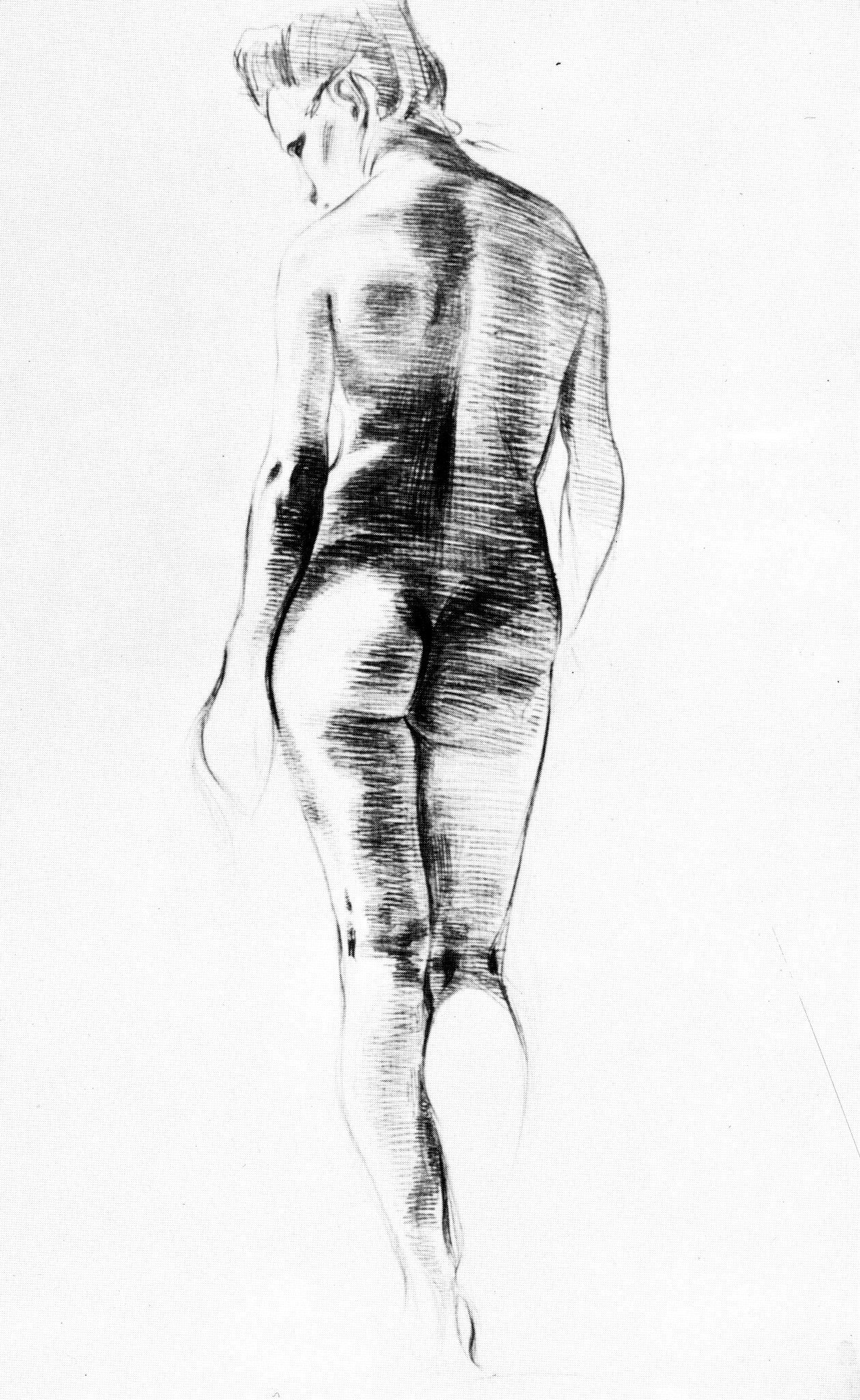
Egon Schiele (1890-1918) At age sixteen, Egon Schiele began three years of instruction in drawing at the Vienna Academy of Fine Arts. He started his studies there by copying plaster casts, producing fully modeled charcoal drawings. He soon advanced to drawing from a live model and to portraiture. For the nude figure, Schiele adopted the spare line of Jugenstil (Art Nouveau in German-speaking countries), encasing the figure in a solid, smooth outline with little or no modeling. By his third year, his drawing skills so accomplished, he rarely attended class.
Even before he left the Academy, an exhibition of 120 drawings and prints by Auguste Rodin at Hugo Heller’s Salon d’Art in Vienna in 1908 showed him the way to independence. Still in his teens, he wanted to break from academic formulas and create art on his own. During 1909, he worked himself free of Jugenstil and the abstract ornamentation of Gustav Klimt, the leading artist in Vienna at that time. By 1910, Schiele’s drawings, such as Young Woman with Crossed Arms show that, having absorbed Rodin’s example, he found his own way to a new body language.

Egon Schiele, Young Woman with Crossed Arms, 1910. Black chalk, pencil, and watercolor, 48.8 x 28 cm. Vienna, Albertina.
As in Rodin’s drawings, the pose is unconventional. The model (his sister Gerti) lies on her back while Schiele examines her from above. Because the lower legs are truncated by the edge of the sheet, she might appear to be standing. She clutches a shoulder with one hand and reaches behind her back with the other, her body nothing but a broad vertical stripe from the top of the sheet to bottom. Her crossed arms form a pronounce V-design that covers her breasts and leaves exposed her labia and pubic hair. The empty space around her offers no hint of a context. Instead, Schiele offers a straight-forward and honest rendition of frail and vulnerable adolescent sexuality.
After rapidly outlining his sister’s attenuated forms in pencil, he strengthened the lines with black chalk, a drawing tool he would soon abandon. The lines, especially in the arms, are corrugated like Rodin’s. And like Rodin, he colored his drawing with watercolor. But Schiele brushed on a number of different colors, not to imitate the gaudy color of the Fauves, as is often said, but to model the figure with projecting warm and receding cool hues. Rodin would have been pleased that a younger artist had used his example to free himself for something new.
Schiele supported himself on his explicit drawings. (In 1911 he demanded ten German marks for black and white drawings, twenty for colored drawings.) He had a harder time selling his paintings which were often labored and multifigured symbolic affairs. In contrast to his painting, he was a speedy and prolific draftsman—there remain over 2000 drawings from a brief ten-year career. Except for portrait studies, very few drawings prepare for the figures in his painting. His drawings are an autonomous art, a body of art complete in itself.
Nevertheless, he jotted down ideas for paintings and worked out their compositions in small notebooks. Sixteen notebooks are known to exist, twelve of them in the Albertina in Vienna. In the sketchbooks, he used an altogether different style of drawing, designing human figures in simple blocks that look like the shapes of an artist’s hinged mannequin or lay figure. The notebooks also contain some landscape sketches, presumably done from nature, but not directly reproduced in his landscape paintings. He painted landscapes from his imagination.
The male nudes in his drawings are almost all self portraits. As in a drawing from 1911, a year he portrayed himself frequently, the self portraits exhibit outlandish emotional expression. In many of them he stripped naked to expose his (or society’s) anxieties about flesh and sex.
Egon Schiele, Self Portrait, 1911. 51.4 x 35 cm. New York, Metropolitan Museum.
Nothing explains the angular pose or the bulging eyes and open mouth of this self portrait. He must be shouting—but why? Some force wrenches his extended arm up, a gesture that pushes his body to the right of the sheet. Something pulls his other arm and hides it behind his back so that it seems truncated at his protruding shoulder. The triangular torso points toward a frighteningly thin groin. Throughout most of 1911, his drawings are often explicitly erotic, yet in this example his genitals nearly disappear.
During this period he created human anatomy with knobby, thin, and wiry lines made with hard pencils. Unlike the smooth washes of 1910, he dabs on watercolor in splotches, darkening his face with the brown color of his hair. As in this drawing, he often emphasized the outline of his figures with a radiance of white gouache as though the figure explodes into view.
In April, 1912, Schiele spent twenty-four days in jail for “public immorality.” The sentence devastated him. In June, 1915, during World War I, he was inducted into the army. His duties in and around Vienna in 1915 and 1916 interfered with his art until 1917 when he was able to re-energize himself. In the meantime, his style had changed.
Female Nude with Black Stockings of 1917 is a good example of what happened.

Egon Schiele, Female Nude with Black Stockings, 1917. Charcoal and watercolor, 46 x 29.5 cm. New York, Metropolitan Museum of Art.
In contrast to his adolescent sister, Schiele portrayed a more mature woman whose body has grown rounder and fuller. He posed her with her hands behind her head as she squirms into an S curve. She too may have been lying on her back even though he signed the drawing as a vertical image. Her raised arms expose and display her breast and genitals for erotic pleasure while her stockings declare that she is naked not nude, real not ideal.
Schiele had switched from hard to soft pencils by 1913 and switched again to darker crayon and to softer, broader charcoal in his final years. Instead of the sketchy and distorted lines of earlier work, the firm outline of the Nude with Black Stockings accurately describes the model’s muscles and bones. Also in the intervening years, watercolor gave way to the more opaque colors of gouache. In place of the flat application of watercolor, he gently modeled the gouache in lights and darks to increase the natural appearance of the nude. As a result, she lacks any disturbing emotion; she lacks personality. She becomes an objective rendering of female sex, accessible and no longer shocking.
Schiele died in the influenza epidemic of 1918, age twenty eight. By then he had become the leading artist in Austria, and his work was much in demand. In his last years Schiele’s portrait drawings were at their finest. His sitters are alert and vibrant people who are palpably present. But his reputation is based on his early drawings of the nude, nudes that speak frankly about the sexual nature of young women and men.
Ernst Ludwig Kirchner (1880-1938) Under the pseudonym L. de Marsalle, Ernst Ludwig Kirchner wrote an essay “Zeichnungen von E. L. Kirchner” (“The Drawings of E. L Kirchner”) in 1920. He began, “If you want to be clear about Kirchner’s peculiar manner of representation, about his forms and his pictorial construction, it is best to examine his drawings” (Genius 2, 1920). With the simple tools of a draftsman, he says, he can feel and capture his sensations of life immediately. An intermediate purpose or intention (Wille) governs the creation of prints and paintings. “Kirchner’s drawings.” he concludes, “are the purest, most beautiful examples of his art.”
In Dresden, in June, 1905, Kirchner, Fritz Bleyl, Eric Heckel, and Karl Schmidt-Rottluff formed an artists’ association they called Die Brücke (The Bridge). They had known each other as architectural students, and now, exhibiting together as a group, they shared studio space and models. They regularly got together for a “quarter-hour nude,” as they called it. Their model held a pose for only fifteen minutes in which time the artists had to nail down her attitude in a drawing. The method, common in drawing classes today, was intended to break with academic practice and bring art closer to living reality.

Ernst Ludwig Kirchner, Two Nudes on a Carpet, 1909. Pastel and colored chalk, 64.5 x 90 cm. Chicago, Art Institute.
It was in Kirchner’s or Heckel’s studio in1909 that Kirchner drew Two Nudes on a Carpet in pastel and colored chalk. He artfully arranged the two models, one lying to the left, the other reclining to the right. They form a diagonal crossed by the diagonal position of the rug, creating an X-shaped design—Kirchner’s favorite compositional scheme.
No matter the calculation of the design, Kirchner drew Two Nudes on a Carpet with abandon and without corrections. He outlined each nude and the edge of the carpet with a few simple, summary lines. Then with blunt pieces of pastel in saturated primary and secondary colors he set down blocks of one color next to another in vivid contrasts. The large drawing may have taken more than fifteen minute if only because he had to put down and pick up separate pieces of chalk.
To make sense of his bold manner, historians of art have chronicled the exhibitions of other artists’ work that Kirchner saw and that may have influenced him: Neo-Impressionists in 1904, Van Gogh in 1905, Nolde in 1906, Matisse in January, 1909, the year he likely drew Two Nudes on a Carpet. But it is not easy to say what drawings of theirs—if any—he might have seen. African and Oceanic art in the ethnographic museum also played a big part in his stylistic development, and possibly Rodin, who made the spontaneous drawing of the nude model his paramount topic, as the art world well knew at that time. But in contrast to Rodin, Kirchner posed his nudes. They did not move about, at least not for Two Nudes on a Carpet, and he did not retrace or correct any drawing as Rodin did. If the drawing did not work, he threw it away. Scholars believe he threw away quite a few. Even so, he left behind about 20,000 drawings.
The most rapid, the most direct, the most inspired drawings by Kirchner can be found in his 180 sketchbooks which contain over 11,000 drawings. One hundred sixty of the sketchbooks are in the Kirchner Museum in Davos, Switzerland. Most of them are about 20 x 16 centimeters (8 x 6 inches). The National Gallery in Washington owns nine pages, depicting dancers, from a sketchbook dated about 1911: http://www.nga.gov/content/ngaweb/Collection/artist-info.1436.html?artistId=1436&pageNumber=1
Kirchner used his sketchbooks constantly throughout his entire career, sketching nude models as they moved around the studio, performers in cafés and cabarets, and people walking in the streets. In the Washington sketchbook, most of the drawings are merely a few lines of motion. He may have been thinking of such sketchbook pages when he called his drawings “hieroglyphs,” lines that convey an experience rather than reproduce an object.
Kirchner continued to draw the nude model more than any other motif both in his studio and outdoors in the summer on the shores of the Moritzburg Lakes near Dresden and Fehmarn island in the Baltic sea. The settings became a make-believe Arcadia or Eden where models and artists went about in the nude. He lived the life that became his art: free drawing of the free human body in the freedom of nature (Diary, 1923).
When Kirchner moved to Berlin in 1911, he changed his iconography and style at the same time that he broke away from his former comrades. He moved his art out of the studio and into the crowded streets of the city where he made hundreds of drawings of passersby in his sketchbooks.
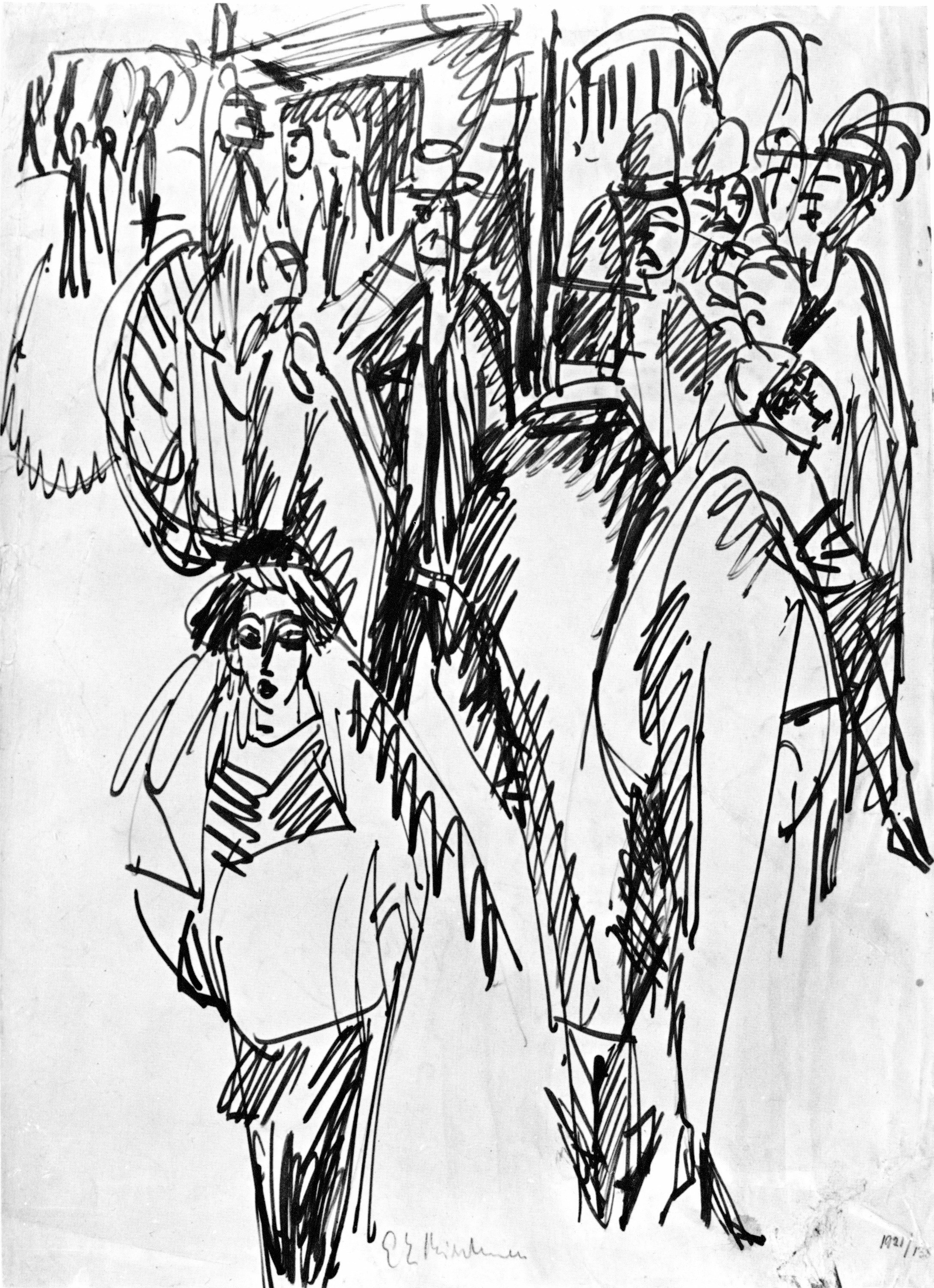
Ernst Ludwig Kirchner, Street Scene, 1914. Pen and ink, 54.6 x 39.4 cm. New York, Museum of Modern Art.
Nevertheless, he must have drawn Street Scene, (1914; pen and ink, 54.6 x 39.4 cm. Museum of Modern Art, NY)—the fleeting conjunction of a dozen strangers—from memory and from his sketchbook pages. It was one of the thirty large drawings in pen, pastel, or charcoal he made in preparation for his paintings of the throngs on busy Berlin streets.
Street Scene too is held together by an X-shaped composition. The street rises up in steep perspective like a ladder on which he placed the flat figures. The prominent women are streetwalkers, cautiously, openly trolling for customers. His street scenes are often said to illustrate the alienation of modern big-city life. More importantly, his assertive rendition of the crowd expresses the electricity in the air.
In contrast to the near-normal, Matisse-like curves of his earlier drawing of two nudes, Kirchner drew mostly harsh, straight contour lines, creating elongated wedge-shaped human figures in this as well as in other drawings from the period. There is nothing tentative or hesitant about this pen and ink drawing. Entirely new is his concern for chiaroscuro. He employed a violent zigzag hatching to establish dark areas. The zigzags spill out beyond forms and in many places seem to reinforce the energy of the contour lines rather than to represent a dark area. In pastel drawings of Berlin street scenes, Kirchner also changed his palette: colors are darker and more discordant. Most figures wear solid black, and in some works red-orange areas clash with red-violet areas.
In 1915, the army declared Kirchner unfit for military service and sent him to a sanatorium to regain his health. He suffered from nervous exhaustion, stomach pain, and the misuse of alcohol and narcotics. Although he spent a good part of World War I in bed, between 1916 and 1918 he was able to produce some exceedingly nervous and agitated drawings such as Landscape in the Taunus, a view of the Kohnstramm Sanatorium in the mountains near Königstein.
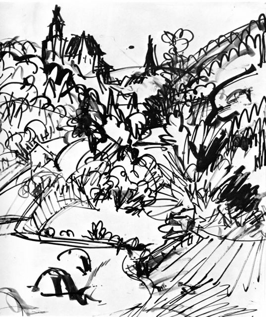
Ernst Ludwig Kirchner, Landscape in the Taunus, 1916. Pen, brush, and ink, 37 x 32 cm. Davos, Kirchner Museum.
In the nearly shape-less drawing, he rendered what must have been a peaceful landscape with an explosion of thick and thin diagonals, zigzags, and curlicues. The welter of ink lines reveals the excited state of the artist’s tangled mind as much as the energy of nature. With bold, brusque strokes he invented a new way of seeing and describing landscape.
By the end of the war, he had settled permanently in Davos in the Swiss Alps, where the mountains and farmers around him became the main topic of his drawings. Adapting to his quiet and peaceful surroundings, his line work eventually became less agitated and his colors became less aggressive. After 1926, he fell under the sway of Picasso and Paul Klee, devising lively but second-rate imitations of their abstract forms. His art was no longer avant-garde.
Kirchner always thought of himself as the inventor and the leader of Die Brücke. To prove the point, in later years he gave many of his drawings an earlier date. For example, around 1935 he wrote the date 1905 on Two Nudes on a Carpet. In truth, his comrades shared his Expressionist belief that the first sensations before a motif are the best and that to capture them an artist must work from the motif directly, rapidly, and confidently, otherwise they are lost. For centuries, artists have made rapid primi pensieri to begin the process of refining the sketch’s fleeting vision for a subsequent, more elaborated work. Kirchner, however, considered his spontaneous drawings finished.
No contemporary equaled his commitment to drawing. He wrote in his diary, “I must draw until I’m raving, just draw” (August 4, 1919).

Paul Klee, The Christ Child with Yellow Wings, 1885. The Christ Child with Yellow Wings, 1885. Pencil with colored wax crayons, 9.0 x 6.3 cm. Zentrum Paul Klee, Bern.
Paul Klee (1879-1940) When Paul Klee was four, his grandmother gave him crayons and taught him how to draw. His parents saved about a dozen of the drawings he did as a child. He later declared that they were the most significant drawings he had ever made (letter to fiancée, 1902).
During his teens, he used pencils to make faithful copies of landscape vignettes in nine small sketchbooks. The subjects he copied appeared in daily calendar illustrations and other popular sources. Working directly from nature in the last four sketchbooks, he kept making the same sort of miniature landscapes.

The Eiger and Mönch Mountains, from Sketchbook III, 1893. Pencil, 11.5 x 18.7 cm. Zentrum Paul Klee, Bern.
In imitation of the wood engravings he was copying, all his 150 landscape drawings depend on fine hatching and stippling to render solid mass and receding space—through chiaroscuro rather than by means of outline.
At age twenty, in preparation for classes at the academy in Munich, he studied figure drawing with Heinrich Knirr. Klee saved about sixty-four drawings from the period—all of them treated with the same sweeping parallel hatching that he had seen in the anticlerical satires of Félicien Rops (d. 1898). The artists probably knew that Leonardo da Vinci had employed a similar hatching technique (see figure 3-3).
Female Nude Seen from the Back, 1899. Pencil, 32.5 x 20.7 cm. Zentrum Paul Klee, Bern.
Knirr declared that Klee was the best pupil he had in ten years. More importantly, Knirr recognized Klee’s extraordinary talent and encouraged him to foster his personal skills and his individuality.
From October, 1901, to May, 1902, Klee toured the museums and ruins of Italy. Face to face with the ideal art of antiquity and the Renaissance, Klee rejected its relevance for modern times, a relevance that academic art still maintained. Compared to the past, modern society felt empty. He decided that the satirical illustrations in the popular magazines Simplicissimus and Jugend were more appropriate to the present day. For years he had filled the margins of his school textbooks and notebooks with caricatures and satirical outline drawings. He saved the best of them because he recognized that they were his most original work and completely modern.
At this time he also rediscovered the drawings he did as a child. Their simplicity and sincerity pointed him toward an art of free personal expression.
In 1903 Klee moved back to provincial Bern, Switzerland, where he struggled in isolation to break free of the art he had learned. Three Nudes Dancing on One Leg, a pencil drawing of 1905, illustrates that in a few short years Klee was using a new and very different graphic language.
Three Nudes Dancing on One Leg, 1905. Pencil, 13.3 x 16.3 cm. Zentrum Paul Klee, Bern.
Like most of his drawings from now on, value contrasts play no part in the design. Drawing for Klee essentially meant line work, and he will spend decades exploring the meaning of line. In Three Nudes Dancing, the line he used is a light, continuously curving outline, aptly suited for the lean, wildly cavorting men. In fact, the arching rhythm of the lines seems to generate their movements. Their dance is witty, playful, even ridiculous. The contours he drew are spontaneous, imperfect, seemingly careless, and far from classically proportioned.
Although the figures sprang freely from his imagination, he deliberately sought out ugliness to counteract an ideal of beauty he felt was no longer valid. He was among the many artists of his generation who questioned everything they had learned and who struggled to break with tradition and rediscover like children the fundamental elements of art. In these pre-war years, Klee did all these things almost exclusively in his drawings.
Klee was stimulated in part by the drawings of Rodin, which he saw in an exhibition in early 1902. The freedom of pose and of line in Rodin’s work enabled Klee to modernize his drawing style, specifically to project the three-dimensional onto a plane without foreshortening or modeling. The three dancing nudes do not even create space by overlapping each other: they move across the plane, not into space.

Lump-ghosts, Rag-ghosts, and Light-ghosts, the latter very fragmentary, 1908. Pencil, 14.5 x 21.2 cm. Zentrum Paul Klee, Bern.
In the early years of the Twentieth Century, Klee also experimented with the quality or character of his lines. After the continuous, even, wrap-around contours of drawings such as Three Nudes Dancing, he tried a series of drawings using discontinuous curves, as in Lump-ghosts, Rag-ghosts, and Light-ghosts, the latter very fragmentary.
Throughout the figures, one short curve follows another as though ectoplasm is trying to ooze through their skin. He found these peculiar lines in the prints of James Ensore.
In the series of twenty-six drawings he made to illustrate Voltaire’s Candide (1911-1912), Klee experimented with another kind of line.
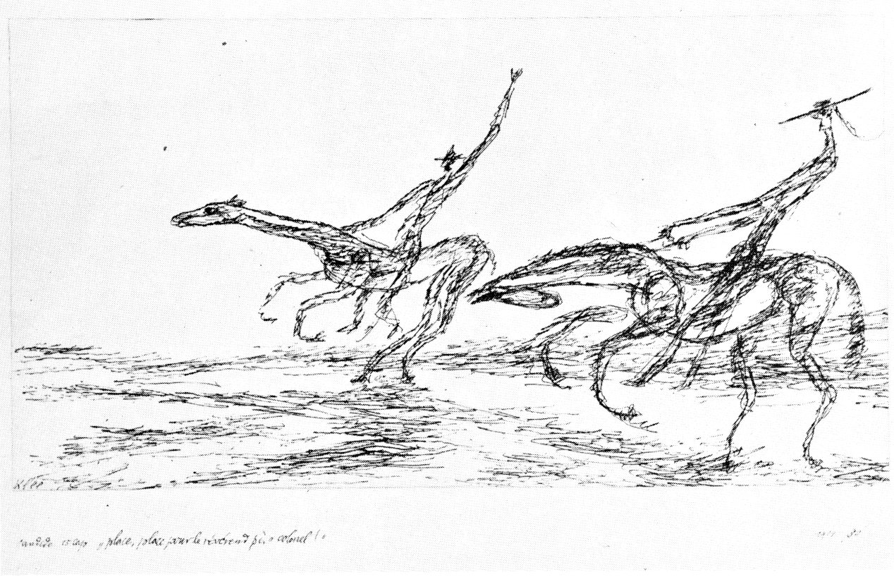
“Place, place pour le révérend père colonel.” Candide, ch. 15, 1911. Pen and ink, 12.1 x 23 cm. Zentrum Paul Klee, Bern.
He roughed up the contours of horses and men with scratchy, jagged lines made from countless short pen strokes. (From now on, pen became a favorite instrument.) Unlike traditional hatching lines, which are bland and boring as lines, the lines in the Candide drawings communicate tension and excitement. In other words, his lines give his hatching texture and character.
To illustrate Candide, Klee invented elongated beings who gesticulate like floppy balloon figures. In each illustration, settings are empty and props are few. The sardonic humor of Voltaire suited him, yet he seems to have illustrated lines of the poem at random. Though the drawings follow the text, they are above all creations of his imagination. He called his drawings “psychic improvisations,” the transformation of experience into a visual equivalent, rather than a reproduction of reality.
In the Candide drawings, Klee was aware that these variations in the quality of the lines in his drawings were in danger of becoming merely ornamental, a gimmick, and not meaningful. He found the solution to that problem in the drawings of Van Gogh where lines that imitated the forms of nature also simultaneously expressed so much of the artist’s personal emotion. Little wonder that, in his diary, Klee wrote most often about the drawings of Van Gogh.
In 1911, shortly before he began Candide, Klee took stock of his art. He began writing a chronological Oeuvrekatalog, for which he examined and numbered everything he had done up until then, including his childhood drawings. He also began arranging his drawings year by year in portfolios to document his progress. He treasured his drawings, whether they were rough pencil sketches or precisely drawn large-format ink drawings. He did not often exhibit or sell them. Like the drawings of Picasso, they were his laboratory.
While at work on the Candide illustrations, Klee’s art took a major turn. At the end of 1911, he finally came in personal contact with the European avant garde. He befriended Wassily Kandinsky and other members of the Blaue Reiter in Munich. And on a visit to Paris in the spring of 1912 he met Robert Delaunay in his studio and studied the work of Matisse and Picasso at their dealers’ showrooms.
The geometric shapes and the flatness of the drawing Fleeing Policemen are the result of his contact with Cubism. But the wit of the drawing is unmistakably Klee.
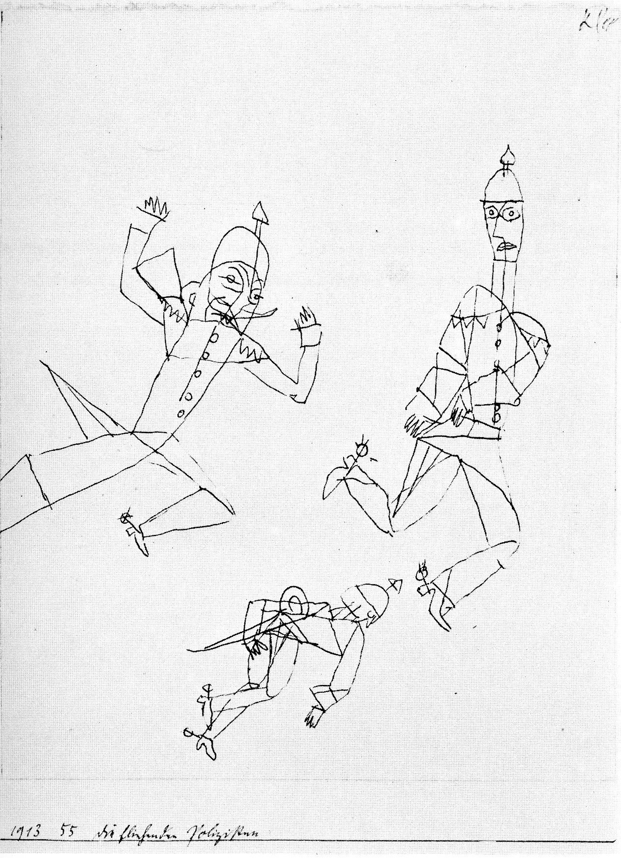
Fleeing Policemen (Die fliehenden Polizisten), 1913. Pen and ink, 19.6 x 15.5 cm. Zentrum Paul Klee, Bern.
Three policemen, the symbols of law and order, fly and stumble over one another as though they were marionettes bouncing on stings. They wear silly expressions, make funny gestures, and are constructed of rudimentary lines as in a child’s drawing. In this drawing as in most of his drawing, he drew a line under the drawing and gave it a date, catalog number, and title. The titles are usually cryptic, insightful, or sarcastic; it is no surprise that he greatly admired Goya’s prints and drawings, which also have trenchant titles.
Until 1914 Klee considered himself a graphic artist who expected that he would earn a living illustrating satirical magazines like Jugend and Simplicissimus. A trip to Tunisia that year changed his attitude. There he discovered color and set out to become a painter. Nonetheless, he continued to draw as he always had: usually about one hundred drawings a year—many more than that in the late twenties and in the late thirties. Of the more than five thousand of his drawings that exist, the Paul Klee Foundation in Bern owns a majority of them.
In early1921, Klee joined the faculty of the Bauhaus, where for ten years he ran workshops and lectured and wrote about the fundamental principals of art. Despite these obligations, he continued to paint and draw.
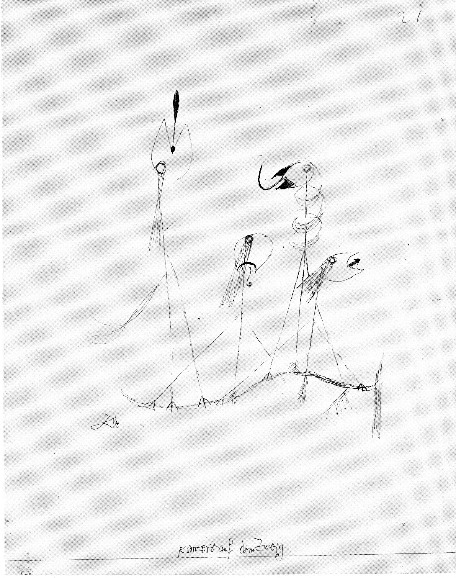
Concert on a Branch (Konzert auf dem Zweig), 1921. Pen and black ink, 28.2 x 22 cm. Zentrum Paul Klee, Bern.
He began to produce model drawings such as Concert on a Branch, an ink drawing that served as the prototype for the famous oil-color and watercolor work Twittering Machine (or Chirping Machine) in the Museum of Modern Art, New York.
Throughout the early twenties, Klee traced dozens of similar drawings, reworking and water-coloring them into new creations, which his dealer could sell for three times the price of an ink drawing. To transfer the original drawing, he normally placed it over a sheet covered with black oil paint. He then traced his drawing with a stylus so that the black paint would adhere to the back and could be imprinted onto a third sheet. (There are fingerprints of black paint and stylus marks on the drawing.)
In Concert on a Branch, four song birds—facing up, down, left, and right—clutch an S-curved branch with their talons. Their curves have been schematized into simple straight lines. The four vertical lines that suffice for their bodies end in a small cluster of feathers near the branch, making it seem that three of the birds have a tripod of three legs supporting them. The songs in their throats are symbolized by an exclamation point, a G-clef, a hook, and an arrow. In short, Klee has cleverly transformed freely singing birds into stripped-down and efficient automatons. Klee made his intention to satirize the Machine Age more explicit in his colored Twittering Machine, where the branch becomes a camshaft turned by a crank.
On occasion, his teaching basic design at the Bauhaus manifested itself in a series of drawings. His fundamental theoretical insight as an instructor was that a line created movement, or as he put it, a point taking a walk. At the end of his stay, he made a number of drawings such as Looped Group in which an endless line turns around and around, crossing itself into a tangle that nevertheless becomes–with the addition of feet–three figures. He playfully tied them up in a knot. To emphasize that the eye should follow the movement that the lines have made, he added his favorite sign, an arrow, here and there along the route.
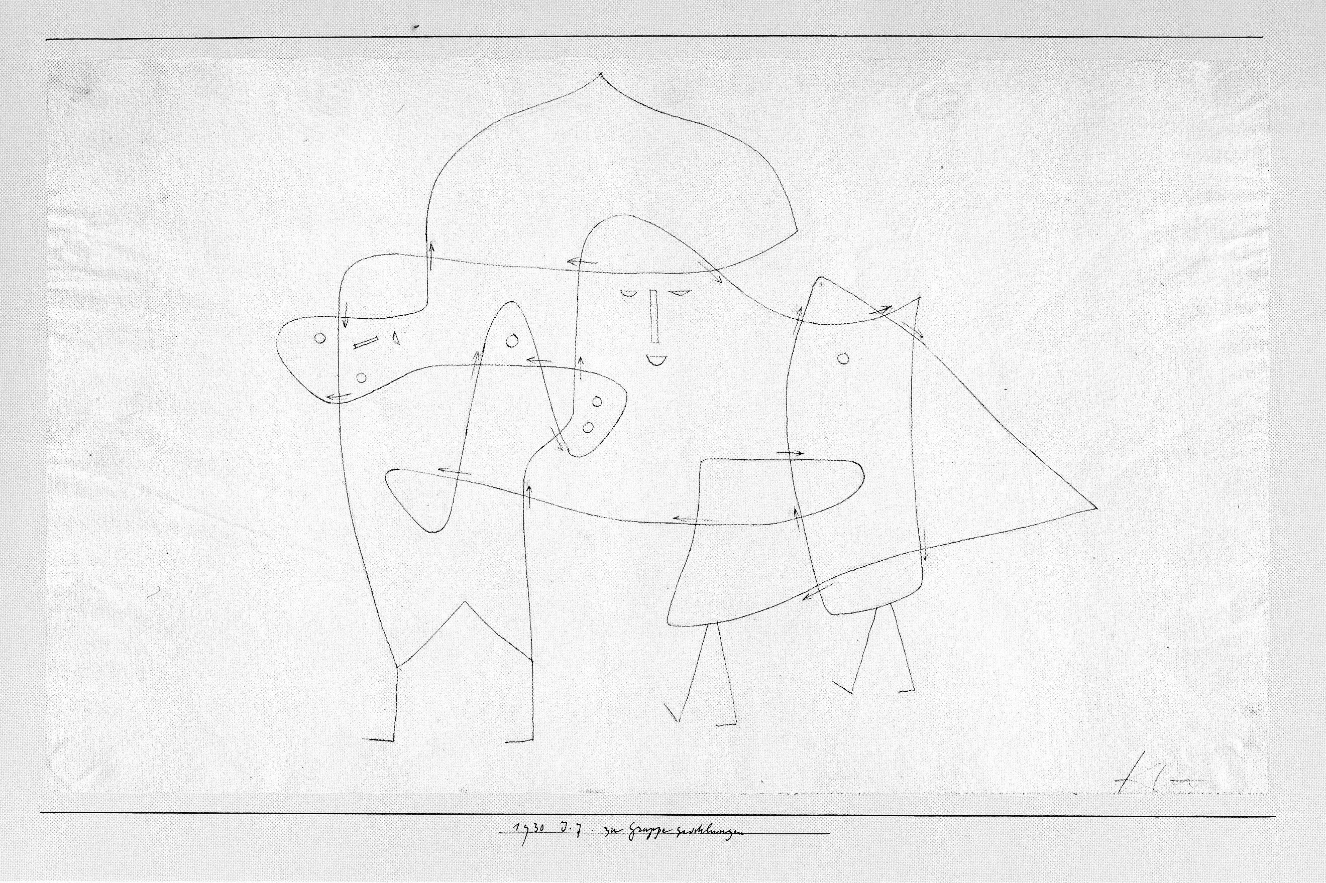
Looped Group (Zur Gruppe geschlungen), 1930. Pen and black ink over pencil, 27.5 x 46.5 cm. Zentrum Paul Klee, Bern
Klee also found movement in another series, drawn almost exclusively with parallel lines, as in Ordensburg, an abstract rendering of a medieval fortress for Germanic knights.
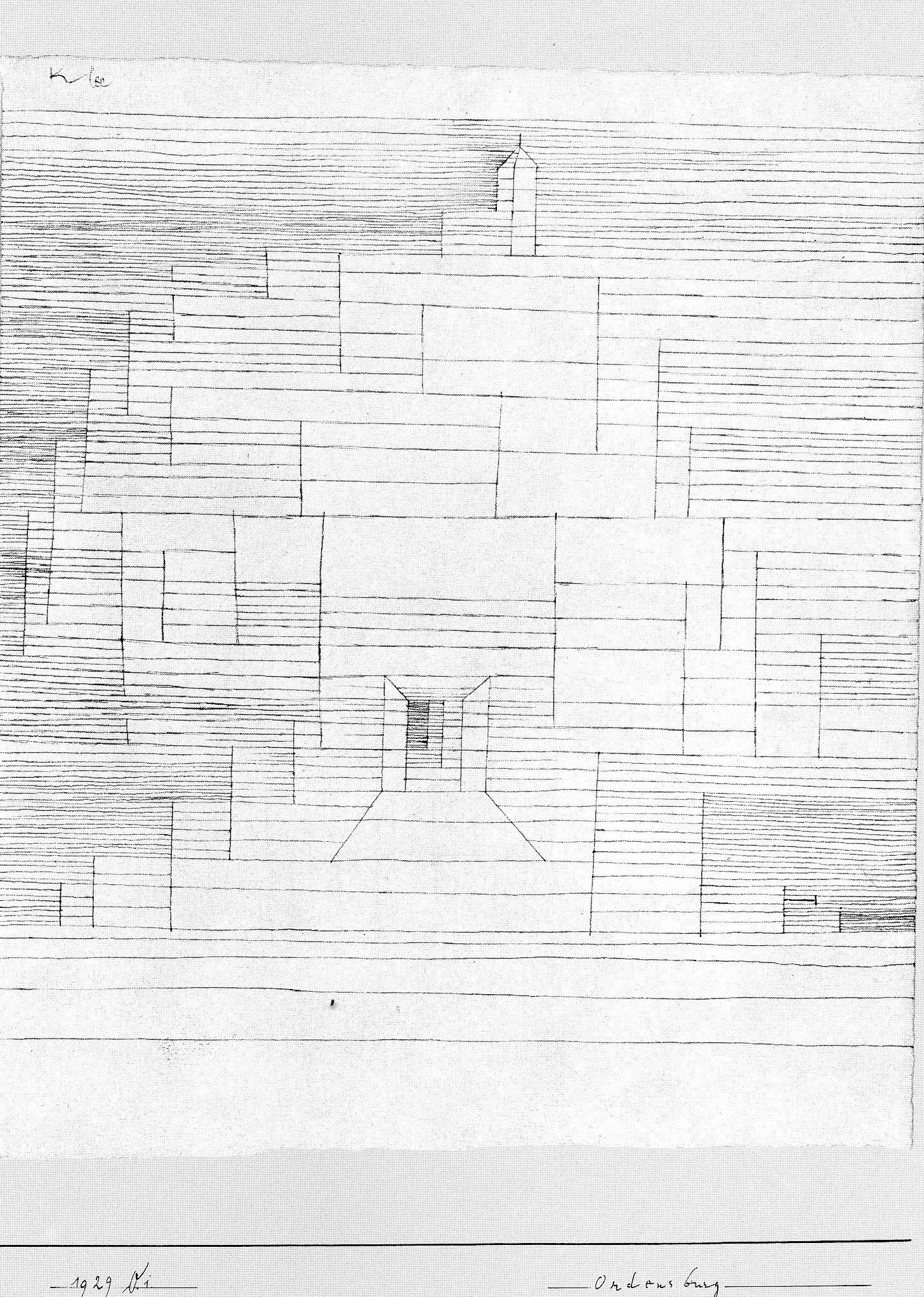
Ordensburg, 1929. Pen and ink, 28.5 x 24.3 cm. Zentrum Paul Klee, Bern.
As the lines get closer together, a progressive movement or rhythm quickens across the drawing. The parallel lines also operate as though they were hatching, producing movement in and out of the flat surface. Many commentators have also noticed that these drawings resemble the staffs and measures of musical notation. (Klee loved Bach and Mozart and played the violin daily.) Starting from center to left or right, whenever a vertical line cuts the horizontal staff lines, the beat doubles.
For many years, Klee could not accept total abstraction—“form without function,” he quipped in 1928. He felt formal construction lacked intuition. Nevertheless, as he left the Bauhaus and moved to the Düsseldorf Academy in 1931, he made of series of at least 113 drawings, variations on geometric constructions or “Models,” as he called them.

Modell 7a, (drei Stäbchen und Gummiband), 1931. Pen and ink, 21 x 33 cm. Zentrum Paul Klee, Bern.
“Three Sticks and a Rubber Band,” the subtitle to Model 7a, the first drawing in a series of fifteen variations, reflects the preliminary course at the Bauhaus in which students studied ordinary materials like cloth, paper, steel, glass, etc. Klee was also thinking of the constructions of Lazlo Maholy-Nagy and Josef Albers made from such materials. Once again, Klee felt that these series of drawings created movement, as though the sequence of variations were the frames of a motion picture film. Despite what he thought earlier about abstraction, he listed the drawings in his Oeuvrekatalog and thereby declared them works of art.
As suddenly as he turned to abstraction, he abandoned it. By the end of 1931, he went back to his favorite themes, faces and the human figure or figures in an anecdotal context. Setting aside straight edge and compass, he experimented with freehand drawing and the automatic drawing of the Surrealists. He tried out new and stronger drawing instruments: for example, grease crayon (Zulustift), charcoal, reed pen, and brush. The new tools helped increase the expressive power of these big-gestured improvisations.
In February, 1933, a Nazi director took charge of the Düsseldorf Academy; three months later Klee was fired. In March, Hitler gained dictatorial power; in April, Klee’s house was searched. Between spring and fall (when he determined to emigrate to Switzerland), Klee reacted to these events with his largest series of drawings, about 230 sheets sketched in an intensity not seen before in his work.
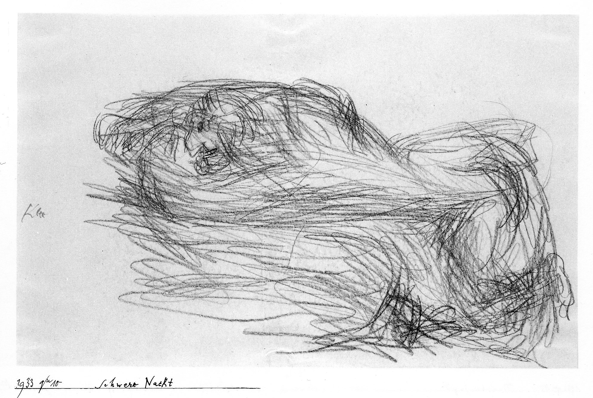
Difficult Night Schwere Nacht, 1933. Zulustift, 21 x 32.9 cm. Zentrum Paul Klee, Bern.
Like Difficult Night, most of these drawings are an explosion of lines, lines which seem to be searching for the forms lurking amid them. In the drawing, a naked man, teeth bared, gropes for something as he leans over a bed. It may or may not represent the sleepless nights many a German endured in those years. As always, Klee treated his subjects indirectly with humor and irony. Only the force of his lines expresses his true feelings.
The lines are not traditional hatching lines that model three dimensional forms. On one level, they resemble the brainstorming lines that Leonard da Vinci and other artists used to discover their images. (See figure 3-2.) On another level, they resemble the multiple contour lines employed by Millet, Cézanne, and many other artists of the late nineteenth century whenever they sketched. Since Klee was familiar with Surrealist automatic drawing, he must have realized that the gestural lines he made with an oily crayon in Difficult Night above all showed uninhibited movement.
National Socialism in Germany may have brought about this unmistakable change of style, but not a single drawing ever directly refers to the Nazis. Many of them, however, deal with power, suffering, melancholy, and fear.
After moving to Bern, Klee at first felt uncertain about his work and lost his way. In addition, in the spring of 1935, he became critically ill. His output fell sharply; he made only a dozen drawings in 1936. But in 1937 he began drawing again with renewed fervor. In the three years before his death he produced a total of 1583 drawings.
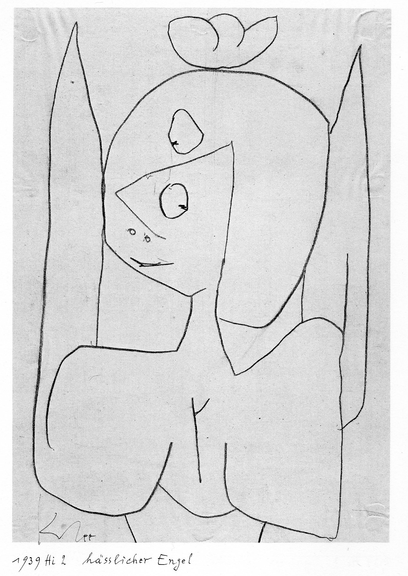
Nasty Angel (Hässliche Engel), 1939. Zulustift, 29.5 x 20.8 cm. Zentrum Paul Klee, Bern.
In Nasty Angel, an angel with a smirk and cockeyed glance epitomizes his belief in the absurdity of life: even a divine being is a joke. However, a single drawing can scarcely illustrate the diversity of his late style. For one thing, he treated many themes, including angels, in a series of variations that as a group more closely reflect his thoughts and feelings about a subject. In addition to a series of angels, he made many drawings of figures with disconnected limbs. Another series had bulbous human forms; another stick figures. The drawings he made with a relatively thick brush tend to have short strokes that look like hieroglyphics.
It can be no coincidence that angel wings can also be found in several drawings he did as a child. The freely and spontaneously drawn Nasty Angel recapitulates some of his past style characteristics as well. There are traces in it of his experiments with an endless line. The flattened forms make one think of his geometric exercises. And of course it uses pure line and not a hint of chiaroscuro. But the new and outstanding characteristic of almost all his late drawings is their large scale: the figures crowd the sheet, leaving little room for empty “background.” (Compare the scale of the birds in Birds on a Branch in relation to the sheet.) The figures in the late drawings assert themselves and loom at the viewer. Klee borrowed this device from the late paintings of Picasso, which astonished him when he saw Picasso’s contemporary work at exhibitions in Zurich in 1932 and in Bern in 1939.
To the end, like a conscientious bookkeeper, Klee recorded his drawings in his Oeuvrekatalog. Aware that he did not have long to live, he drew as much as and as fast as he could in order to publish in those drawings his legacy, his art, his world.
SURREALISM
Automatic Drawing
In his 1924 Manifesto of Surrealism, the poet André Breton described how he would reproduce an apparition if he were an artist:
“Equipped with a pencil and a sheet of white paper, it would be easy for me to follow its [the apparition’s] contours. In doing this, it would no longer be a question of creating a drawing, it would only be a question of tracing. I could thus configure a tree, a wave, a musical instrument, all of them things of which at this moment I am incapable of furnishing the most schematic idea. I would bury myself in it, with the certitude of finding my way again in a maze of lines which appear to me, at first, to add up to nothing. And, opening my eyes, I would experience from it a very strong impression of ‘never seen’.”
To capture a psychic event such as an apparition or dream, Breton would plunge into a frenzy and lose himself in a flurry of lines, merely tracing the apparition rather than drawing it, scribbling away without planning or thinking. In the original French, Breton rejects the word dessiner (drawing), which means in French to design and compose in addition to make marks on paper. In other words, by mechanically tracing the apparition, he relinquishes rational control so that he can record his subconscious. The result is something new. Breton described what became known as automatic drawing, the first of several new drawing processes that Surrealism gave the twentieth century.
Breton had no skill as an artist, as he admits. However, several other artists, before and after the manifesto was written, attempted to draw using “pure psychic automatism,” as Breton defined Surrealism. In the Manifesto he cites only the example of the poet-artist Robert Desnos who under hypnosis had produced some surrealistic poems/drawings, few of which exist. More importantly, Jean Arp, André Masson, and Joan Miró practiced different forms of automatic drawing around the time Breton wrote his Manifesto.
Jean (Hans) Arp (1886-1966) Jean Arp helped found the Dada movement in Zurich in 1916. A somewhat shy person, Arp seldom took part in the provocative Dada theatrics staged at Zurich’s Cabaret Voltaire. Nevertheless, Dada anarchy emboldened him to experiment with chance and accidents. One result was several brush and ink drawings, such as Automatic Drawing (1917-1918) now in the Museum of Modern Art, New York.
In this drawing, curving worm-like shapes play around thicker blobs that gather toward the upper right. Arp’s organic shapes vaguely recall trees and other forms of nature he had recently sketched in the countryside. Pencil marks visible on the sheet indicate that Arp had made a preliminary sketch over which he brushed the ink. Chance would have governed the making of the pencil sketch even as he was calculating how the lines and shapes he drew would appear finally in ink. Arp’s work was included in the first Surrealist group exhibition in 1925, but he probably never intended Automatic Drawing to reveal the subconscious.
André Masson (1896-1987) André Masson abandoned a Cubist style in 1924 when, at Breton’s invitation, he joined the Surrealist movement. For the next several years, automatism was the primary tendency in Surrealist art, and Masson was the leading exponent of automatic drawing—until Breton expelled Masson from the group in 1929 and Breton himself became disillusioned with automatic drawing. Masson’s pen and ink drawing, Automatic Drawing, 1924, also at the Museum of Modern Art, is an early example of his surrealist work. In later years he used a lighter touch for automatic drawings.
To draw automatically, Masson worked himself into a trace-like state, freeing his mind of rational control. He would begin to scribble spontaneously and rapidly to keep the flow from his subconscious free from any reasoning that might control the movement of his hand. Unlike Arp, he did not make a preliminary sketch in pencil. As the drawing progressed, images that lurked in his memory became imbedded in the rhythmic mass of lines. In his drawing of 1924, curves became hands whose fingers bend around objects, possibly breasts. Just as Breton confidently traced his hypothetical apparition, Masson fearlessly recorded his subconscious vision, but now in indelible ink.
Joan Miró (1893-1983) A friend of André Masson in Paris, Joan Miró also practiced automatic drawing in the mid and late twenties. Although he never joined their group, ideas of the Surrealists influenced him greatly and enticed him away from the geometry of Cubism. Viticulture (Art Institute of Chicago) a drawing of a vineyard dated 10.11.1924, illustrates the transition from his earlier style and also a very different understanding of automatism from Masson’s.
Instead of a swirl of lines, Miró marked the paper with a variety of freely drawn lines and shapes, first in pencil, then in darker conté crayon and a few watercolor touches. In addition to the branch-like pathways in the center, the artist scattered across the sheet a man at a grindstone, a smoking pipe, copulating dogs, a man standing on a ladder leaning over a vat, and a flying bird and insect. The thin, weightless images, though recognizable, are a foretaste of the mysterious biomorphic creatures that will people his art from now on. Pictorial space is flat as can be: no image overlaps another, and two horizontal lines divide space symbolically into three parts—reading from the bottom up—foreground, middle ground, sky.
Miró confessed that, in the mid-1920s, he often went hungry to provoke hallucinations in order to make drawings like Viticulture. The images for the drawing came to him rapidly as in a trance or dream, without any prior planning. In this sense the content of his drawing was “automatic”—even though it did not emerge out of a vortex of rhythmic scribbles. Despite his allegiance to automatism, Miró drew, like Paul Klee, with a thinking eye that knew how to compose. (Miró saw works by Klee in exhibitions and collections in Paris.) Furthermore, Miró very often developed his automatic drawings into paintings.
Collage
In the 1920s Surrealist artists also found that the artistic process of collage opened a door into the subconscious. In 1912 Picasso and Braque adopted collage when they began pasting pieces of newspaper or wallpaper to their canvases and drawings. As their work was becoming more abstract, collage reintroduced reality in a way that made the viewer question the meaning of representation. Was a rectangular shape an actual piece of wallpaper that imitated wood grain or a section of canvas painted to imitate wood grain? Which was closer to reality, which was more imaginative?
The example of Cubist collage and the anarchy of Dada gave Jean Arp the courage to experiment with a new material: paper. Starting in 1916, he began making collages which were “arranged according to the laws of chance, ” http://www.moma.org/collection/object.php?object_id=37013 the subtitle of his work in the Museum of Modern Art. He tore pieces of colored paper into rough squares. He once claimed that he cut the paper with a paper cutter (letter opener?) to avoid control by the hand. Then he let the pieces fall to the ground so that accident and chance would determine their arrangement, in the order that the pieces themselves chose. Arp changed the fundamental notion of art from the conscious imitation of nature to a subconscious process that was in good part out of the artist’s control.
However, in the early example cited above, the squares are clearly located in a grid of parallel lines and are nicely balanced on the center of the sheet. After they had haphazardly fallen, he obviously moved them around until he became satisfied with the design. In short, he still maintained an artist’s eye for harmony and balance. Arp continued to make collages into the 1930s when he tore up older drawings and prints that had been damaged accidentally by heat and moisture. They are known in French as papiers déchirés.
Max Ernst (1891-1976) When Max Ernst first joined the Dada movement in 1919, he began to make collages. Exhibited in Paris in 1921, they brought Ernst to the attention of Breton. Ernst concentrated on collages again between the years 1929 and 1934. His collages resemble more closely the contemporary photomontages of John Heartfield and Hannah Höch in Berlin than the earlier collages of Picasso and Braque in Paris. Typically, Ernst cut wood-engravings from nineteenth-century illustrated books and magazines, then juxtaposed parts of them in original and startling combinations. The original collages for the novel Une semaine de bonté (1934) were exhibited at the Musé d’Orsay in 2008:
http://www.musee-orsay.fr/en/events/exhibitions/in-the-musee-dorsay/exhibitions-in-the-musee-dorsay/article/les-collages-de-max-ernst-20484.html?cHash=241cb291e1 In them one can distinguish the separate pieces of paper he pasted together. In the photo-engraved reproductions, the junctions are seamless.
Through the manipulation of paper, Ernst made popular imagery strange and often nightmarish. Through collage, he made the irrational meeting of disparate realities Surrealism’s most popular means of exploring the psyche. In effect, he was making variations on the poet Lautréamont’s (d. 1870) prophetic vision (and Surrealism’s mantra): “the chance meeting on a dissecting table of a sewing machine and an umbrella.”
Frottage
In 1926 Ernst exhibited 34 drawings in the series he named Histoire Naturelle. He made them with a technique he called frottage (rubbing) in which he placed a sheet of paper over a common material like floor boards. Wheel of Light (La Roue de la lumière) http://www.moma.org/collection/object.php?object_id=94253 is a collotype made from one of the drawings. In this instance, he placed his paper on top of leaves and rubbed the paper with soft graphite to capture their texture. (The flesh around the eye may be a frottage of rough cloth.) After staring at their pattern, the leaves became in his mind the blood vessels of an eye whose iris consists of radiating lines like the spokes of a wheel. By means of frottage he noticed a disturbing similarity between two very different living forms. One image becomes another as in a dream. Furthermore, the radiating lines and the title suggest an impossibility: that the eye is a source of light, rather than a receiver of light.
Ernst considered frottage a form of automatism. At first, he may have randomly dropped his paper on top of the various materials. But randomness did not keep him from refining and elaborating the resultant texture with fine precise lines and subtle chiaroscuro.