Arshile Gorky (1904-1948) Arshile Gorky taught life drawing at Grand Central School of Art in New York from 1926 to 1932. He had emigrated to the United states from Armenia a few years earlier in 1920. With an inborn talent to draw, he could always draw a precise portrait in the style of Ingres if he chose to do so. Nevertheless, in the twenties and thirties he taught himself a modern style of drawing by studying artists from the Impressionists to Picasso in art books and magazines and in the museums and galleries of New York City.
A pencil drawing in the Museum of Modern Art, Study for Nighttime, Enigma and Nostalgia illustrates that in the early 1930s Gorky was assimilating the Cubist style of Picasso and Braque. In the Gorky drawing, a swinging line, traced over parts of a rough sketch, creates more than a dozen oval shapes that overlap and intersect one another. Since the shapes are transparent, their three-dimensional relationship one to another is ambiguous—a classic principle of Cubism. However, the trapezoidal, straight-lined frame surrounding the curved shapes derives, surprisingly, from a painting by Giorgio de Chirico (The Fatal Temple, 1913) that Gorky saw in New York.
Gorky was also imitating Picasso’s use of a continuous, interlaced line. (A year earlier, Paul Klee used the same line in his drawing Looped Group.) Picasso was always proud of his ability as a draftsman, showing off that he could draw a hand or the human body with one line without ever lift the pencil or pen from the paper. More seriously, as a Cubist device, a continuous line ties together onto the surface of the sheet the planes that ambiguously move back and forth in space. Gorky may have seen an uninterrupted contour line in prints by Braque.
Gorky made about fifty drawings (and two oil paintings) on the theme “Nighttime, Enigma and Nostalgia.” When asked in 1941 what it meant, he replied cryptically and facetiously, “Wounded birds, poverty, and a whole week of rain.” The shapes of the drawing themselves appear to be parts of the human body, arms and legs as well as breasts and vagina or anus.
In another drawing on the same theme (Objects, 1932), Gorky used his pen to blacken most of the background, as in the de Chirico’s painting. He also darkened other shapes with patterns and textures so that light and dark contrasts bring about the perception of in-and-out movement. The title Objects has led some to misconstrue the drawing as a still life rather than as an abstract rendering of a reclining nude.
A change came over Gorky’s drawing in the 1940s when he began spending time in the Virginia and Connecticut countryside. Instead of synthesizing the shapes of the human figure, he derived his abstract shapes from direct contact with nature, often getting down in the grass and weeds to analyze the shapes of plants, leaves, stones, and bugs. Elaine de Kooning, who witnessed Gorky drawing in the summer of 1943, wrote a vivid report of the artist at work:
“Sitting outside day after day, he found in the contours of weeds and foliage, a fantastic terrain, pitted with bright craters of color which he let swim isolated on the white paper while a labyrinthine pencil line, never stopping, crested dizzy, tilted perspectives that catapulted the horizons to the top of the page. Then he focused more minutely, staring down into the hearts of flowers to come up with magnified stamens and pistils, aggressive as weapons, with petals like arching claws, leaves like pointed teeth and stems like spears, in an increasingly refined and sadistic imagery.”
Gorky, Study for Liver is the Cock’s Comb, 1943. Museum of Contemporary Art, Los Angeles.
A drawing in Los Angeles at the Museum of Contemporary Art, one of many studies he made in connection with the painting The Liver is the Cock’s Comb, (1944, Albright-Knox Gallery, Buffalo), reveals the change in style. The shapes he spreads across the middle of the sheet are now smaller in scale, more irregular, and devoid of Cubist transparent intersections. As in most of the drawings from the forties, the top and bottom of the sheet are left blank. De Kooning saw the top as the horizon, perhaps the sky, of a landscape. As usual, he drew over a light sketch. And in the forties he added smears and scribbles of colored crayon which here and there “swim” on the surface, independent of the boundaries of a shape.
The drawing is on a size of paper (19 x 25 inches) typical for Gorky, give or take an inch or two. Like almost all his drawings, it is in horizontal or “landscape” format. And although it is a study for a painting, like many of his drawings, it appears “finished.”
One can pick out in the drawing some of the shapes that must have been derived from leaves or other plant forms and point to some combinations of shapes that look like insects. The title suggests that ultimately the shapes were meant to resemble human organs. In the title, Gorky equates the liver, which in Greek medicine produces bile, the cause of jealousy and anger, with the cockscomb, the most prominent feature of the rooster.
In addition to the contact with nature, Gorky’s inspiration in these years came from the work of Miró and contact with the Surrealists—rather than from Picasso and other Cubists. Miró had a retrospective at the Museum of Modern Art in 1941, and in a gouache drawing from 1941-1942 in the Weisman Art Foundation, Los Angeles, Gorky imitated Miró closely. As in Miró’s art, Gorky assembled biomorphic shapes into personnages that float over a colored background. He was still drawing biomorphic shapes in The Liver is the Cox’s Comb.
Of the many European Surrealists who came to New York during the World War II, Gorky probably discussed automatic drawing with André Masson, whom he would have met at S. W. Hayter’s Atelier 17. Gorky does not use a continuous line as he did in the thirties but, according to de Kooning’s testimony, he drew non-stop with lines that built a labyrinth. She hints that, like the Surrealist, he drew in a frenzy with lines and shapes spilling from him out of control. Present at the creation of his imagery, she interpreted it as menacing: flowers become “weapons,” petal become “claws,” leaves become “teeth,” stems become “spears.” Watching him refine his imagery, she found the transformation “sadistic.” Her intuitions were right on.
Jackson Pollock (1922-1956) In the winter of 1946-1947, Jackson Pollock began pouring, dripping, and flicking paint on canvas. Several months later, he was pouring ink and paint on paper as well. (Most of the sheets of paper measured about 31 x 22 inches.) In Untitled, a work from 1948, he dripped and poured both ink and enamel paint on the large piece of paper. He never touched the surface with the brush or the stick he used to release the stream of ink or paint.
He intended it as a finished work. He did not make preparatory drawings. In fact, at this point in his career, he made no distinction between painting and drawing—only the surface on which he worked, and its smaller size, might categorize the object. Indeed, one of the great achievements of Pollock’s new method was that he brought the spontaneity and immediacy of drawing into painting, wiping out any difference between the two.
In this untitled work, poured lines swirl around three nodules where he concentrated thicker ink. The three look like stick figures. From an analysis of photos and films of the artist at work in late 1950, it seems that Pollock often began a drawing or painting during his mature period (1947-1950) with isolated configurations like these three nodules before he began to cover the surface with the more rhythmic lines that unified the composition.
On top of the black ink in the drawing, he splattered pools and tendrils of red enamel. Lines swell and taper as they race around the sheet, their tangles creating a shallow screen across the surface. Pollock’s linear abstraction breaks with Cubism’s emphasis on planes to suggest space.
Everything about his lines telegraphs the hand and arm movements that made them. His lines make visible energy and motion. Even more, they lay bare the artist himself. He said on several occasions that he wanted his art to express his inner world. He wanted his art to represent his unconscious—even as he eliminated any overt imagery.
In most other works of this period, for example, Number 12, 1949 , curved lines cover most of the surface and obliterate the initial drawing. Many lines in Number 12, 1949 go beyond the sheet, but the movement of most lines and pools of paint stays within the confines of the edges, as they clearly do in the previous work Untitled. Pollock remained in control of his new method of drawing with its lively give and take between the work and the artist. If he lost control, if it became a mess, the work was abandoned.
In the three exhibitions of Pollock’s work at Peggy Guggenheim’s gallery Art of This Century in the mid 1940s, he exhibited both large paintings on canvas and smaller drawings. The artist and his dealer were well aware that smaller works on paper sold more easily. He also exhibited drawings alongside paintings in exhibitions at Betty Parson’s gallery from 1948 to1951.
Pollock never exhibited the ten black ink drawings from1950 that remained in his studio at his death. As in Untitled, now in the Museum of Modern Art, their few lines against the empty sheet and the lack of colors differ from the countless lines and many colors of his previous drawings and of his contemporary paintings. (For once, the style of his drawing and painting diverged.) In the New York drawing he poured, dripped, and splattered ink around five nodules located in the corners and center of the sheet. (It is impossible to know what they meant to the artist.) A strong whiplash movement draws attention to the central nodule. With no distractions, the viewer can focus on raw gesture. The isolation of forms and starkness of the drawing makes it one of his most powerful. The ten drawings look forward to his black paintings the following year.
The next year, 1951, Pollock experimented with absorbent papers. The sheets are nearly all the same size (roughly 24 to 34-38 inches). When he poured ink on such sheets, the ink spread and stained the paper. The result, as in Untitled at the Museum of Modern Art, was short, thick blots of ink. Despite their relative size, they float across the sheet. Although the black ink lies in front of the red, no black shape overlaps another black and no red shape overlaps another red. The ink often bled onto other sheets that were placed underneath the original. He could then rework the copy into another composition.
During the last four years of his life, 1952-1956, Pollock lost confidence in himself and produced few drawings or paintings.
In 1930, at age eighteen, Pollock moved from Los Angeles to New York to study with Thomas Hart Benton at the Art Students League. Very few drawings remain from the 1930s except three sketchbooks, dated 1937-1941, now in the Metropolitan Museum of Art, and eighty-two drawings, now dispersed, that he gave regularly to his psychiatrist Dr. Richard Henderson in 1939 and 1940.
Critics and historians have investigated his early work mainly to show how it influenced his breakthrough manner of 1947. For example, in several drawings in the first two sketchbooks, Pollock explored a method of analysis Benton taught him. In copies of Renaissance or Baroque paintings such as El Greco’s, the drawing emphasizes the linear rhythms that structure the composition. That Pollock absorbed the lesson is evident in the rhythmic lines that organize his later work.
Drawings in the third sketchbook demonstrate that Pollock knew the work of the Mexican muralists, such as David Alfaro Siqueiros and José Clemente Orozco. Their powerful figure style inspired Pollock to make fully modeled colored pencil drawings. They include convoluted fantasies about religion and sex, dramatized with Benton’s curved rhythms.
Pollock also knew the work of Picasso, Miró, and other contemporaries from exhibitions at the Museum of Modern Art and in commercial galleries in New York City. And when many European Surrealists were in New York during the War, he learned about automatic drawing. However, Pollock drew “automatically” more like Joan Miró than André Masson. Like Miró, Pollock conjured up one image after another directly from his fantasy—not from the suggestions made by a whirlwind of lines. The rhythmic lines he added to his works to unify the design in fact veiled his images.
[Drawing for P. G.] must suffice to illustrate the characteristics of his manner in the hundred of other drawings he produced between 1939 and 1946. Small plants, distorted animal and human forms, a centaur with long hair, a cockeyed weather vane, and assorted doodles fill the sheet. They stay flat on the sheet—none of them overlap. In fact, in many of his so-called psychoanalytic drawings he organized such small sketches in rows, like photos or postage stamps pasted in an album. The ink wash that stains the paper on the right may have been in place before he began sketching with a pen. Finally, dark, thick gouache accents, covering parts of the drawing, attempt to tie the sketches together.
Both Pollock and his psychiatrist in 1939-1940 were followers of Carl Jung. The drawings he gave his analyst helped Pollock articulate his problems. Although the imagery he used in them and in other works of the forties was derived from Picasso and Miró and many other contemporaries, they were his personal fantasies and he believed that his emotions and character were revealed in the imagery of his drawings. As a Jungian, he would presume that his private fantasies were a means to uncover symbols of universal significance. Yet he probably could not articulate what they exactly meant. At the very least, he realized that he was making something constructive and positive out of his disabilities and psychic problems. He never lost the conviction that drawing exposed his soul.
Robert Rauschenberg (1925-2008) Robert Rauschenberg made his reputation in the late 1950s with combines—canvases to which he attached junk material that protruded into the room. A combine was in effect a three-dimensional collage. By the end of the decade he invented yet another form of collage: transfer drawings. The technique allowed him to introduce into a drawing an image from a magazine or newspaper without actually pasting anything onto the surface. He said that at the time he was desperate to incorporate his way of working into the more intimate scale of drawing, “to make drawings as complex as collages” (Kotz, 98).
To transfer a photograph reproduced in a magazine, Rauschenberg soaked it in turpentine or lighter fluid and pressed it to the paper. By rubbing the back of the image with a pencil or dry pen nib, he transferred the ink from the illustration to the drawing sheet. It is clear from looking at Canto XXXI The Central Pit of Malebolge, The Giants, that his rough hatching across the illustration brought the image into existence. The process allowed photographic images to become part of the act of drawing, opening up new possibilities.
The transfer process maintains the reality of the photos but makes them illusive. They flicker like the picture on an old TV screen. In this drawing and many others, he added lines that separate the drawing into strata. Sometimes lines box in an image. Throughout the series, color is minimal. Gouache added to Canto XXXI makes it one of the darkest drawings in the series. Later transfer drawings in the 1960s are lighter and more colorful.
Canto XXXI belongs to a series of thirty-four transfer drawings he made to illustrate the Inferno by Dante. Soon after Rauschenberg developed the process in 1958, he spent eighteen months (1959-1960) illustrating each of the thirty-four cantos of Dante’s Inferno. For the last six of those months, he labored in seclusion in a rented storeroom in Florida. After years of sometimes shocking experimentation, he challenged himself to illustrate a definite subject, one of the masterpieces of Western literature, and to attempt narrative art rather than more abstraction. He wanted to be taken seriously as an artist.
Despite the use of modern photographic reproductions, the imagery remains faithful to the text of each canto. The relatively small sheets of paper (36.8 x 29.2 cm., 14 ½ x 11 ½ in.) approximate the dimensions of an illustrated book, and the drawings can be read like the page of a book. In the upper left corner of Canto XXXI, Dante and his guide, the Roman poet Virgil, descend stairs into the central pit of hell. Depicted as a sprinter, Virgil hurries them along. The figure of Dante, wrapped in a towel, was transferred from an ad for golf clubs in Sports Illustrated, and it reappears in other cantos. Dante and Virgil hear a loud horn as they approach. Through the gloom, Dante makes out enchained giants, whom Rauschenberg illustrated as prizewinning Olympic weightlifters. Photographed from below, they stand like the towers Dante at first thought the giants to be. Note that, like pressing a printing plate, transferring a magazine image reverses it. Finally, the giant Antaeus scoops up Dante and Virgil in his fist and deposits them in the lowest level of hell—the two tiny figures at the bottom.
Other drawings in the series depict athletes, warriors, businessmen, and politicians—the heroes of modern American culture. Just as Dante described contemporaries suffering the punishments of hell, Rauschenberg placed his contemporaries in The Inferno. Other transfer drawings in the late 1960s employ topical imagery also, including scenes from the space race and civil rights movement.
Rauschenberg was not a resolute draftsman. He sometimes made preparatory sketches for his combines, but in all his drawings, he avoided hand-drawn figures because he felt that they might convey the self assertion of Abstract Expressionism. He added lines, light and dark contrasts, color, and texture to his drawings, not figures. To Rauschenberg. lines and colors were lines and colors, not the equivalent of struggle and anxiety.
Transfer drawings of the late nineteen fifties and the nineteenth sixties were the only drawings he exhibited and marketed. (He made about one hundred of them.) Around 1962, he discovered that he could transfer enlarged photographs to canvas by means of screenprinting. The process would not reverse the image. Transfer drawings thus became the transition in his art from three-dimensional combines to the surface unity of a flat canvas. Although transfer drawings were a transition, they remained a major activity of his in the late sixties—a period in which he was more consumed with printmaking and performance art than painting.
Rauschenberg’s only other important drawing is his notorious Erased de Kooning Drawing of 1953. In it he wanted to rid himself of previous art and declare his independence. Like much of his work, it questions the definition of art by means of something provocative.
Jasper Johns (1930- ) When Jasper Johns moved to New York City in late 1953, he destroyed all the art he had made until then. From that time on, Johns made paintings and drawings of just a few subjects: bull’s-eye targets, American flags, the numbers 0 to 9, and stenciled words like red, yellow, and blue. They are all common images whose shapes we primarily perceive as symbols of an idea rather than as a representation of a thing. The startled New York art world saw in his deadpan imagery a way to break free of the stranglehold of Abstract Expressionism.
It is noteworthy that Robert Rauschenberg and he were friends—in the late 1950s, they lived in the same apartment building in New York. As artists they had similar aims.
Over the next several decades, Johns made nearly two dozen paintings of the flag and more than three dozen drawings of it. Green Flag of 1956 is one of his earliest drawings of the motif—it still has forty-eight instead of fifty stars. He had first painted the American flag in red, white, and blue encaustic and oil in 1954-1955 (Museum of Modern Art, NY). In contrast to the five-foot-wide painted flag, the drawing is surprisingly small, roughly six by eight inches, the size of an index card or a half sheet of typing paper. Most of his early drawings are also rather small, even though they followed upon large-scale paintings of the subject. Johns seldom made preparatory drawings although he sometimes laid out the basic composition of a painting in a small drawing in his notebooks, which are still in his possession. His drawings are more commonly independent variations on a theme, expansions and supplements of a previous work. He liked to see how the work changed in a new medium.
Johns drew the flag in Green Flag with a straight edge over a dark background of intense and rugged hatching. He added more hatching between the horizontal lines and between the stars. With the addition of blue-green and yellow-green crayon marks, the somber flag barely emerges from the darkness encasing it. Like most of his drawings, Green Flag primarily concerns value contrasts rather than lines. As a draftsman, Johns walks in the steps of Seurat and Redon.
The vigorous hatching differs from the sameness of traditional parallel hatching and cross hatching. It has been read as a remnant of Abstract Expressionism’s compulsion to invest line with personal expression. But the lines are too repetitive to project an emotional statement onto them. Rather they remind one of the rough texture of his encaustic paintings, brushed on surfaces pasted with newsprint and cloth.
In the 1970s and 1980s, his coiled hatching will become short regular parallel hatch marks that form an interwoven pattern of diagonal lines covering the surface of a painting or drawing. He will say that he glimpsed such lines on the side of a passing car in 1970, but many early drawings show that he had been working on the hatching motif since the 1950s.
In contrast to Green Flag, Diver of 1963 is an enormous drawing, over eight feet high and nearly seven feet wide. The drawing is on the scale of the human body. On the surface, it diagrams the movement of someone at the beginning of a springboard dive. As a metaphor, it has been interpreted as a leap into the unknown, Hart Crane’s suicide, and other dark concepts. Indeed the artist coated the surface with layers of broad vertical strokes of charcoal, scarcely relieved by a few touches of white pastel. At the top of the diving board, Johns imprinted his bare feet. And at the top and bottom of the V-shaped parallel lines, he imprinted his hands, pointing up, then pointing down. Arrows below the top pair of hands direct the eye to the bottom pair, just as a diver might extend his or her arms out then brings them back as he or she leaps onto the end of the board. The arrows at the end of the curved lines might indicate that the diver then swings his or her arms out over the water to perform a swan dive, in John’s own admission.
Over the next several decades, Johns will, on occasion, incorporate imprints of body parts into his paintings and drawings. (He had little training in drawing the human figure.) The imprints are an ultimate form of self expression, yet ironically they are all too matter-of-fact and also as primitive as the handprints on prehistoric cave walls. Johns surely knew that connection, and he had surely seen Paul Klee in his paintings and drawings use arrows to direct the movement of the eye.
In the sixties and seventies, Johns drew less frequently since he more often made variations of his paintings in lithographs and other forms of printmaking.
In the late seventies, he began tracing reproductions of works by Grunewald, Duchamp, and others on sheets of transparent plastic. An ink line dries on plastic with a uniformity that masks the gesture that made it. He liked the distance it afforded. Between the lines, pools of ink wash gave the drawings an opalescence like a Tiffany window.
Starting in the mid 1980s, Johns concentrated on collage, that is to say, the appearance of collage. He drew objects he owned—vases, bathroom fixtures, art reproductions, etc.—and combined them in an endless variety of designs. A favorite motif was a white vase whose contours were shaped by the outlines of two profile heads facing each other. The image could be read both as a vase or as two heads. The illusion symbolizes what Johns was about from the beginning of his career: that perception shifts meaning.
Ellsworth Kelly (1923 -2015) Ellsworth Kelly is famous for two sorts of drawings: abstract designs made in preparation for his paintings (for example, Study for “La Combe II,” 1950) and drawings of plants copied from nature (for example, Wild Grape, 1960) The one abstract, the other realistic, they would seem, at first glance, to be very different. They are, as he himself admits, intimately related. (He also drew many portraits of friends and self portraits.)
Kelly studied drawing for two years (1946-1948) at the School of the Boston Museum of Fine Arts. Under the guidance of Ture Bengtz, the Director of Drawing and Graphics at the school, Kelly drew from the nude every afternoon. Although Bengtz was a social realist, Kelly wanted to learn contour drawing in the manner of Matisse and Picasso whose art he admired. More importantly, according to Kelly, Bengtz “taught me how to see.” He probably meant that he could now find in nature its essential lines, shapes, repetitions, and order.
In October, 1948, Kelly moved to Paris, France, where he stayed until July, 1954. In 1949 his career took off when he began making abstract drawings of his surroundings such as sketches of pavement patterns, of chimneys and windows, including a window in the Museum of Modern Art, Paris, the subject of his first painting in France. That work, whether in oil or in its many preparatory drawings in pencil or ink, is simply, starkly a tall rectangle, subdivided by a few horizontal and vertical lines. There is no background or context: the rectangle of the window fills the surface from edge to edge.
Kelly wanted to be a modern abstract artist, but unlike Mondrian or Kandinsky he refused to invent lines, shapes, and colors from his imagination guided by anything like the older artists’ Theosophical mysticism. Instead, he derived his lines from the direct observation of nature. The many studies he made for La Combe, illustrated above, originated in the shadows of a railing falling on steps seen from above. He found such abstract designs already made in the reality around him and accurately transferred them to paper. Since the lines and shapes already existed, he did not have to adjust or compose them or impose his own order upon them. Also, he so condensed the subject that the original source was not recognizable and thus could not become a symbol with extended meanings and associations, such as a window or shadows.
Living in France for six years, Kelly was not exposed to Abstract Expressionism. Nevertheless, as if in reaction to it, he wanted his art to be impersonal and not look like it could have been done by someone else. There are never any bold gestures in his drawings. He sought to efface himself.
In Paris he met and corresponded with John Cage and talked to Jean Arp who persuaded him to try Surrealist drawing techniques. To explore chance, he made dozens of automatic drawings, such as Pine Branches VI, 1950. Some of them he drew while not look at the sheet of paper; others he drew blindfolded from a visual memory. They are among the only abstract drawings of the period he made with curved lines.
From Arp and the example of his late wife Sophie Taeuber-Arp, Kelly learned to make collages “according to the laws of chance.” Just as Arp had cut up old drawings and prints in the 1930s and made collages with the pieces, so too Kelly cut up his own drawings and pasted them “according to the laws of chance.” However, when Kelly cut up a drawing he made of brushstrokes (Study for Cité, 1951, Study for Cité ), he cut it into identical squares. And after scrambling the pieces, he pasted them randomly—but in a grid, with all the lines arranged horizontally. If he needed inspiration for the grid pattern, he might have looked at the art of Paul Klee. (See Klee’s Ordensburg of 1929.)
Just as Arp had adjusted the “chance” distribution of his paper squares (see Arp’s collage of 1916 in the Museum of Modern Art)), so too Kelly felt he had to control chance by means of a grid in order to display randomness and unpredictability. In another series of collages, he arranged squares of commercially colored, sticky paper in a grid: Spectrum Colors Arranged by Chance VI, 1951. In this instance, chance only precluded a rational color arrangement. Resembling Post-it notes but in bright, shiny colors, the papiers gommettes Kelly bought for the collages were commonly used in French kindergartens. Kelly made only one painting (NY, MOMA) derived from the eight collages in the series.
In 1951 Kelly submitted a proposal to the Guggenheim Foundation in New York for a book he titled Line, Form and Color. His grant application was rejected, but the forty-six drawings he sent are now in the collection of New York’s Museum of Modern Art. (See “Horizontal Line” and following drawings.) In his letter to the foundation, he called his wordless book “an alphabet of plastic pictorial elements” which aimed to establish “a new spirit of painting to accompany modern architecture.” It was meant as a handbook for artists who, like Kelly, were trying to develop a style suited for the lines and shapes of the emerging International Style of architecture. With these lines, shapes, and colors before them, artists could continually manipulate the essential alphabet of seeing.
Line, Form and Color could have been a textbook for students at the Bauhaus in the 1920s. (Kelly did not know Paul Klee’s Pedagogical Sketchbook which was published in English only in 1953.) But unlike Klee’s visual elements, Kelly’s are static. Kelly begins his visual alphabet with a horizontal line, followed by a vertical, and soon arrives at a grid, There is only one curved line among the pages. He then builds these lines into shapes—circle, triangle, rectangle. Kelly eliminated three drawings of dots from his proposal, suggesting that he rejected line as the embodiment of movement (in Klee’s famous phrase, “taking a line for a walk”). Black and white constitute the only value contrast he recognizes, and as many artists do, he seems to include green among of primary colors. Kelly’s straightforward “alphabet” of colors differs from the complex ideas of Josef Albers who, in this period, was teaching the subtle interaction of color at Black Mountain and Yale.
Nevertheless, Line, Form and Color explains how Kelly thought of the grid and how, in the pages devoted to color, he developed self-sufficient areas of monochrome color—a hallmark of his painting when he returned to the States. In his book proposal, he discovered the power of a single area of color. In addition to squares of the “four” primary colors, each of which fills the entire page, another five pages are devoted to the three primaries in combinations of two or three thick horizontal bands covering the entire page.
In 1949, the same year that he began transforming observed reality into abstract designs, Kelly started to make drawings of seaweed, apples, and especially plants that grew at the side of a road or in his house. See Apples, 1949. For the next six decades he made over a thousand plant drawings. The public saw some of them for the first time in 1970 in an exhibition at the Metropolitan Museum.
Kelly’s plant drawings are almost all flat, colorless contour renditions of only the plant, devoid of any background or setting and without texture, modeling, or shadows. His plant drawings usually include the stem or branch in addition to the leaves, but not a series of wild grape leaves from 1961. The leaves appear to float across the empty paper. Despite their simplicity, they are accurate, exact, instantly recognizable renditions of the botanical forms and thoroughly captivating.
He obviously drew them with ease, just as Picasso often drew a human figure or his hand with one continuous line. Kelly’s pencil lines are never tentative, sketchy, or broken. (Of course he never exhibited a drawing in which the line hesitated or fumbled.) He used the smallest number of lines, and the lines seldom overlap. The only illusion of three-dimensional space he admits is, occasionally, the foreshortening of a leaf, which nonetheless still lies flat on the page.
In the United States, Kelly eventually abandoned chance and the grid. The real yet flat plant leaves that he drew taught him that not just monochrome rectangles but any simple monochrome shape would stay flat on the canvas. His big dynamic forms, now usually with curved contours, dominate and obliterate the ground on which they might hover. The plant drawings loosened his style, shook him free from rigid geometry. In “Notes from 1969” he asserted that his plant drawings were “a bridge towards a way of seeing” that was the basis of all his work for the last twenty years.
Kelly had a thirst for drawing; he could not keep himself from drawing. He filled dozens of sketchbooks with drafts, observations, and diagrams often with extensive annotations. He drew obsessively on any scrap of paper at hand: envelops, postcards, menus, old forms or letters. In 1973, when he moved out of New York City, he mounted these scraps of paper on more than two hundred mat boards. He called the boards “tablets.” Any of these drawings might become the source for a painting or piece of sculpture.
Kelly always made finished drawings and collages in order to develop his paintings. He rated them A, B, and C. Only an A drawing became a painting. In other words, before he began to paint, the painting had already been resolved in a drawing.
Agnes Martin (1912-2004) From 1957 to 1960 Ellsworth Kelly and Agnes Martin lived in the same loft building on Coenties Slip, a small street on the southern tip of Manhattan. They became good friends.
Persuaded by the art dealer Betty Parsons, Martin had moved from Taos, New Mexico, where she painted Miró-like abstractions. She had lived in New York before: in 1941-1942 and in 1951-1954 when she earned a BA and a MFA at Columbia Teachers College. In those years she saw everything she could in New York’s galleries and museums, including the survey of Miró’s work at the Museum of Modern Art in 1941.
Although Martin was eleven years older than Kelly, they both shared the same goal in the late 1950s: to make art that was impersonal—in opposition to the graphic emotions displayed in Abstract Expressionism. Their solution was the grid. Recall that, since the early fifties, Kelly had controlled the randomly selected pieces of his collages by arranging them in a grid. Another friend, Ad Reinhardt, whom Martin knew through Betty Parsons, started painting grids at this time.
Martin referred to The Tree of 1964 (see: moma.org/collection) as her first grid, even though other grid compositions preceded it. She told the Museum of Modern Art the next year that “all my paintings are about joyful experiences.” And in 1989 she recalled that “when I first made a grid I happened to be thinking of the innocence of trees and then this grid came into my mind and I thought it represented innocence, and I still do, and so I painted it and then I was satisfied. I thought, this is my vision” (Susan Campbell interview, May 15, 1989, in Archives of American Art). Despite the title, she always denied that her art represented some form of nature. And although she had studied Buddhism and other kinds of mysticism, she always asserted that her art represented only happiness and innocence. She once said that, just as someone could stare for hours at the sameness of the ocean or a waterfall, an innocent and untroubled mind could enjoy her art.
Like almost all her paintings for the next thirty years, Martin used a six-foot square canvas for The Tree and for another work Milk River of 1963. On both these paintings, she drew, over a base of oil paint, horizontal and vertical pencil lines. In The Tree, closely spaced lines form twenty-four horizontal bands and hundreds of vertical lines form small rectangles between the bands. In Milk River, hundreds of only horizontal lines rake across the painted square set within a surrounding frame of unpainted canvas. (She used an unpainted canvas border only that year in a few paintings.) The delicacy of the hand-drawn graphite lines are impossible to reproduce in photographs and, in front of the painting, can be appreciated only at close range. Different viewing positions change the perception of the painting. Viewed up close, the lines vary in thickness and value; they bulge and billow slightly: they are clearly hand-drawn. Seen at a distance, the mass of lines tremble and shimmer and dissolve into a veil. Individual lines become invisible.
Contemporary critics pigeonholed Martin with the Minimalists. However, they often let others realize their work, while she laboriously drew every line herself.
Because these works are on canvas, Martin called them paintings, even though their essence derived from hand-drawn pencil lines. In short, Martin so conflated painting and drawing that the distinction between them is trivial. Gorky and Pollock had also made little distinction between drawing and painting. All three artists opened up an adventurous future for drawing.
In addition to drawing on canvas, Martin also drew on paper. They were not preparatory sketches but independent work. (She ruthlessly destroyed any drawing or painting that was tentative or, to her, unsuccessful.) The obvious differences between her paintings and her drawings were the support, and consequently the scale, and the use of ink in her works on paper instead of pencil.
Like the canvases, almost all works on paper are square, ranging from nine by nine inches to twelve by twelve inches. Stone of 1964 (see: moma.org/collection) is approximately eleven by eleven inches square. It combines about one hundred vertical lines in pen with as many pairs of less visible horizontal lines in pencil. Most of her drawings are in pen alone. A pen makes a darker more definitive line—sharper, smoother, and more regular. In works on paper she sought to eliminate irregularities. Paradoxically, the pen lines in her drawings have much less character and personality than the pencil lines in her paintings. She in effect subverted the drawing medium which traditionally was understood to be autographic, intimate, a record of personality.
At the very edge of the paper, Martin placed marks to guide the placement of the lines. (A matte might cover them, but perhaps they were meant to be seen.) For drawings, she probably used a rigid T-square to draw perfectly straight lines. For her six-foot paintings, she usually stretched a string or a tape across the canvas to guide her pencil. The string of course flexed a little; the canvas gave under the pressure of the pencil; the pencil played with the texture of the canvas; and she probably had to stop and start as she shifted position from one side to the other. In short, her pencil line is obviously hand-made and betrays a personal touch. The inked lines in her drawings create a purer abstraction.
In the summer of 1967 Martin left New York. (She spent much of 1963 hospitalized for paranoid schizophrenia.) She drove around the west coast of Canada and the United States for a year and a half before settling back in New Mexico. In 1972 she began to draw again on paper. When she fully resumed painting and drawing in the mid-seventies, her grids became bands of different pale colors (the primary colors as well as gray and white) outlined in pencil. See for example Untitled of 1977. Since light and dark contrasts are negligible, the bands make a luminous, diaphanous atmosphere.
Over a long career, she made only subtle changes to the grid format. Her grid paintings and drawings had a considerable impact on artists of the sixties, especially on Sol LeWitt whose wall drawings are unthinkable without the example of Martin’s work.
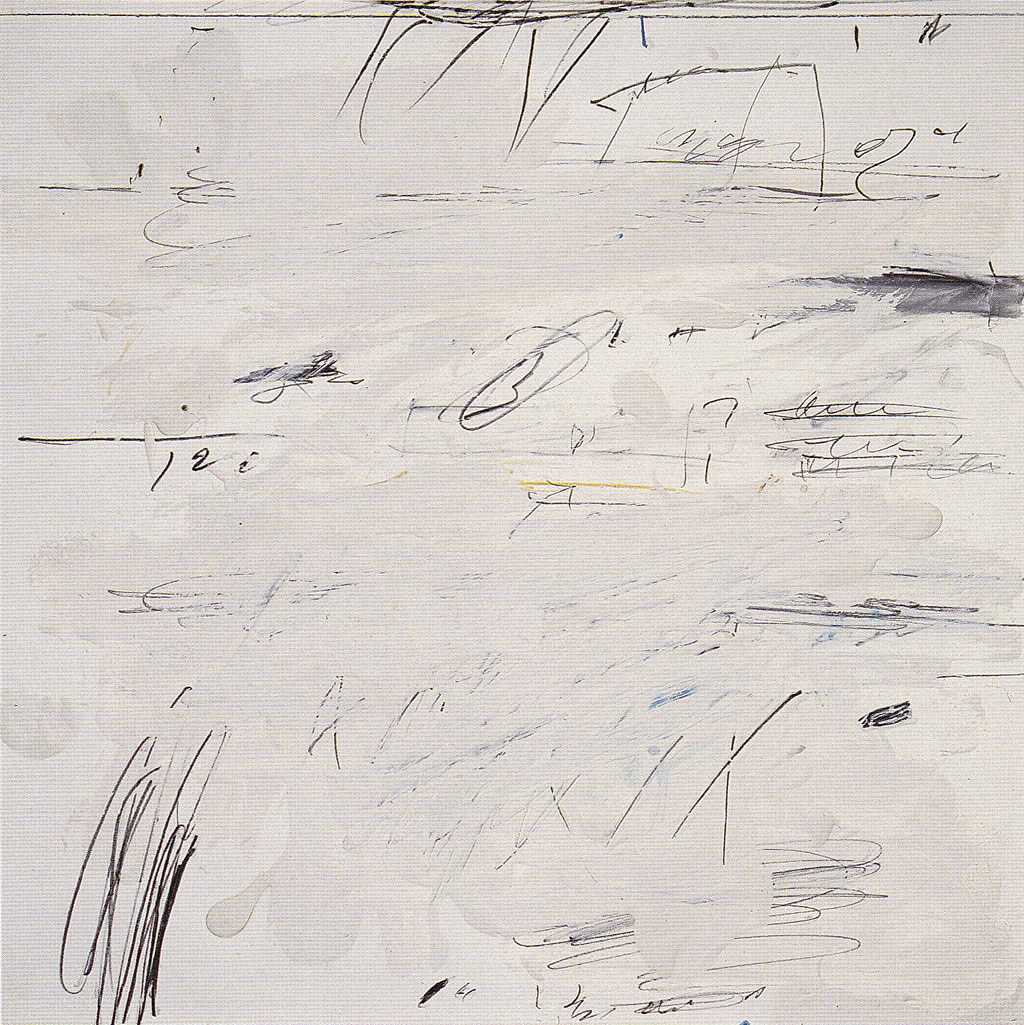
Cy Twombly (1928-2011) In the autumn of 1952, on a trip across North Africa with Robert Rauschenberg, Cy Twombly filled an unknown number of sketchbooks with drawings. In the autumn of 1953 and winter of 1954, while serving in the army, Twombly rented a hotel room each weekend in Augusta, Georgia, so that he could draw. At the end of 1954, while sharing a studio with Rauschenberg in New York City, he made a new group of drawings. In 1959, sitting on the floor of his future-wife’s apartment in Manhattan, he made another new series. And so on.
Twombly, it seems, drew in spurts, usually while traveling and while away from his studio. The drawings he made on these occasions were never preparatory in a strict sense, yet he based his subsequent paintings on them. He used his drawing campaigns to explore and develop the next stage of his art..
Twombly found his vocation as an artist in high school in Lexington, Virginia. As did Ellsworth Kelly, Twombly first studied at the School of the Museum of Fine Arts, Boston (from 1947 to 1949). He then attended the Art Students League in New York (1950). In Boston he absorbed the lessons of German Expressionism; and in the art galleries and museums in New York he admired the work of Gorky, Franz Kline, Robert Motherwell, and Pollock. He became friends with Rauschenberg at the Art Students League. As did Kelly (and Rauschenberg and Johns), Twombly also wanted an art that was impersonal and that did not bare his soul. He rejected the psychic struggle inherent in the gestures of Abstract Expressionism.
Cy Twombly, page from North African sketchbooks, 1953. Conté crayon, 22 x 28 cm.
The adjacent illustration is one of the hundreds of sketches Twombly drew while traveling through North Africa with Rauschenberg in 1952. (He also sketched African artifacts in the Pigorini ethnographic museum in Rome). He stapled many such sheets together into sketchbooks. They were never exhibited in his lifetime.
The unpretentious drawings of his African sketchbooks often display a row or rows of vertical, tube-like shapes—in this example, the inside shape is tubular, the outside shapes are conical. A few short internal lines might decorate a shape; other short lines might suggest spiked hairs growing out their sides. Mimicking the arts and cloth patterns of Africa, he created from their designs personnages, as did Miró, and totems or fetishes, as did Pollack and Gorky. (He had studied the Gorky retrospective at the Whitney Museum in 1950.) Like so many artists of the Twentieth Century, he was drawn to so-called primitive arts and to children’s art as a defense against his own facile drawing ability. Some months later, he drew the same imagery into a base of oil paint on a canvas he named Tiznit. From now on, drawing became an essential component of his painting. Drawing and painting merged.
In the hotel room in Augusta in 1953-1954, Twombly made another series of drawings on largish beige paper. In Augusta he frequently drew in the dark, not as an exercise in Surrealist automatic drawing, but once again to break from the deftness of hand he had acquired. He declared a few years later that the Augusta drawings determined “the direction everything would take from then on.”
Cy Twombly, Untitled, 1954. Colored pencil, 48.5 x 64 cm.
The lines in these drawings are more fluid than those in the African sketchbook. He still depicts vaguely biomorphic shapes with mouths and tails. What’s new are long, looping lines and the childlike scrawls—the start of his own personal handwriting. The seeming mindlessness of his drawing—the lack of concern for design or composition or significance—can be off-putting. The disorder, the scribbling, and the lightness of touch do not convey drama or conflict. As often happens in Twombly’s art, the design drifts diagonally from lower left to upper right.
He very soon transferred this style of drawing to large canvases covered with house paint. Setting aside his paint brush, he drew thin lines into and onto and under this painted base with soft pencil and wax crayon. From the start, viewers confronting these paintings thought of aging layers of graffiti on a weathered stone or cement walls.
While sharing a studio in New York with Rauschenberg (1954-1955), Twombly worked on a new series of drawings, this time with colored pencils. Layers of frantic scrawls randomly piled on top one another have replaced any suggestion of biomorphic shapes.
Cy Twombly, Untitled, 1954. Colored pencil, crayon, 48.5 x 64 cm.
The paintings that followed these drawings were different. In a painting such as Academy, the layers of oil ground are more uniform. The pencil and pastel lines drawn on the six by seven foot canvas appear thin. Look-alike, mostly vertical marks now cover the entire surface, and light and dark contrast are absent from the tangle of lines. There are some scribbles and scrawls as in the drawings, but for the most part the lines seem to be parts of geometric shapes, numbers, or letters. One can make out the word “fuck” at the bottom. But what stands out is the unfocused, repetitive, unemotional carpeting of marks across the surface.
In 1957 Twombly moved to Italy. From then on, although he exhibited regularly for some years at the Leo Castelli Gallery in New York, his work was seen and acclaimed mostly in Europe.
In the summer of 1959, at Sperlonga on the Mediterranean coast, and back in Rome, Twombly made two new sets of drawings, including the series, Poems to the Sea.
Cy Twombly, Poems to the Sea, 1959. Sheet 16 of 24. Oil, crayon, pastel, and colored pencil, 31.7 x 31 cm.
For this series of drawings, instead of house paint, he spread oil paint from tubes across the paper and on top of many of the pencil marks he had made. In most cases, this effacing often left visible only his activity at the top and bottom of the sheet . The sparse configurations do not overlap one another and now float in empty space. However, the numbers, rectangles, circles, and other shapes are clearer and would remain his language for years.
In the summer of 1961, Twombly began to smear, splash, and dab colored paint on canvas with relatively little line work. The symbiosis of painting and drawing was broken. Nevertheless, he was prolific in the sixties. Sexual imagery, dates and places, and mythological names began appearing in his work.
For a number of years in the late sixties, he drew on paper and on canvas similar, repetitive loops and swirls in white over dark gray grounds. Their calligraphy resembles the exercises of students learning the Palmer Method of handwriting. Then in the seventies and eighties he cut back drastically and worked infrequently. Finally, in the nineties and beyond, he drew flowers on paper like a child gone wild with finger paints.
Sol LeWitt (1928 -2007) In 1968, Sol LeWitt exhibited his first wall drawing in a group show at the Paula Cooper gallery in Manhattan. Using hard, sharp pencils and a straight edge, he drew on the wall of the gallery two square grids next to one another, each measuring two feet by two feet. Each of the two large grids was divided into four smaller grids, and those four grids contained four even smaller squares. These thirty-two smallest squares were filled with dozens of precisely spaced horizontal, vertical, and diagonal lines. The work lasted on the wall only a short time. After the exhibition closed, LeWitt covered over the drawing and obliterated it. Nevertheless, Wall Drawing 1, now in the Fischer Collection, was recently recreated on a wall in the San Francisco Museum of Modern Art. And it was rendered on a wall of SFMOMA in colored pencil in 2002.
A price list, now in the Archives of American Art, posted the dollar amount each artist in the exhibition expected for his work—except for LeWitt, who indicated next to his name that he would charge by the hour. In other words, he was not selling an object, a traditional drawing on paper, but an idea or concept that could be executed again on another wall. He was asking for the cost to translate his design to a mural-size drawing on a wall belonging to the buyer.
To LeWitt, the idea or concept of a piece was the essential part, not the execution. He declared his meaning the year before: “I will refer to the kind of art in which I am involved as conceptual art. In conceptual art the idea or concept is the most important aspect of the work. When an artist uses a conceptual form of art, it means that all of the planning and decisions are made beforehand and the execution is a perfunctory affair. The idea becomes a machine that makes art” (“Paragraphs on Conceptual Art,” Artforum, June, 1967).
Instead of a physical something that could hang on a wall and later be bought and sold as a commodity in the art market, LeWitt was offering an idea for a drawing that either he or someone else would realize on a wall and that for a time would become part of the wall. In actuality, very soon collaborators almost always executed the wall drawings for LeWitt. Most wall drawings, literally, do not exhibit the artist’s hand.
Wall drawings normally came with a certificate of ownership and a diagram with instructions on how to reproduce it on a wall. For example, the diagram for the first wall drawing reads: “Lines in four directions (horizontal, vertical, diagonal left & diagonal right) covering the entire surface of the wall. Note: The lines are drawn with hard graphite (8H or 9H) as close together as possible (1/16” apart, approximately) and are straight.” See the certificate and diagram for Wall Drawing #91 (1971) in the Yale Art Museum collection.
Before he began making wall drawings in 1968, LeWitt had been designing grid-like pieces of sculpture or “structures,” as he called them. He made working drawings first, then had the pieces fabricated by others following his designs. His practice in making structures built by someone else obviously became a precedent for the realization of his wall drawings. He had also worked as a graphic designer for the architect I. M. Pei in 1955. The practice of architecture offered him another precedent for wall drawings. Builders and contractors, working from a set of plans, realize the architect’s ideas, not the architect. But the most commonly cited precedent for LeWitt’s wall drawings comes from the art of music, where performers realize the composer’s score at different times and in different places. It was the analogy he preferred to make.
LeWitt’s belief that the idea is the essence of art also has precedents in the history of drawing. In the Renaissance, from Michelangelo to Federico Zuccaro, drawing was understood as the manifestation of a divinely inspired idea residing in the artist’s intellect. In effect, LeWitt revived Renaissance theory. More realistically, LeWitt embraced wall drawings in reaction to Abstract Expressionism. Like many draftsmen of his generation, he wanted nothing to do with the drama and cult of personality that went with Expressionism. As he wrote in “Paragraphs on Conceptual Art” (Artforum, June, 1967), “To work with a plan that is preset is one way of avoiding subjectivity.”
In the year following the Paula Cooper exhibition, LeWitt made nearly four dozens wall drawings. His preferred media at that time were constantly sharpened hard pencils or ink on paper. When he worked with colored inks, he chose the three primary colors. The drawings in those years were all combinations of horizontal, vertical, right-facing and left-facing diagonal straight lines rendered in grid patterns. The grid and basic line directions appealed to a number of artists at the time. In the early sixties, Agnes Martin had penciled grids onto paper and canvas. Earlier, in 1951, Ellsworth Kelly had proposed in his book Line, Form and Color a basic vocabulary starting with straight lines in the four basic directions. LeWitt and Kelly, as did so many artists in the twentieth century, felt compelled to base their art on the fundamental visual elements.
Like his sculpture, LeWitt’s drawings were usually conceived as series. A series or a serial progression of an idea for a drawing automatically created variations on a theme. Regulated changes within a series generated the ideas for new drawings. Sometimes, after a year or more of developing a series, he introduced something different, as in Wall Drawing 46 of 1970 where he called for lines “not straight, not touching.” Then in 1971 he introduced curves and arcs into his work, and in 1975 he moved on to drawing six basic geometric shapes: circle, square, triangle, rectangle, trapezoid, and parallelogram.
By the early 1970s, instead of merely replicating a drawing as if it were an enlarged sheet of paper, LeWitt’s wall drawings began to occupy the entire wall and to adjust themselves to the variations in the wall. For example, in Wall Drawing 51: All Architectural Points Connected by Straight Lines (1970), lines radiate from the corners of the window and door frames, the light switches, and ceiling beams to the corners of all the other features in the room. The drawing of course looks very different in different rooms.
In 1974, at the John Weber gallery in New York, he introduced a series of “location” drawings. Location drawings characteristically had lengthy and elaborate instructions describing how to place a simple shape, such as a square or triangle, on the surface. The complicated description makes fun of the belief, by some Conceptual art theorists, that a visual idea can have a verbal equivalent.
In the 1980s LeWitt became a different artist. His work became bolder, more sensual and dynamic. He started to use colored ink washes on walls. Three-dimensional cubes and pyramids replaced two-dimensional squares and triangles. Lines grew into thick bands; then straight lines became waves and swirls; and squares and triangles sometimes broke into shards. In 1997 he began using vibrant acrylic colors for wall drawings and gouache for drawings on paper.
LeWitt produced over1200 wall drawings in his lifetime. He also did more than fifty artist’s books. (The grid of lines of Wall Drawing 1 first appeared a year earlier in the so-called “Xerox Book” of 1967.) He also produced innumerable works on paper, including rough sketches and working drawings, diagrams for his wall drawings, as well as finished drawings. His finished drawings have not received as much attention from historians and critics as his wall drawings. They are neither preparations for nor copies after his wall drawings. They appeared before, during, or after any related wall drawing. Independent works on paper allowed him to explore and gave him new ideas.
For finished works on paper of the late sixties and of the seventies, he employed sharpened hard pencils and fine pens. In the early drawing, Vertical and Horizontal Lines (ink and pencil on paper, 1970), precisely spaced horizontal and vertical lines cross one another. The hand-made mesh of lines produces a faint quivering gray tonality. The delicate and hyper-precise lines seem ethereal. Robert Rosenblum in the catalog of the MOMA 1978 LeWitt retrospective aptly called his art “stunningly beautiful.” Beautiful is a word that Lewitt preferred not to hear, but it is a word that can apply to many of his finished works on paper as well as his wall drawings.
Sol LeWitt: A Wall Drawing Retrospective, an exhibition at MASS MoCA in North Adams, Massachusetts, emphasizes his later work. It is made up of 105 of LeWitt’s large-scale wall drawings, spanning the artist’s career from 1969 to 2007. An entire three-story building has been restored and redesigned for the installation of the drawings. The show is slated to be on view for twenty-five years.
The Sixties
The Museum of Modern Art in New York has periodically held exhibitions that have surveyed the art of drawing during the previous decade or decades. The exhibitions have started the process of sifting through the enormous amount of contemporary work, and they have begun the task of historical assessment. They are a welcome guide through the recent past. The first exhibition, Drawing Now, 1976, was curated by Bernice Rose, who wrote an essay for the catalog.
The exhibition began with work by Rauschenberg, Johns, and Twombly from the late fifties and early sixties. It included the drawings of Pop artists, such as Andy Warhol, Roy Lichtenstein, Claes Oldenberg, and Jim Dine from the sixties and into the early seventies. It concluded with the work of Conceptual artists, especially Sol LeWitt, from the same period. Rose claims that during this period drawing lost its reputation as a subsidiary art form. Drawing began to innovate and won equal status with the other arts.
She sees an arc or an underlying movement during these years away from the personal handwriting and gestures of Abstract Expressionism, epitomized in Pollock’s drawing, toward depersonalized drawings with non-descript lines divested of human touch, which were meant only to embody an idea.
Although Pollock’s drawings were not in the show, the catalog begins with artists active in the fifties whose work is, in Rose’s words, “graphological, coloristic, and painterly” (16) like Pollock’s. Looking ahead to LeWitt’s wall drawings, Rose observes that Pollock “in his black-and-white canvases of 1951-52 . . . blows the scale of drawing up to the monumental” (12). In their early work, Rauschenberg and Johns often seem to retain the charged lines of Abstract Expressionism, yet their mundane subject matter strips them of personal struggle. Moreover, the sameness of their lines bring them closer to traditional parallel hatching than to Pollock’s self-expression through line. In Twombly’s case, his calligraphic gestures derived from Surrealist automatic drawing, not from the example of the Abstract Expressionists.
Rose does not discuss the prolific draftsmanship of Ellsworth Kelly. The catalog illustrates only one of his works, a pencil drawing of 1974. The exhibition seems to place him among the Conceptualists, even though he emerged as an artist much earlier. Living in France during the heyday of Abstract Expressionism in the late forties and early fifties, he escaped its influence. Like Johns and Twombly, he too sought, in the simple geometrical grids of his early collages and in Surrealist chance, an art that was impersonal.
Rose’s catalog illustrates two works on paper by Agnes Martin, but not her better known penciled canvases. In the text of the catalog, Rose does not discuss her work. She mentions only that her “pencil grids on painted canvas played a key role in the projection of the grid image which came to dominate the sixties” (68).
When Pop artists, following Rauschenberg and Johns, restored recognizable subject matter, they adopted a depersonalized realistic style of contour drawing as practiced in commercial art and the mass media. For example, Lichtenstein “undermines the handmade look of drawing” (Rose, 40) by imitating the heavy outline of stereotypical comic strip drawing.
Oldenberg was one of the few prolific draftsmen among the Pop artists. (The Whitney Museum has the world’s largest collection of his drawings.) He drew constantly, carrying with him a sketchbook to record and develop ideas as they occurred to him. He had a knack for drawing and experimented with different styles, but he preferred to draw with an energetic, gestural, and textured line using a black greasy crayon. Rose calls it a “grand style” in the traditional of the Baroque. She notes that he is the only prominent artist of the period to draw the nude figure. She justifies this breach with modernity because the nudes appear in a series of erotic drawings and must be interpreted as irony and parody.
The catalog notes that since 1965 Oldenburg has made drawings for proposed large-scale monuments and soft sculpture. For these works he filled notebook pages, made many studies and some finished drawings, and provideed technical diagrams and templates if the project was realized. Drawing, in short, was the core of his artistic practice. Nevertheless these drawings, which now define him as a draftsman, seem to lie beyond the scope of the exhibition.
Rose declares that drawing became the major two-dimensional art form of the late sixties “not as a function of the ‘failure’ of painting but as a function of the discipline of drawing” (68). Simply put, Environmental artists, Minimal artists, and Conceptual artists needed drawing. “During the sixties the drawing as a preliminary step to work in another medium assumed a vital role. As sculptors began to have their works fabricated by industrial craftsmen . . . , it became important for the artist to provide first, for himself, a visualization of what the work would look like and then, for the fabricator, a sketch or diagram with measurements and instructions” (56). These pragmatic drawings soon became collectors’ items since they embodied, as only drawing can, the artist’s idea. “It was the particular gift of Minimal artists like Dan Flavin to restore to contemporary sensibility an initial sense of the drawing as conceptual” (56) .
For Environmental artists Robert Smithson and Michael Heizer, and also Cristo, “drawing became an economic necessity, enabling them to continue to work on more ambitious projects” (56). Collecting their drawings was the equivalent of buying stock in their companies. Rose observes that the finished drawings of Cristo, who possessed academic drawing skills, “are a type of modello.” In addition, “ex post facto drawings were made to provide a record of works executed in distant locations” (56) or, in Cristo’s case, works that were temporary.
Of all the Conceptual artists, Rose focuses on Sol LeWitt, for whom “drawing was the fundamental discipline” (71). For the 1976 exhibition at the museum, four collaborators installed a wall drawing from 1969 entitled Straight Lines in Four Directions Supperimposed. As drawn in pencil on the wall, it measured 12 by 26 feet, nine inches. Strangely, LeWitt’s wall drawing was set up like a large canvas on a room divider in the middle of a museum gallery, rather than as part of an actual wall.
Rose reports that Minimal artists and sculptors like Donald Judd and Dan Flavin developed systems based on geometry to elaborate their work and that a new interest in drawing arose around these developments (68). Sol LeWitt also generated his drawings from systems dependent on a geometric grid. His use of nothing but horizontal, vertical, and diagonal straight lines in his early drawings constituted a return to fundamentals—a recurrent theme for artists of the sixties. Rose observes that his closely spaced parallel lines resembled hatching and cross hatching and result in a “tonal field” (71).
Warhol said that as an artist he wanted to be a machine. LeWitt’s wall drawings, executed by others, indeed eliminated the artist as craftsman. Rose sees in this idea a return to the Renaissance concept of drawing as disegno—drawing understood as intellectual content and independent of execution. LeWitt’s drawing caps, she concludes, “a movement in the arts toward more ‘Platonic’ ideational modes as opposed to sensuous modes” (91).
The seventies and eighties
In 1992 the Museum of Modern Art held a second exhibition examining the state of drawing during the previous two decades. Bernice Rose once again curated the show, which she called Allegories of Modernism: Contemporary Drawing. She also wrote an essay for the publication that accompanied the exhibition. In lieu of a catalog, the museum published a Checklist of the exhibition (available online). The list included about two hundred works by over forty artists.
In spite of the claim that the exhibition picked up where the first one left off in 1976, her essay begins by re-evaluating her assessment of the first period, the sixties and early seventies. She now understands the movement toward conceptual art as the start of postmodernism.
Rose defines postmodernism as the breakup and reworking of the modernist movement, or in her words “a continuing discourse between the modernist corpus and the present” (11). For example, the body language and gestures of Abstract Expressionism were extended into performance art. And the authorial marks of the modern style became conceptualized and mechanized by LeWitt and others. She concludes that “the isolation and concentration on line as a subject in itself had the effect of catapulting drawing . . . into a major autonomous role” (13).
She also believes that a postmodernist reworking of modernism can be read as an allegory, in the sense that an allegory appropriates, overrides, and reinterprets another art. For example, Pop art, rejecting self-expressive drawing, appropriated the mechanical and stereotyped graphic language of mass media to become something different.
And Rose notes that in the mid 1970s European art, especially German art, once more had an impact on the American art scene. With that in mind, she begins her review of the artists of the period with a reassessment of Joseph Beuys and with evaluations of other German artists, namely Sigmar Polke, A. R. Penck, and Georg Baselitz.
Joseph Beuys (1921-1986) is best known as a performance artist who gave his art a social and political function. Through much of his career, Beuys drew prolifically, freely, and inventively. But Rose never explains her claim that his drawing “became the building blocks of his all-encompassing ‘Social Sculpture’” (19).
Beuys studied at the Düsseldorf Academy of Art from 1947 to 1951. Ten years later he was appointed Professor of Monumental Sculpture at the same academy. A major influence on his style of drawing were the late drawings of August Rodin, which he discovered around 1950. Like Rodin, Beuys favored the human, especially female figure. Unlike Rodin, he did not use a model, but worked from his imagination in a ragged, primitive manner in part derived from the elongated sculpture of Wilhelm Lehmbruck, who worked in Düsseldorf early in the century.
Beuys often employed a simple pencil. In many other drawings, he used a brush for bold lines and washes in watercolor and oil paint. He also made use of collage elements. He regularly exhibited his drawings alongside his sculpture. Although he did not make preparatory sketches as such, he felt that his works on paper, which recorded his life’s experiences, made his later political works possible.
Throughout the sixties and early seventies Sigmar Polke (1941-2010) made copious drawings in the style of a ten-year-old adolescent boy on cheap pieces of pulp paper and in dozens of sketchbooks. (The Museum of Modern Art has examples. Google moma.org/collection/. Also see: http://stoppingoffplace.blogspot.com/2010/06/sigmar-polke-early-drawings.html )
He started this kind of drawing while a student at the Düsseldorf Academy where Beuys taught. Polke drew cartoonish, schmoo-like humans and trivial items like potatoes. He made a personal interpretation of American Pop art, which he knew from art magazines. Polke used ball-point pens and felt-tip pens, adding strokes of watercolor or gouache on some larger sheets. Drawn with the unbroken and featureless line of a ballpoint pen, his art was crude, sometimes provocative, and often funny.
He eventually began layering these images one over another, especially in a number of large drawings from the early seventies that are up to fifteen feet across. Instead of a parody of a single mass-media or mass-market image, these large drawings are montages of images drawn from his graphic repertoire. He drew the same imagery in paint on canvas or even on cheap printed fabric. Polke moved seamlessly from drawing to painting: his paintings are little different from his drawings.
Polke’s layered montages in fact are only possible with drawing. Since line drawings are so-to-speak transparent—light shines through them from the sheet—drawings can be layered without overly obscuring the image underneath.
In the mid-seventies Polke stopped drawing and devoted himself to photogrpahy.
Polke’s enormous drawings of the early seventies demonstrate that at that time drawing was being redefined. A drawing was once an intimate, hand-held work on paper. Now it became common for artists to draw on a large scale and on non-paper supports.
Polke was not the only artist to use large canvas-scale sheets of paper for their drawings. In the Museum’s exhibition about a dozen artists—among them, Susan Rothenberg, Keith Haring, and Jean Michel Basquiat—had on display drawings on sheets of paper four, five … up to twenty feet wide or high.
The pursuit of drawing on a large scale logically led to non-paper supports. Recall that Agnes Martin had earlier drawn in pencil on stretched canvases and Sol Lewitt on walls. In the late seventies and early eighties Jonathan Borofsky drew on the walls of his installations. Two works by Julian Schnabel and David Salle in the 1992 MoMA exhibiton are in fact drawings on large canvases. Salle frequently overlaid his imagery in the manner of Polke.
The drawings of the German artist A. R Penck (Ralf Winkler, 1939-2017) illustrate another trend brought out in the 1992 exhibition: serial drawings. Artists in the past, Matisse for instance, had made portfolios of drawings, and others had produced any number of related drawings focused on a theme. The difference is that Penck’s series of drawings must be seen all at once and therefore need to be arrayed on a wall. In a way, his drawing is a performance.
Three such series of his were shown, including Welt des Adlers (World of the Eagle), 1980. In it he fill 472 sheets of paper with scrawled and scribbled pencil lines. His drawing series depend on the tradition of Surrealist automatic drawing as well as the graphic traditions of German Expressionism.
More typically, during the sixties while living in East Germany, A. R. Penck began drawing stick figures both on paper and on canvas. His repertoire of images includes not only stick figures but also pictograms, geometric shapes, numbers and letters. Like many a prehistoric artists, he filled the entire surface without any overlapping. He drew these figures and signs with thick, consistent lines whether on paper or on canvas.
Other artists in the show made little distinction between their drawing and painting, for example Brice Marden’s calligraphic lattice-work paintings and drawings of the late 70s and the 1980s. In both media, Susan Rothenberger adds, subtracts, reworks, and smudges her lines.
Rose concludes that by the 1980s “the hierarchy of mediums, the exclusivity of disciplines . . . finally gave way.” Not only did artists move seamlessly from drawing to painting but a “new attitude toward painting developed . . . based on the notion that the painting, too, is only a fragment, one thought along the way” (58)—in other words, like a drawing. In sum, artists of the seventies and eighties challenged the meaning of drawing.
Finally, during the period covered by the exhibition, the art world discovered the gaffiti sprayed on the walls and subways of modern cities. Out of several graffiti artists who made the move from city street to art gallery, Jean-Michel Basquiat (1960-1988) rocketed to stardom in the eighties. In his first year (1981), his paintings sold for $5000 to $10000. His art now sells for astronomical prices. He was the only black artist of the twentieth century to achieve such success in the art market.
Aquaintances have reported that he was always drawing. In less than nine years he made about nine hundred works on paper. The graffiti that he sprayed outdoors (1978-1980) under the pseudonym SAMO (same old shit) seems to have consisted mainly of anarchic words and phrases rather than images. His earliest drawings, however, were of the full human figure, at first with boxy torsos, then later more curvilinear. He also focused on the human head. In 1982, he drew dozens of colorful heads, almost all with bulging eyes and huge mouths that usually bared a full set of teeth. His hallmark heads, inspired by children’s art, African masks, and Picasso, appear in most of his works. Other frequnt images include childishly drawn autos, airplanes, diagrams, and three-pointed crowns. His many bones and internal organs came from a favorite book, Gray’s Anatomy. But the heroes and saints of his paintings, black boxers and black musicians, are seldom the subjects of his drawings.
In 1983, he integrated words more and more into his drawings, especially in his Daros Suite, a series of 32 drawings now in Switzerland. [Google “Daros Suite”] The words he used in his art include random names and phrases, lists of things, repetitions of the same word or words, and sayings. He often crossed out some of them with an X or a line. The cryptic sayings derive from his graffiti practice, of course, but also from an emerging trend of word art in Conceptualism. It is no surprise that Annina Nosei, Basquiat’s first professional gallery dealer, also represented Jenny Holzer and Barbara Kreuger as well as German Neo-Expressionists. Basquiat and his contemporary A. R. Penck share many similarities of style and iconogrpahy. When painting, they both drew on canvas.
Basquiat’s favorite drawing tool whether on paper or on canvas was an oil stick. Oil sticks in an array of colors were available commercially only in the 1960s. Their blunt ends made possible the thick lines he preferred. Oil sticks allowed him to move from paper to canvas without shifting gears so to speak. The main difference is that in his paintings, areas of flat color play hide and seek with his aggressively drawn gestures.
He normally drew on a modest-sized sheets of paper (22 x 30 or 32 x 40 inches), except in the late eighties when he worked on enormous sheets or a collage of several sheets. Using less assertive and thinner lines, he sometimes filled these sheets with words and things, composed in a primitive horror vacui, with no overlapping, as did Penck. This may have been a new direction for Basquiat before his career was cut short.
The nineties
In 2002 the Museum of Modern Art held a third exhibition, an assessment of the state of drawing in the1990s. The show was called Drawing Now: Eight Propositions. Those proposition were illustrated with over 200 works by only 26 artists. In the tradition of Bernice Rose, the exhibition was organized around an idea embodied in the work of young artists who emerged during the nineties and who made drawing a primary mode of expression. Drawing, it seems, had declined in the eighties, then flourished in the nineties.
According to Laura Hoptman who wrote the introduction to the exhibition catalog, the artists selected for the exhibition did not try to capture the creative process in the act of drawing, instead they made finished drawings that were thought out and imagined beforehand. Drawing in the nineties, she writes, was a noun rather than a verb: they were a finished thing as opposed to a display of a process. Almost all the drawings in the show were representational. Most of the drawings depicted the human figure; some of them depicted architecture. On several occasions, Hoptman remarks that drawings in the exhibition resemble nineteenth-century drawing, especially the work of the Pre-Raphaelites.
The eight propositions are really eight visual sources that influenced the young artists. In summary fashion, the major sources can be reduced to three: 1) scientific drawing and architectural drafting, 2) ornamental design, and 3) vernacular illustration, including comics, animation, and fashion illustration. Artists affected by industrial and commercial illustration tended to produce precise and refined drawings. Artists affected by vernacular illustration tended to produce drawings that describe a situation or tell a story.
Three or four artists were chosen to illustrate each one of the eight categories. The 2002 exhibition had a more international scope than the previous two. Although ten of the artists lived and worked in New York and California, there were also five from Great Britain, three from Germany, one each from Holland, Sweden, and Switzerland, and two from Japan. Seven were women.
Despite modern trends to draw on a variety of supports, all the drawings chosen for the exhibition were works on paper, except two sets of drawings by Julie Mehretu and Matthew Ritchie on sheets of Mylar. (The catalog also illustrated a trio of wall drawings, not in the exhibition, by Richard Wright.) In keeping with modern trends in drawing, seven artists worked on very large sheets of paper well over five feet across.
A few of the better known artists in the exhibition are Julie Mehretu, Takashi Murakami, Elizabeth Peyton, Matthew Ritchie, and Kara Walker. One can find a helter-skelter sampling of their work on Google Images: [artist’s name] drawing.
Elizabeth Peyton (1965- ) draws small, roughly eight-by-six inch portraits, mostly in colored pencil. Although the exhibition cited fashion illustration and Pre-Raphaelite art as sources of her style, she usually works from photographs of celebrities and friends. While realistically represented, the majority of her portraits, male and female, are elongated, thin, pale, and androgynous—an idealized conception of beauty. She usually gives them the same very small, very red, Cupid-bow lips, almond-shaped eyes, and arched brows.
Kara Walker (1969- ) is most famous for her installations of life-size cut-paper silhouettes. But the exhibition illustrated her work with eight drawings from her “Negress Notes,” a series that she began in 1995. The catalog posits that her drawings were influenced by popular venacular culture, specifically naive imagery and styles. However, the series of drawings seems to owe a great deal to Goya, especially his Caprichos.
Takashi Murakami (1962- ) grew up devouring Japanese anime and manga (comics). After a year in New York City (1994), where he admired Jeff Koons, he began producing work that blurred the distinction between high and low art. The exhibiton featured several elongated anime-inspired figures. He is also know for more comic-inspired, circular balloon-headed figures and colorful smiling flowers.
Julie Mehretu (1970- ) fell under the third “proposition:” that some artists in the nineties embraced architectural drafting as a model for their art. The show displayed ten of her ink and colored pencil drawing from 2000, drawings of precisely rendered architectural fragments, overlayed with large abstract lines and with smaller flame-like and explosive groups of lines. Her drawings prepare for her large paintings, which also benefit from the transparency of drawing so that layers of images and lines can overlap, intersect, and not obliterate one another.
Matthew Ritchie (1964- ) also layers images and robust lines with drawings, drawings that he manipulates on a computer before they become painting or sculpture. Drawing, then, lies at the center of his art.
coda
Absent from the three Modern Art exhibitions were Vija Celmins, Lee Bontecou, and Richard Serra.
In 2007 the Museum of Modern Art in New York established the Judith Rothschild Foundation Contemporary Drawing Collection. Between 2003 and 2005 the Foundation had amassed about 2,500 drawings which they gave to the museum. The collection, in effect, documents the works on paper available in those years.
In 2005 Phaidon Press published an “up-to-the-minute” antholoogy of contemporary drawing. The publisher called it Vitamin D: New Perspectives in Drawing. For the book, international critics, curators, and museum directors made a world-wide assessment of the state of drawing. They selected 109 artists “who practice drawing as their primary or one of their primary mediums” (005). Vitamin D discussed nearly three times as many artists as any of the Modern’s exhibitions. It also focused on young artists who had emerged since 1990, and its scope was decidedly more international than the New York exhibitions had been. After an introduction by Emma Dexter, a variety of authors wrote biographies of each artist.
In the nineties, the introduction asserts, “drawing has become increasingly prominent,” and “never before has drawing been more dynamic” (005). The current resurgence in drawing means that it is “perhaps the first moment in history when artists can opt for drawing as their principle medium, confident in the knowledge that their work will not suffer in status as a result” (008).
Dexter offered a succinct definition of drawing. She defines drawing as “a mark-making process used to produce a line-based composition” (005). Drawing is thus reduced to making lines, ignoring other visual components. In the centuries-old debate about disegno and colore, Poussin and Ingres fought for the supremacy of line. In 2005, it would seem, they won!
Dexter interprets line-making broadly: “there is only a short step to understanding body movement as the drawing of invisible lines in space”. Understood this way, making a drawing may include walking in a line, dancing, and stringing telephone lines.
This kind of thinking led to the exhibition On Line: Drawing Through the Twentieth Century at the Museum of Modern Art in New York in 2011, a show that included dance performances.
In 2013 Phaidon Press published a second survey of drawing, which they called Vitamin D2: New Perspectives in Drawing. This time the international critics, curators, and directors chose 115 artists who emerged since 2005. Vitamin D2 was billed as a cross-section of contemporary drawing, meant “to define and characterize current practice” (007).
Christian Rattermeyer, curator at the Museum of Modern Art in New York, writes in his introduction that for the last thirty years there has been a return to figuration and narration in drawing. He points to Laura Hoptman’s 2002 Modern Art exhibition as confirmation of the trend.
In Vitamin D2, Rattermeyer asks “What has changed since 2005?” One difference is that “In the first few years of the 2000s, collage and assemblage techniques assumed a major role in the production of artists across all disciplines.” Consequently, “collage and mixed-media works radically expanded the notion of drawing from a medium of mark-making . . . to a more inclusive concept of a ‘work on paper’ (011).
For the most part, however, he finds striking similarities and continuity with works in the first volume. At the end of the last century as well as in the first decade of this century, artists made “large, intricate, and fantastical drawings, often dreamscapes and landscapes of imaginary geographies and cities … intersperse[d] with willfully personal, intimate, even kitschy imagery” (012).
He adds that “material experiments are as inventive. . . . Execution is often exquisite for figurative and abstract solutions alike. A return to neo-classical vocabularies . . . is just as present as as the obsessive, repetitive mark. Drawing in the year 2012 is not remarkable for the radicality of its reversals and diversions of the dominant styles of the past decade (or decades), but rather for the steadiness” (012).
But finally he asserts that “extreme diversity of these artists’ origins” is the most compelling difference between the two volumes. Drawing has been energized by the globalization of the art world which now includes artists from Latin America, south-east Asia, Africa, and the middle east. “Drawing, one might argue, is in fact of more vital importance and of greater urgency precisely in these overlooked areas of the global art world.” These artists have introduced new sources of form and content. There is “a global dialogue, where methods and materials, subjects and traditions are exchanged and employed regardless of national boundaries” The global dialogue fosters radical breakthroughs and unexpected consequences and “leaves drawing revitalized and emboldened” (013).